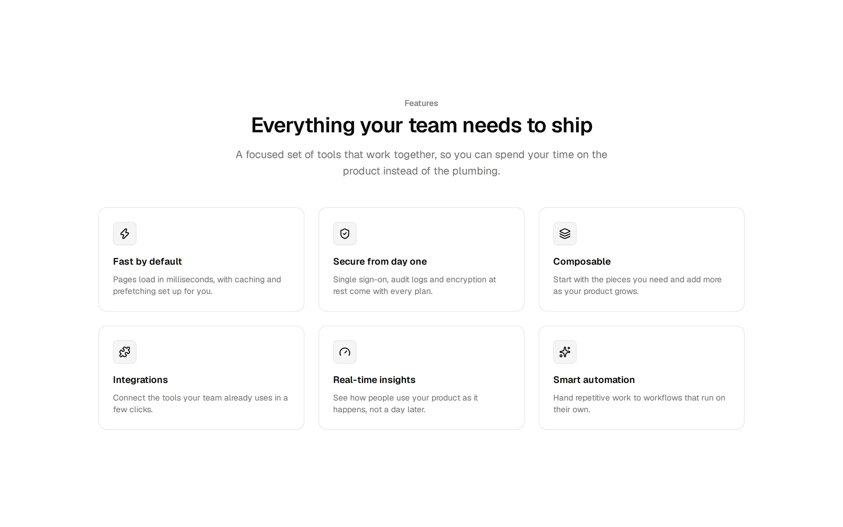
Feature Spotlight Grid
Six icon cards under a centered intro, with one soft highlight that glides to the card you point at
Six icon cards under a centered intro, with one soft highlight that glides to the card you point at
registry/blocks/feature-spotlight-grid-01/components/feature-spotlight-grid.tsx
"use client";

import { motion, useReducedMotion } from "motion/react";
import { type ReactNode, useState } from "react";
import { cn } from "@/lib/utils";

// Cortexcn item "feature-spotlight-grid-01", revision 8d557dddbbbd, MIT license.
// https://ui.cortexcn.dev/r/v/feature-spotlight-grid-01/8d557dddbbbd.json

export interface SpotlightFeature {
  title: string;
  description: string;
  icon?: ReactNode;
}

export interface FeatureSpotlightGridProps {
  label?: string;
  heading?: string;
  description?: string;
  /** Up to six reads best; the grid wraps any number. */
  features?: SpotlightFeature[];
  className?: string;
}

interface Highlight {
  x: number;
  y: number;
  width: number;
  height: number;
  visible: boolean;
  /** Jump straight to the card instead of gliding (first hover after leaving). */
  snap: boolean;
}

const SPRING = { type: "spring", stiffness: 420, damping: 38 } as const;

function IconFrame({ children }: { children: ReactNode }) {
  return (
    <svg
      aria-hidden="true"
      className="size-5"
      fill="none"
      stroke="currentColor"
      strokeLinecap="round"
      strokeLinejoin="round"
      strokeWidth="1.75"
      viewBox="0 0 24 24"
      xmlns="http://www.w3.org/2000/svg"
    >
      {children}
    </svg>
  );
}

const DEFAULT_FEATURES: SpotlightFeature[] = [
  {
    title: "Code you own",
    description:
      "Components install as source files in your project, so nothing is hidden behind a package.",
    icon: (
      <IconFrame>
        <path d="M8 7l-5 5 5 5M16 7l5 5-5 5" />
      </IconFrame>
    ),
  },
  {
    title: "Fits every screen",
    description:
      "Layouts adapt from phones to wide monitors with Tailwind's responsive utilities.",
    icon: (
      <IconFrame>
        <rect height="11" rx="1.5" width="15" x="2" y="4" />
        <rect height="11" rx="1.5" width="6" x="16" y="9" />
        <path d="M7 19h5" />
      </IconFrame>
    ),
  },
  {
    title: "Keyboard friendly",
    description:
      "Focus states, labels, and keyboard support come built in, not bolted on later.",
    icon: (
      <IconFrame>
        <rect height="12" rx="2" width="20" x="2" y="6" />
        <path d="M6 10h.01M10 10h.01M14 10h.01M18 10h.01M7 14h10" />
      </IconFrame>
    ),
  },
  {
    title: "Typed end to end",
    description:
      "Every prop has a type, so your editor flags mistakes before they reach production.",
    icon: (
      <IconFrame>
        <rect height="18" rx="3" width="18" x="3" y="3" />
        <path d="M7.5 10h5M10 10v7M14.5 16.5c.4.4 1 .5 1.6.5 1 0 1.9-.5 1.9-1.5 0-2-3.5-1-3.5-3 0-.9.8-1.5 1.8-1.5.6 0 1.1.2 1.5.5" />
      </IconFrame>
    ),
  },
  {
    title: "Easy to restyle",
    description:
      "Change colors, spacing, and copy through props and CSS variables, not overrides.",
    icon: (
      <IconFrame>
        <path d="M4 6h10M18 6h2M4 12h4M12 12h8M4 18h12M20 18h0" />
        <circle cx="16" cy="6" r="2" />
        <circle cx="10" cy="12" r="2" />
        <circle cx="18" cy="18" r="2" />
      </IconFrame>
    ),
  },
  {
    title: "Light on dependencies",
    description:
      "Most blocks need nothing beyond React, Tailwind, and a small utils file.",
    icon: (
      <IconFrame>
        <path d="M13 2L4 14h7l-1 8 9-12h-7l1-8z" />
      </IconFrame>
    ),
  },
];

export function FeatureSpotlightGrid({
  label = "Features",
  heading = "Everything you need to ship the page",
  description = "Open code components you can read, change, and keep. Start with good defaults, then make every detail fit your product.",
  features = DEFAULT_FEATURES,
  className,
}: FeatureSpotlightGridProps) {
  const reduceMotion = useReducedMotion();
  const [highlight, setHighlight] = useState<Highlight | null>(null);

  const moveHighlightTo = (card: HTMLElement) => {
    setHighlight((current) => ({
      x: card.offsetLeft,
      y: card.offsetTop,
      width: card.offsetWidth,
      height: card.offsetHeight,
      visible: true,
      snap: !current?.visible,
    }));
  };

  const hideHighlight = () => {
    setHighlight((current) => current && { ...current, visible: false });
  };

  const snap = reduceMotion || highlight?.snap !== false;

  return (
    <section className={cn("px-6 py-24 sm:py-32", className)}>
      <div className="mx-auto flex max-w-6xl flex-col items-center text-center">
        <span className="rounded-full border bg-muted/50 px-3 py-1 font-medium text-muted-foreground text-xs uppercase tracking-wider">
          {label}
        </span>
        <h2 className="mt-6 max-w-3xl text-balance font-semibold text-4xl tracking-tight sm:text-5xl">
          {heading}
        </h2>
        <p className="mt-5 max-w-2xl text-balance text-lg text-muted-foreground">
          {description}
        </p>

        <div
          className="relative mt-14 grid w-full grid-cols-1 text-left sm:grid-cols-2 lg:grid-cols-3"
          onPointerLeave={hideHighlight}
        >
          <motion.div
            animate={
              highlight
                ? {
                    opacity: highlight.visible ? 1 : 0,
                    x: highlight.x,
                    y: highlight.y,
                    width: highlight.width,
                    height: highlight.height,
                  }
                : { opacity: 0 }
            }
            aria-hidden="true"
            className="pointer-events-none absolute top-0 left-0 rounded-3xl bg-muted"
            initial={false}
            transition={
              snap
                ? { opacity: { duration: 0.15 }, default: { duration: 0 } }
                : { opacity: { duration: 0.2 }, default: SPRING }
            }
          />

          {features.map((feature) => (
            <div
              className="relative p-2"
              key={feature.title}
              onPointerEnter={(event) => moveHighlightTo(event.currentTarget)}
            >
              <div className="relative flex h-full flex-col gap-4 rounded-2xl border bg-card p-6 shadow-xs">
                <span className="flex size-10 items-center justify-center rounded-xl border bg-muted/60 text-foreground">
                  {feature.icon}
                </span>
                <div>
                  <h3 className="font-semibold text-lg tracking-tight">
                    {feature.title}
                  </h3>
                  <p className="mt-1.5 text-muted-foreground text-sm leading-relaxed">
                    {feature.description}
                  </p>
                </div>
              </div>
            </div>
          ))}
        </div>
      </div>
    </section>
  );
}