Loading
 Velora UI blocksfor shadcn/ui.
27 blocks · all free · updated 13 Oct 2026
100 animated React components and 31 free section blocks for Tailwind CSS 4 — accessible, reduced-motion safe and MIT licensed.
New from Velora UI
Newest first






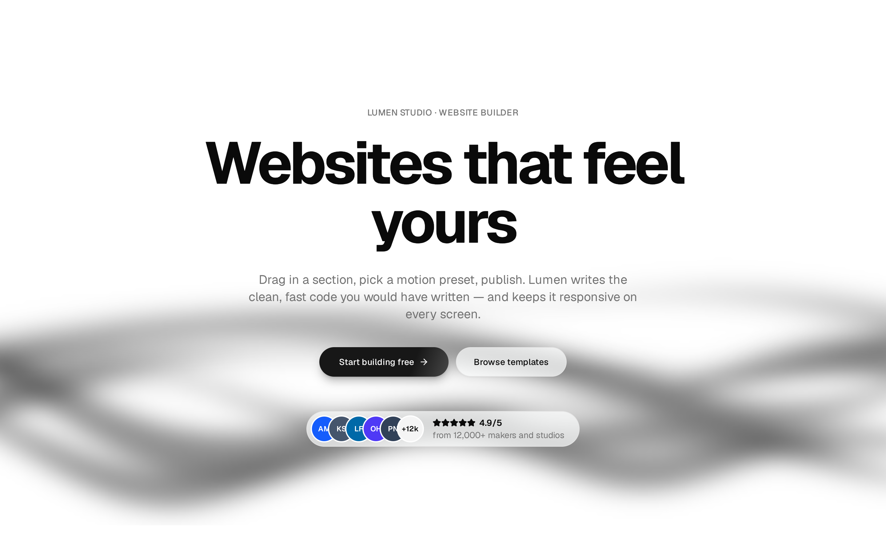







Velora UI hero blocks
5 blocks
Velora UI feature sections blocks
4 blocks
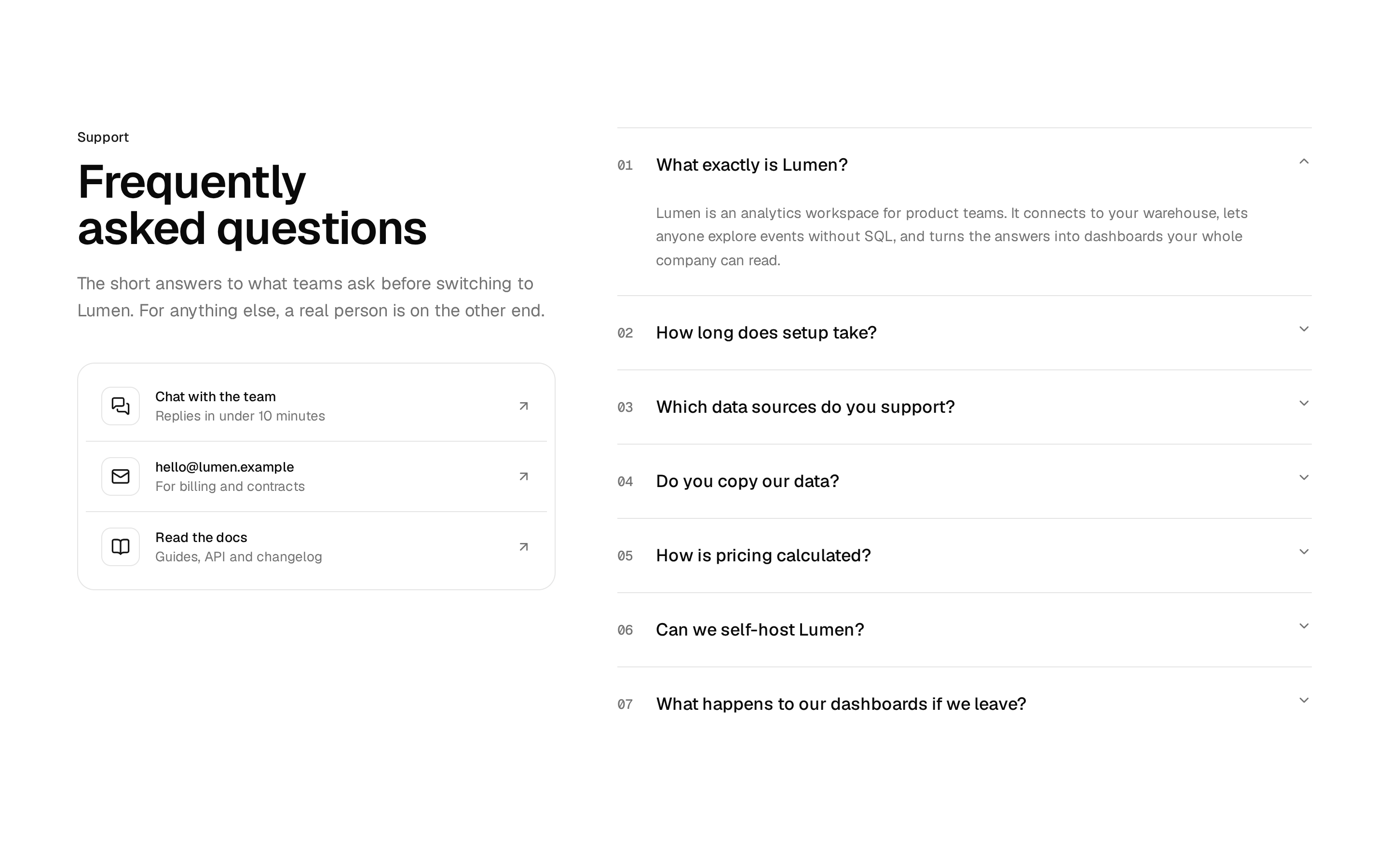
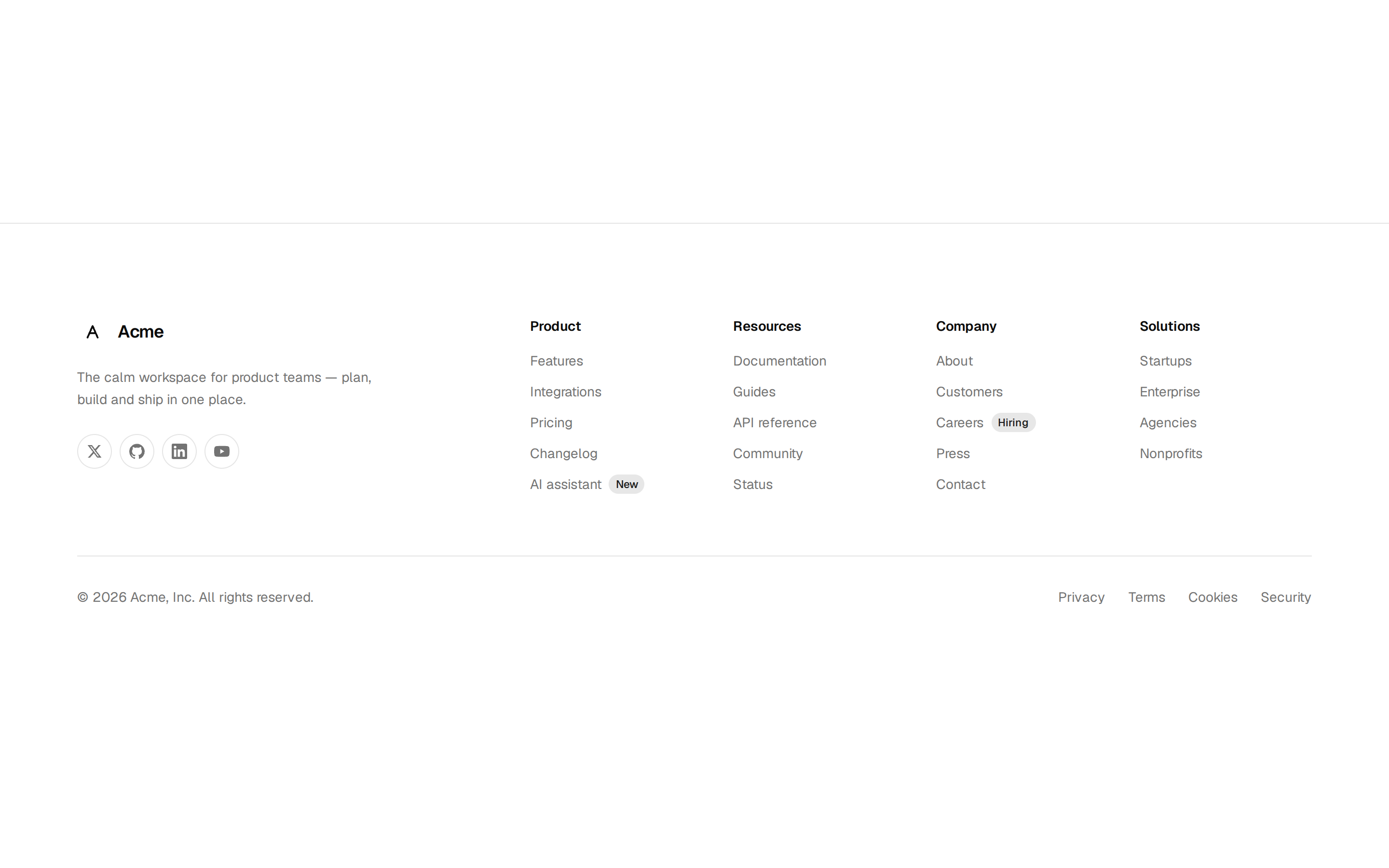
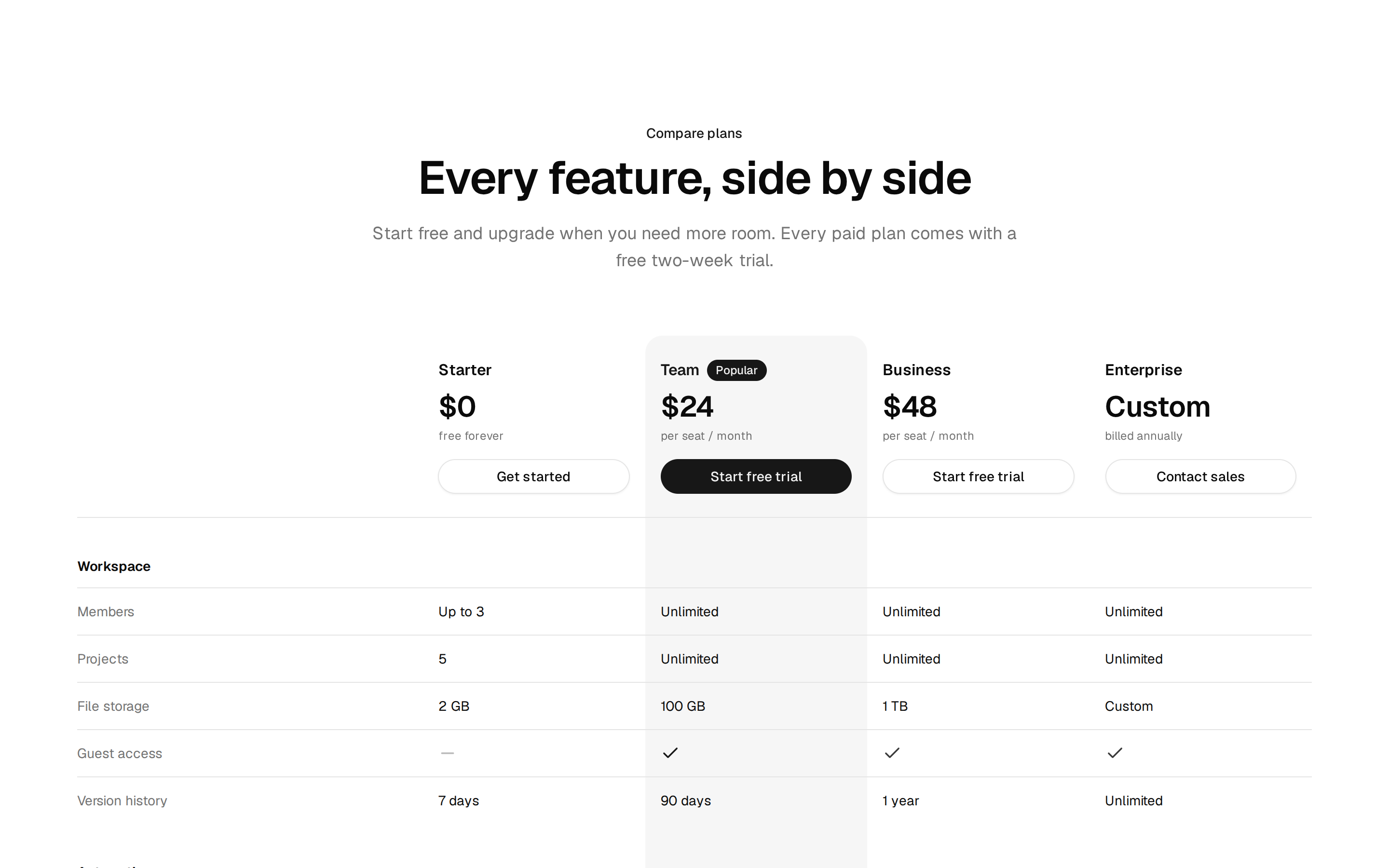
Velora UI is a library of animated React components and landing page blocks from Colorlib, built with Next.js 16, Tailwind CSS 4, shadcn/ui and Motion. The components cover backgrounds like auroras, beams and particle fields, animated text, buttons, cards, scroll effects, cursors, carousels, loaders and mockups. The blocks are full sections: heroes, navbars, feature grids, pricing tables, FAQs, testimonials, logo walls, calls to action, footers and a split login page. Each component reads shadcn's CSS variables, so a single token change rebrands it, and each one lists its gzipped size and dependency count.
Animations respect reduced-motion settings, and the components work in both Base UI and Radix projects. Everything on the site is free under MIT, including a complete multi-page SaaS template. A paid Pro tier with niche templates and more section variants has been announced but isn't out yet.
More registries like Velora UI
Hero and feature sections blocks from other makers