// Ballmac UI: Tour 1. https://ui.ballmac.com/blocks/tour-1
"use client"

import * as React from "react"
import { ArrowLeft, ArrowRight, Bell, BarChart3, FolderKanban, Home, Inbox, Play, RotateCcw, Search, Settings, X } from "lucide-react"

import { Button } from "@/components/ballmac/button"
import { cn } from "@/lib/utils"

type Tour1Step = {
  /** The value of the data-tour attribute on the element to point at. */
  target: string
  title: string
  body: string
}

type Tour1Props = Omit<React.ComponentProps<"section">, "title" | "onChange"> & {
  steps?: Tour1Step[]
  /** The interface to tour. Mark the elements to point at with data-tour="name". Leave out to tour a built-in sample app. */
  children?: React.ReactNode
  /** Start the tour already running, at a step. */
  defaultStep?: number | null
  /** Called when the tour ends, finished or skipped. */
  onFinish?: (result: { completed: boolean; step: number }) => void
}

const sampleSteps: Tour1Step[] = [
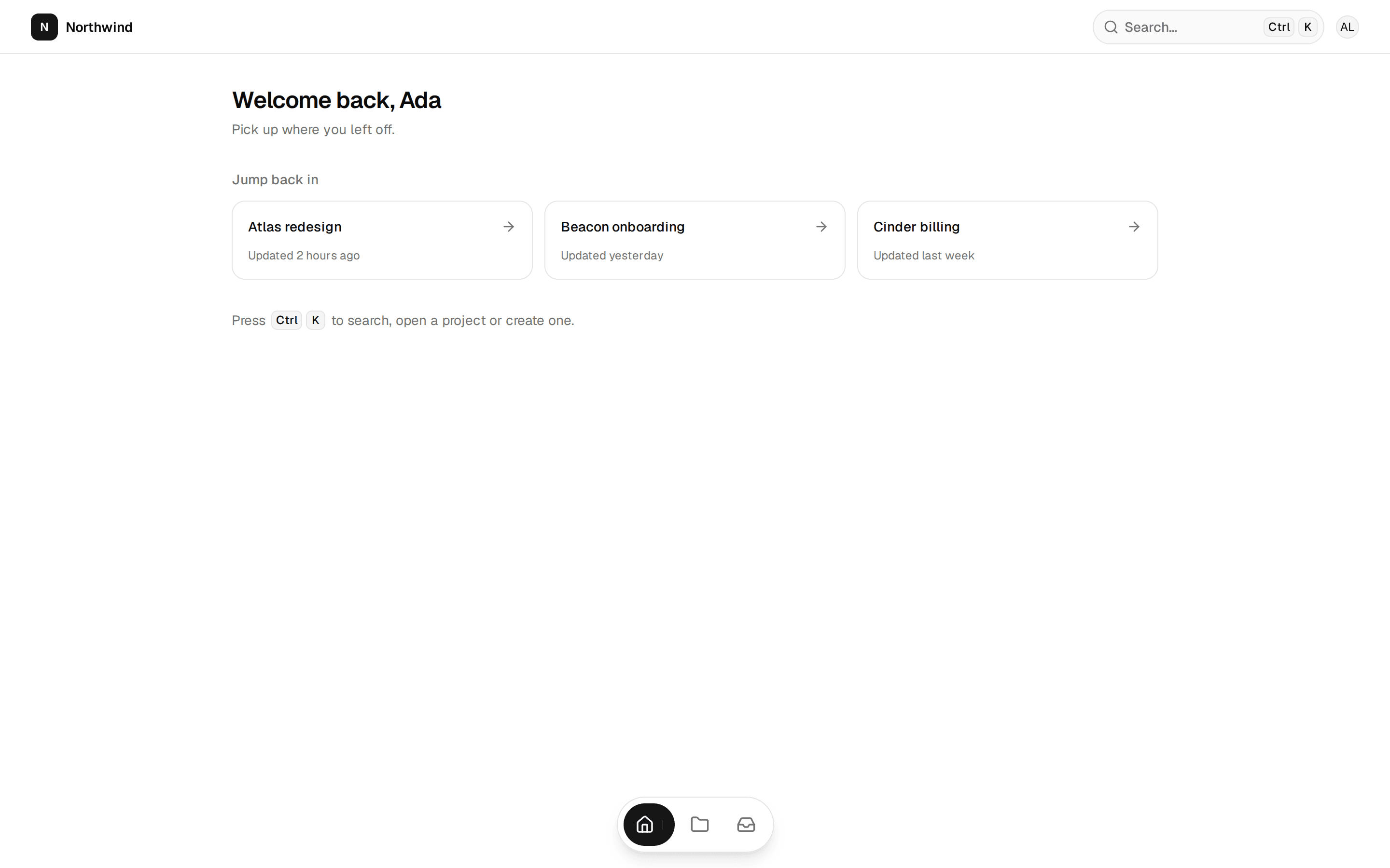
  { target: "nav", title: "Everything starts here", body: "Move between your home, projects, inbox and reports. The one you are on is highlighted." },
  { target: "search", title: "Find anything fast", body: "Press / from anywhere to search projects, people and files. It finds words inside documents too." },
  { target: "chart", title: "See how the week went", body: "This chart shows work finished each day. Hover or focus a bar to read its exact number." },
  { target: "alerts", title: "Never miss a mention", body: "Replies and approvals land here. A dot means something is waiting for you." },
]

function SampleApp() {
  const bars = [38, 52, 44, 68, 59, 31, 74]
  return (
    <div className="bg-card grid min-h-[36rem] grid-cols-[3.5rem_minmax(0,1fr)] sm:grid-cols-[11rem_minmax(0,1fr)]">
      <nav data-tour="nav" aria-label="Sample navigation" className="bg-muted/40 border-e p-2 sm:p-3">
        <p className="mb-3 hidden px-2 text-sm font-semibold sm:block">Acme</p>
        {[[Home, "Home"], [FolderKanban, "Projects"], [Inbox, "Inbox"], [BarChart3, "Reports"], [Settings, "Settings"]].map(([Icon, label], i) => {
          const I = Icon as typeof Home
          return (
            <div key={label as string} className={cn("flex items-center gap-2.5 rounded-lg px-2.5 py-2 text-sm", i === 0 ? "bg-background font-medium shadow-sm" : "text-muted-foreground")}>
              <I aria-hidden="true" className="size-4 shrink-0" />
              <span className="hidden sm:inline">{label as string}</span>
            </div>
          )
        })}
      </nav>
      <div className="min-w-0 p-3 sm:p-5">
        <div className="flex items-center gap-3">
          <div data-tour="search" className="bg-background text-muted-foreground flex h-9 min-w-0 flex-1 items-center gap-2 rounded-lg border px-3 text-sm">
            <Search aria-hidden="true" className="size-4 shrink-0" />
            <span className="truncate">Search projects, people, files</span>
          </div>
          <div data-tour="alerts" className="bg-background relative flex size-9 shrink-0 items-center justify-center rounded-lg border">
            <Bell aria-hidden="true" className="size-4" />
            <span aria-hidden="true" className="bg-destructive absolute end-1.5 top-1.5 size-2 rounded-full" />
          </div>
        </div>
        <div className="mt-4 grid grid-cols-3 gap-3">
          {[["Open", "24"], ["Done", "118"], ["Late", "3"]].map(([l, v]) => (
            <div key={l} className="rounded-xl border p-3">
              <p className="text-muted-foreground text-xs">{l}</p>
              <p className="text-xl font-semibold tabular-nums">{v}</p>
            </div>
          ))}
        </div>
        <div data-tour="chart" className="mt-4 rounded-xl border p-4">
          <p className="text-sm font-medium">Finished this week</p>
          <div className="mt-3 flex h-28 items-end gap-2" aria-hidden="true">
            {bars.map((h, i) => (
              <span key={i} className="bg-chart-1/70 flex-1 rounded-t-md" style={{ height: `${h}%` }} />
            ))}
          </div>
        </div>
      </div>
    </div>
  )
}

/**
 * A guided product tour: a spotlight lifts one part of your interface out of a dimmed page while a card beside it says what it is for. Next, Back, the arrow
 * keys and Escape all work, a progress bar and 'Step 2 of 4' say where you are, focus moves to the card at each step, and the tour can be started again. Mark what to
 * point at with data-tour attributes in your own interface, or leave it empty to tour the sample app.
 */
function Tour1({ steps = sampleSteps, children, defaultStep = null, onFinish, className, ...props }: Tour1Props) {
  const id = React.useId()
  const [step, setStep] = React.useState<number | null>(defaultStep)
  const [rect, setRect] = React.useState<{ x: number; y: number; w: number; h: number } | null>(null)
  const [box, setBox] = React.useState({ w: 0, h: 0 })
  const stage = React.useRef<HTMLDivElement>(null)
  const card = React.useRef<HTMLDivElement>(null)
  const startBtn = React.useRef<HTMLButtonElement>(null)
  const running = step !== null
  const s = running ? steps[step!] : undefined

  const measure = React.useCallback(() => {
    const root = stage.current
    if (!root || step === null) return
    const el = root.querySelector<HTMLElement>(`[data-tour="${steps[step]?.target}"]`)
    const r0 = root.getBoundingClientRect()
    setBox({ w: r0.width, h: r0.height })
    if (!el) return setRect(null)
    const r = el.getBoundingClientRect()
    setRect({ x: r.left - r0.left, y: r.top - r0.top, w: r.width, h: r.height })
  }, [step, steps])

  React.useLayoutEffect(() => {
    measure()
    if (!running) return
    window.addEventListener("resize", measure)
    const ro = typeof ResizeObserver !== "undefined" ? new ResizeObserver(measure) : null
    if (stage.current) ro?.observe(stage.current)
    return () => {
      window.removeEventListener("resize", measure)
      ro?.disconnect()
    }
  }, [measure, running])

  // Move focus to the card when a step appears, and back to Start when the tour ends.
  const wasRunning = React.useRef(running)
  const mounted = React.useRef(false)
  React.useEffect(() => {
    // Never take focus on page load, only when the person starts, moves or ends the tour.
    if (mounted.current) {
      if (running) card.current?.querySelector<HTMLElement>("[data-primary]")?.focus({ preventScroll: true })
      else if (wasRunning.current) startBtn.current?.focus()
    }
    mounted.current = true
    wasRunning.current = running
  }, [running, step])

  function end(completed: boolean) {
    onFinish?.({ completed, step: step ?? 0 })
    setStep(null)
  }
  const go = (d: number) => {
    if (step === null) return
    const n = step + d
    if (n >= steps.length) end(true)
    else if (n >= 0) setStep(n)
  }

  // The card sits below the target when there is room, otherwise above, and stays inside the stage.
  const CARD_W = Math.min(320, Math.max(220, box.w - 24))
  const pad = 8
  const CARD_H = 215
  const pos = (() => {
    if (!rect) return { left: 12, top: 12 }
    const below = rect.y + rect.h + pad + 6 + CARD_H < box.h
    const left = Math.max(12, Math.min(box.w - CARD_W - 12, rect.x + rect.w / 2 - CARD_W / 2))
    return { left, top: Math.max(12, Math.min(box.h - CARD_H - 12, below ? rect.y + rect.h + pad + 6 : rect.y - pad - CARD_H - 6)) }
  })()

  return (
    <section data-slot="tour-1" aria-labelledby={`${id}-title`} className={cn("mx-auto w-full max-w-4xl px-4 py-10 sm:px-6", className)} {...props}>
      <div className="mb-6 flex flex-wrap items-end justify-between gap-4">
        <div>
          <h2 id={`${id}-title`} className="text-3xl font-semibold tracking-[-0.035em] text-balance">
            Take the tour
          </h2>
          <p className="text-muted-foreground mt-2 max-w-md text-pretty">A minute to see where things are.</p>
        </div>
        <Button ref={startBtn} onClick={() => setStep(0)} disabled={running}>
          {running ? <RotateCcw aria-hidden="true" /> : <Play aria-hidden="true" className="fill-current" />}
          {running ? "Tour in progress" : "Start the tour"}
        </Button>
      </div>

      <div
        ref={stage}
        className="relative overflow-hidden rounded-3xl border"
        onKeyDown={(e) => {
          if (!running) return
          if (e.key === "Escape") { e.stopPropagation(); end(false) }
          else if (e.key === "ArrowRight") { e.preventDefault(); go(1) }
          else if (e.key === "ArrowLeft") { e.preventDefault(); go(-1) }
        }}
      >
        <div inert={running ? true : undefined}>{children ?? <SampleApp />}</div>

        {running && s ? (
          <>
            {!rect ? <div aria-hidden="true" className="pointer-events-none absolute inset-0 bg-black/55" /> : null}
            {rect ? (
              <div aria-hidden="true" className="ring-background pointer-events-none absolute rounded-xl ring-2 transition-[left,top,width,height] duration-300 ease-out motion-reduce:transition-none" style={{ left: rect.x - 6, top: rect.y - 6, width: rect.w + 12, height: rect.h + 12, boxShadow: "0 0 0 9999px rgb(0 0 0 / 0.55)" }} />
            ) : null}
            <div
              ref={card}
              role="dialog"
              aria-modal="false"
              aria-labelledby={`${id}-st`}
              aria-describedby={`${id}-sb`}
              className="bg-popover text-popover-foreground absolute z-10 rounded-2xl border p-5 shadow-2xl transition-[left,top] duration-300 ease-out motion-reduce:transition-none"
              style={{ width: CARD_W, left: pos.left, top: pos.top }}
            >
              <div className="flex items-start justify-between gap-3">
                <p className="text-muted-foreground text-xs font-medium tabular-nums">
                  Step {step! + 1} of {steps.length}
                </p>
                <button type="button" onClick={() => end(false)} aria-label="Skip the tour" className="text-muted-foreground hover:text-foreground focus-visible:ring-ring/50 -m-1 rounded-md p-1 outline-none focus-visible:ring-[3px]">
                  <X aria-hidden="true" className="size-4" />
                </button>
              </div>
              <h3 id={`${id}-st`} className="mt-1.5 font-semibold tracking-tight text-balance">
                {s.title}
              </h3>
              <p id={`${id}-sb`} className="text-muted-foreground mt-1.5 text-sm text-pretty">
                {s.body}
              </p>
              <div role="progressbar" aria-label="Tour progress" aria-valuemin={1} aria-valuemax={steps.length} aria-valuenow={step! + 1} className="mt-4 flex gap-1">
                {steps.map((_, i) => (
                  <span key={i} aria-hidden="true" className={cn("h-1 flex-1 rounded-full", i <= step! ? "bg-foreground" : "bg-muted")} />
                ))}
              </div>
              <div className="mt-4 flex items-center justify-between gap-2">
                <Button variant="ghost" size="sm" onClick={() => go(-1)} disabled={step === 0}>
                  <ArrowLeft aria-hidden="true" className="rtl:rotate-180" />
                  Back
                </Button>
                <Button size="sm" data-primary onClick={() => go(1)}>
                  {step === steps.length - 1 ? "Finish" : "Next"}
                  {step === steps.length - 1 ? null : <ArrowRight aria-hidden="true" className="rtl:rotate-180" />}
                </Button>
              </div>
            </div>
          </>
        ) : null}
      </div>
      <p className="text-muted-foreground mt-3 text-xs">While the tour runs: Left and Right arrows move between steps, Escape ends it.</p>
      <p aria-live="polite" className="sr-only">
        {running && s ? `Step ${step! + 1} of ${steps.length}: ${s.title}` : ""}
      </p>
    </section>
  )
}

export { Tour1, type Tour1Props, type Tour1Step }