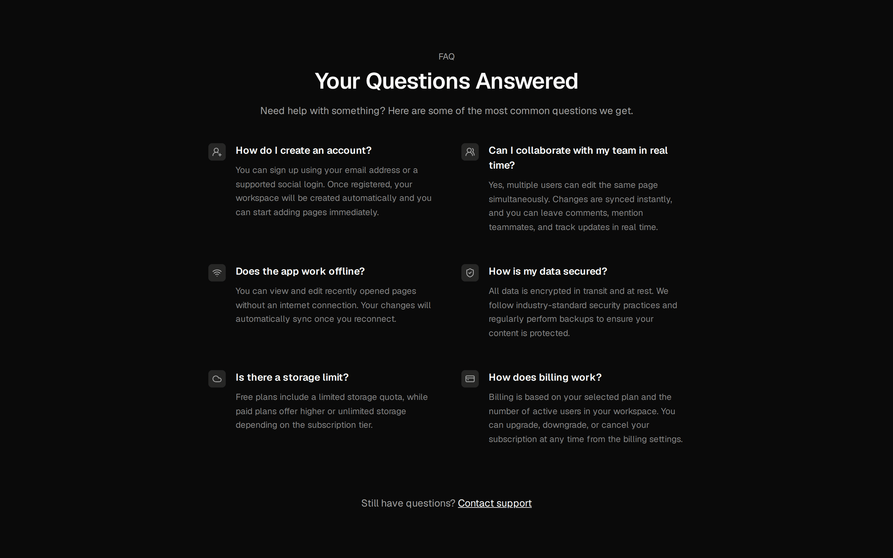
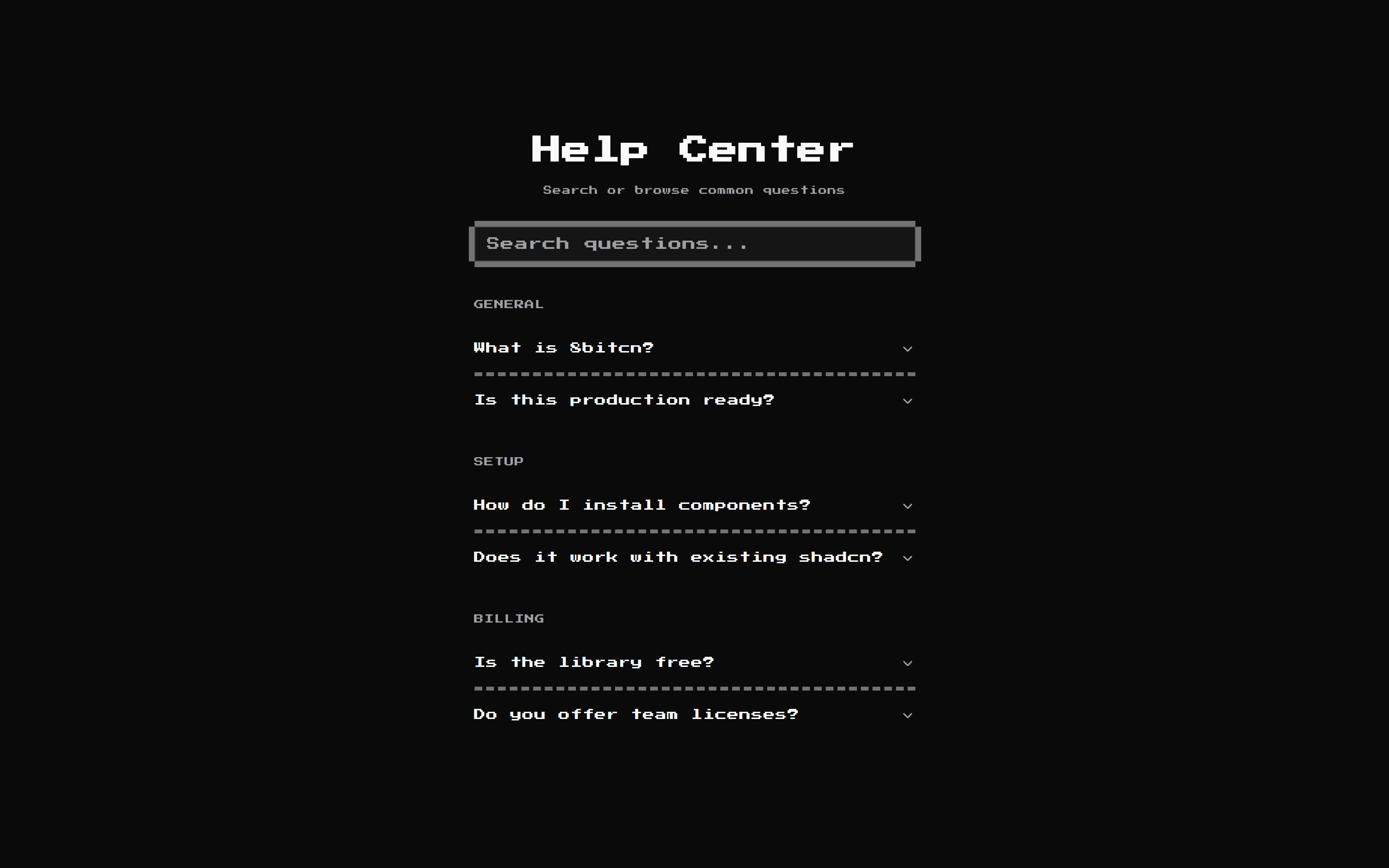
FAQ 01
Two-column FAQ: sticky heading and a hairline help note on the start side, numbered accordion on the end side.
@hirael
Two-column FAQ: sticky heading and a hairline help note on the start side, numbered accordion on the end side.
@hirael
registry/hirael/bases/radix/blocks/faq-01/faq-01.tsx
// FAQ 01 from Hirael <https://hirael.com/blocks/faqs/faq-01>
// MIT · Mohammad Shehadeh · https://github.com/MohammadShehadeh/hirael
import type * as React from 'react';
import { ArrowUpRight, MessageCircleQuestion } from 'lucide-react';
import { cn } from '@/lib/utils';
import {
Accordion,
AccordionContent,
AccordionItem,
AccordionTrigger,
} from '@/registry/hirael/bases/radix/ui/accordion';
import { Button } from '@/registry/hirael/bases/radix/ui/button';
const ENTER =
'animate-in fade-in slide-in-from-bottom-4 duration-500 ease-[cubic-bezier(0.22,1,0.36,1)] fill-mode-both motion-reduce:animate-none';
const stagger = (index: number, step = 60, offset = 0): React.CSSProperties => ({
animationDelay: `${offset + index * step}ms`,
});
const FAQS = [
{
q: 'How is Hirael different from shadcn/ui?',
a: 'Hirael is a peer, not a replacement. shadcn/ui covers the core primitives: Button, Dialog, Select. Hirael ships the components most products still end up building by hand: multi-select, tag input, year picker, an async combobox, password strength. Both use the same CLI and the same install URL pattern, so you can mix them freely.',
},
{
q: 'Is Hirael a dependency I install?',
a: 'No. Hirael is a registry, not a package. The shadcn CLI copies the component source into your repo under components/ui. You own the code, you can edit it, and nothing at runtime depends on Hirael.',
},
{
q: 'How is a component put together?',
a: 'As a set of composable parts, the same way shadcn primitives work. The root holds state, and parts such as the trigger, content and items handle layout. A few components also take a shorter options prop for the common case, but the parts always come first.',
},
{
q: 'Can I theme it?',
a: 'Yes. Hirael reads the same CSS variables as shadcn/ui, so any shadcn theme works as is. Change a token and every installed component picks it up.',
},
{
q: 'Does it work with React Server Components?',
a: "Yes. Components that need interactivity are marked 'use client' at the top of their file, and static ones render on the server. Both work in the App Router and the Pages Router.",
},
{
q: 'Is it ready for production?',
a: 'Every published component is typed end to end, works from the keyboard, and renders safely on the server. A component is not listed until it has focus handling and a working demo in the registry.',
},
] as const;
const Faq01 = () => {
return (
<section data-slot="faq" className="bg-background py-20 sm:py-28">
<div className="mx-auto grid w-full max-w-[1480px] grid-cols-1 gap-12 px-4 lg:grid-cols-12 lg:gap-16">
<div className="flex flex-col gap-6 lg:col-span-5">
<div data-slot="faq-intro" className="sticky top-12 flex flex-col gap-6">
<span className={cn(ENTER, 'text-xs text-muted-foreground uppercase')}>Before you install</span>
<h2
style={stagger(1, 70)}
className={cn(
ENTER,
'font-serif text-4xl leading-[1.04] font-medium tracking-tight sm:text-5xl md:text-6xl',
)}
>
Frequently <span className="text-foreground italic">unobvious</span> questions.
</h2>
<p style={stagger(2, 70)} className={cn(ENTER, 'text-sm text-muted-foreground')}>
The questions teams ask in their first ten minutes with Hirael, answered the way we'd want them
answered. If something isn't here, the issue tracker is open.
</p>
<div
data-slot="faq-help"
style={stagger(3, 70)}
className={cn(ENTER, 'mt-2 flex flex-col gap-3 border-t border-border pt-6')}
>
<p className="inline-flex items-center gap-2 text-sm font-medium">
<MessageCircleQuestion aria-hidden className="size-4 text-muted-foreground" />
Still stuck?
</p>
<p className="text-sm text-muted-foreground">
Drop a question in the repo. Most get a reply within a day.
</p>
<Button asChild variant="outline" size="sm" className="w-fit">
<a href="#">
Open an issue
<ArrowUpRight className="size-3.5 rtl:-scale-x-100" />
</a>
</Button>
</div>
</div>
</div>
<div data-slot="faq-list" className="lg:col-span-7">
<Accordion type="single" collapsible defaultValue="item-0">
{FAQS.map((f, i) => (
<AccordionItem key={f.q} value={`item-${i}`} style={stagger(i, 50, 200)} className={ENTER}>
<AccordionTrigger>
<span className="flex items-baseline gap-4">
<span className="text-xs text-muted-foreground tabular-nums">{String(i + 1).padStart(2, '0')}</span>
<span>{f.q}</span>
</span>
</AccordionTrigger>
<AccordionContent>
<div className="ms-10 max-w-2xl text-muted-foreground">{f.a}</div>
</AccordionContent>
</AccordionItem>
))}
</Accordion>
</div>
</div>
</section>
);
};
export default Faq01;