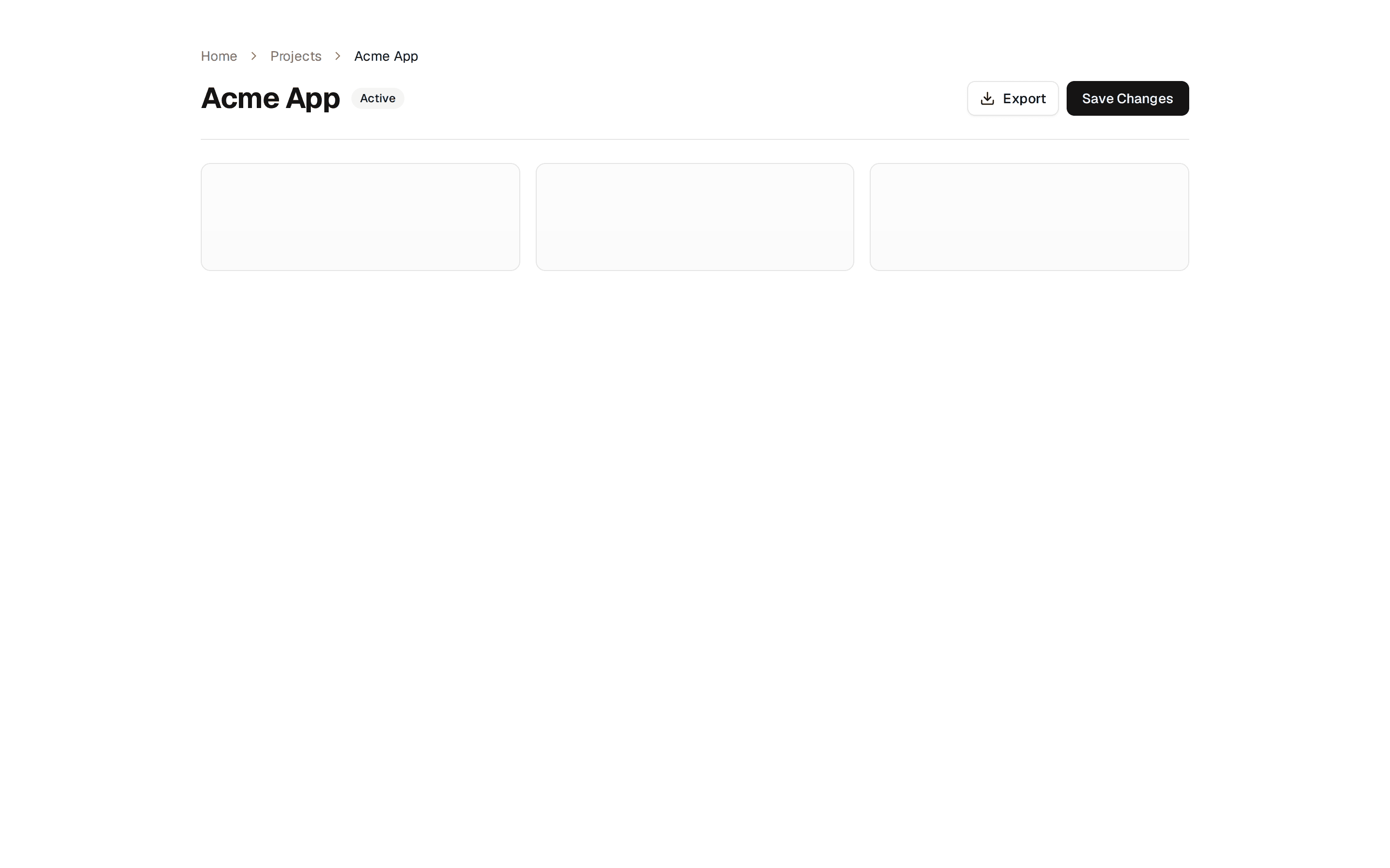
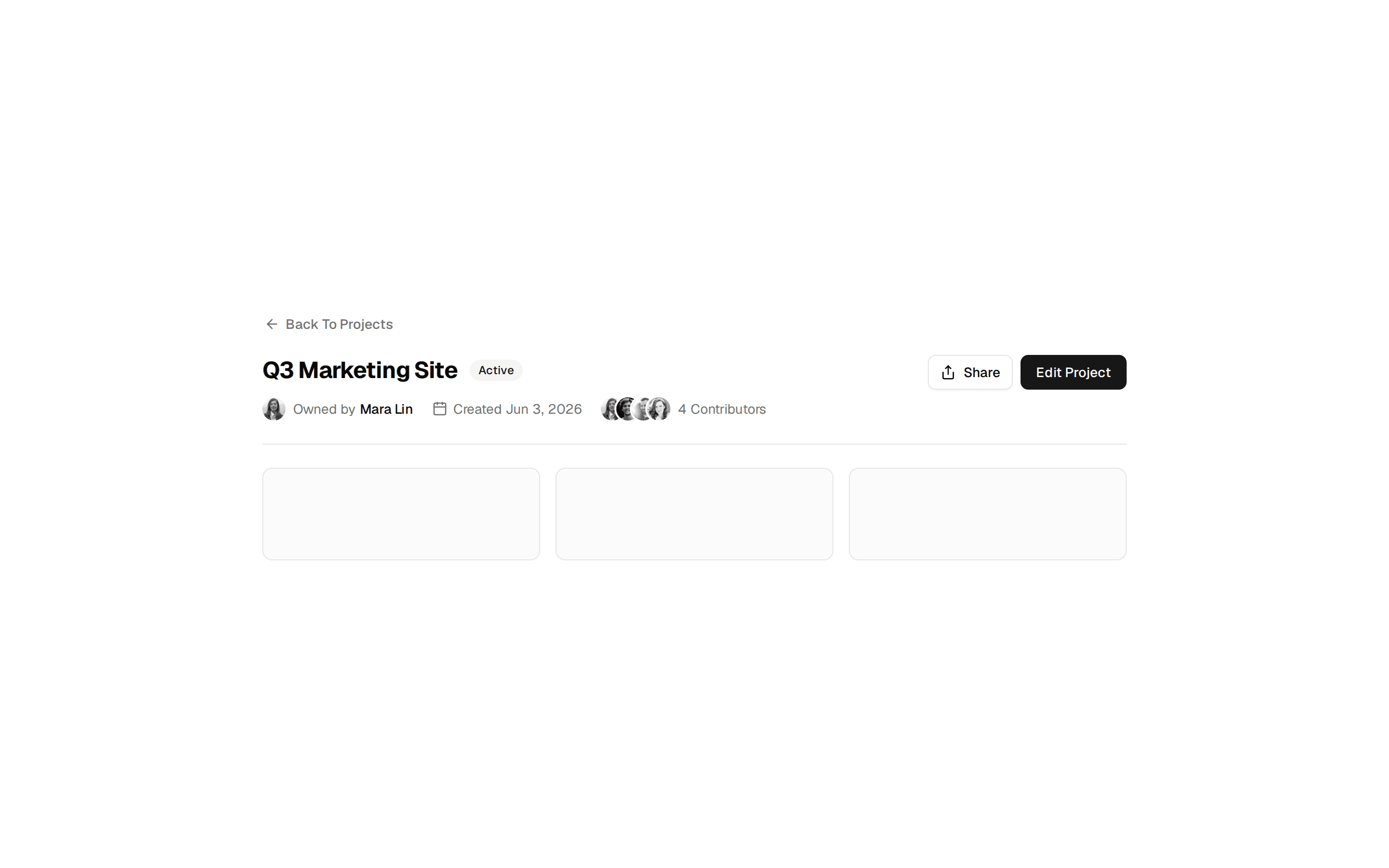
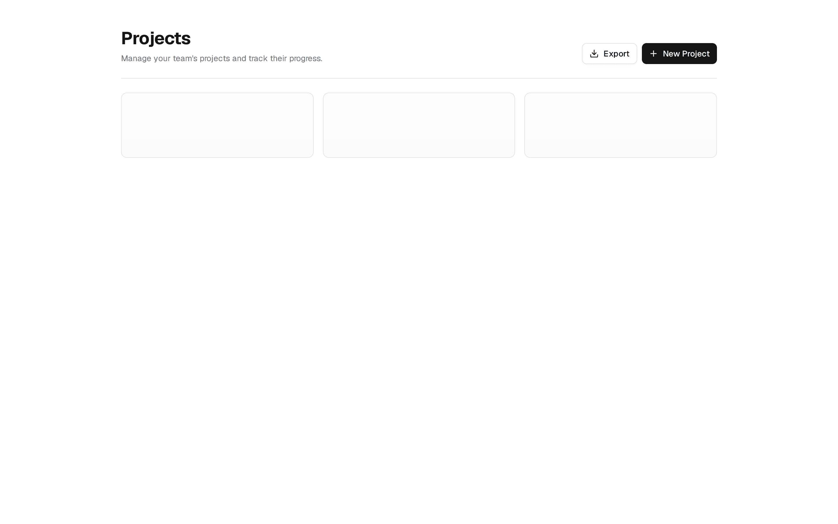
Header With Search Toolbar
List view page header with a title, primary action, and a toolbar of search input, status and sort selects, and a list or grid view toggle.
@7ovr
List view page header with a title, primary action, and a toolbar of search input, status and sort selects, and a list or grid view toggle.
@7ovr
registry/blocks/page-header/5/page-header-block.tsx
"use client"

import { useState } from "react"
import { cn } from "@/lib/utils"
import { Button } from "@/components/ui/button"
import { Input } from "@/components/ui/input"
import {
  Select,
  SelectContent,
  SelectItem,
  SelectTrigger,
  SelectValue,
} from "@/components/ui/select"
import { Separator } from "@/components/ui/separator"
import { IconPlaceholder } from "@/components/icons/icon-placeholder"

export default function PageHeaderBlock() {
  const [view, setView] = useState<"grid" | "list">("list")

  return (
    <section className="w-full bg-background px-6 py-10 text-foreground">
      <div className="mx-auto w-full max-w-4xl">
        <div className="flex flex-col gap-4 sm:flex-row sm:items-start sm:justify-between">
          <div className="flex flex-col gap-1">
            <h1 className="font-heading text-2xl font-bold tracking-tight">
              Projects
            </h1>
            <p className="text-sm text-muted-foreground">
              Manage and track every project across your workspace.
            </p>
          </div>
          <Button className="w-full sm:w-auto">
            <IconPlaceholder
              lucide="Plus"
              tabler="IconPlus"
              hugeicons="Add01Icon"
              phosphor="Plus"
              remixicon="RiAddLine"
              data-icon="inline-start"
              aria-hidden="true"
            />
            New project
          </Button>
        </div>

        <Separator className="my-5" />

        <div className="flex flex-col gap-3 sm:flex-row sm:items-center sm:justify-between">
          <div className="relative w-full sm:max-w-xs">
            <IconPlaceholder
              lucide="Search"
              tabler="IconSearch"
              hugeicons="SearchIcon"
              phosphor="MagnifyingGlass"
              remixicon="RiSearchLine"
              className="pointer-events-none absolute top-1/2 left-2.5 size-4 -translate-y-1/2 text-muted-foreground"
              aria-hidden="true"
            />
            <Input
              type="search"
              placeholder="Search projects..."
              className="pl-8"
              aria-label="Search projects"
            />
          </div>

          <div className="flex items-center gap-2">
            <Select defaultValue="Active">
              <SelectTrigger className="w-32" aria-label="Filter by status">
                <SelectValue />
              </SelectTrigger>
              <SelectContent alignItemWithTrigger={false}>
                <SelectItem value="All">All</SelectItem>
                <SelectItem value="Active">Active</SelectItem>
                <SelectItem value="Archived">Archived</SelectItem>
              </SelectContent>
            </Select>
            <Select defaultValue="Most recent">
              <SelectTrigger className="w-36" aria-label="Sort by">
                <SelectValue />
              </SelectTrigger>
              <SelectContent alignItemWithTrigger={false}>
                <SelectItem value="Most recent">Most recent</SelectItem>
                <SelectItem value="Name">Name</SelectItem>
                <SelectItem value="Owner">Owner</SelectItem>
              </SelectContent>
            </Select>
            <div className="flex overflow-hidden rounded-lg border border-border">
              <button
                type="button"
                aria-label="List view"
                aria-pressed={view === "list"}
                onClick={() => setView("list")}
                className={cn(
                  "flex size-8 items-center justify-center transition-colors",
                  view === "list"
                    ? "bg-foreground text-background"
                    : "text-muted-foreground hover:bg-muted/60"
                )}
              >
                <IconPlaceholder
                  lucide="List"
                  tabler="IconList"
                  hugeicons="LeftToRightListBulletIcon"
                  phosphor="ListBullets"
                  remixicon="RiListUnordered"
                  className="size-4"
                  aria-hidden="true"
                />
              </button>
              <button
                type="button"
                aria-label="Grid view"
                aria-pressed={view === "grid"}
                onClick={() => setView("grid")}
                className={cn(
                  "flex size-8 items-center justify-center border-l border-border transition-colors",
                  view === "grid"
                    ? "bg-foreground text-background"
                    : "text-muted-foreground hover:bg-muted/60"
                )}
              >
                <IconPlaceholder
                  lucide="Grid"
                  tabler="IconLayoutGrid"
                  hugeicons="GridIcon"
                  phosphor="GridFour"
                  remixicon="RiGridFill"
                  className="size-4"
                  aria-hidden="true"
                />
              </button>
            </div>
          </div>
        </div>
      </div>
    </section>
  )
}