Breadcrumb Header With Status
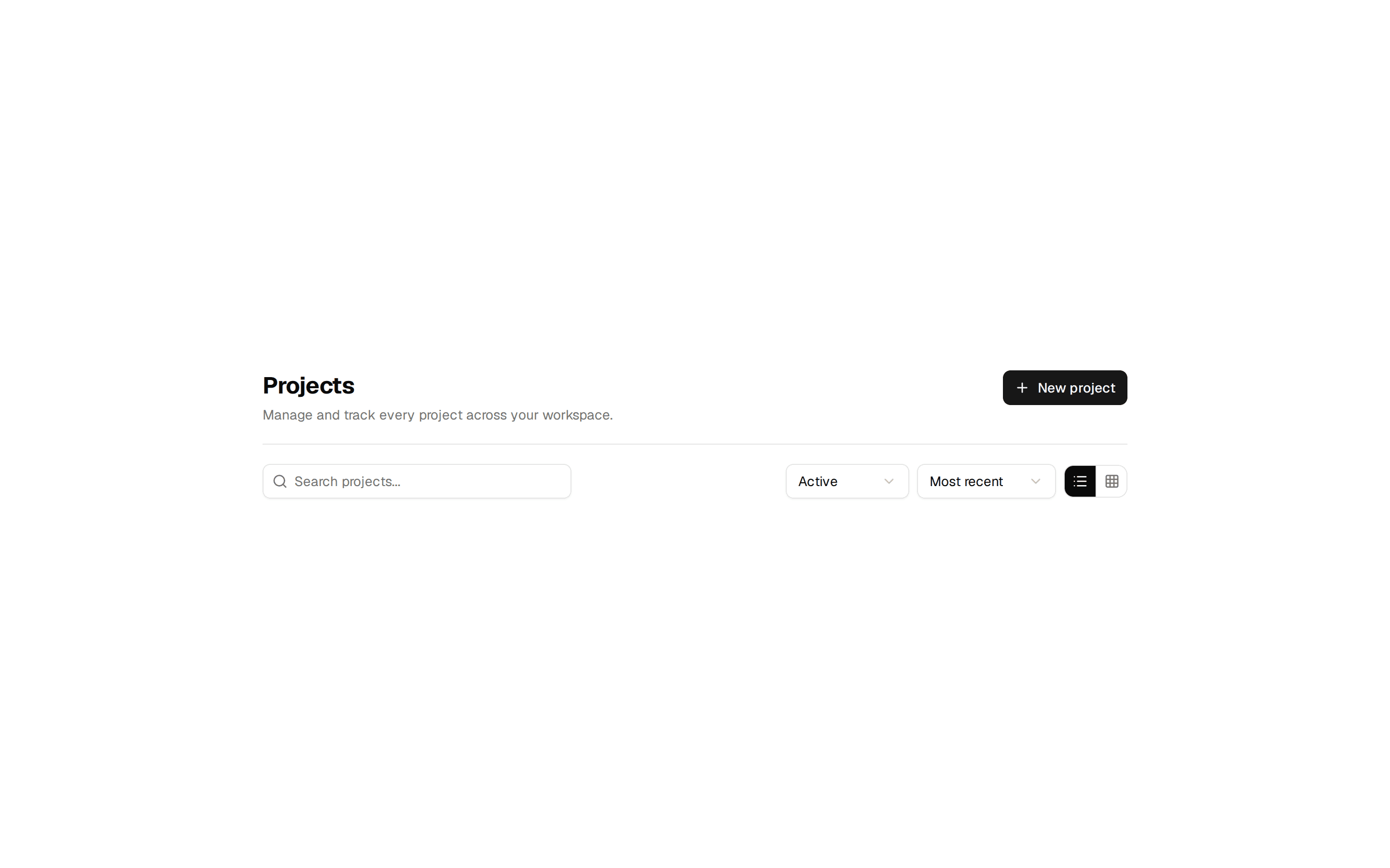
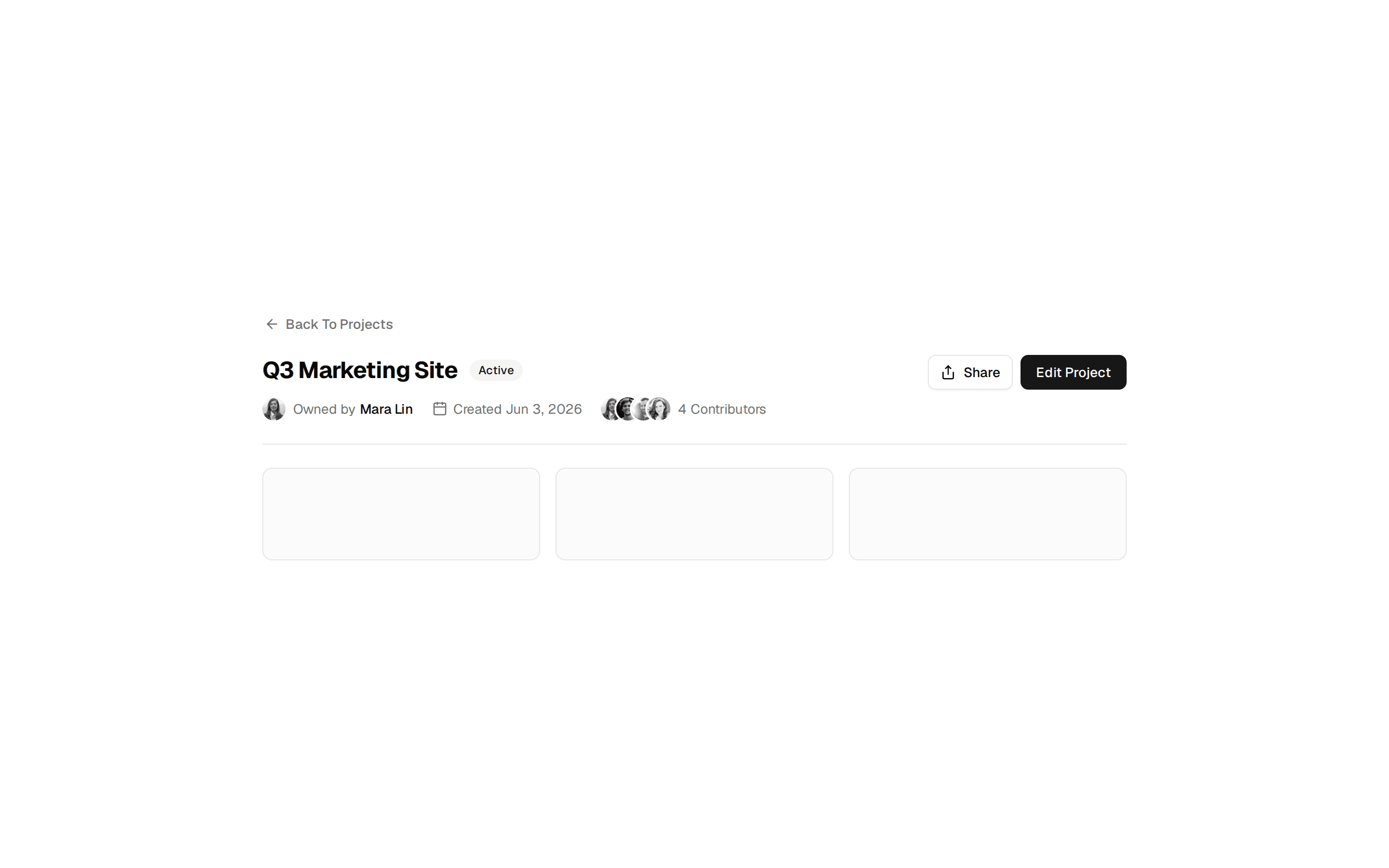
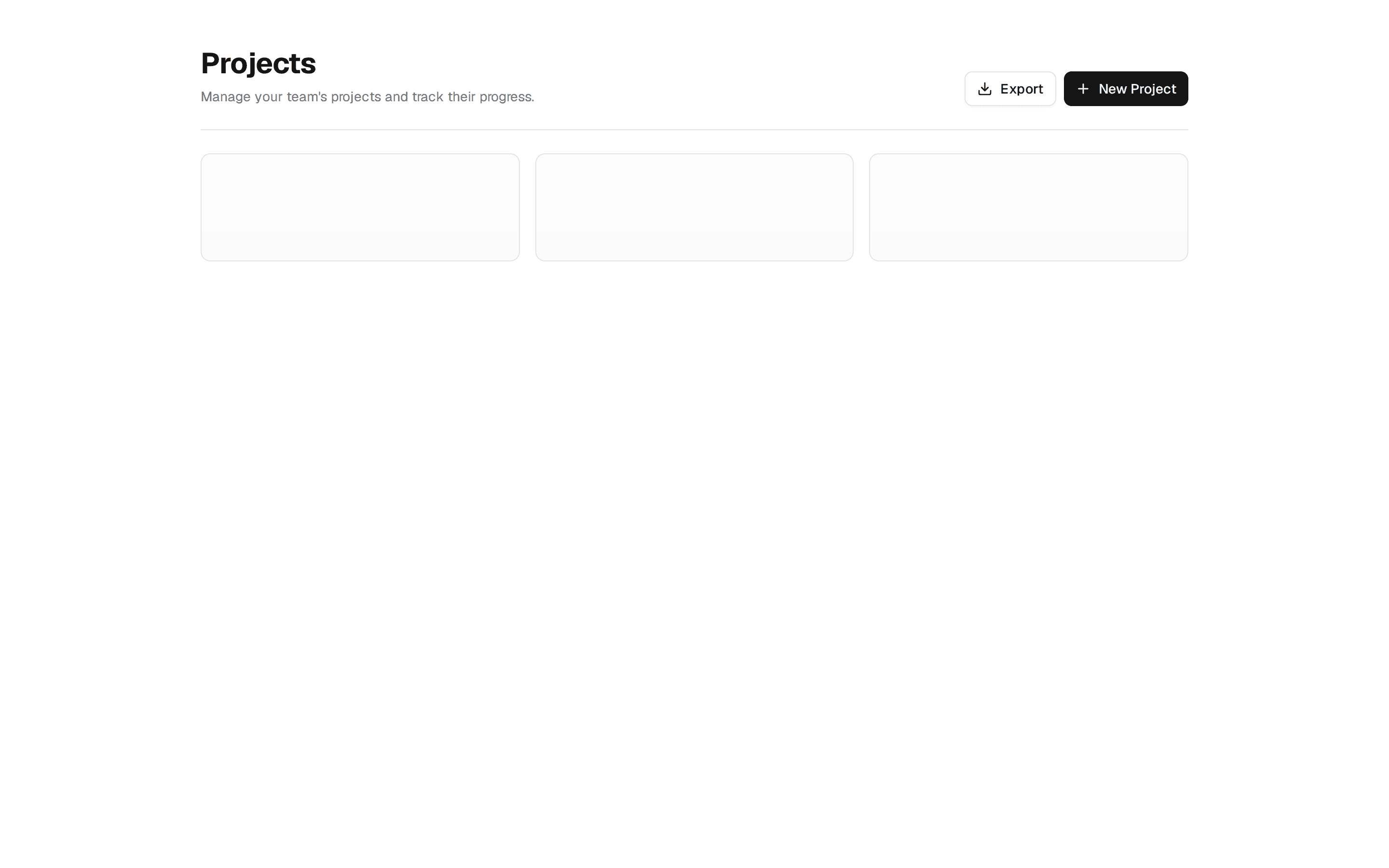
Page header with a breadcrumb trail, a title paired with an Active status badge, and Export and Save Changes actions.
@7ovr
Page header with a breadcrumb trail, a title paired with an Active status badge, and Export and Save Changes actions.
@7ovr
registry/blocks/page-header/2/page-header-block.tsx
import { Badge } from "@/components/ui/badge"
import {
  Breadcrumb,
  BreadcrumbItem,
  BreadcrumbLink,
  BreadcrumbList,
  BreadcrumbPage,
  BreadcrumbSeparator,
} from "@/components/ui/breadcrumb"
import { Button } from "@/components/ui/button"
import { IconPlaceholder } from "@/components/icons/icon-placeholder"

export default function PageHeaderBlock() {
  return (
    <section className="min-h-svh w-full bg-background px-6 py-12 text-foreground">
      <div className="mx-auto w-full max-w-5xl">
        <Breadcrumb className="mb-4">
          <BreadcrumbList>
            <BreadcrumbItem>
              <BreadcrumbLink render={<a href="#" />}>Home</BreadcrumbLink>
            </BreadcrumbItem>
            <BreadcrumbSeparator />
            <BreadcrumbItem>
              <BreadcrumbLink render={<a href="#" />}>Projects</BreadcrumbLink>
            </BreadcrumbItem>
            <BreadcrumbSeparator />
            <BreadcrumbItem>
              <BreadcrumbPage>Acme App</BreadcrumbPage>
            </BreadcrumbItem>
          </BreadcrumbList>
        </Breadcrumb>

        <div className="flex flex-col gap-4 border-b border-border pb-6 sm:flex-row sm:items-end sm:justify-between">
          <div className="flex items-center gap-3">
            <h1 className="font-heading text-2xl font-bold tracking-tight sm:text-3xl">
              Acme App
            </h1>
            <Badge variant="secondary">Active</Badge>
          </div>

          <div className="flex items-center gap-2">
            <Button variant="outline">
              <IconPlaceholder
                lucide="Download"
                tabler="IconDownload"
                hugeicons="DownloadIcon"
                phosphor="Download"
                remixicon="RiDownloadLine"
                data-icon="inline-start"
                aria-hidden="true"
              />
              Export
            </Button>
            <Button>Save Changes</Button>
          </div>
        </div>

        <div className="mt-6 grid gap-4 sm:grid-cols-3">
          {Array.from({ length: 3 }).map((_, i) => (
            <div
              key={i}
              className="h-28 rounded-lg border border-border bg-muted/30"
            />
          ))}
        </div>
      </div>
    </section>
  )
}
Requires a base-* style in components.json (the shadcn init default). Legacy new-york/radix-* styles install Radix primitives, which reject the render prop this block uses.