Minimal Centered Hero
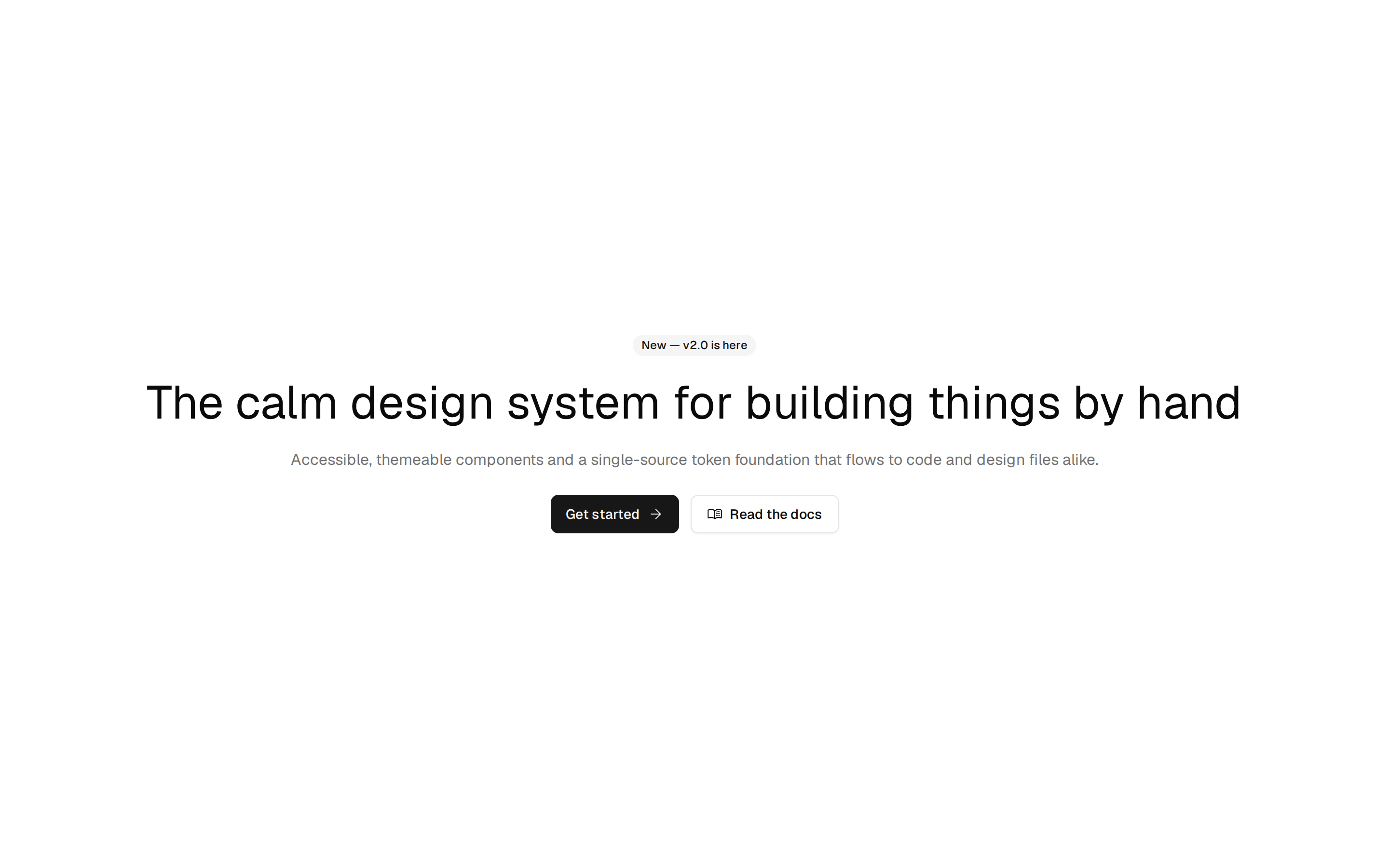
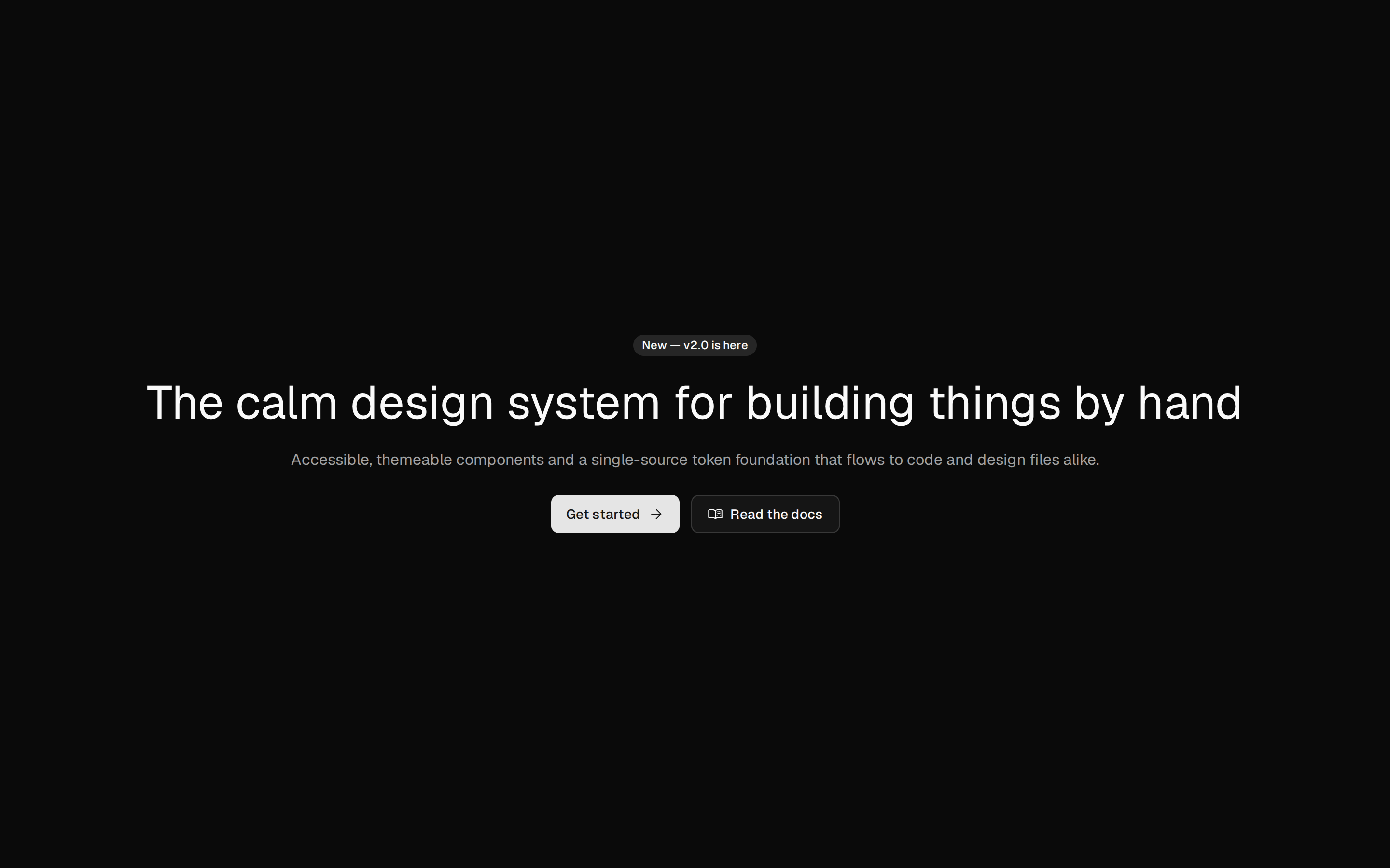
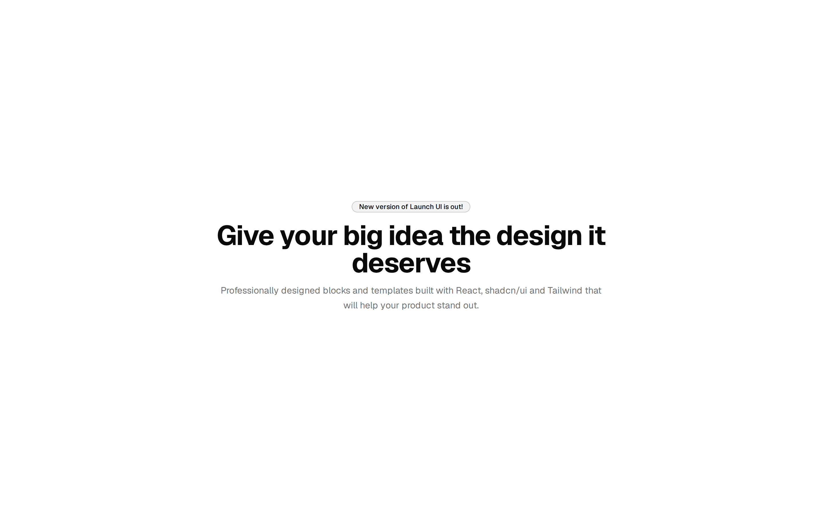
Plain centered hero: a small eyebrow, a large headline, a description and a primary and an outline button. Theme tokens only, light and dark.
Plain centered hero: a small eyebrow, a large headline, a description and a primary and an outline button. Theme tokens only, light and dark.
blocks/hero/minimal-hero-01/index.tsx
import { cn } from "cn"

import {
  Hero,
  HeroActions,
  HeroContainer,
  HeroContent,
  HeroDescription,
  HeroHeading,
} from "@/components/editorial/hero"
import { buttonVariants } from "@/components/ui/button"

// The copy: change text here, not in the markup.
const COPY = {
  eyebrow: "New: release calendars",
  title: "Plan the release, not the meeting about it",
  body: "Orbcore keeps the plan, the review and the handoff in one place, so your team ships without chasing each other.",
  primary: { label: "Start free", href: "#" },
  secondary: { label: "See how it works", href: "#" },
} as const

export default function MinimalHero01() {
  return (
    <Hero>
      <HeroContainer variant="stack" className="py-24">
        <HeroContent align="center">
          <p className="text-sm font-medium text-muted-foreground">
            {COPY.eyebrow}
          </p>
          <HeroHeading>{COPY.title}</HeroHeading>
          <HeroDescription className="text-muted-foreground">
            {COPY.body}
          </HeroDescription>
          <HeroActions>
            <a
              href={COPY.primary.href}
              data-slot="button"
              className={cn(buttonVariants({ size: "lg" }))}
            >
              {COPY.primary.label}
            </a>
            <a
              href={COPY.secondary.href}
              data-slot="button"
              className={cn(buttonVariants({ variant: "outline", size: "lg" }))}
            >
              {COPY.secondary.label}
            </a>
          </HeroActions>
        </HeroContent>
      </HeroContainer>
    </Hero>
  )
}