"use client"

// react
import { type ReactNode, useState } from "react"

// next
import Link from "next/link"
import { usePathname } from "next/navigation"

// shadcn
import { Button } from "@/components/ui/button"
import {
  Collapsible,
  CollapsibleContent,
  CollapsibleTrigger,
} from "@/components/ui/collapsible"
import {
  DropdownMenu,
  DropdownMenuContent,
  DropdownMenuItem,
  DropdownMenuSub,
  DropdownMenuSubContent,
  DropdownMenuSubTrigger,
  DropdownMenuTrigger,
} from "@/components/ui/dropdown-menu"
import { Input } from "@/components/ui/input"
import {
  Sheet,
  SheetClose,
  SheetContent,
  SheetHeader,
  SheetTitle,
  SheetTrigger,
} from "@/components/ui/sheet"

// project-imports
import {
  hasActiveDescendant,
  isNavItemActive,
  menuGroups,
  type NavItem,
} from "@/components/uiable/blocks/layout/dashboard-layout/data/dashboard-2.data"
import NotificationDropdown from "@/components/uiable/layout/notification-dropdown"
import SearchBar from "@/components/uiable/layout/search-bar"
import Logo from "@/components/uiable/layout/shared/logo"
import UserProfile from "@/components/uiable/layout/user-profile"

// assets
import {
  ChevronDown,
  ChevronRight,
  Menu,
  Search,
  Settings,
  X,
} from "lucide-react"

const navItemClass = "gap-2 rounded-lg px-3.5 py-2 font-medium"
const navItemActiveClass =
  "bg-primary/10 text-primary hover:bg-primary/10 hover:text-primary"
const navItemInactiveClass = "text-muted-foreground hover:text-foreground"

// The top-nav layout renders each menu group as a top-level entry, so its label
// becomes the trigger and its items become the dropdown children.
const topNavItems: NavItem[] = menuGroups.map((group) => ({
  id: group.id,
  title: group.label,
  icon: group.icon,
  children: group.items,
}))

//  ------------------------------ | TOP NAV ITEM | ------------------------------  //

function TopNavItem({
  item,
  className,
  onNavigate,
}: {
  item: NavItem
  className?: string
  onNavigate?: () => void
}) {
  const pathname = usePathname()
  const Icon = item.icon
  const isActive = isNavItemActive(pathname, item.href)
  return (
    <Button
      variant="ghost"
      nativeButton={false}
      className={`${navItemClass} ${
        isActive ? navItemActiveClass : navItemInactiveClass
      } ${className ?? ""}`}
      render={
        <Link
          href={item.href ?? "#"}
          target={item.target}
          rel={item.target === "_blank" ? "noopener noreferrer" : undefined}
          onClick={onNavigate}
        />
      }
    >
      {Icon ? <Icon className="size-4.5" /> : null}
      <span>{item.title}</span>
    </Button>
  )
}

//  ------------------------------ | TOP NAV DROPDOWN NODE | ------------------------------  //

// Renders a single entry inside a dropdown: a leaf becomes a link item, a parent
// nests another submenu recursively so menus can go arbitrarily deep.
function TopNavMenuNode({ node }: { node: NavItem }) {
  const pathname = usePathname()

  if (!node.children?.length) {
    return (
      <DropdownMenuItem
        data-active={isNavItemActive(pathname, node.href)}
        className="data-[active=true]:bg-primary/10 data-[active=true]:text-primary"
        render={
          <Link
            href={node.href ?? "#"}
            target={node.target}
            rel={node.target === "_blank" ? "noopener noreferrer" : undefined}
          />
        }
      >
        <span>{node.title}</span>
      </DropdownMenuItem>
    )
  }

  return (
    <DropdownMenuSub>
      <DropdownMenuSubTrigger
        data-active={hasActiveDescendant(node, pathname)}
        className="data-[active=true]:text-primary"
      >
        <span>{node.title}</span>
      </DropdownMenuSubTrigger>
      <DropdownMenuSubContent>
        {node.children.map((child) => (
          <TopNavMenuNode key={child.id} node={child} />
        ))}
      </DropdownMenuSubContent>
    </DropdownMenuSub>
  )
}

//  ------------------------------ | TOP NAV DROPDOWN | ------------------------------  //

function TopNavDropdown({ item }: { item: NavItem }) {
  const pathname = usePathname()
  const Icon = item.icon
  const isActive = hasActiveDescendant(item, pathname)
  return (
    <DropdownMenu>
      <DropdownMenuTrigger
        render={
          <Button
            variant="ghost"
            className={`${navItemClass} ${
              isActive ? navItemActiveClass : navItemInactiveClass
            }`}
          />
        }
      >
        {Icon ? <Icon className="size-4.5" /> : null}
        <span>{item.title}</span>
        <ChevronDown className="size-4" />
      </DropdownMenuTrigger>
      <DropdownMenuContent align="start" className="min-w-44 p-2">
        {item.children?.map((child) => (
          <TopNavMenuNode key={child.id} node={child} />
        ))}
      </DropdownMenuContent>
    </DropdownMenu>
  )
}

//  ------------------------------ | TOP NAV | ------------------------------  //

function TopNav() {
  return (
    <nav className="ml-4 hidden items-center gap-1 xl:flex">
      {topNavItems.map((item) =>
        item.children?.length ? (
          <TopNavDropdown key={item.id} item={item} />
        ) : (
          <TopNavItem key={item.id} item={item} />
        )
      )}
    </nav>
  )
}

//  ------------------------------ | MOBILE NAV NODE | ------------------------------  //

// Mirrors the desktop dropdown as a nested collapsible tree so touch users get
// the same multi-level menu. Parents expand when a descendant route is active.
function MobileNavNode({
  node,
  onNavigate,
}: {
  node: NavItem
  onNavigate: () => void
}) {
  const pathname = usePathname()

  if (!node.children?.length) {
    return (
      <TopNavItem
        item={node}
        className="w-full justify-start"
        onNavigate={onNavigate}
      />
    )
  }

  const Icon = node.icon
  return (
    <Collapsible
      className="group/collapsible"
      defaultOpen={hasActiveDescendant(node, pathname)}
    >
      <CollapsibleTrigger
        nativeButton={false}
        render={
          <Button
            variant="ghost"
            className={`w-full justify-start ${navItemClass} ${
              hasActiveDescendant(node, pathname)
                ? navItemActiveClass
                : navItemInactiveClass
            }`}
          />
        }
      >
        {Icon ? <Icon className="size-4.5" /> : null}
        <span>{node.title}</span>
        <ChevronRight className="ml-auto size-4 transition-transform group-data-open/collapsible:rotate-90" />
      </CollapsibleTrigger>
      <CollapsibleContent className="h-(--collapsible-panel-height) overflow-hidden transition-[height] duration-300 ease-out data-ending-style:h-0 data-starting-style:h-0">
        <div className="mt-1 ml-4 flex flex-col gap-1 border-l border-border/50 pl-2">
          {node.children.map((child) => (
            <MobileNavNode
              key={child.id}
              node={child}
              onNavigate={onNavigate}
            />
          ))}
        </div>
      </CollapsibleContent>
    </Collapsible>
  )
}

//  ------------------------------ | MOBILE NAV | ------------------------------  //

function MobileNav() {
  const [open, setOpen] = useState(false)
  return (
    <Sheet open={open} onOpenChange={setOpen}>
      <SheetTrigger className="inline-flex h-9 w-9 shrink-0 items-center justify-center rounded-lg text-muted-foreground transition-colors hover:bg-muted hover:text-primary xl:hidden">
        <Menu className="size-5" />
        <span className="sr-only">Toggle navigation</span>
      </SheetTrigger>
      <SheetContent side="left" className="w-72 gap-0 overflow-y-auto p-0">
        <SheetHeader className="border-b border-border/50 px-4 py-3">
          <SheetTitle className="sr-only">Navigation</SheetTitle>
          <Logo link={false} />
        </SheetHeader>
        <nav className="flex flex-col gap-1 p-3">
          {topNavItems.map((item) => (
            <MobileNavNode
              key={item.id}
              node={item}
              onNavigate={() => setOpen(false)}
            />
          ))}
        </nav>
      </SheetContent>
    </Sheet>
  )
}

//  ------------------------------ | MOBILE SEARCH | ------------------------------  //

function MobileSearch() {
  return (
    <Sheet>
      <SheetTrigger className="inline-flex h-9 w-9 shrink-0 items-center justify-center rounded-lg text-muted-foreground transition-colors hover:bg-muted hover:text-primary md:hidden">
        <Search className="size-5" />
        <span className="sr-only">Open search</span>
      </SheetTrigger>
      <SheetContent side="top" showCloseButton={false} className="gap-0 p-0">
        <SheetHeader className="px-4 py-3">
          <SheetTitle className="sr-only">Search</SheetTitle>
          <div className="flex items-center gap-2">
            <div className="relative flex-1">
              <Search className="absolute top-3.5 left-3.5 h-4 w-4 text-muted-foreground" />
              <Input
                type="search"
                autoFocus
                placeholder="Search..."
                className="block h-auto w-full rounded-xl border border-border bg-input py-[.66rem] pr-3 pl-10 text-base placeholder:text-[#bec8d0] focus:border-primary focus:outline-none dark:focus:border-primary"
              />
            </div>
            <SheetClose className="inline-flex h-9 w-9 shrink-0 items-center justify-center rounded-lg text-muted-foreground transition-colors hover:bg-muted hover:text-foreground">
              <X className="size-5" />
              <span className="sr-only">Close search</span>
            </SheetClose>
          </div>
        </SheetHeader>
      </SheetContent>
    </Sheet>
  )
}

//  ------------------------------ | DASHBOARD HEADER | ------------------------------  //

function DashboardHeader() {
  return (
    <header className="flex h-16 shrink-0 items-center gap-2 border-b border-border/50 bg-background/80 px-4 backdrop-blur-md sm:gap-4 sm:px-6">
      <MobileNav />

      <Logo link={false} />

      <TopNav />

      <div className="flex-1" />

      <div className="-mr-1 flex items-center gap-2 sm:gap-4">
        <SearchBar />
        <MobileSearch />
        <Button
          variant="ghost"
          className="inline-flex h-9 w-9 items-center justify-center rounded-lg border border-transparent text-muted-foreground transition-colors hover:bg-muted hover:text-primary"
        >
          <Settings className="size-5" />
        </Button>
        <div className="mx-1 hidden h-4 w-px bg-border sm:block" />
        <NotificationDropdown />
        <div className="mx-1 hidden h-4 w-px bg-border sm:block" />
        <UserProfile />
      </div>
    </header>
  )
}

//  ------------------------------ | DASHBOARD CONTENT | ------------------------------  //

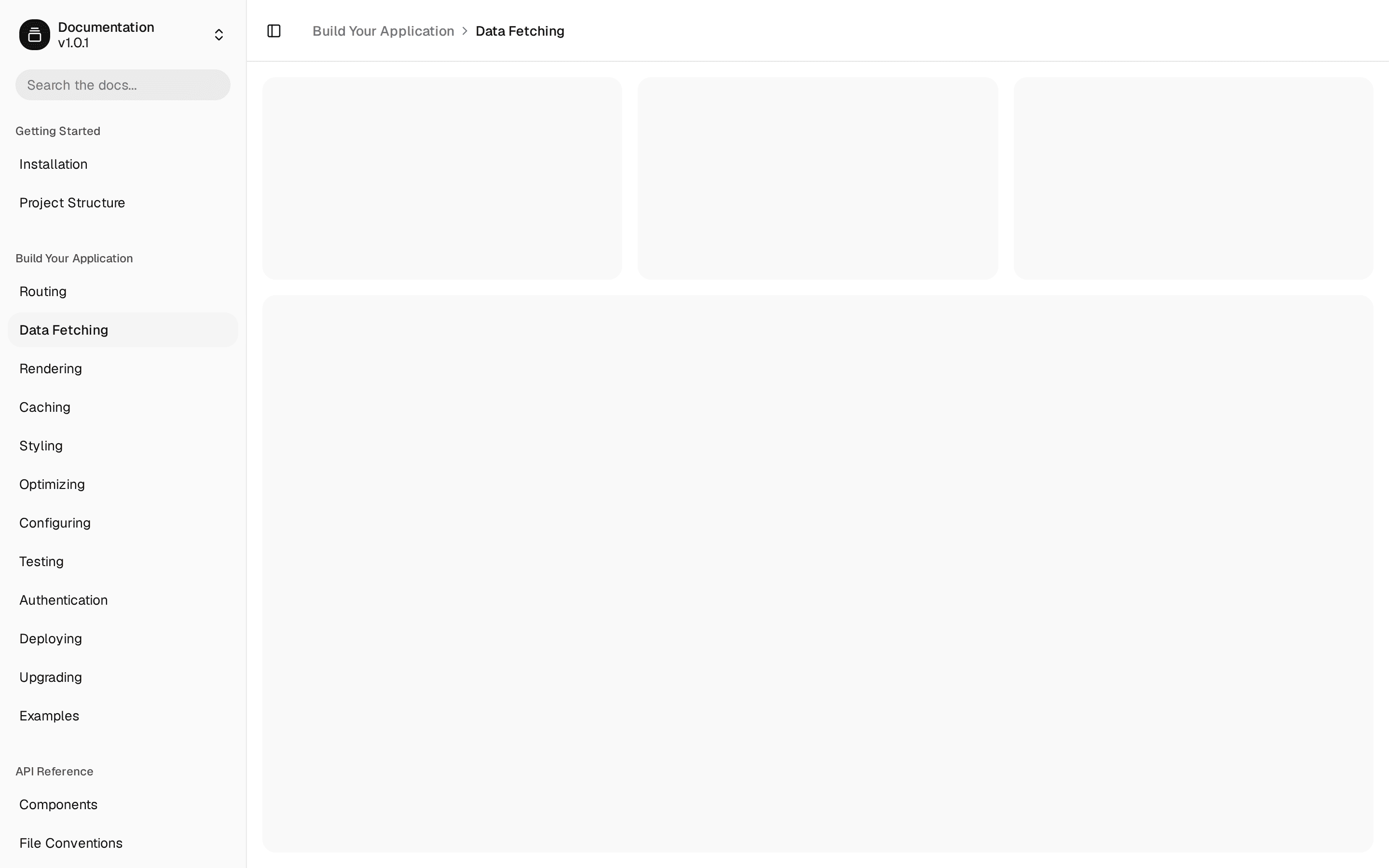
function DashboardContent() {
  const pathname = usePathname()
  const activeItem =
    topNavItems.find((item) => hasActiveDescendant(item, pathname)) ??
    topNavItems[0]

  return (
    <div className="flex-1 overflow-y-auto">
      <div className="flex h-full min-h-0 flex-col gap-6 p-4 sm:p-6">
        <div className="flex flex-col gap-1">
          <h4 className="mb-0 capitalize">{activeItem.title}</h4>
          <p className="text-sm text-muted-foreground">
            Welcome back, here is what is happening today.
          </p>
        </div>

        {/* Stat cards */}
        <div className="grid auto-rows-min gap-4 sm:grid-cols-2 lg:grid-cols-4">
          <div className="h-24 rounded-xl bg-card" />
          <div className="h-24 rounded-xl bg-card" />
          <div className="h-24 rounded-xl bg-card" />
          <div className="h-24 rounded-xl bg-card" />
        </div>

        {/* Main + side panels */}
        <div className="grid flex-1 gap-4 lg:grid-cols-3">
          <div className="min-h-64 rounded-xl bg-card lg:col-span-2" />
          <div className="min-h-64 rounded-xl bg-card" />
        </div>
      </div>
    </div>
  )
}

//  ------------------------------ | BLOCK - DASHBOARD LAYOUT 2 (TOP NAV) | ------------------------------  //

export default function DashboardTwo({ children }: { children?: ReactNode }) {
  return (
    <div className="relative flex h-screen w-full flex-col overflow-hidden bg-background [.in-iframe-preview_&]:h-[600px]">
      <DashboardHeader />
      {children ? (
        <main className="flex-1 overflow-y-auto p-4 sm:p-6">{children}</main>
      ) : (
        <DashboardContent />
      )}
    </div>
  )
}