src/registry/blocks/testimonial-section/two/index.tsx
"use client";
import React, { useState } from "react";
import Image from "next/image";
import { motion, AnimatePresence } from "motion/react";
import { X } from "lucide-react";
interface Testimonial {
id: string;
name: string;
role: string;
image: string;
quote: string;
}
const testimonials: Testimonial[] = [
{
id: "1",
name: "Sarah Chen",
role: "CEO of DataFlow",
image: "https://assets.solaceui.com/solaceui-member-five.png",
quote:
"SolaceUI transformed our design workflow. What used to take weeks now takes days.",
},
{
id: "2",
name: "Marcus Rodriguez",
role: "Product Lead",
image: "https://assets.solaceui.com/solaceui-member-one.png",
quote:
"The best investment we've made for our frontend architecture in years.",
},
{
id: "3",
name: "Olivia Koe",
role: "Design Director",
image: "https://assets.solaceui.com/solaceui-member-six.png",
quote:
"Simply beautiful components that are easy to customize and integrate.",
},
{
id: "4",
name: "David Kim",
role: "Founder",
image: "https://assets.solaceui.com/solaceui-member-two.png",
quote: "Our development velocity has doubled since adopting SolaceUI.",
},
{
id: "5",
name: "Amara Okonkwo",
role: "CTO",
image: "https://assets.solaceui.com/solaceui-member-three.png",
quote:
"Accessibility and performance out of the box. Truly impressive work.",
},
{
id: "6",
name: "James Mitchell",
role: "Frontend Dev",
image: "https://assets.solaceui.com/solaceui-member-four.png",
quote: "The documentation is clear and the components just work. Love it.",
},
{
id: "7",
name: "Elena Rodriguez",
role: "Product Manager",
image: "https://assets.solaceui.com/solaceui-member-five.png",
quote:
"It looks premium and feels premium. Our users noticed the difference immediately.",
},
{
id: "8",
name: "Michael Chang",
role: "Tech Lead",
image: "https://assets.solaceui.com/solaceui-member-one.png",
quote:
"Clean abstractions and great TypeScript support. A joy to work with.",
},
{
id: "9",
name: "Sofia Weber",
role: "Designer",
image: "https://assets.solaceui.com/solaceui-member-six.png",
quote:
"Finally a library that respects design constraints while offering flexibility.",
},
];
export default function Testimonial2() {
const [selected, setSelected] = useState<Testimonial | null>(null);
// Split testimonials into 3 rows for visual variance
const row1 = testimonials.slice(0, 3);
const row2 = testimonials.slice(3, 6);
const row3 = testimonials.slice(6, 9);
return (
<div className="relative w-full py-20 overflow-hidden [--color-primary:#003AF9] bg-white dark:bg-background text-neutral-900 dark:text-white">
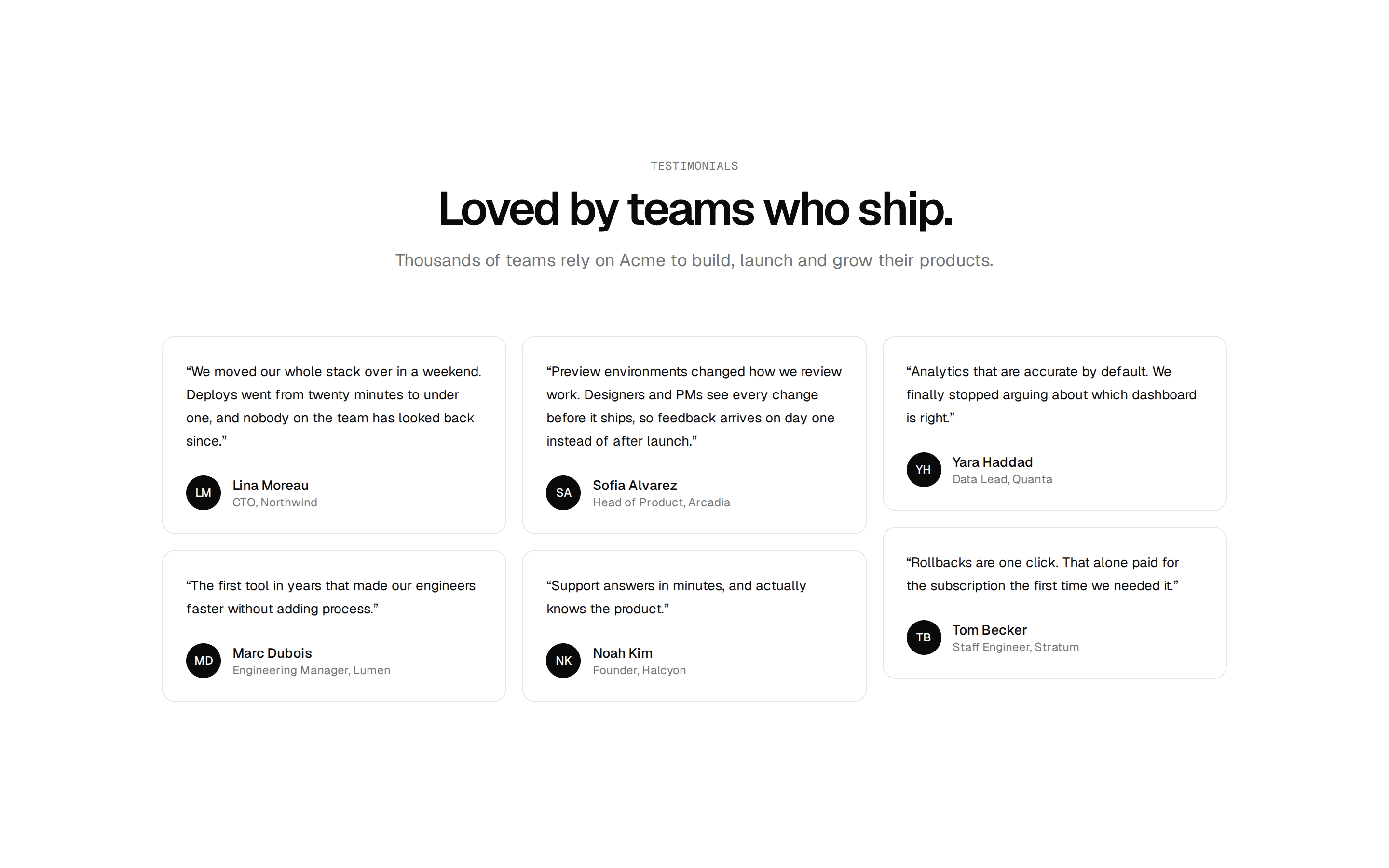
<div className="max-w-7xl mx-auto px-4 text-center mb-12">
<h2 className="text-3xl md:text-5xl font-bold tracking-tight">
Trusted By The Best People
</h2>
</div>
{/* Main Container acting as the viewport for background and fades */}
<div className="relative w-full">
{/* Shaded Background - Matches the height of this container exactly */}
<div className="absolute inset-0 z-0 opacity-10 bg-[repeating-linear-gradient(315deg,currentColor_0,currentColor_1px,transparent_0,transparent_50%)] bg-[length:10px_10px] border-y border-black dark:border-white pointer-events-none"></div>
{/* Fades - Match the height of this container exactly */}
<div className="absolute left-0 top-0 bottom-0 w-40 bg-gradient-to-r from-white dark:from-black to-transparent z-20 pointer-events-none"></div>
<div className="absolute right-0 top-0 bottom-0 w-40 bg-gradient-to-l from-white dark:from-black to-transparent z-20 pointer-events-none"></div>
{/* Content Rows */}
<div className="relative z-10 flex flex-col gap-8 py-12 items-center justify-center overflow-hidden">
{[row1, row2, row3].map((row, rowIndex) => (
<motion.div
key={rowIndex}
className="flex items-center gap-6 min-w-max"
animate={{
x: rowIndex % 2 === 0 ? ["0%", "-25%"] : ["-25%", "0%"],
}}
transition={{
duration: 40,
repeat: Infinity,
ease: "linear",
}}
>
{[...row, ...row, ...row, ...row].map((testimonial, i) => (
<Capsule
key={`${testimonial.id}-${i}`}
testimonial={testimonial}
onClick={() => setSelected(testimonial)}
/>
))}
</motion.div>
))}
</div>
</div>
{/* Modal */}
<AnimatePresence>
{selected && (
<div className="fixed inset-0 z-50 flex items-center justify-center p-4">
{/* Backdrop */}
<motion.div
initial={{ opacity: 0 }}
animate={{ opacity: 1 }}
exit={{ opacity: 0 }}
onClick={() => setSelected(null)}
className="absolute inset-0 bg-white/10 dark:bg-black/40 backdrop-blur-md"
/>
{/* Modal Card */}
<motion.div
initial={{ opacity: 0, scale: 0.9, y: 20 }}
animate={{ opacity: 1, scale: 1, y: 0 }}
exit={{
opacity: 0,
scale: 0.95,
y: 10,
transition: { duration: 0.15 },
}}
transition={{ duration: 0.2, ease: "easeOut" }}
className="relative w-full max-w-lg bg-black dark:bg-white text-white dark:text-black p-8 md:p-12 rounded-2xl border-2 border-(--color-primary) shadow-2xl z-50"
>
<button
onClick={() => setSelected(null)}
className="absolute top-4 right-4 p-2 text-neutral-500 hover:text-white dark:hover:text-black transition-colors"
>
<X size={20} />
</button>
<div className="flex flex-col items-center text-center">
<p className="text-xl md:text-2xl font-medium leading-relaxed mb-8">
“{selected.quote}”
</p>
<div className="flex items-center gap-4">
<div className="relative w-12 h-12 rounded-full overflow-hidden border-2 border-(--color-primary)">
<Image
src={selected.image}
alt={selected.name}
fill
className="object-cover object-top"
unoptimized
/>
</div>
<div className="text-left">
<h4 className="font-bold text-base text-white dark:text-black">
{selected.name}
</h4>
<p className="text-sm text-neutral-400 dark:text-neutral-600">
{selected.role}
</p>
</div>
</div>
</div>
</motion.div>
</div>
)}
</AnimatePresence>
</div>
);
}
function Capsule({
testimonial,
onClick,
}: {
testimonial: Testimonial;
onClick: () => void;
}) {
return (
<motion.div
whileHover={{ scale: 1.05 }}
whileTap={{ scale: 0.95 }}
onClick={onClick}
className="group flex items-center gap-4 p-2 pr-8 rounded-full bg-white dark:bg-black/90 border border-neutral-300 hover:border-(--color-primary) hover:border-dashed dark:hover:border-(--color-primary) dark:border-neutral-800 cursor-pointer transition-all shadow-sm hover:shadow-md group"
>
<div className="relative w-14 h-14 rounded-full overflow-hidden border border-black group-hover:border-(--color-primary) dark:group-hover:border-(--color-primary) dark:border-white transition-colors">
<Image
src={testimonial.image}
alt={testimonial.name}
fill
className="object-cover object-top"
sizes="48px"
unoptimized
/>
</div>
<div className="flex flex-col items-start leading-tight">
<span className="text-sm font-bold text-neutral-900 dark:text-white">
{testimonial.name}
</span>
<span className="text-xs text-neutral-500 dark:text-neutral-400">
{testimonial.role}
</span>
</div>
</motion.div>
);
}