src/registry/blocks/auth-section/three/index.tsx
"use client";

import { useState } from "react";
import type { ReactNode } from "react";
import { FlutedGlass } from "@paper-design/shaders-react";
import { Eye, EyeOff } from "lucide-react";
import { motion } from "motion/react";

const formFields = [
  { label: "First name", value: "Harshit", type: "text", placeholder: "Harshit" },
  { label: "Last name", value: "Sharma", type: "text", placeholder: "Sharma" },
];

const termsText = (
  <>
    By creating an account, you agree to our{" "}
    <a href="#" className="font-medium text-black/55 underline underline-offset-2 dark:text-white/55">
      Terms of Service
    </a>{" "}
    and{" "}
    <a href="#" className="font-medium text-black/55 underline underline-offset-2 dark:text-white/55">
      Privacy Policy
    </a>
  </>
);

export default function AuthSectionThree() {
  return (
    <section className="min-h-screen bg-white p-3 text-black antialiased [font-synthesis:none] dark:bg-[#050505] dark:text-white">
      <div className="grid min-h-[calc(100vh-1.5rem)] gap-6 lg:grid-cols-[0.94fr_1.06fr]">

        {/* Left Side - SignUp Form */}
        <div className="flex min-h-[760px] items-center justify-center rounded-md border border-black/10 bg-white px-6 py-12 dark:border-white/5 dark:bg-[#0a0a0c] lg:min-h-0 lg:px-14 lg:py-20 xl:px-20">
          <div className="mx-auto w-full max-w-[460px]">


            <div>
              <h1 className="text-3xl font-medium tracking-tight sm:text-4xl text-black dark:text-white">
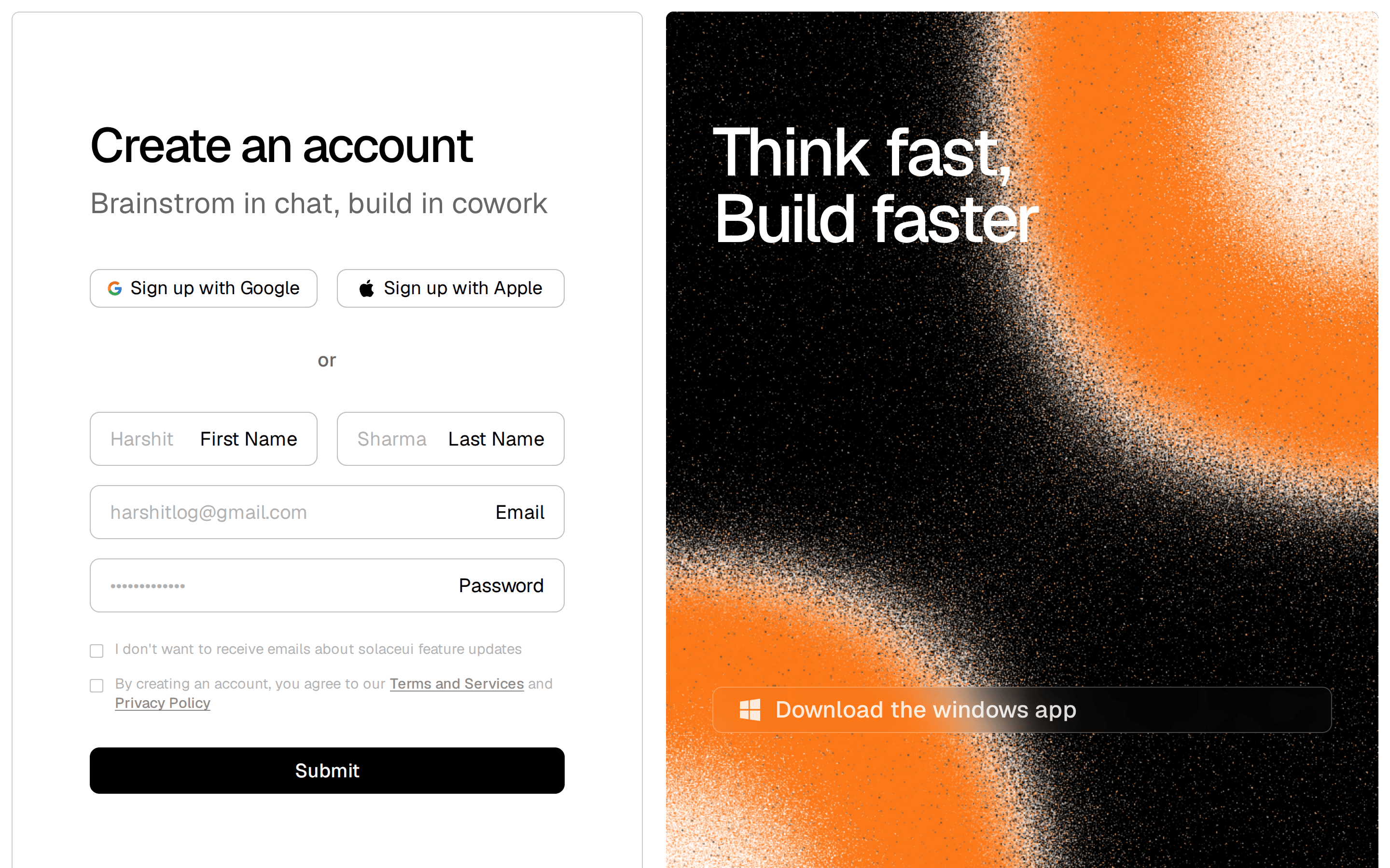
                Create an account
              </h1>
            </div>

            {/* Social Signup Buttons */}
            <div className="mt-8 grid gap-3 sm:grid-cols-2 sm:gap-4">
              <button
                type="button"
                className="flex h-11 w-full min-w-0 items-center justify-center gap-2 rounded-lg border border-black/15 bg-white px-4 text-sm font-medium text-black transition-colors hover:bg-black/[0.02] dark:border-white/10 dark:bg-white/5 dark:text-white dark:hover:bg-white/10"
              >
                <GoogleIcon />
                <span className="whitespace-nowrap">Sign up with Google</span>
              </button>
              <button
                type="button"
                className="flex h-11 w-full min-w-0 items-center justify-center gap-2 rounded-lg border border-black/15 bg-white px-4 text-sm font-medium text-black transition-colors hover:bg-black/[0.02] dark:border-white/10 dark:bg-white/5 dark:text-white dark:hover:bg-white/10"
              >
                <AppleIcon />
                <span className="whitespace-nowrap">Sign up with Apple</span>
              </button>
            </div>

            <div className="my-6 flex items-center gap-4 text-xs font-medium text-black/40 dark:text-white/30">
              <div className="h-px flex-1 bg-black/10 dark:bg-white/10" />
              or
              <div className="h-px flex-1 bg-black/10 dark:bg-white/10" />
            </div>

            <form className="space-y-4">
              <div className="grid gap-4 sm:grid-cols-2">
                {formFields.map((field) => (
                  <InputField
                    key={field.label}
                    label={field.label}
                    value={field.value}
                    placeholder={field.placeholder}
                    type={field.type}
                  />
                ))}
              </div>

              <InputField
                label="Email"
                value="harshitlog@gmail.com"
                placeholder="email@example.com"
                type="email"
              />

              <InputField
                label="Password"
                value="*************"
                placeholder="Enter password"
                type="password"
              />

              <div className="space-y-3 pt-2 text-xs leading-5 text-black/45 dark:text-white/40 sm:text-[13px]">
                <CheckboxLine>
                  I don't want to receive emails about Postdrips feature updates and best practices.
                </CheckboxLine>
                <CheckboxLine>{termsText}</CheckboxLine>
              </div>

              <button
                type="button"
                className="mt-8 flex h-11 w-full items-center justify-center rounded-lg border border-black/40 bg-black text-sm font-medium text-white transition-colors hover:bg-black/85 dark:border-white/40 dark:bg-white dark:text-black dark:hover:bg-white/85"
              >
                Submit
              </button>
            </form>
          </div>
        </div>

        {/* Right Side - Marketing Testimonial and Mockup */}
        <div className="relative flex min-h-[720px] flex-col overflow-hidden rounded-md bg-linear-to-b from-black to-white p-8 text-white dark:to-[#050505] sm:p-12 lg:min-h-0 lg:p-16">
          {/* Background Shader */}
          <div className="absolute inset-0 z-0 pointer-events-none">
            <FlutedGlass
              size={0.89}
              shape="lines"
              angle={0}
              distortionShape="prism"
              distortion={0.5}
              shift={0}
              blur={0}
              edges={0.25}
              stretch={0}
              scale={1.11}
              fit="cover"
              highlights={0.1}
              shadows={0.2}
              grainMixer={0.1}
              grainOverlay={0.1}
              colorBack="#00000000"
              colorHighlight="#FFFFFF"
              colorShadow="#000000"
              className="w-full h-full bg-transparent"
            />
          </div>

          <div className="relative z-10 h-full w-full">
            <div className="max-w-[460px] lg:pt-12">
              <motion.div
                initial={{ opacity: 0, y: 12, filter: "blur(6px)" }}
                whileInView={{ opacity: 1, y: 0, filter: "blur(0px)" }}
                viewport={{ once: true, margin: "-10%" }}
                transition={{ duration: 0.7, ease: [0.22, 1, 0.36, 1] }}
                className="flex items-center gap-4"
              >
                <img
                  src="https://assets.solaceui.com/solaceui-member-five.png"
                  alt="Charlotte"
                  className="size-10 shrink-0 rounded-full border border-white/20 object-cover"
                />
                <div>
                  <div className="font-semibold leading-tight text-white">Charlotte</div>
                  <div className="mt-0.5 text-xs text-white/60">Design Engineer</div>
                </div>
              </motion.div>
              <motion.blockquote
                initial={{ opacity: 0, y: 18, filter: "blur(8px)" }}
                whileInView={{ opacity: 1, y: 0, filter: "blur(0px)" }}
                viewport={{ once: true, margin: "-10%" }}
                transition={{ duration: 0.8, delay: 0.12, ease: [0.22, 1, 0.36, 1] }}
                className="mt-7 text-2xl font-light leading-tight tracking-[-0.035em] text-white/90 sm:text-3xl lg:text-[34px]"
              >
                “Every block had the restraint and polish we usually spend weeks refining.”
              </motion.blockquote>
            </div>

            <div className="mt-10 w-full translate-y-[24%] overflow-hidden rounded-2xl border border-white/15 bg-black/70 p-2 shadow-[0_30px_90px_rgba(0,0,0,0.5)] backdrop-blur-xl sm:translate-y-[22%] lg:absolute lg:left-[12%] lg:-bottom-28 lg:mt-0 lg:w-[105%] lg:max-w-none lg:origin-bottom-left lg:translate-y-0 lg:-rotate-3 xl:left-[14%] xl:-bottom-[150px] xl:w-[108%] 2xl:-bottom-[170px] 2xl:w-[112%]">
              <motion.div
                initial={{ opacity: 0, y: 72, filter: "blur(10px)" }}
                whileInView={{ opacity: 1, y: 0, filter: "blur(0px)" }}
                viewport={{ once: true, margin: "-10%" }}
                transition={{ duration: 1, delay: 0.22, ease: [0.16, 1, 0.3, 1] }}
                className="overflow-hidden rounded-xl border border-white/10 bg-black"
              >
                <div className="flex items-center gap-1.5 border-b border-white/10 bg-black/40 px-4 py-3 select-none">
                  <div className="size-2 rounded-full bg-white/35" />
                  <div className="size-2 rounded-full bg-white/25" />
                  <div className="size-2 rounded-full bg-white/15" />
                  <span className="ml-4 text-[9px] font-mono tracking-wider text-white/40">solaceui.com/dashboard</span>
                </div>
                <img
                  src="https://assets.solaceui.com/solaceui-hero-light.png"
                  alt="SolaceUI Dashboard App Mockup"
                  className="h-auto w-full object-cover object-top opacity-95 [filter:invert(1)_hue-rotate(180deg)_brightness(0.68)_contrast(1.16)] dark:[filter:none]"
                />
              </motion.div>
            </div>

          </div>

        </div>
      </div>
    </section>
  );
}

function InputField({
  label,
  placeholder,
  type = "text",
  value,
}: {
  label: string;
  placeholder: string;
  type?: string;
  value: string;
}) {
  const [val, setVal] = useState(value);
  const [showPassword, setShowPassword] = useState(false);
  const [isEditing, setIsEditing] = useState(false);

  return (
    <div className="space-y-1.5 text-left w-full">
      <label className="text-xs font-semibold text-black/60 dark:text-white/60">
        {label}
      </label>
      <div className="relative flex h-11 items-center rounded-lg border border-black/15 bg-white px-3.5 dark:border-white/10 dark:bg-white/5">
        <input
          type={type === "password" ? (showPassword ? "text" : "password") : type}
          value={val}
          onFocus={() => {
            if (!isEditing) {
              setVal("");
              setIsEditing(true);
            }
          }}
          onChange={(e) => {
            setVal(e.target.value);
            setIsEditing(true);
          }}
          placeholder={placeholder}
          className="w-full bg-transparent text-sm text-black outline-none placeholder:text-black/30 dark:text-white dark:placeholder:text-white/30"
        />
        {type === "password" && (
          <button
            type="button"
            onClick={() => setShowPassword(!showPassword)}
            className="absolute right-3.5 text-black/40 dark:text-white/40 hover:text-black dark:hover:text-white cursor-pointer"
          >
            {showPassword ? <EyeOff className="size-4" /> : <Eye className="size-4" />}
          </button>
        )}
      </div>
    </div>
  );
}

function CheckboxLine({ children }: { children: ReactNode }) {
  return (
    <label className="flex items-start gap-3 cursor-pointer">
      <span className="relative mt-1 size-3.5 shrink-0">
        <input
          type="checkbox"
          className="peer size-full cursor-pointer appearance-none rounded-[3px] border border-black/25 bg-white checked:border-black checked:bg-black dark:border-white/30 dark:bg-white/5 dark:checked:border-white dark:checked:bg-white"
        />
        <svg viewBox="0 0 12 12" className="pointer-events-none absolute inset-0 hidden size-full p-0.5 text-white peer-checked:block dark:text-black" fill="none" aria-hidden="true">
          <path d="M3 6.2 5 8.1 9 3.9" stroke="currentColor" strokeWidth="1.6" strokeLinecap="round" strokeLinejoin="round" />
        </svg>
      </span>
      <span>{children}</span>
    </label>
  );
}

function GoogleIcon() {
  return (
    <svg width="15" height="15" viewBox="0 0 24 24" aria-hidden="true" className="shrink-0">
      <path
        d="M22.56 12.25c0-.78-.07-1.53-.2-2.25H12v4.26h5.92c-.26 1.37-1.04 2.53-2.21 3.31v2.77h3.57c2.08-1.92 3.28-4.74 3.28-8.09Z"
        fill="#4285F4"
      />
      <path
        d="M12 23c2.97 0 5.46-.98 7.28-2.66l-3.57-2.77c-.98.66-2.23 1.06-3.71 1.06-2.86 0-5.29-1.93-6.16-4.53H2.18v2.84C3.99 20.53 7.7 23 12 23Z"
        fill="#34A853"
      />
      <path
        d="M5.84 14.1c-.22-.66-.35-1.36-.35-2.1s.13-1.44.35-2.1V7.06H2.18C1.43 8.55 1 10.22 1 12s.43 3.45 1.18 4.94l3.66-2.84Z"
        fill="#FBBC05"
      />
      <path
        d="M12 5.38c1.62 0 3.06.56 4.21 1.64l3.15-3.15C17.45 2.09 14.97 1 12 1 7.7 1 3.99 3.47 2.18 7.06l3.66 2.84C6.71 7.3 9.14 5.38 12 5.38Z"
        fill="#EB4335"
      />
    </svg>
  );
}

function AppleIcon() {
  return (
    <svg width="16" height="16" viewBox="0 0 24 24" fill="currentColor" aria-hidden="true" className="shrink-0">
      <path d="M17.05 12.54c-.03-3.02 2.47-4.47 2.58-4.54-1.41-2.06-3.6-2.34-4.38-2.37-1.86-.19-3.64 1.1-4.58 1.1-.95 0-2.42-1.07-3.98-1.04-2.05.03-3.94 1.19-4.99 3.02-2.13 3.69-.54 9.16 1.53 12.15 1.01 1.46 2.22 3.1 3.81 3.04 1.53-.06 2.11-.99 3.96-.99s2.37.99 3.99.96c1.65-.03 2.69-1.49 3.69-2.96 1.16-1.69 1.64-3.33 1.66-3.41-.04-.02-3.2-1.23-3.24-4.87ZM14.03 3.66c.84-1.02 1.41-2.43 1.25-3.84-1.21.05-2.68.81-3.55 1.83-.78.9-1.46 2.34-1.28 3.72 1.35.1 2.73-.69 3.58-1.71Z" />
    </svg>
  );
}