"use client";
import React from "react";
import Image from "next/image";
import { cn } from "@/lib/utils";
import Link from "next/link";
import { motion, Variants } from "motion/react";
import { AnimatedGroup } from "@/components/ui/animated-group";

interface Iphone15ProProps extends React.SVGProps<SVGSVGElement> {
  width?: string | number;
  height?: string | number;
  src?: string;
  alt?: string;
}

const Iphone15Pro: React.FC<Iphone15ProProps> = ({
  width = "100%",
  height = "auto",
  src,
  alt = "iPhone screen content",
  className,
  ...props
}) => {
  return (
    <div className={cn("relative", className)}>
      <svg
        width={width}
        height={height}
        viewBox="0 0 433 882"
        preserveAspectRatio="xMidYMid meet"
        fill="none"
        xmlns="http://www.w3.org/2000/svg"
        className="transition-all duration-500 ease-in-out"
        {...props}
      >
        {/* Outer frame */}
        <path
          d="M2 73C2 32.6832 34.6832 0 75 0H357C397.317 0 430 32.6832 430 73V809C430 849.317 397.317 882 357 882H75C34.6832 882 2 849.317 2 809V73Z"
          className="dark:fill-[#DADADA] fill-[#404040]"
        />
        {/* Side buttons */}
        <path
          d="M0 171C0 170.448 0.447715 170 1 170H3V204H1C0.447715 204 0 203.552 0 203V171Z"
          className="dark:fill-[#DADADA] fill-[#404040]"
        />
        <path
          d="M1 234C1 233.448 1.44772 233 2 233H3.5V300H2C1.44772 300 1 299.552 1 299V234Z"
          className="dark:fill-[#DADADA] fill-[#404040]"
        />
        <path
          d="M1 319C1 318.448 1.44772 318 2 318H3.5V385H2C1.44772 385 1 384.552 1 384V319Z"
          className="dark:fill-[#DADADA] fill-[#404040]"
        />
        <path
          d="M430 279H432C432.552 279 433 279.448 433 280V384C433 384.552 432.552 385 432 385H430V279Z"
          className="dark:fill-[#DADADA] fill-[#404040]"
        />

        {/* Inner body */}
        <path
          d="M6 74C6 35.3401 37.3401 4 76 4H356C394.66 4 426 35.3401 426 74V808C426 846.66 394.66 878 356 878H76C37.3401 878 6 846.66 6 808V74Z"
          className="fill-[#262626] dark:fill-black" // Simplified dark mode fill
        />

        {/* Top speaker grille */}
        <path
          opacity="0.5"
          d="M174 5H258V5.5C258 6.60457 257.105 7.5 256 7.5H176C174.895 7.5 174 6.60457 174 5.5V5Z"
          className="dark:fill-[#DADADA] fill-[#404040]"
        />

        {/* Screen area */}
        <path
          d="M21.25 75C21.25 44.2101 46.2101 19.25 77 19.25H355C385.79 19.25 410.75 44.2101 410.75 75V807C410.75 837.79 385.79 862.75 355 862.75H77C46.2101 862.75 21.25 837.79 21.25 807V75Z"
          className="fill-[#111] dark:fill-[#F5F5F5]" // Screen background
        />

        {/* Screen Content Area */}
        {src && (
          <foreignObject
            x="21.25"
            y="19.25"
            width="389.5"
            height="843.5"
            clipPath="url(#roundedCorners)"
          >
            <div
              style={{
                width: "100%",
                height: "100%",
                borderRadius: "55.75px",
                overflow: "hidden",
                position: "relative",
                backgroundColor: "#111",
              }}
              className="dark:bg-[#F5F5F5]"
            >
              <Image
                src={src}
                alt={alt}
                fill
                style={{ objectFit: "cover" }}
                sizes="(max-width: 768px) 80vw, (max-width: 1200px) 50vw, 33vw"
                priority
                unoptimized
              />
            </div>
          </foreignObject>
        )}

        {/* Notch area */}
        <path
          d="M154 48.5C154 38.2827 162.283 30 172.5 30H259.5C269.717 30 278 38.2827 278 48.5C278 58.7173 269.717 67 259.5 67H172.5C162.283 67 154 58.7173 154 48.5Z"
          className="fill-[#262626] dark:fill-[#F0F0F0]"
        />
        {/* Inner Notch Elements */}
        <path
          d="M249 48.5C249 42.701 253.701 38 259.5 38C265.299 38 270 42.701 270 48.5C270 54.299 265.299 59 259.5 59C253.701 59 249 54.299 249 48.5Z"
          className="fill-[#111] dark:fill-[#D1D1D1]" // Slightly darker for contrast
        />
        <path
          d="M254 48.5C254 45.4624 256.462 43 259.5 43C262.538 43 265 45.4624 265 48.5C265 51.5376 262.538 54 259.5 54C256.462 54 254 51.5376 254 48.5Z"
          className="fill-white/30 dark:fill-black" // Even darker for the lens appearance
        />

        <defs>
          <clipPath id="roundedCorners">
            <rect
              x="21.25"
              y="19.25"
              width="389.5"
              height="843.5"
              rx="55.75"
              ry="55.75"
            />
          </clipPath>
        </defs>
      </svg>
    </div>
  );
};

const navItems = [
  { name: "Product", href: "#" },
  { name: "Customer", href: "#" },
  { name: "Solution", href: "#" },
  { name: "Pricing", href: "#" },
  { name: "Company", href: "#" },
];

export default function HeroSection6() {
  const textVariants: Variants = {
    hidden: { opacity: 0, filter: "blur(10px)", y: 20 },
    visible: {
      opacity: 1,
      filter: "blur(0px)",
      y: 0,
      transition: {
        type: "spring",
        bounce: 0.2,
        duration: 1,
      },
    },
  };

  return (
    <div className="relative w-full h-screen [--color-primary:#003AF9] overflow-hidden">
      {/* Radial Gradient Background */}
      <div className="absolute inset-0 z-0 bg-[radial-gradient(125%_125%_at_50%_10%,#fff_40%,var(--color-primary)_100%)] dark:bg-[radial-gradient(125%_125%_at_50%_10%,#000_40%,var(--color-primary)_100%)]" />

      {/* Navbar */}
      <nav className="w-full flex justify-between items-center py-4 px-4 sm:px-6 border-b border-black/10 dark:border-white/20 relative z-10">
        <div className="font-bold text-md tracking-tight">SolaceUI</div>

        <div className="items-center gap-4 hidden md:flex">
          {navItems.map((item) => (
            <Link href={item.href} key={item.name}>
              <span className="text-sm md:text-[1rem] text-neutral-400 hover:text-black transition-colors  dark:text-white/70">
                {item.name}
              </span>
            </Link>
          ))}
        </div>

        <div className="flex items-center gap-4">
          <Link href="#">
            <button className="px-3 py-1 text-sm font-medium border border-neutral-200 text-black dark:text-white hover:bg-neutral-200 transition-colors rounded-sm">
              Log in
            </button>
          </Link>
          <Link href="#">
            <button className="px-3 py-1 text-sm font-medium bg-(--color-primary) text-white hover:bg-black/90 transition-colors rounded-sm">
              Sign Up
            </button>
          </Link>
        </div>
      </nav>

      {/* Hero Content */}
      <div className="flex flex-col items-center justify-start text-center pt-20 md:pt-10 px-4 pb-0 max-w-7xl mx-auto z-10 relative rounded-none">
        <AnimatedGroup
          className="max-w-4xl mx-auto text-center flex flex-col items-center"
          variants={{
            container: {
              visible: {
                transition: {
                  staggerChildren: 0.1,
                },
              },
            },
            item: textVariants,
          }}
        >
          <h1 className="text-3xl md:text-4xl lg:text-6xl font-bold tracking-tight text-gray-900 dark:text-white mb-5 leading-[1.1] px-6 md:px-0">
            AI Agents That Code
            <br />
            Like Your Best Engineer
          </h1>
          <p className="text-sm sm:text-sm md:text-lg lg:text-xl text-neutral-600 dark:text-neutral-300 max-w-[350px]  md:max-w-lg  mx-auto mb-6 md:mb-5">
            Autonomous agents that debug, refactor, and ship features while you
            focus on architecture and strategy
          </p>
          <div className="flex flex-row sm:flex-row items-center justify-center gap-4 w-[300px] md:w-full mb-16 mx-auto">
            <button className="px-1 py-1 md:px-4 md:py-2 text-lg rounded-md bg-(--color-primary) hover:bg-(--color-primary)/90 text-white w-full sm:w-auto shadow-lg shadow-(--color-primary)/20 transition-all hover:shadow-(--color-primary)/40 rounded-sm cursor-pointer">
              Book a demo
            </button>

            <button className="px-1 py-1 md:px-4 md:py-2 text-lg rounded-md w-full sm:w-auto border border-neutral-300 dark:border-neutral-700 hover:bg-neutral-300 dark:hover:bg-neutral-800 transition-colors rounded-sm cursor-pointer">
              Try for free
            </button>
          </div>
        </AnimatedGroup>

        {/* Hero Images Section */}
        <div className="relative w-full mx-auto z-20">
          <div className="relative">
            {/* Desktop Screenshot */}
            <motion.div
              initial={{ opacity: 0, y: 30, scale: 0.98 }}
              animate={{ opacity: 1, y: 0, scale: 1 }}
              transition={{ duration: 0.8, delay: 0.4, ease: "easeOut" }}
              className="relative w-full rounded-md overflow-hidden border border-gray-200 dark:border-gray-800 shadow-xl dark:bg-gray-900"
            >
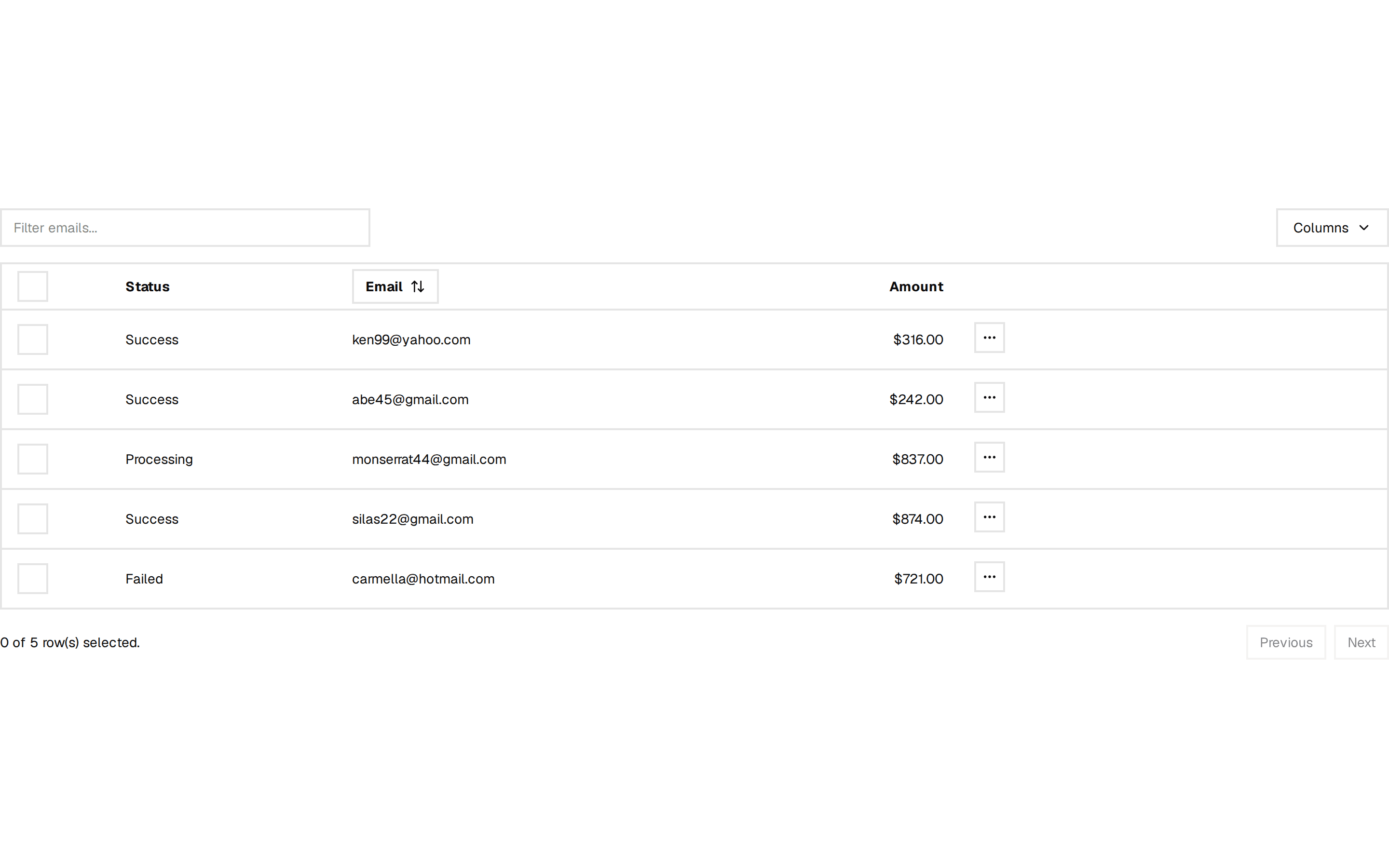
              <Image
                src="https://assets.solaceui.com/solaceui-hero-light.png"
                alt="Desktop Dashboard"
                width={800}
                height={800}
                className="object-cover object-left w-full h-auto"
                priority
                unoptimized
              />
            </motion.div>

            {/* iPhone Frame */}
            <div className="absolute top-1/2 left-1/2 -translate-x-1/2 -translate-y-[55%] md:-translate-y-[45%] lg:-translate-y-[55%] w-[150px] sm:w-[220px] md:w-[260px] lg:w-[320px] xl:w-[380px]">
              <motion.div
                initial={{ opacity: 0, scale: 0.8, y: 20 }}
                animate={{ opacity: 1, scale: 1, y: 0 }}
                transition={{ duration: 0.8, delay: 0.7, ease: "easeOut" }}
              >
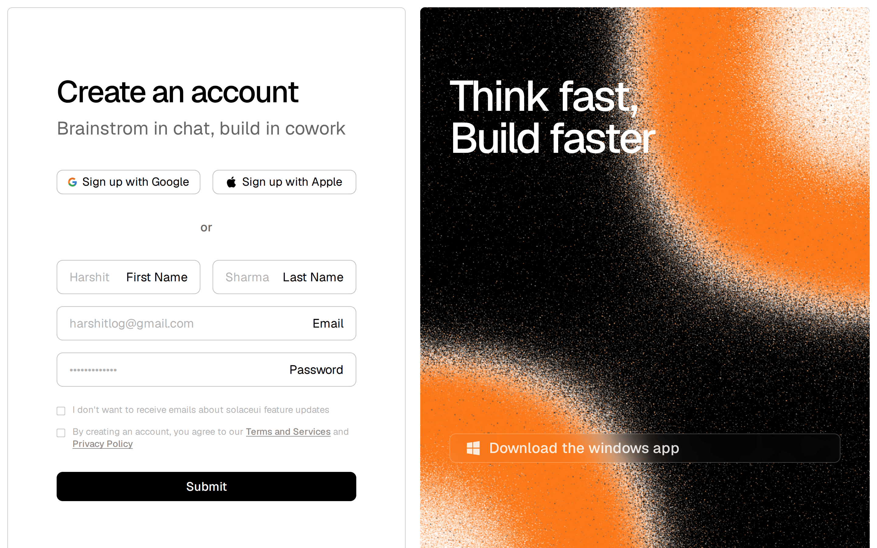
                <Iphone15Pro
                  src="https://assets.solaceui.com/solaceui-Notion-screen.png"
                  className="w-full h-[240px] md:h-[420px] lg:h-[480px] xl:h-[540px]"
                />
              </motion.div>
            </div>
          </div>

          {/* Fade Overlay for both images */}
          {/* Fade Overlay for both images */}
          <motion.div
            initial={{ opacity: 0 }}
            animate={{ opacity: 1 }}
            transition={{ duration: 0.8, delay: 0.4, ease: "easeOut" }}
            className="absolute -bottom-2 left-0 right-0 h-50 md:h-60 lg:h-80 bg-gradient-to-t from-white via-white/80 to-transparent  z-30 pointer-events-none rounded-md"
          />
        </div>
      </div>
    </div>
  );
}