"use client";
import React from "react";
import Image from "next/image";
import Link from "next/link";
import LogoCloud from "@/registry/blocks/hero-section/logo-cloud";
import { ArrowRight } from "lucide-react";
import { AnimatedGroup } from "@/components/ui/animated-group";
import { motion, Variants } from "motion/react";

export default function HeroSection5() {
  const navItems = [
    { name: "Products", href: "#" },
    { name: "Customers", href: "#" },
    { name: "Solution", href: "#" },
    { name: "Pricing", href: "#" },
    { name: "Company", href: "#" },
  ];

  const transitionVariants: { container?: Variants; item?: Variants } = {
    item: {
      hidden: {
        opacity: 0,
        filter: "blur(12px)",
        y: 12,
      },
      visible: {
        opacity: 1,
        filter: "blur(0px)",
        y: 0,
        transition: {
          type: "spring",
          bounce: 0.3,
          duration: 1,
        },
      },
    },
  };

  const imageVariants: Variants = {
    hidden: {
      opacity: 0,
      y: 40,
      filter: "blur(10px)",
      scale: 0.98,
    },
    visible: {
      opacity: 1,
      y: 0,
      filter: "blur(0px)",
      scale: 1,
      transition: {
        type: "spring",
        bounce: 0.3,
        duration: 1,
        delay: 0.2,
      },
    },
  };

  return (
    <div className="w-full min-h-screen bg-white dark:bg-[#212121] [--color-primary:#003AF9]">
      <div className="max-w-3xl mx-auto border-x border-neutral-200 dark:border-white/20 min-h-screen flex flex-col relative">
        {/* 1. Navbar */}
        <nav className="w-full flex justify-between items-center py-4 px-6 border-b border-black/10 dark:border-white/20">
          <div className="font-bold text-md tracking-tight">SolaceUI</div>

          <div className="items-center gap-4 hidden md:flex">
            {navItems.map((item) => (
              <Link href={item.href} key={item.name}>
                <span className="text-sm md:text-[1rem] text-neutral-400 hover:text-black transition-colors  dark:text-white/70">
                  {item.name}
                </span>
              </Link>
            ))}
          </div>

          <div className="flex items-center gap-4">
            <Link href="#">
              <button className="px-3 py-1 text-sm font-medium border border-neutral-200 text-black dark:text-white hover:bg-neutral-200 transition-colors rounded-none">
                Log in
              </button>
            </Link>
            <Link href="#">
              <button className="px-3 py-1 text-sm font-medium bg-(--color-primary) text-white hover:bg-black/90 transition-colors rounded-none">
                Sign Up
              </button>
            </Link>
          </div>
        </nav>

        {/* 2. Upper Hero Section */}
        <AnimatedGroup
          className="flex flex-col items-center text-center mt-8 md:mt-12 px-6 relative z-10 will-change-transform"
          variants={transitionVariants}
        >
          {/* Announcement Chip */}
          <Link
            href="#"
            className="inline-flex items-center gap-2 px-2 py-1 md:px-3 md:py-1 border border-neutral-200 dark:border-white/20 rounded-none mb-8 cursor-pointer group"
          >
            <span className="md:px-2 px-2 py-0 rounded-none bg-neutral-300 dark:bg-white/10 text-neutral-400 dark:text-white text-sm group-hover:bg-neutral-900 group-hover:text-white transition-colors">
              Hiring
            </span>
            <span className="text-sm text-neutral-400  dark:text-white/20 group-hover:text-black transition-colors dark:group-hover:text-white">
              Apply for Design Engineers
            </span>

            <ArrowRight className="size-3 text-neutral-400  dark:text-white/60 group-hover:translate-x-1 transition-colors group-hover:text-black dark:group-hover:text-white" />
          </Link>

          {/* Hero Text */}
          <h1 className="text-3xl md:text-5xl font-semibold tracking-tighter text-black dark:text-white  mb-3 md:mb-5">
            AI Agents That Code Like <br className="hidden md:block" />
            Your Best Engineer
          </h1>

          {/* Sub Heading */}
          <p className="text-sm md:text-lg text-black/60 dark:text-white/80 max-w-[400px] md:max-w-lg text-center md:mb-5 mb-4 md:leading-relaxed">
            Autonomous agents that debug, refactor, and ship features while you
            focus on architecture and strategy
          </p>

          {/* Two CTA Buttons */}
          <div className="flex flex-row gap-4 mb-10">
            <button className="px-2 py-1  md:px-3 md:py-1 bg-(--color-primary) text-white text-sm md:text-lg font-medium hover:bg-blue-700 transition-colors rounded-non min-w-[100px] md:min-w-[200px]">
              Book free demo
            </button>
            <button className="px-2 py-1 md:px-3 md:py-1 border border-neutral-300 text-black dark:text-white text-sm md:text-lg font-medium hover:bg-gray-50 transition-colors rounded-none min-w-[100px] md:min-w-[200px]">
              Try it now
            </button>
          </div>
        </AnimatedGroup>

        {/* 3. Divider Shaded Div */}
        <div className="w-full h-12 border-y border-black dark:border-white opacity-10 bg-[repeating-linear-gradient(315deg,currentColor_0,currentColor_1px,transparent_0,transparent_50%)] bg-[length:10px_10px]"></div>

        {/* 4. Hero Image Container */}
        <div className="w-full relative bg-gray-50 dark:bg-[#212121] border-b border-black/10 dark:border-none">
          <motion.div
            className="max-w-5xl mx-auto overflow-hidden"
            initial="hidden"
            animate="visible"
            variants={imageVariants}
            style={{ willChange: "transform, opacity, filter" }}
          >
            <div className="relative">
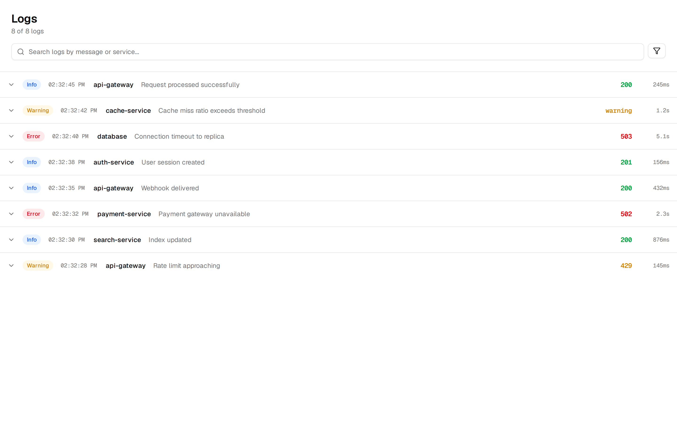
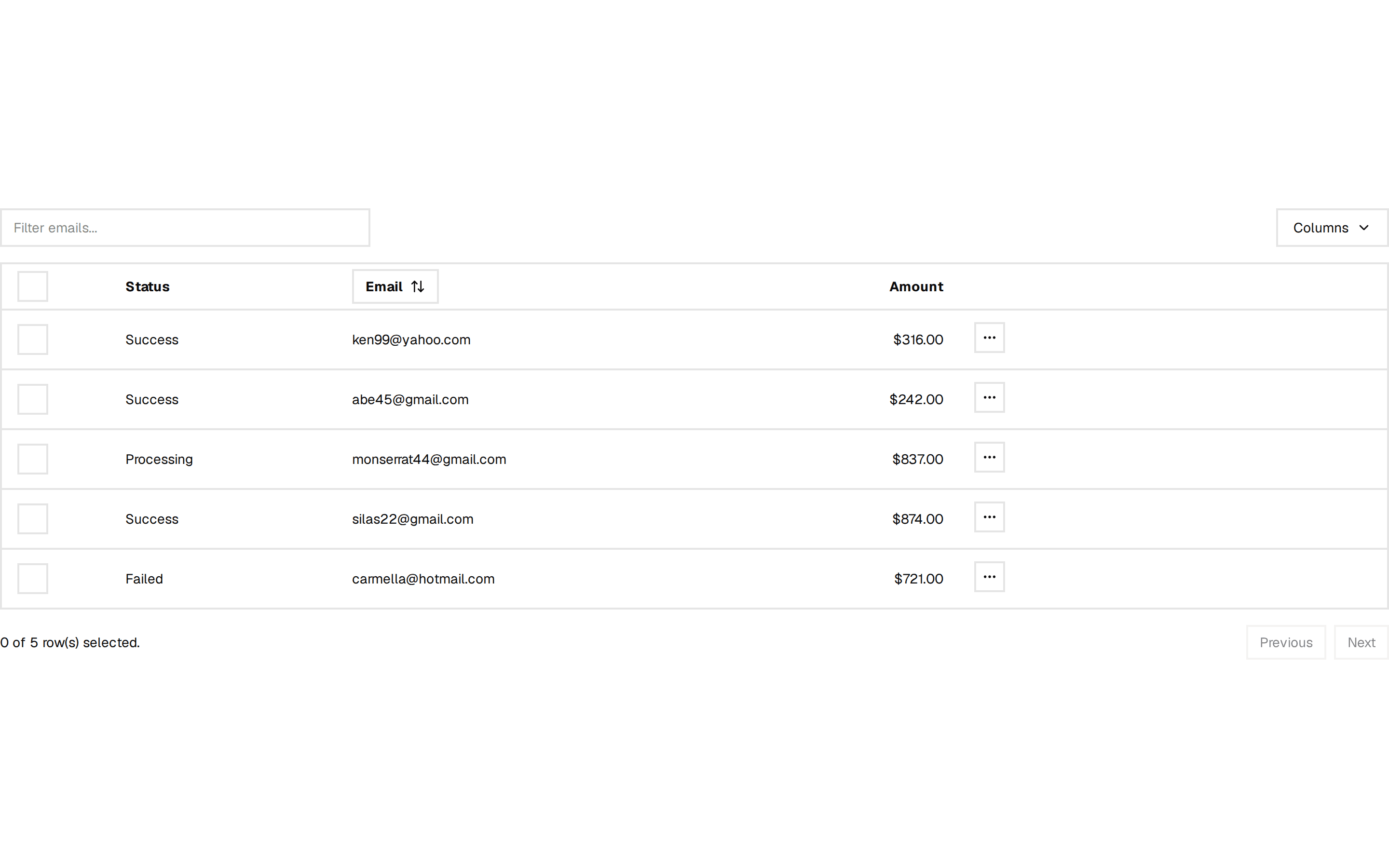
              <Image
                src="https://assets.solaceui.com/solaceui-hero-light.png"
                alt="Dashboard Preview"
                width={1200}
                height={800}
                className="object-cover object-top w-full h-auto"
                priority
                sizes="(max-width: 768px) 100vw, (max-width: 1200px) 100vw, 1200px"
                unoptimized
              />

              {/* Fade Effect - Always visible on image bottom */}
              <div className="absolute bottom-0 left-0 right-0 h-48 bg-linear-to-t from-white dark:from-black via-white/80 dark:via-[#212121]/20 to-transparent pointer-events-none" />

              {/* Overlay Logo Cloud (Visible on md to lg/xl) */}
              <div className="absolute bottom-0 left-0 right-0 h-48 hidden md:flex xl:hidden flex-col justify-end items-center pb-8 overflow-hidden z-10">
                <div className="w-full max-w-4xl px-4 opacity-80 scale-100">
                  <LogoCloud className="gap-8 lg:gap-16 pb-0 overflow-hidden" />
                </div>
              </div>
            </div>

            {/* Bottom Logo Cloud (Visible on mobile and xl+) */}
            <div className="flex md:hidden xl:flex flex-col justify-end items-center pb-8 pt-6 overflow-hidden bg-white dark:bg-[#212121] border-y dark:border-white/20 border-neutral-200">
              <div className="w-full max-w-4xl px-4 opacity-80 scale-90 xl:scale-80">
                <LogoCloud className="gap-2 pb-0 overflow-hidden" />
              </div>
            </div>
          </motion.div>
        </div>
      </div>
    </div>
  );
}