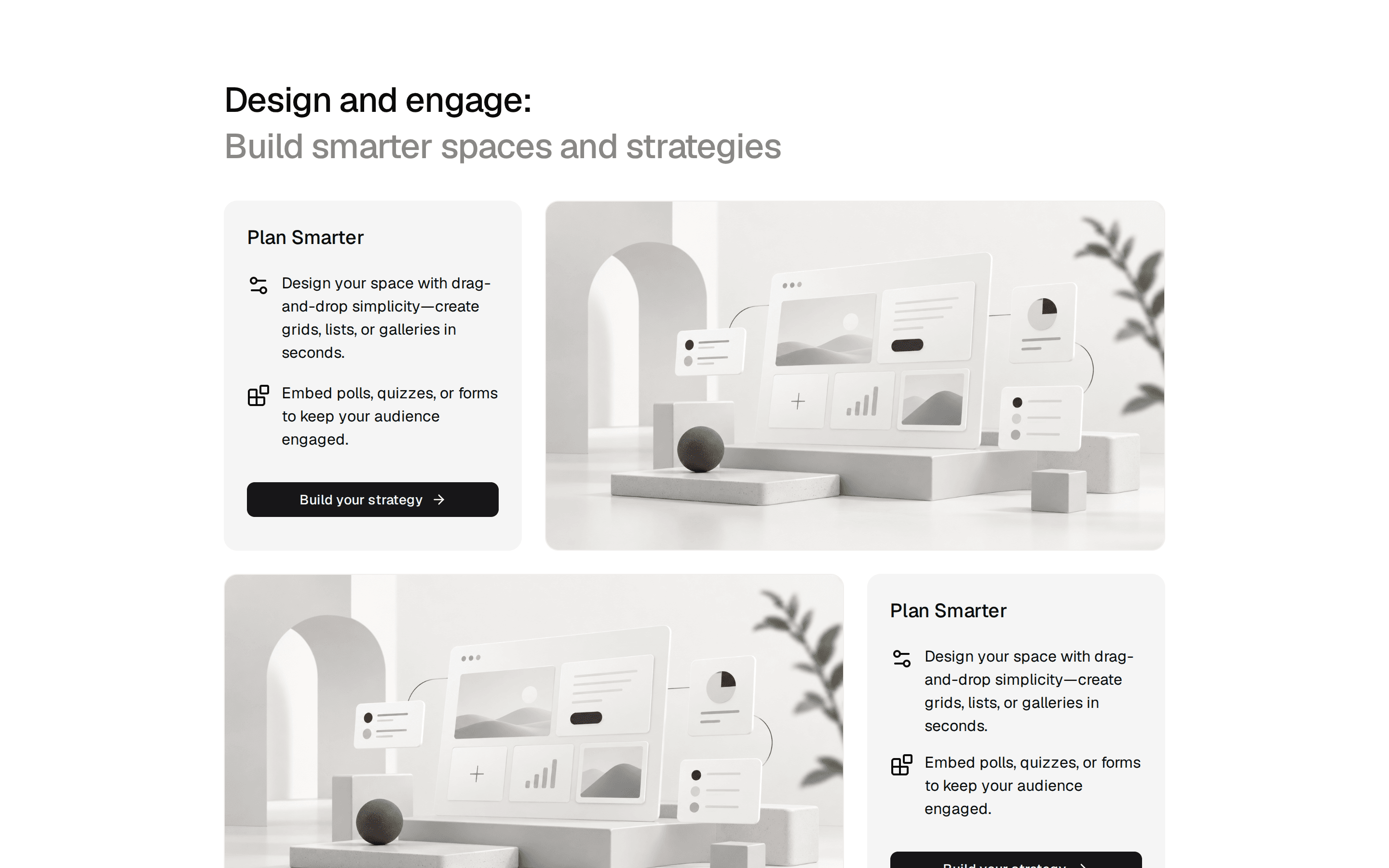
Feature 13 - Two-column feature cards with linked titles and imagery
A heading and optional intro above a two-column grid of cards that combine labels, linked titles, descriptions, and bottom-anchored images per feature.
@shadcnblocks
A heading and optional intro above a two-column grid of cards that combine labels, linked titles, descriptions, and bottom-anchored images per feature.
@shadcnblocks
block/feature13/feature13.tsx
import {
  Blocks,
  Globe,
  Layers,
  Palette,
  Rocket,
  Zap,
} from "lucide-react";
import { cn } from "cn";

interface FeatureCardListItem {
  title: string;
  description: string;
  image: Image;
  href?: string;
  icon?: React.ReactNode;
  label?: string;
}
interface Image {
  src: string;
  alt: string;
  srcDark?: string;
}

interface FeatureCardListProps {
  heading: string;
  features?: FeatureCardListItem[];
  className?: string;
}

interface Feature13Props extends FeatureCardListProps {}
type Props = Partial<Feature13Props>;

const defaultProps: Feature13Props = {
  heading: "Build faster with production ready features",
  features: [
    {
      icon: <Zap className="size-5" />,
      title: "Full Source Code",
      description:
        "Every block ships as plain React you own. No runtime dependency, no SDK lock-in, just copy and customize.",
      image: {
        src: "https://cdn.shadcnblocks.com/shadcnblocks/image-set/modern/saas-details/saas-card-detail-1-4x3.svg",
        alt: "Full Source Code",
      },
      href: "https://www.shadcnblocks.com",
    },
    {
      icon: <Palette className="size-5" />,
      title: "Responsive Design",
      description:
        "Every block adapts seamlessly from mobile to desktop with Tailwind's mobile-first utility classes.",
      image: {
        src: "https://cdn.shadcnblocks.com/shadcnblocks/image-set/modern/saas-details/saas-card-detail-2-4x3.svg",
        alt: "Responsive Design",
      },
      href: "https://www.shadcnblocks.com",
    },
    {
      icon: <Layers className="size-5" />,
      title: "Customizable",
      description:
        "Override any prop, swap icons, adjust spacing — every block is designed to be extended, not locked down.",
      image: {
        src: "https://cdn.shadcnblocks.com/shadcnblocks/image-set/modern/saas-details/saas-card-detail-3-4x3.svg",
        alt: "Customizable",
      },
      href: "https://www.shadcnblocks.com",
    },
    {
      icon: <Rocket className="size-5" />,
      title: "Production Ready",
      description:
        "Battle-tested in real projects. No placeholder hacks, no lorem ipsum — clean code you can ship today.",
      image: {
        src: "https://cdn.shadcnblocks.com/shadcnblocks/image-set/modern/saas-details/saas-card-detail-4-4x3.svg",
        alt: "Production Ready",
      },
      href: "https://www.shadcnblocks.com",
    },
    {
      icon: <Blocks className="size-5" />,
      title: "Registry Compatible",
      description:
        "Install blocks directly with the shadcn CLI. Dependencies and registry items are listed in every block's MDX.",
      image: {
        src: "https://cdn.shadcnblocks.com/shadcnblocks/image-set/modern/saas-details/saas-card-detail-5-4x3.svg",
        alt: "Registry Compatible",
      },
      href: "https://www.shadcnblocks.com",
    },
    {
      icon: <Globe className="size-5" />,
      title: "Framework Agnostic",
      description:
        "Plain ESM + React that works with Next.js, Vite, Remix, and Astro without any Shadcnblocks SDK.",
      image: {
        src: "https://cdn.shadcnblocks.com/shadcnblocks/image-set/modern/saas-details/saas-card-detail-6-4x3.svg",
        alt: "Framework Agnostic",
      },
      href: "https://www.shadcnblocks.com",
    },
  ],
};

const Feature13 = (props: Props) => {
  const { heading, features, className } = {
    ...defaultProps,
    ...props,
  };

  return (
    <section className={cn("py-32", className)}>
      <div className="container mx-auto">
        {heading && (
          <div className="mx-auto mb-9 max-w-5xl text-center lg:mb-14">
            <h2 className="text-4xl font-semibold tracking-tight text-balance lg:text-5xl">
              {heading}
            </h2>
          </div>
        )}
        <div className="grid gap-6 lg:grid-cols-2">
          {features?.slice(0, 4).map((feature, index) => (
            <div
              key={index}
              className="flex flex-col justify-between rounded-lg bg-muted"
            >
              <div className="flex justify-between gap-10 border-b">
                <div className="flex flex-col justify-start gap-8 py-6 pl-4 md:gap-14 md:py-10 md:pl-8 lg:justify-normal">
                  <span className="font-mono text-xs text-muted-foreground">
                    {feature.label}
                  </span>
                  <a href={feature.href}>
                    <h3 className="text-2xl font-semibold tracking-tight transition-all hover:text-primary hover:opacity-80 sm:text-3xl lg:text-4xl">
                      {feature.title}
                    </h3>
                  </a>
                </div>
                <div className="w-2/5 shrink-0 rounded-r-lg border-l md:w-1/3">
                  <a href={feature.href}>
                    <img
                      src={feature.image.src}
                      alt={feature.image.alt}
                      className="aspect-4/3 h-full w-full rounded-t-lg object-cover object-top transition-opacity hover:opacity-80"
                    />
                  </a>
                </div>
              </div>
              <p className="p-4 text-muted-foreground md:p-8">
                {feature.description}
              </p>
            </div>
          ))}
        </div>
      </div>
    </section>
  );
};

export { Feature13 };