Stepper with purchase order checks
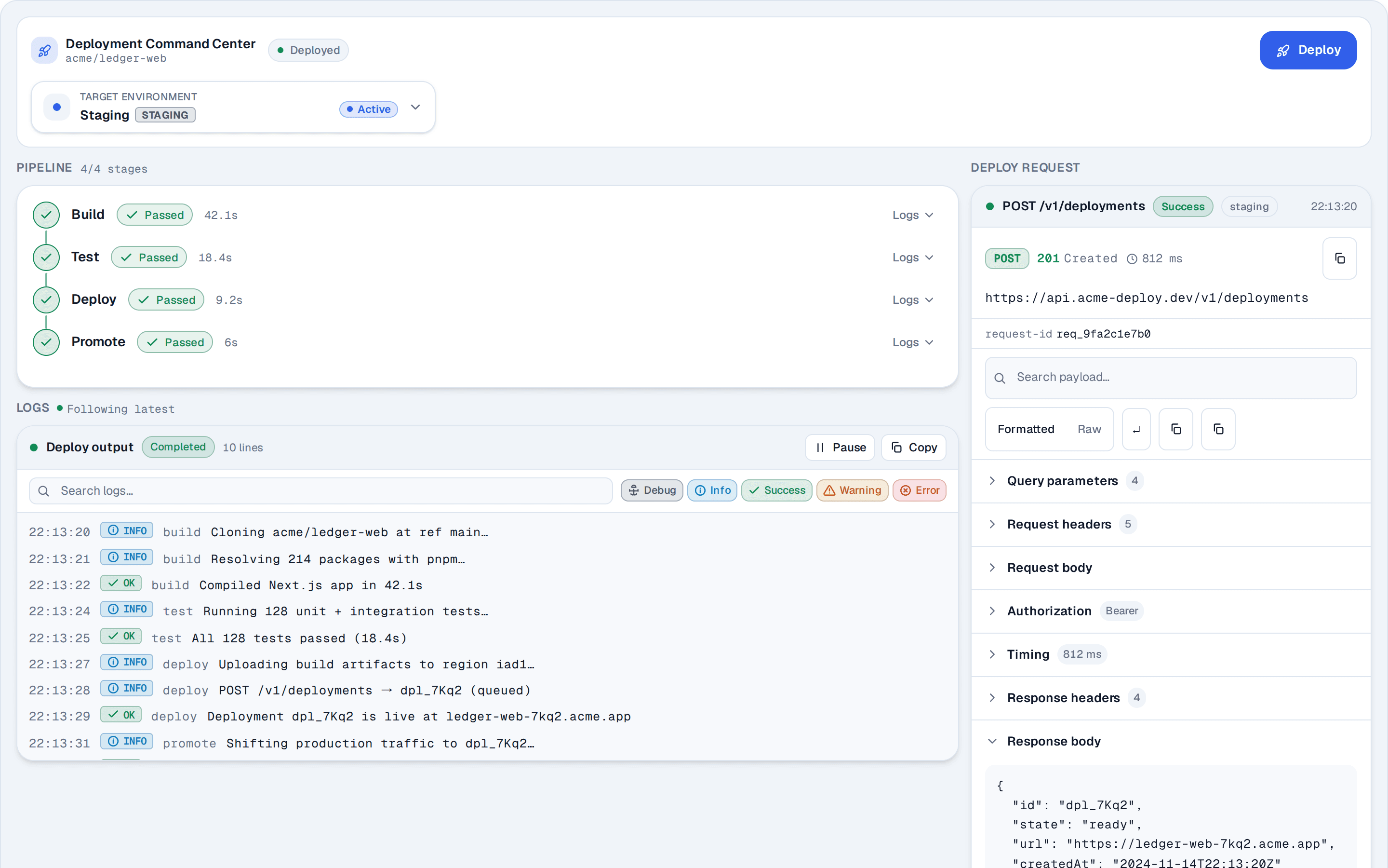
6 purchase orders that expand into 3-way match checks, each passed, failed with an issue count, or pending, with payment links under More.
@reui
6 purchase orders that expand into 3-way match checks, each passed, failed with an issue count, or pending, with payment links under More.
@reui
c-stepper-20.tsx
"use client"

import { useId, useRef, useState, type ReactNode } from "react"
import { Badge } from "@/components/reui/badge"
import {
  Tree,
  TreeItem,
  TreeItemLabel,
} from "@/components/reui/tree"
import {
  hotkeysCoreFeature,
  selectionFeature,
  syncDataLoaderFeature,
} from "@headless-tree/core"
import { useTree } from "@headless-tree/react"
import { cn } from "cn"

import { Button } from "@/components/ui/button"
import {
  DropdownMenu,
  DropdownMenuContent,
  DropdownMenuItem,
  DropdownMenuTrigger,
} from "@/components/ui/dropdown-menu"
import { Separator } from "@/components/ui/separator"
import { IconPlaceholder } from "@/app/(create)/components/icon-placeholder"

type Status = "passed" | "failed" | "pending"

const badges = {
  Ready: "success-light",
  Review: "warning-light",
} as const

interface Check {
  status: Status
  issues?: number
}

interface Item extends Partial<Check> {
  name: string
  children?: string[]
  badge?: keyof typeof badges
  next?: Status
  icon?: ReactNode
}

const passed: Check = { status: "passed" }
const pending: Check = { status: "pending" }
const failed = (issues: number): Check => ({ status: "failed", issues })

// 3WIM is the three-way invoice match, the checks an order passes or fails.
// More holds plain links to what follows approval: they are not steps, so
// they carry no status and Previous and Next skip them.
const match = ["Document validation", "3-way line match", "Approve payment"]
const links: Item[] = [
  {
    name: "Schedule payment",
    icon: (
      <IconPlaceholder
        lucide="CalendarClockIcon"
        tabler="IconCalendarTime"
        hugeicons="Calendar03Icon"
        phosphor="CalendarDotsIcon"
        remixicon="RiCalendarScheduleLine"
      />
    ),
  },
  {
    name: "Post to ledger",
    icon: (
      <IconPlaceholder
        lucide="BookOpenIcon"
        tabler="IconBook"
        hugeicons="Book02Icon"
        phosphor="BookOpenIcon"
        remixicon="RiBookOpenLine"
      />
    ),
  },
]

const orders = [
  { id: "PO-2026-10021", checks: [failed(1), failed(2), pending] },
  { id: "PO-2026-10001", checks: [passed, passed, passed] },
  { id: "PO-2026-10024", checks: [passed, pending, pending] },
  { id: "PO-2026-10032", checks: [passed, passed, pending] },
  { id: "PO-2026-10011", checks: [pending, pending, pending] },
  { id: "PO-2026-10033", checks: [passed, failed(3), pending] },
]

const items: Record<string, Item> = {
  root: { name: "Purchase orders", children: orders.map(({ id }) => id) },
}

// Every check in tree order, across orders: the list Previous and Next walk.
const stepIds: string[] = []

for (const { id, checks } of orders) {
  // A failed check sends the order to review; a fully passed match makes
  // it ready to pay.
  items[id] = {
    name: id,
    badge: checks.some((check) => check.status === "failed")
      ? "Review"
      : checks.every((check) => check.status === "passed")
        ? "Ready"
        : undefined,
    children: [`${id}/3WIM`, `${id}/More`],
  }

  items[`${id}/3WIM`] = {
    name: "3WIM",
    children: match.map((step) => `${id}/3WIM/${step}`),
  }
  match.forEach((step, index) => {
    stepIds.push(`${id}/3WIM/${step}`)
    items[`${id}/3WIM/${step}`] = {
      name: step,
      ...checks[index],
      next: checks[index + 1]?.status,
    }
  })

  items[`${id}/More`] = {
    name: "More",
    children: links.map((link) => `${id}/More/${link.name}`),
  }
  for (const link of links) items[`${id}/More/${link.name}`] = link
}

const issueCount = (count = 0) => `${count} ${count === 1 ? "issue" : "issues"}`

function note({ status, issues }: Item) {
  if (status === "failed")
    return `${issueCount(issues)} to resolve before payment.`
  return status === "passed" ? "Passed with no issues." : "Waiting to run."
}

// A tone is a text color, so the ring, the dot and the start of the
// connector below it all paint with currentColor.
const tones = {
  passed: {
    color: "text-success",
    to: "to-success",
    icon: (
      <IconPlaceholder
        lucide="CheckIcon"
        tabler="IconCheck"
        hugeicons="Tick02Icon"
        phosphor="CheckIcon"
        remixicon="RiCheckLine"
        className="size-3 text-white *:stroke-3"
        aria-hidden="true"
      />
    ),
  },
  failed: {
    color: "text-destructive",
    to: "to-destructive",
    icon: (
      <IconPlaceholder
        lucide="XIcon"
        tabler="IconX"
        hugeicons="Cancel01Icon"
        phosphor="XIcon"
        remixicon="RiCloseLine"
        className="size-3 text-white *:stroke-3"
        aria-hidden="true"
      />
    ),
  },
  pending: {
    color: "text-ring/80",
    to: "to-ring/80",
    icon: (
      <IconPlaceholder
        lucide="CircleDashedIcon"
        tabler="IconCircleDashed"
        hugeicons="CircleDashedIcon"
        phosphor="CircleDashedIcon"
        remixicon="RiCheckboxBlankCircleLine"
        className="size-3 text-white"
        aria-hidden="true"
      />
    ),
  },
} satisfies Record<Status, object>

// A hollow 20px ring around a 16px dot, pulled back under the group's
// chevron so the rail continues that column. In the 32px rows the connector
// is three 2px dots cut from a gradient by a centered mask (tiles in rem, like
// the box), with 1px clear of each ring. It overhangs the next row, so it ignores
// the pointer and a click there reaches that row.
function Indicator({ status, next }: { status: Status; next?: Status }) {
  return (
    <span
      aria-hidden="true"
      className={cn(
        "relative -ms-4.25 flex size-5 shrink-0 items-center justify-center rounded-full border border-current",
        tones[status].color
      )}
    >
      <span className="flex size-4 items-center justify-center rounded-full bg-current">
        {tones[status].icon}
      </span>
      {next && (
        <span
          className={cn(
            "pointer-events-none absolute inset-x-0 top-5.25 mx-auto h-2.5 w-0.5 bg-linear-to-b from-current mask-[radial-gradient(circle_closest-side,#000_90%,transparent)] mask-size-[0.125rem_0.25rem] mask-center",
            tones[next].to
          )}
        />
      )}
    </span>
  )
}

const indent = 20

// The primitive paints rows bg-background, which reads as a box on any
// other surface (a card, a dark preview), so rows stay transparent.
const label =
  "text-muted-foreground gap-1.5 bg-transparent px-1.5 font-medium whitespace-nowrap"

export function Pattern() {
  // The tree's container props set aria-label to "", so it is named by a
  // visually hidden label instead.
  const labelId = useId()
  const [active, setActive] = useState("PO-2026-10021/3WIM/Document validation")
  const [menuOpen, setMenuOpen] = useState(false)

  // selectedItems is pinned to the active step, so the tree's multi-select
  // gestures snap back to it and only a step's primary action, Previous or
  // Next moves it.
  const tree = useTree<Item>({
    state: { selectedItems: [active] },
    initialState: {
      expandedItems: ["PO-2026-10021", "PO-2026-10021/3WIM"],
      focusedItem: active,
    },
    indent,
    rootItemId: "root",
    // Rows are named by aria-label, so it carries the badge and status too.
    getItemName: (item) => {
      const { name, badge, status, issues } = item.getItemData()
      const state =
        status === "failed" ? `failed, ${issueCount(issues)}` : status
      return [name, badge, state].filter(Boolean).join(", ")
    },
    isItemFolder: (item) => Boolean(item.getItemData().children),
    onPrimaryAction: (item) => {
      // Only a check becomes the active step; a More link is plain navigation.
      if (item.getItemData().status) setActive(item.getId())
    },
    dataLoader: {
      getItem: (itemId) => items[itemId],
      getChildren: (itemId) => items[itemId].children ?? [],
    },
    features: [syncDataLoaderFeature, selectionFeature, hotkeysCoreFeature],
  })

  const prevRef = useRef<HTMLButtonElement>(null)
  const nextRef = useRef<HTMLButtonElement>(null)
  const position = stepIds.indexOf(active)

  function goTo(index: number) {
    const id = stepIds[index]
    setActive(id)
    // Open the order and group above the step and give it the tree's tab
    // stop, so Tab into the tree lands on the active step.
    const [orderId, groupName] = id.split("/")
    for (const folder of [orderId, `${orderId}/${groupName}`]) {
      const instance = tree.getItemInstance(folder)
      if (!instance.isExpanded()) instance.expand()
    }
    tree.getItemInstance(id).setFocused()
    // The pressed button disables itself at either end, so focus moves to
    // its partner.
    if (index === 0) nextRef.current?.focus()
    if (index === stepIds.length - 1) prevRef.current?.focus()
  }

  const [order, group] = active.split("/")
  const steps = items[`${order}/${group}`].children ?? []
  const step = items[active]

  // 288px, not the design's 240px: 14px step labels need room for their
  // badge and actions button. Folder labels keep their 6px padding as hover
  // bleed, and step labels end 6px early to line up with the badges. Below
  // 32rem the content stacks under the tree in the same 288px column.
  return (
    <div className="@container mx-auto w-full max-w-xl">
      <span id={labelId} className="sr-only">
        Purchase order checks
      </span>

      <div className="mx-auto flex max-w-72 flex-col gap-6 @lg:max-w-none @lg:flex-row @lg:items-start">
        <Tree
          indent={indent}
          tree={tree}
          aria-labelledby={labelId}
          className="@lg:w-72 @lg:shrink-0"
        >
          {tree.getItems().map((item) => {
            const data = item.getItemData()
            // Rows sit flush instead of 2px apart, so the guide line under an
            // order's chevron and the step connectors run unbroken.
            const row = cn(
              "not-last:pb-0",
              item.getItemMeta().level > 0 &&
                "relative before:absolute before:inset-y-0 before:start-3.25 before:w-px before:-translate-x-1/2 before:bg-border rtl:before:translate-x-1/2"
            )

            // A More link keeps a plain row: its icon sits in the status column,
            // so the label lines up with the checks above it.
            if (data.icon) {
              return (
                <TreeItem
                  key={item.getId()}
                  item={item}
                  className={cn(row, "flex items-center gap-1")}
                >
                  <span
                    aria-hidden="true"
                    className="text-ring -ms-4.25 flex size-5 shrink-0 items-center justify-center [&_svg]:size-3.5"
                  >
                    {data.icon}
                  </span>
                  <TreeItemLabel
                    className={cn(
                      label,
                      "me-1.5 h-8 min-w-0 flex-1 not-in-data-[folder=true]:ps-1.5"
                    )}
                  >
                    <span className="truncate">{data.name}</span>
                  </TreeItemLabel>
                </TreeItem>
              )
            }

            if (!data.status) {
              return (
                <TreeItem key={item.getId()} item={item} className={row}>
                  <TreeItemLabel
                    className={cn(
                      label,
                      "in-aria-expanded:text-foreground [&>svg]:text-ring h-8 [&>svg]:size-3.5 in-aria-expanded:[&>svg]:text-current"
                    )}
                  >
                    {data.name}
                    {data.badge && (
                      <Badge variant={badges[data.badge]} className="ms-auto">
                        {data.badge}
                      </Badge>
                    )}
                  </TreeItemLabel>
                </TreeItem>
              )
            }

            // A div row, so the active step can hold its actions button. That
            // button is pointer-only and the tree keeps one Tab stop: the row
            // itself opens the menu on Shift+F10 or the context menu key, and
            // Enter and Space still activate the step.
            const selected = item.isSelected()
            return (
              <TreeItem
                key={item.getId()}
                item={item}
                render={<div />}
                aria-current={selected ? "step" : undefined}
                aria-haspopup={selected ? "menu" : undefined}
                aria-keyshortcuts={selected ? "Shift+F10" : undefined}
                onContextMenu={(event) => {
                  if (!selected) return
                  event.preventDefault()
                  setMenuOpen(true)
                }}
                onKeyDown={(event) => {
                  // Keys from the portaled menu bubble here through React too.
                  if (event.target !== event.currentTarget) return
                  if (selected && event.shiftKey && event.key === "F10") {
                    event.preventDefault()
                    setMenuOpen(true)
                  } else if (event.key === "Enter" || event.key === " ") {
                    event.preventDefault()
                    item.primaryAction()
                  }
                }}
                className={cn(row, "flex items-center gap-1")}
              >
                <Indicator status={data.status} next={data.next} />
                <TreeItemLabel
                  className={cn(
                    label,
                    "me-1.5 h-8 min-w-0 flex-1 not-in-data-[folder=true]:ps-1.5"
                  )}
                >
                  <span className="truncate">{data.name}</span>
                  {data.issues ? (
                    <Badge variant="destructive-light">{data.issues}</Badge>
                  ) : null}
                  {selected && (
                    <DropdownMenu open={menuOpen} onOpenChange={setMenuOpen}>
                      <DropdownMenuTrigger
                        tabIndex={-1}
                        aria-hidden="true"
                        render={
                          <Button
                            variant="ghost"
                            size="icon-xs"
                            aria-label={`${data.name} actions`}
                            className="text-ring ms-auto -me-1.25"
                          />
                        }
                      >
                        <IconPlaceholder
                          lucide="EllipsisVerticalIcon"
                          tabler="IconDotsVertical"
                          hugeicons="MoreVerticalIcon"
                          phosphor="DotsThreeVerticalIcon"
                          remixicon="RiMore2Fill"
                          className="size-3.5"
                          aria-hidden="true"
                        />
                      </DropdownMenuTrigger>
                      <DropdownMenuContent
                        align="end"
                        finalFocus={() => item.getElement() ?? true}
                        className="w-40"
                      >
                        <DropdownMenuItem>Re-run step</DropdownMenuItem>
                        <DropdownMenuItem>Assign reviewer</DropdownMenuItem>
                        <DropdownMenuItem>Add comment</DropdownMenuItem>
                      </DropdownMenuContent>
                    </DropdownMenu>
                  )}
                </TreeItemLabel>
              </TreeItem>
            )
          })}
        </Tree>

        {/* Decorative, so hidden from assistive tech: a line across while the
            columns stack, a line between them once they sit side by side. */}
        <Separator aria-hidden="true" className="@lg:hidden" />
        <Separator
          aria-hidden="true"
          orientation="vertical"
          className="hidden @lg:block"
        />
        <div className="min-w-0 flex-1 px-1.5">
          <div aria-live="polite" className="flex flex-col gap-1">
            <p className="text-muted-foreground flex items-center gap-1.5 text-xs">
              {order}
              <span
                aria-hidden="true"
                className="bg-muted-foreground/40 size-1 shrink-0 rounded-full"
              />
              Step {steps.indexOf(active) + 1} of {steps.length}
            </p>
            <p className="text-sm font-medium">{step.name}</p>
            <p className="text-muted-foreground text-sm">{note(step)}</p>
          </div>

          <div className="mt-3 flex flex-wrap justify-start gap-2">
            <Button
              ref={prevRef}
              variant="outline"
              size="sm"
              disabled={position === 0}
              onClick={() => goTo(position - 1)}
            >
              Previous
            </Button>
            <Button
              ref={nextRef}
              variant="outline"
              size="sm"
              disabled={position === stepIds.length - 1}
              onClick={() => goTo(position + 1)}
            >
              Next
            </Button>
          </div>
        </div>
      </div>
    </div>
  )
}