'use client'

import {
  DropdownMenu,
  DropdownMenuContent,
  DropdownMenuTrigger
} from '@/components/ui/dropdown-menu'
import { cn } from '@/lib/utils'
import { demoTextMessages, demoImageMessages, demoReactionMessage, demoVoiceMessage } from './demo/messaging'
import { Check, CheckCheck, Smile } from 'lucide-react'
import { useRef, useState } from 'react'

/**
 * Internal avatar component options.
 * @interface InternalAvatarOptions
 * @property {string} [src] - Avatar image URL
 * @property {string} fallback - Fallback letter when image fails or is missing
 * @property {string} [className] - Additional CSS classes
 */
interface InternalAvatarOptions {
  src?: string
  fallback: string
  className?: string
}

function Avatar({ src, fallback, className }: InternalAvatarOptions) {
  const [imgError, setImgError] = useState(false)

  if (src && !imgError) {
    return (
      <img
        src={src}
        alt={fallback}
        onError={() => setImgError(true)}
        className={cn('h-8 w-8 rounded-full object-cover shrink-0', className)}
      />
    )
  }

  return (
    <div
      className={cn(
        'h-8 w-8 rounded-full bg-primary text-primary-foreground flex items-center justify-center text-xs font-semibold shrink-0',
        className
      )}
    >
      {fallback}
    </div>
  )
}

/**
 * ═══════════════════════════════════════════════════════════════════════════
 * MessageBubbleProps
 * ═══════════════════════════════════════════════════════════════════════════
 *
 * Props for configuring a text message bubble in chat interfaces with avatar,
 * delivery status, and own/other message styling.
 */
export interface MessageBubbleProps {
  data?: {
    /** Message text content to display. */
    content?: string
    /** URL for the sender's avatar image. */
    avatarUrl?: string
    /** Fallback letter to display when avatar image is unavailable. */
    avatarFallback?: string
    /** Display name of the message author. */
    author?: string
    /** Time display string (e.g., "10:30 AM"). */
    time?: string
  }
  appearance?: {
    /**
     * Whether this message is from the current user.
     * @default false
     */
    isOwn?: boolean
  }
  control?: {
    /** Message delivery status indicator. */
    status?: 'sent' | 'delivered' | 'read'
  }
}

/**
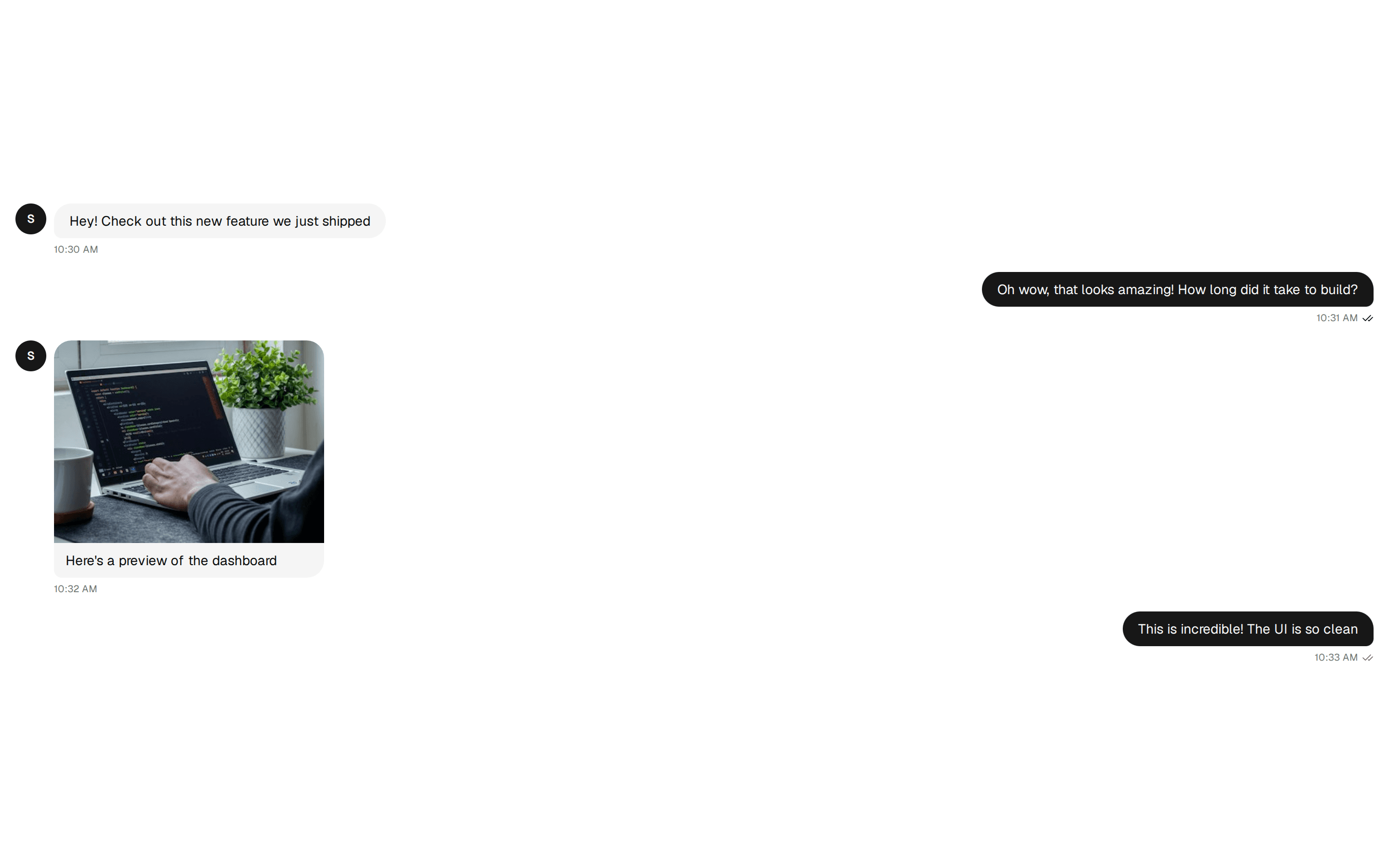
 * A single text message bubble for chat interfaces.
 * Displays avatar, message content, time, and delivery status.
 *
 * Features:
 * - Own/other message styling with color differentiation
 * - Avatar with image or letter fallback
 * - Delivery status indicators (sent, delivered, read)
 * - Time display
 *
 * @component
 * @example
 * ```tsx
 * <MessageBubble
 *   data={{
 *     content: "Hey! How are you?",
 *     avatarUrl: "https://example.com/avatar.jpg",
 *     avatarFallback: "J",
 *     time: "10:30 AM"
 *   }}
 *   appearance={{ isOwn: false }}
 *   control={{ status: "read" }}
 * />
 * ```
 */
export function MessageBubble({
  data,
  appearance,
  control
}: MessageBubbleProps) {
  const resolved: NonNullable<MessageBubbleProps['data']> = data ?? demoTextMessages[0]
  const content = resolved.content
  const avatarFallback = resolved.avatarFallback
  const avatarUrl = resolved.avatarUrl
  const time = resolved.time
  const { isOwn = false } = appearance ?? {}
  const { status } = control ?? {}
  return (
    <div className={cn('flex gap-2', isOwn && 'flex-row-reverse')}>
      {!isOwn && avatarFallback && <Avatar src={avatarUrl} fallback={avatarFallback} />}
      <div className={cn('max-w-[75%]', isOwn && 'items-end')}>
        {content && (
          <div
            className={cn(
              'rounded-2xl px-4 py-2',
              isOwn
                ? 'bg-primary text-primary-foreground rounded-br-md'
                : 'bg-muted rounded-bl-md'
            )}
          >
            <p className="text-sm">{content}</p>
          </div>
        )}
        <div
          className={cn('flex items-center gap-1 mt-1', isOwn && 'justify-end')}
        >
          {time && <span className="text-[10px] text-muted-foreground">{time}</span>}
          {isOwn && status && (
            <span className="text-muted-foreground">
              {status === 'sent' && <Check className="h-3 w-3" />}
              {status === 'delivered' && <CheckCheck className="h-3 w-3" />}
              {status === 'read' && (
                <CheckCheck className="h-3 w-3 text-foreground" />
              )}
            </span>
          )}
        </div>
      </div>
    </div>
  )
}

/**
 * ═══════════════════════════════════════════════════════════════════════════
 * ImageMessageBubbleProps
 * ═══════════════════════════════════════════════════════════════════════════
 *
 * Props for configuring an image message bubble that displays a shared photo
 * with optional caption and message metadata.
 */
export interface ImageMessageBubbleProps {
  data?: {
    /** URL of the image to display. */
    image?: string
    /** Optional caption text below the image. */
    content?: string
    /** URL for the sender's avatar image. */
    avatarUrl?: string
    /** Fallback letter to display when avatar image is unavailable. */
    avatarFallback?: string
    /** Display name of the message author. */
    author?: string
    /** Time display string (e.g., "10:32 AM"). */
    time?: string
  }
  appearance?: {
    /**
     * Whether this message is from the current user.
     * @default false
     */
    isOwn?: boolean
  }
  control?: {
    /** Message delivery status indicator. */
    status?: 'sent' | 'delivered' | 'read'
  }
}

/**
 * An image message bubble for sharing photos in chat.
 * Displays an image with optional caption and message metadata.
 *
 * Features:
 * - Image display with max width constraint
 * - Optional caption below image
 * - Own/other message styling
 * - Avatar and delivery status support
 *
 * @component
 * @example
 * ```tsx
 * <ImageMessageBubble
 *   data={{
 *     image: "https://example.com/photo.jpg",
 *     content: "Check this out!",
 *     avatarFallback: "J",
 *     time: "10:32 AM"
 *   }}
 *   appearance={{ isOwn: false }}
 * />
 * ```
 */
export function ImageMessageBubble({
  data,
  appearance,
  control
}: ImageMessageBubbleProps) {
  const resolved: NonNullable<ImageMessageBubbleProps['data']> = data ?? demoImageMessages[0]
  const image = resolved.image
  const content = resolved.content
  const avatarFallback = resolved.avatarFallback
  const avatarUrl = resolved.avatarUrl
  const time = resolved.time
  const { isOwn = false } = appearance ?? {}
  const { status } = control ?? {}
  return (
    <div className={cn('flex gap-2', isOwn && 'flex-row-reverse')}>
      {!isOwn && avatarFallback && <Avatar src={avatarUrl} fallback={avatarFallback} />}
      <div className={cn('max-w-[75%]', isOwn && 'items-end')}>
        {image && (
          <div
            className={cn(
              'rounded-2xl overflow-hidden',
              isOwn ? 'rounded-br-md' : 'rounded-bl-md'
            )}
          >
            <img
              src={image}
              alt={content || 'Shared image in chat'}
              className="w-full max-w-[280px] h-auto object-cover"
            />
            {content && (
              <div
                className={cn(
                  'px-3 py-2',
                  isOwn ? 'bg-primary text-primary-foreground' : 'bg-muted'
                )}
              >
                <p className="text-sm">{content}</p>
              </div>
            )}
          </div>
        )}
        <div
          className={cn('flex items-center gap-1 mt-1', isOwn && 'justify-end')}
        >
          {time && <span className="text-[10px] text-muted-foreground">{time}</span>}
          {isOwn && status && (
            <span className="text-muted-foreground">
              {status === 'sent' && <Check className="h-3 w-3" />}
              {status === 'delivered' && <CheckCheck className="h-3 w-3" />}
              {status === 'read' && (
                <CheckCheck className="h-3 w-3 text-foreground" />
              )}
            </span>
          )}
        </div>
      </div>
    </div>
  )
}

/**
 * ═══════════════════════════════════════════════════════════════════════════
 * MessageWithReactionsProps
 * ═══════════════════════════════════════════════════════════════════════════
 *
 * Props for configuring a message bubble with emoji reaction support,
 * allowing users to add, toggle, and view reactions on messages.
 */
export interface MessageWithReactionsProps {
  data?: {
    /** Message text content to display. */
    content?: string
    /** URL for the sender's avatar image. */
    avatarUrl?: string
    /** Fallback letter to display when avatar image is unavailable. */
    avatarFallback?: string
    /** Display name of the message author. */
    author?: string
    /** Time display string (e.g., "2:45 PM"). */
    time?: string
    /** Array of reactions with emoji and count. */
    reactions?: { emoji: string; count: number }[]
  }
  actions?: {
    /** Called when the user adds or toggles a reaction emoji. */
    onReact?: (emoji: string) => void
  }
  appearance?: {
    /**
     * Whether this message is from the current user.
     * @default false
     */
    isOwn?: boolean
  }
}

/**
 * Available emoji options for reactions.
 * @constant
 */
const availableEmojis = [
  '❤️',
  '👍',
  '👎',
  '😂',
  '😮',
  '😢',
  '🎉',
  '🔥',
  '👏',
  '💯'
]

/**
 * A message bubble with emoji reaction support.
 * Allows users to add, toggle, and view reactions on messages.
 *
 * Features:
 * - Emoji reaction picker dropdown
 * - Toggle reactions on/off
 * - Reaction count display
 * - Highlighted user's own reactions
 * - Full reaction emoji set
 *
 * @component
 * @example
 * ```tsx
 * <MessageWithReactions
 *   data={{
 *     content: "This is great news! 🎉",
 *     avatarFallback: "A",
 *     time: "2:45 PM",
 *     reactions: [{ emoji: "❤️", count: 3 }, { emoji: "👍", count: 2 }]
 *   }}
 *   actions={{
 *     onReact: (emoji) => console.log("Reacted with:", emoji)
 *   }}
 *   appearance={{ isOwn: false }}
 * />
 * ```
 */
export function MessageWithReactions({
  data,
  actions,
  appearance
}: MessageWithReactionsProps) {
  const resolved: NonNullable<MessageWithReactionsProps['data']> = data ?? demoReactionMessage
  const content = resolved.content
  const avatarFallback = resolved.avatarFallback
  const avatarUrl = resolved.avatarUrl
  const time = resolved.time
  const initialReactions = resolved.reactions ?? []
  const { onReact } = actions ?? {}
  const { isOwn = false } = appearance ?? {}
  const [reactions, setReactions] = useState(initialReactions)
  // Track which emojis the current user has reacted with
  const [userReactions, setUserReactions] = useState<Set<string>>(new Set())

  const handleReact = (emoji: string) => {
    const hasUserReacted = userReactions.has(emoji)
    const existingIndex = reactions.findIndex((r) => r.emoji === emoji)

    if (hasUserReacted) {
      // User already reacted - toggle off (decrement)
      if (existingIndex >= 0) {
        const updated = [...reactions]
        if (updated[existingIndex].count <= 1) {
          // Remove reaction entirely if count would become 0
          updated.splice(existingIndex, 1)
        } else {
          updated[existingIndex] = {
            ...updated[existingIndex],
            count: updated[existingIndex].count - 1
          }
        }
        setReactions(updated)
      }
      // Remove from user's reactions
      setUserReactions((prev) => {
        const next = new Set(prev)
        next.delete(emoji)
        return next
      })
    } else {
      // User hasn't reacted - add reaction
      if (existingIndex >= 0) {
        const updated = [...reactions]
        updated[existingIndex] = {
          ...updated[existingIndex],
          count: updated[existingIndex].count + 1
        }
        setReactions(updated)
      } else {
        setReactions([...reactions, { emoji, count: 1 }])
      }
      // Add to user's reactions
      setUserReactions((prev) => new Set(prev).add(emoji))
    }
    onReact?.(emoji)
  }

  return (
    <div className={cn('flex gap-2', isOwn && 'flex-row-reverse')}>
      {!isOwn && avatarFallback && <Avatar src={avatarUrl} fallback={avatarFallback} />}
      <div className={cn('max-w-[75%]', isOwn && 'items-end')}>
        {content && (
          <div
            className={cn(
              'rounded-2xl px-4 py-2',
              isOwn
                ? 'bg-primary text-primary-foreground rounded-br-md'
                : 'bg-muted rounded-bl-md'
            )}
          >
            <p className="text-sm">{content}</p>
          </div>
        )}
        <div
          className={cn(
            'flex items-center gap-1 mt-1.5',
            isOwn ? 'justify-end' : 'justify-start'
          )}
        >
          {reactions && reactions.length > 0 && (
            <>
              {reactions.map((reaction, index) => (
                <button
                  key={index}
                  onClick={() => handleReact(reaction.emoji)}
                  aria-label={`${userReactions.has(reaction.emoji) ? 'Remove' : 'Add'} ${reaction.emoji} reaction, ${reaction.count} ${reaction.count === 1 ? 'reaction' : 'reactions'}`}
                  className={cn(
                    'inline-flex items-center gap-0.5 rounded-full px-1.5 py-0.5 text-xs transition-colors cursor-pointer',
                    userReactions.has(reaction.emoji)
                      ? 'bg-primary/15 border border-primary/50'
                      : 'bg-card border hover:bg-muted'
                  )}
                >
                  {reaction.emoji}
                  <span
                    className={cn(
                      userReactions.has(reaction.emoji)
                        ? 'text-primary'
                        : 'text-muted-foreground'
                    )}
                  >
                    {reaction.count}
                  </span>
                </button>
              ))}
            </>
          )}
          <DropdownMenu>
            <DropdownMenuTrigger asChild>
              <button
                aria-label="Add reaction"
                className="inline-flex items-center justify-center h-6 w-6 bg-card border rounded-full hover:bg-muted transition-colors cursor-pointer"
              >
                <Smile className="h-3.5 w-3.5 text-muted-foreground" />
              </button>
            </DropdownMenuTrigger>
            <DropdownMenuContent align="start" className="p-2">
              <div className="grid grid-cols-5 gap-1">
                {availableEmojis.map((emoji) => (
                  <button
                    key={emoji}
                    onClick={() => handleReact(emoji)}
                    aria-label={`React with ${emoji}`}
                    className="h-8 w-8 flex items-center justify-center text-lg hover:bg-muted rounded transition-colors cursor-pointer"
                  >
                    {emoji}
                  </button>
                ))}
              </div>
            </DropdownMenuContent>
          </DropdownMenu>
        </div>
        <div
          className={cn('flex items-center gap-1 mt-1', isOwn && 'justify-end')}
        >
          {time && <span className="text-[10px] text-muted-foreground">{time}</span>}
        </div>
      </div>
    </div>
  )
}

/**
 * ═══════════════════════════════════════════════════════════════════════════
 * VoiceMessageBubbleProps
 * ═══════════════════════════════════════════════════════════════════════════
 *
 * Props for configuring a voice/audio message bubble with playback controls,
 * progress bar, and duration display.
 */
export interface VoiceMessageBubbleProps {
  data?: {
    /** Total duration display string (e.g., "0:42"). */
    duration?: string
    /** URL for the sender's avatar image. */
    avatarUrl?: string
    /** Fallback letter to display when avatar image is unavailable. */
    avatarFallback?: string
    /** Display name of the message author. */
    author?: string
    /** Time display string (e.g., "3:15 PM"). */
    time?: string
    /** URL of the audio file to play. */
    audioSrc?: string
  }
  appearance?: {
    /**
     * Whether this message is from the current user.
     * @default false
     */
    isOwn?: boolean
  }
  control?: {
    /** Message delivery status indicator. */
    status?: 'sent' | 'delivered' | 'read'
  }
}

/**
 * A voice/audio message bubble with playback controls.
 * Allows users to play, pause, and see progress of audio messages.
 *
 * Features:
 * - Play/pause button with icon toggle
 * - Progress bar showing playback position
 * - Duration and current time display
 * - Own/other message styling
 * - Delivery status indicators
 *
 * @component
 * @example
 * ```tsx
 * <VoiceMessageBubble
 *   data={{
 *     duration: "0:42",
 *     audioSrc: "https://example.com/audio.mp3",
 *     avatarFallback: "M",
 *     time: "3:15 PM"
 *   }}
 *   appearance={{ isOwn: false }}
 *   control={{ status: "delivered" }}
 * />
 * ```
 */
export function VoiceMessageBubble({
  data,
  appearance,
  control
}: VoiceMessageBubbleProps) {
  const resolved: NonNullable<VoiceMessageBubbleProps['data']> = data ?? demoVoiceMessage
  const duration = resolved.duration
  const avatarFallback = resolved.avatarFallback
  const avatarUrl = resolved.avatarUrl
  const time = resolved.time
  const audioSrc = resolved.audioSrc
  const { isOwn = false } = appearance ?? {}
  const { status } = control ?? {}
  const [isPlaying, setIsPlaying] = useState(false)
  const [progress, setProgress] = useState(0)
  const [currentTime, setCurrentTime] = useState('0:00')
  const audioRef = useRef<HTMLAudioElement>(null)

  const togglePlay = () => {
    if (audioRef.current) {
      if (isPlaying) {
        audioRef.current.pause()
      } else {
        audioRef.current.play()
      }
      setIsPlaying(!isPlaying)
    }
  }

  const handleTimeUpdate = () => {
    if (audioRef.current) {
      const current = audioRef.current.currentTime
      const total = audioRef.current.duration || 1
      setProgress((current / total) * 100)
      const mins = Math.floor(current / 60)
      const secs = Math.floor(current % 60)
      setCurrentTime(`${mins}:${secs.toString().padStart(2, '0')}`)
    }
  }

  const handleEnded = () => {
    setIsPlaying(false)
    setProgress(0)
    setCurrentTime('0:00')
  }

  return (
    <div className={cn('flex gap-2', isOwn && 'flex-row-reverse')}>
      <audio
        ref={audioRef}
        src={audioSrc}
        onTimeUpdate={handleTimeUpdate}
        onEnded={handleEnded}
        preload="metadata"
      />
      {!isOwn && avatarFallback && <Avatar src={avatarUrl} fallback={avatarFallback} />}
      <div className={cn('max-w-[75%]', isOwn && 'items-end')}>
        <div
          className={cn(
            'rounded-2xl px-4 py-3 flex items-center gap-3',
            isOwn
              ? 'bg-primary text-primary-foreground rounded-br-md'
              : 'bg-muted rounded-bl-md'
          )}
        >
          <button
            onClick={togglePlay}
            aria-label={isPlaying ? 'Pause voice message' : 'Play voice message'}
            className={cn(
              'h-8 w-8 rounded-full flex items-center justify-center shrink-0 transition-colors cursor-pointer',
              isOwn
                ? 'bg-primary-foreground/20 hover:bg-primary-foreground/30'
                : 'bg-foreground/10 hover:bg-foreground/20'
            )}
          >
            {isPlaying ? (
              <svg className="h-4 w-4" viewBox="0 0 24 24" fill="currentColor">
                <path d="M6 4h4v16H6V4zm8 0h4v16h-4V4z" />
              </svg>
            ) : (
              <svg
                className="h-4 w-4 ml-0.5"
                viewBox="0 0 24 24"
                fill="currentColor"
              >
                <path d="M8 5v14l11-7z" />
              </svg>
            )}
          </button>
          <div className="flex-1 flex items-center gap-2">
            <div className="flex-1 h-1 bg-current/20 rounded-full overflow-hidden">
              <div
                className="h-full bg-current rounded-full transition-all duration-100"
                style={{ width: `${progress || 33}%` }}
              />
            </div>
            <span className="text-xs font-medium">
              {isPlaying ? currentTime : (duration ?? '0:00')}
            </span>
          </div>
        </div>
        <div
          className={cn('flex items-center gap-1 mt-1', isOwn && 'justify-end')}
        >
          {time && <span className="text-[10px] text-muted-foreground">{time}</span>}
          {isOwn && status && (
            <span className="text-muted-foreground">
              {status === 'sent' && <Check className="h-3 w-3" />}
              {status === 'delivered' && <CheckCheck className="h-3 w-3" />}
              {status === 'read' && (
                <CheckCheck className="h-3 w-3 text-foreground" />
              )}
            </span>
          )}
        </div>
      </div>
    </div>
  )
}