Content 11
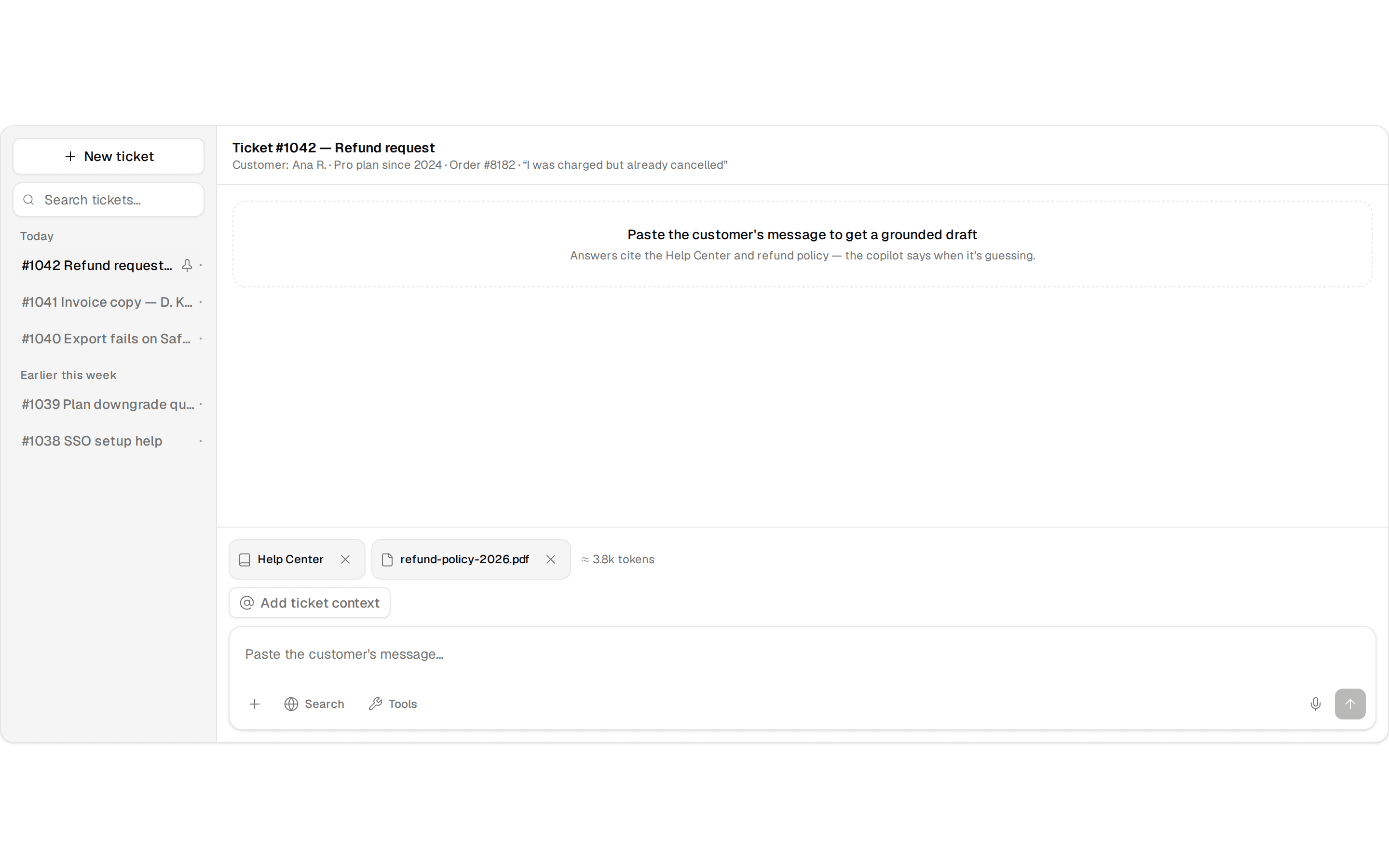
A billing overview split with a dashboard preview card and two feature highlights, built for the app-shell preset.
@flx
A billing overview split with a dashboard preview card and two feature highlights, built for the app-shell preset.
@flx
'use client'

import * as React from 'react'
import { icons } from 'lucide-react'
import { motion, useReducedMotion, type Variants } from 'motion/react'
import Balancer from 'react-wrap-balancer'

import { cn } from '@/lib/utils'

import { Icon } from '../../shared/dynamic-icon'
import { DashboardDemo } from './dashboard-demo'

export interface Content11Feature {
  icon: string
  title: string
  description: string
}

export interface Content11Props {
  title: string
  description?: string
  feature1: Content11Feature
  feature2: Content11Feature
  media?: React.ReactNode
  variant?: 'standard' | 'compact'
  animation?: 'none' | 'subtle'
}

const variantStyles = {
  standard: {
    section: 'py-16 sm:py-24',
    grid: 'gap-10 lg:gap-14',
    title: 'text-2xl sm:text-3xl',
    description: 'max-w-sm text-sm sm:text-base',
    header: 'gap-4',
    frame: 'h-72 sm:h-80 lg:h-[22rem]',
    peek: 'absolute top-6 left-6 w-[125%] max-w-none overflow-hidden rounded-2xl',
    features: 'gap-4 sm:gap-5',
    featureCard: 'gap-2 p-6',
    icon: 'size-5',
  },
  compact: {
    section: 'py-12 sm:py-16',
    grid: 'gap-8 lg:gap-10',
    title: 'text-xl sm:text-2xl',
    description: 'max-w-xs text-sm',
    header: 'gap-3',
    frame: 'h-60 sm:h-64 lg:h-72',
    peek: 'absolute top-4 left-4 w-[120%] max-w-none overflow-hidden rounded-xl',
    features: 'gap-3 sm:gap-4',
    featureCard: 'gap-2 p-5',
    icon: 'size-4',
  },
} as const

const container: Variants = {
  hidden: {},
  visible: { transition: { staggerChildren: 0.1, delayChildren: 0.05 } },
}

const item: Variants = {
  hidden: { opacity: 0, y: 12, filter: 'blur(6px)' },
  visible: {
    opacity: 1,
    y: 0,
    filter: 'blur(0px)',
    transition: { duration: 0.5, ease: [0.22, 1, 0.36, 1] },
  },
}

const mediaItem: Variants = {
  hidden: { opacity: 0, scale: 0.97, filter: 'blur(8px)' },
  visible: {
    opacity: 1,
    scale: 1,
    filter: 'blur(0px)',
    transition: { duration: 0.6, ease: [0.22, 1, 0.36, 1] },
  },
}

function FeatureCard({
  feature,
  animate,
  className,
  iconClassName,
}: Readonly<{
  feature: Content11Feature
  animate: boolean
  className: string
  iconClassName: string
}>) {
  const cardClassName = cn(
    'bg-secondary/70 dark:bg-secondary/30 flex h-full flex-col rounded-3xl',
    className,
  )

  const content = (
    <>
      {feature.icon && (
        <Icon
          name={feature.icon as keyof typeof icons}
          className={cn('text-foreground', iconClassName)}
        />
      )}
      <h3 className="text-foreground text-sm font-semibold">{feature.title}</h3>
      <p className="text-muted-foreground text-sm leading-relaxed">
        <Balancer>{feature.description}</Balancer>
      </p>
    </>
  )

  if (!animate) return <div className={cardClassName}>{content}</div>

  return (
    <motion.div variants={item} className={cardClassName}>
      {content}
    </motion.div>
  )
}

function Reveal({
  active,
  variants,
  className,
  children,
}: Readonly<{
  active: boolean
  variants?: Variants
  className?: string
  children: React.ReactNode
}>) {
  if (!active) return <div className={className}>{children}</div>

  return (
    <motion.div variants={variants ?? item} className={className}>
      {children}
    </motion.div>
  )
}

export function Content11({
  title,
  description,
  feature1,
  feature2,
  media = <DashboardDemo />,
  variant = 'standard',
  animation = 'none',
}: Readonly<Content11Props>) {
  const reduce = useReducedMotion()
  const animate = animation === 'subtle' && !reduce
  const vs = variantStyles[variant]

  const titleElement = title && (
    <h2
      className={cn(
        'text-foreground font-semibold tracking-tight text-balance',
        vs.title,
      )}
    >
      <Balancer>{title}</Balancer>
    </h2>
  )

  const descriptionElement = description && (
    <p className={cn('text-muted-foreground', vs.description)}>
      <Balancer>{description}</Balancer>
    </p>
  )

  const mediaElement = media && (
    <div
      className={cn(
        'bg-secondary/70 dark:bg-secondary/30 relative w-full overflow-hidden rounded-3xl',
        vs.frame,
      )}
    >
      <div className={cn(vs.peek, '*:w-full')}>{media}</div>
    </div>
  )

  const feature1Element = feature1 && (
    <FeatureCard
      feature={feature1}
      animate={animate}
      className={vs.featureCard}
      iconClassName={vs.icon}
    />
  )

  const feature2Element = feature2 && (
    <FeatureCard
      feature={feature2}
      animate={animate}
      className={vs.featureCard}
      iconClassName={vs.icon}
    />
  )

  const featuresElement = (
    <div className={cn('flex flex-col', vs.features)}>
      {feature1Element}
      {feature2Element}
    </div>
  )

  return (
    <section className="bg-background w-full">
      <motion.div
        className={cn(
          'mx-auto flex max-w-6xl flex-col px-6',
          vs.section,
          vs.grid,
        )}
        variants={animate ? container : undefined}
        initial={animate ? 'hidden' : false}
        whileInView={animate ? 'visible' : undefined}
        viewport={{ once: true, margin: '-80px' }}
      >
        <Reveal
          active={animate}
          className={cn('flex max-w-xl flex-col', vs.header)}
        >
          {titleElement}
          {descriptionElement}
        </Reveal>

        <div className="grid grid-cols-1 items-stretch gap-8 lg:grid-cols-[1.4fr_1fr] lg:gap-6">
          <Reveal active={animate} variants={mediaItem}>
            {mediaElement}
          </Reveal>
          {featuresElement}
        </div>
      </motion.div>
    </section>
  )
}