Pricing
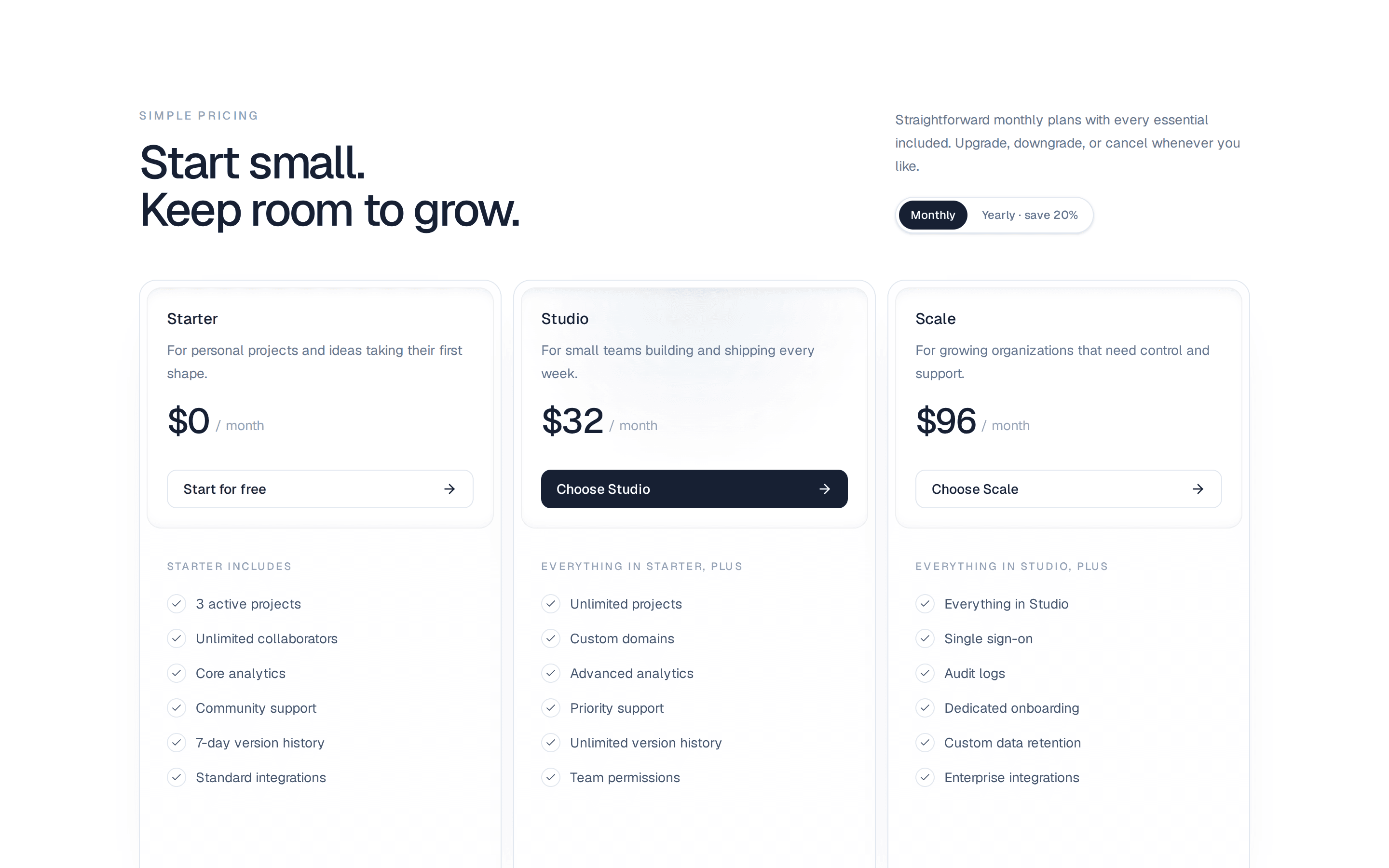
A pricing section with plan cards, a featured plan and an optional monthly or yearly billing switch.
@corsair-ui
A pricing section with plan cards, a featured plan and an optional monthly or yearly billing switch.
@corsair-ui
registry/default/components/blocks/pricing.tsx
"use client";

import { CheckIcon } from "lucide-react";
import { isValidElement, useState, type ComponentProps, type ReactNode } from "react";
import { cn } from "@/registry/default/lib/utils";
import { Badge } from "@/registry/default/ui/badge";
import { Button } from "@/registry/default/ui/button";
import {
  Card,
  CardContent,
  CardDescription,
  CardFooter,
  CardHeader,
} from "@/registry/default/ui/card";
import { ToggleGroup, ToggleGroupItem } from "@/registry/default/ui/toggle-group";

type PricingBilling = "monthly" | "yearly";

/** A value that is either the same for both billing periods or differs per period. */
type PricingValue = ReactNode | { monthly: ReactNode; yearly: ReactNode };

interface PricingPlan {
  /** Used as the React key; falls back to the index. */
  id?: string;
  name: ReactNode;
  description?: ReactNode;
  /** One price, or `{ monthly, yearly }` to show the billing switch. Pass formatted strings. */
  price: PricingValue;
  /** Shown after the price in muted text, e.g. "/month". */
  period?: PricingValue;
  features: ReactNode[];
  action?: { label: ReactNode; href: string };
  /** Highlights the plan with a ring and a solid action button. */
  featured?: boolean;
  /** Small label next to the plan name, e.g. "Most popular". */
  badge?: ReactNode;
}

interface PricingProps extends Omit<ComponentProps<"section">, "title"> {
  eyebrow?: ReactNode;
  title?: ReactNode;
  description?: ReactNode;
  plans?: PricingPlan[];
  /** The billing period shown (controlled). */
  billing?: PricingBilling;
  /** The billing period shown first (uncontrolled). Defaults to "monthly". */
  defaultBilling?: PricingBilling;
  onBillingChange?: (billing: PricingBilling) => void;
  monthlyLabel?: ReactNode;
  yearlyLabel?: ReactNode;
  /** Accessible name of the billing switch. */
  billingLabel?: string;
  /** Shown next to the yearly label, e.g. "Save 20%". Pass `null` to hide. */
  yearlyNote?: ReactNode;
}

const DEFAULT_PLANS: PricingPlan[] = [
  {
    id: "starter",
    name: "Starter",
    description: "For individuals trying things out.",
    price: { monthly: "$0", yearly: "$0" },
    period: { monthly: "/month", yearly: "/year" },
    features: ["Up to 3 projects", "Basic analytics", "Community support"],
    action: { label: "Get started", href: "#get-started" },
  },
  {
    id: "pro",
    name: "Pro",
    description: "For growing teams that need more room.",
    price: { monthly: "$12", yearly: "$120" },
    period: { monthly: "/month", yearly: "/year" },
    features: [
      "Unlimited projects",
      "Advanced analytics",
      "Shared workspaces",
      "Priority email support",
    ],
    action: { label: "Start free trial", href: "#get-started" },
    featured: true,
    badge: "Most popular",
  },
  {
    id: "enterprise",
    name: "Enterprise",
    description: "For organisations with custom needs.",
    price: "Custom",
    features: ["Everything in Pro", "Single sign-on", "Audit logs", "Dedicated account manager"],
    action: { label: "Contact sales", href: "#contact" },
  },
];

// Full class names so Tailwind picks them up.
const GRID_COLUMNS: Record<number, string> = {
  1: "mx-auto max-w-md",
  2: "mx-auto max-w-4xl md:grid-cols-2",
  3: "lg:grid-cols-3",
  4: "md:grid-cols-2 lg:grid-cols-4",
};

function isPerBilling(value: PricingValue): value is { monthly: ReactNode; yearly: ReactNode } {
  return (
    typeof value === "object" &&
    value !== null &&
    !isValidElement(value) &&
    "monthly" in value &&
    "yearly" in value
  );
}

function resolve(value: PricingValue, billing: PricingBilling): ReactNode {
  return isPerBilling(value) ? value[billing] : value;
}

/**
 * A pricing section: a centred header, an optional monthly / yearly switch
 * and one card per plan. Give a plan `price: { monthly, yearly }` (and the
 * same shape for `period`) and the switch appears above the grid; plain
 * values stay the same for both periods. Prices are shown as passed, so
 * format them for your locale and currency. The featured plan gets a ring
 * and a solid button, and its `badge` sits next to the name.
 *
 * Every string is a prop: `monthlyLabel`, `yearlyLabel`, `yearlyNote` and
 * `billingLabel` (the switch's accessible name). The billing period works
 * controlled (`billing` + `onBillingChange`) or uncontrolled
 * (`defaultBilling`), and the current one is exposed as `data-billing`.
 *
 * Accessibility: the section title is an `<h2>` and plan names are `<h3>`;
 * plans and features are lists; the switch is a radio-style toggle group
 * that cannot be cleared, reachable with Tab and the arrow keys.
 *
 * @example
 * <Pricing
 *   title="Pricing"
 *   plans={[
 *     { name: "Free", price: "$0", features: ["1 project"] },
 *     { name: "Team", price: { monthly: "$20", yearly: "$200" }, features: ["10 projects"], featured: true },
 *   ]}
 * />
 */
function Pricing({
  className,
  eyebrow = "Pricing",
  title = "Plans that grow with you",
  description = "Start for free and upgrade when your team needs more. Every plan includes a 14-day trial.",
  plans = DEFAULT_PLANS,
  billing: billingProp,
  defaultBilling = "monthly",
  onBillingChange,
  monthlyLabel = "Monthly",
  yearlyLabel = "Yearly",
  billingLabel = "Billing period",
  yearlyNote = "2 months free",
  ...props
}: PricingProps) {
  const [billingState, setBillingState] = useState<PricingBilling>(defaultBilling);
  const billing = billingProp ?? billingState;
  const hasBillingSwitch = plans.some(
    (plan) => isPerBilling(plan.price) || (plan.period !== undefined && isPerBilling(plan.period))
  );
  const hasHeader = eyebrow != null || title != null || description != null;

  function handleBillingChange(value: string) {
    // A single toggle group can be cleared by pressing the active item; keep one selected.
    if (value !== "monthly" && value !== "yearly") return;
    if (billingProp === undefined) setBillingState(value);
    onBillingChange?.(value);
  }

  return (
    <section
      data-slot="pricing"
      data-billing={billing}
      className={cn("py-16 sm:py-24", className)}
      {...props}
    >
      <div data-slot="pricing-container" className="mx-auto w-full max-w-6xl px-4 sm:px-6">
        {hasHeader ? (
          <div data-slot="pricing-header" className="mx-auto max-w-2xl text-center">
            {eyebrow != null ? (
              <p data-slot="pricing-eyebrow" className="text-muted-foreground text-sm font-medium">
                {eyebrow}
              </p>
            ) : null}
            {title != null ? (
              <h2
                data-slot="pricing-title"
                className={cn(
                  "text-3xl font-semibold tracking-tight text-balance sm:text-4xl",
                  eyebrow != null && "mt-2"
                )}
              >
                {title}
              </h2>
            ) : null}
            {description != null ? (
              <p
                data-slot="pricing-description"
                className="text-muted-foreground mt-4 text-lg text-pretty"
              >
                {description}
              </p>
            ) : null}
          </div>
        ) : null}
        <div data-slot="pricing-content" className={cn(hasHeader && "mt-12")}>
          {hasBillingSwitch ? (
            <div data-slot="pricing-billing" className="mb-10 flex justify-center">
              <ToggleGroup
                type="single"
                variant="outline"
                value={billing}
                onValueChange={handleBillingChange}
                aria-label={billingLabel}
              >
                <ToggleGroupItem value="monthly" data-slot="pricing-billing-monthly">
                  {monthlyLabel}
                </ToggleGroupItem>
                <ToggleGroupItem value="yearly" data-slot="pricing-billing-yearly">
                  {yearlyLabel}
                  {yearlyNote != null ? (
                    <span
                      data-slot="pricing-yearly-note"
                      className="bg-muted text-muted-foreground rounded px-1.5 py-0.5 text-xs"
                    >
                      {yearlyNote}
                    </span>
                  ) : null}
                </ToggleGroupItem>
              </ToggleGroup>
            </div>
          ) : null}
          <ul
            data-slot="pricing-plans"
            className={cn("grid gap-6", GRID_COLUMNS[Math.min(Math.max(plans.length, 1), 4)])}
          >
            {plans.map((plan, index) => {
              const period = plan.period === undefined ? null : resolve(plan.period, billing);
              return (
                <li key={plan.id ?? index} data-slot="pricing-plan-item" className="flex">
                  <Card
                    data-slot="pricing-plan"
                    data-featured={plan.featured ? "" : undefined}
                    className={cn("w-full", plan.featured && "border-primary ring-primary ring-2")}
                  >
                    <CardHeader>
                      <div className="flex flex-wrap items-center gap-2">
                        <h3
                          data-slot="pricing-plan-name"
                          className="text-lg leading-none font-semibold"
                        >
                          {plan.name}
                        </h3>
                        {plan.badge != null ? (
                          <Badge data-slot="pricing-plan-badge">{plan.badge}</Badge>
                        ) : null}
                      </div>
                      {plan.description != null ? (
                        <CardDescription data-slot="pricing-plan-description">
                          {plan.description}
                        </CardDescription>
                      ) : null}
                    </CardHeader>
                    <CardContent className="flex flex-1 flex-col gap-6">
                      <p data-slot="pricing-price" className="flex flex-wrap items-baseline gap-1">
                        <span className="text-4xl font-semibold tracking-tight">
                          {resolve(plan.price, billing)}
                        </span>
                        {period != null ? (
                          <span
                            data-slot="pricing-period"
                            className="text-muted-foreground text-sm"
                          >
                            {period}
                          </span>
                        ) : null}
                      </p>
                      <ul data-slot="pricing-features" className="flex flex-col gap-3 text-sm">
                        {plan.features.map((feature, featureIndex) => (
                          <li
                            key={featureIndex}
                            data-slot="pricing-feature"
                            className="flex items-start gap-2"
                          >
                            <CheckIcon
                              aria-hidden="true"
                              className="text-primary mt-0.5 size-4 shrink-0"
                            />
                            <span>{feature}</span>
                          </li>
                        ))}
                      </ul>
                    </CardContent>
                    {plan.action ? (
                      <CardFooter>
                        <Button
                          asChild
                          // "outline" is the button variant name, not the Tailwind utility.
                          // tailwind-compat-ignore-next-line
                          variant={plan.featured ? "default" : "outline"}
                          className="w-full"
                        >
                          <a data-slot="pricing-plan-action" href={plan.action.href}>
                            {plan.action.label}
                          </a>
                        </Button>
                      </CardFooter>
                    ) : null}
                  </Card>
                </li>
              );
            })}
          </ul>
        </div>
      </div>
    </section>
  );
}

export { Pricing, type PricingBilling, type PricingPlan, type PricingProps, type PricingValue };