Pricing 1: two tiers
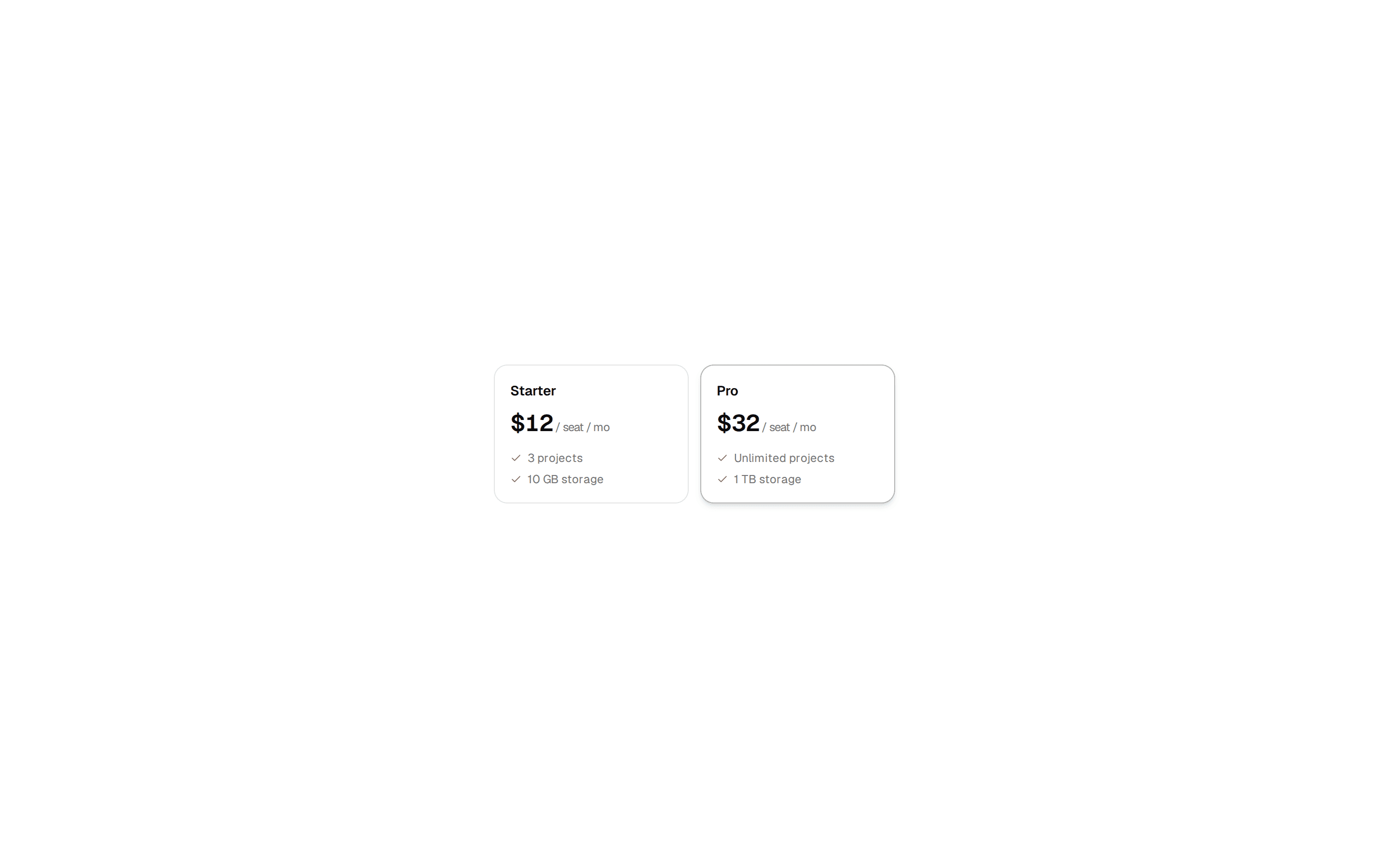
Two pricing cards side by side with included and excluded features, a highlighted plan with a border beam and badge, and small print.
@ballmac
Two pricing cards side by side with included and excluded features, a highlighted plan with a border beam and badge, and small print.
@ballmac
registry/ballmac/components/blocks/pricing-1/pricing-1.tsx
// Ballmac UI: Pricing 1. https://ui.ballmac.com/blocks/pricing-1
import * as React from "react"
import { Check, Minus } from "lucide-react"

import { Badge } from "@/components/ballmac/badge"
import { BorderBeam } from "@/components/ballmac/border-beam"
import { buttonVariants } from "@/components/ballmac/button"
import { cn } from "@/lib/utils"

type Plan = {
  name: string
  price: string
  period?: string
  description: string
  features: { label: string; included: boolean }[]
  cta: { label: string; href: string }
  featured?: boolean
}

type Pricing1Props = Omit<React.ComponentProps<"section">, "title"> & {
  /** Section heading. */
  title?: string
  /** One sentence under the heading. */
  description?: string
  /** Exactly two plans read best; the featured one gets emphasis. */
  plans?: Plan[]
  /** Small print under the plans. */
  note?: string
}

const defaults: Plan[] = [
  {
    name: "Hobby",
    price: "$0",
    description: "For side projects and trying things out.",
    features: [
      { label: "3 projects", included: true },
      { label: "Deploy previews", included: true },
      { label: "Community support", included: true },
      { label: "Performance budgets", included: false },
      { label: "Team roles", included: false },
    ],
    cta: { label: "Start free", href: "#" },
  },
  {
    name: "Pro",
    price: "$20",
    period: "per member / month",
    description: "For teams shipping to production every day.",
    features: [
      { label: "Unlimited projects", included: true },
      { label: "Deploy previews", included: true },
      { label: "Priority support", included: true },
      { label: "Performance budgets", included: true },
      { label: "Team roles", included: true },
    ],
    cta: { label: "Start 14-day trial", href: "#" },
    featured: true,
  },
]

function Pricing1({
  title = "Simple pricing that scales with you.",
  description = "Start free. Upgrade when your team does.",
  plans = defaults,
  note = "Prices in USD. Taxes may apply.",
  className,
  ...props
}: Pricing1Props) {
  return (
    <section data-slot="pricing-1" className={cn("mx-auto max-w-5xl px-4 py-20 sm:px-6 md:py-28", className)} {...props}>
      <div className="mx-auto max-w-2xl text-center">
        <h2 className="text-3xl font-semibold tracking-[-0.035em] text-balance sm:text-4xl">{title}</h2>
        <p className="mt-4 text-lg text-muted-foreground">{description}</p>
      </div>
      <div className="mt-12 grid gap-5 md:grid-cols-2">
        {plans.map((plan) => (
          <div key={plan.name} className={cn("relative flex flex-col rounded-2xl border bg-card p-8", plan.featured && "border-foreground/20 shadow-[0_30px_80px_-40px_rgb(0_0_0/0.35)]")}>
            {plan.featured && <BorderBeam duration={10} className="rounded-2xl" />}
            <div className="flex items-center justify-between gap-3">
              <h3 className="text-lg font-semibold">{plan.name}</h3>
              {plan.featured && <Badge>Most popular</Badge>}
            </div>
            <p className="mt-2 text-sm text-muted-foreground">{plan.description}</p>
            <p className="mt-6 flex items-baseline gap-2">
              <span className="text-5xl font-semibold tracking-[-0.04em]">{plan.price}</span>
              {plan.period && <span className="text-sm text-muted-foreground">{plan.period}</span>}
            </p>
            <ul className="mt-8 flex-1 space-y-3 text-sm">
              {plan.features.map((f) => (
                <li key={f.label} className={cn("flex items-start gap-3", !f.included && "text-muted-foreground")}>
                  {f.included ? <Check className="mt-0.5 size-4 shrink-0" aria-label="Included" /> : <Minus className="mt-0.5 size-4 shrink-0" aria-label="Not included" />}
                  {f.label}
                </li>
              ))}
            </ul>
            <a className={buttonVariants({ variant: plan.featured ? "default" : "outline", size: "lg", shape: "pill", className: "mt-8" })} href={plan.cta.href}>{plan.cta.label}</a>
          </div>
        ))}
      </div>
      {note && <p className="mt-8 text-center text-sm text-muted-foreground">{note}</p>}
    </section>
  )
}

export { Pricing1, type Pricing1Props }