Two Plan Split Panel
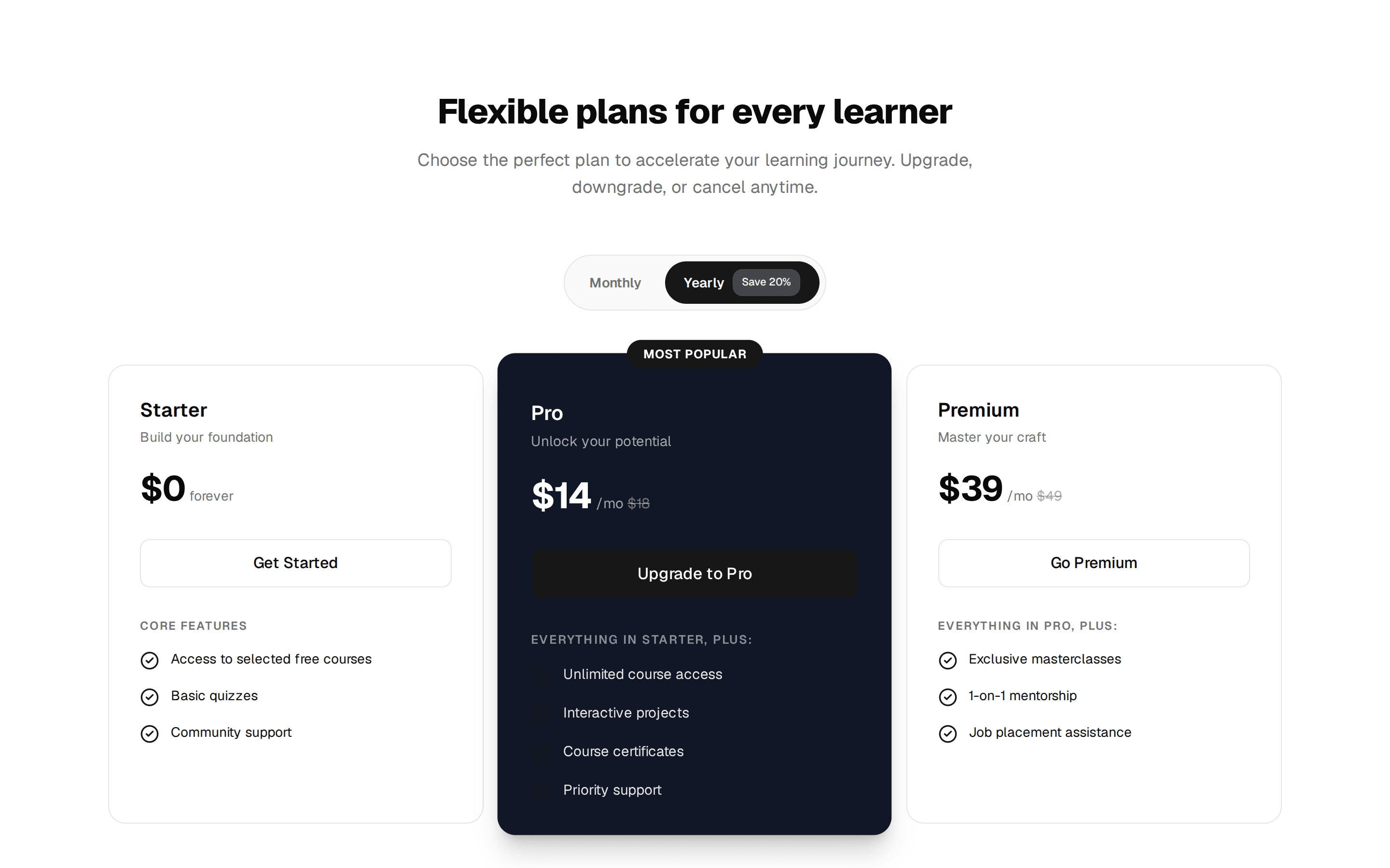
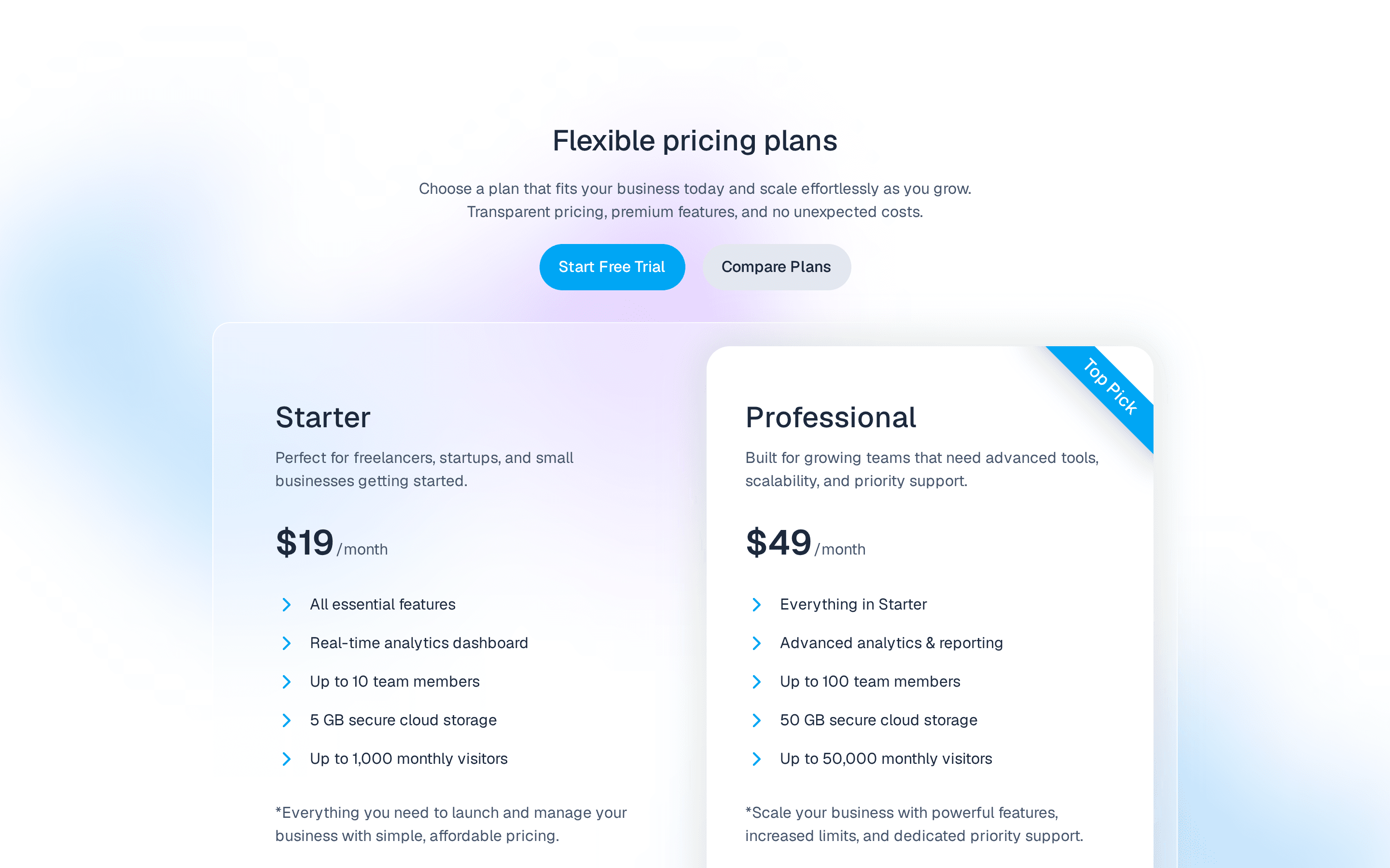
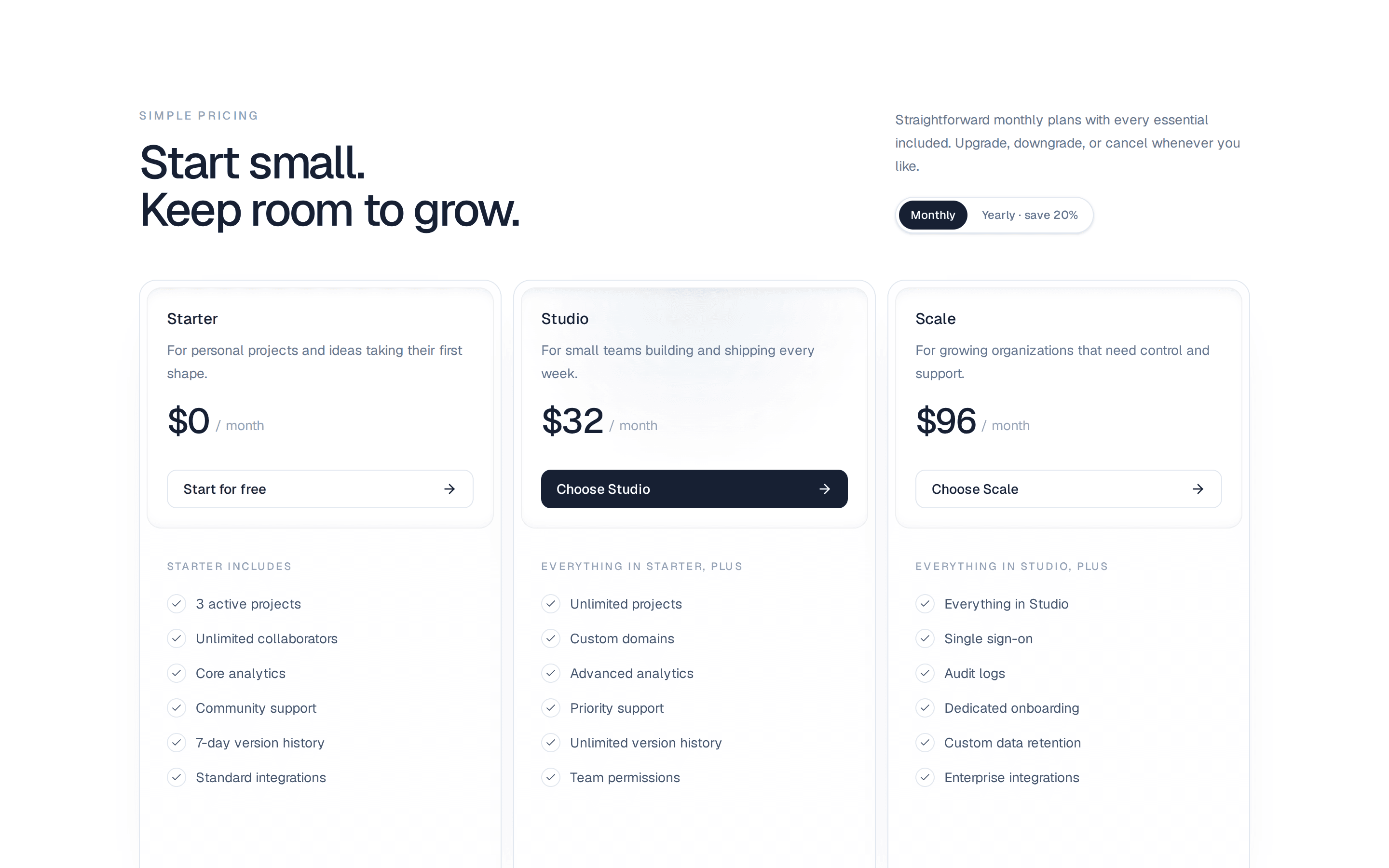
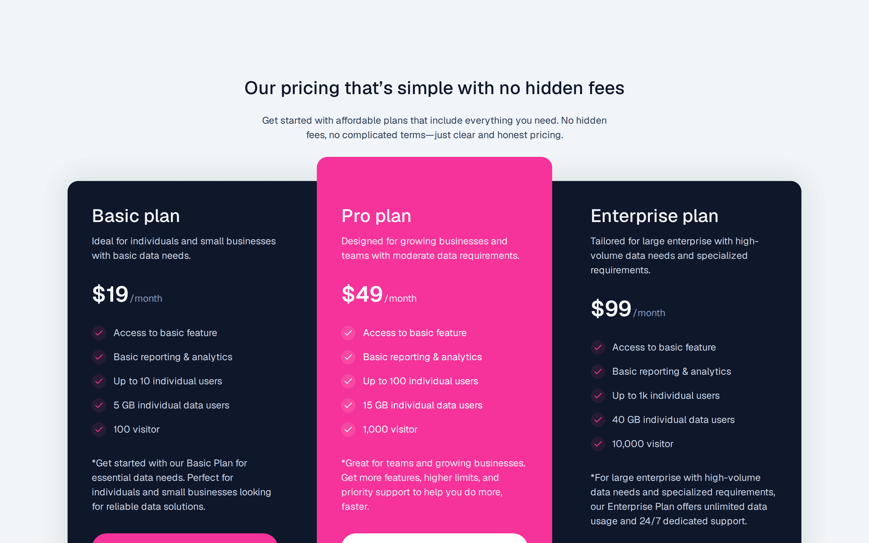
Two plan pricing split into one panel, a filled Pro side beside a plain Starter side, each with price, feature checklist, and CTA, plus a billing toggle.
@7ovr
Two plan pricing split into one panel, a filled Pro side beside a plain Starter side, each with price, feature checklist, and CTA, plus a billing toggle.
@7ovr
registry/blocks/pricing/2/pricing-block.tsx
"use client"

import * as React from "react"
import { cn } from "@/lib/utils"
import { Badge } from "@/components/ui/badge"
import { Button } from "@/components/ui/button"
import { Separator } from "@/components/ui/separator"
import { IconPlaceholder } from "@/components/icons/icon-placeholder"

const STARTER_FEATURES = [
  "1 workspace",
  "Up to 3 members",
  "5 GB storage",
  "Community support",
  "Basic analytics",
]

const PRO_FEATURES = [
  "Unlimited workspaces",
  "Up to 50 members",
  "100 GB storage",
  "Priority email support",
  "Advanced analytics",
  "Custom domain",
  "Audit logs",
]

type Billing = "monthly" | "annual"

export default function PricingBlock() {
  const [billing, setBilling] = React.useState<Billing>("monthly")
  const proPrice = billing === "annual" ? 23 : 29

  return (
    <section className="flex w-full items-center justify-center bg-background px-6 py-12 text-foreground">
      <div className="mx-auto w-full max-w-3xl">
        <div className="flex flex-col gap-4 pb-8 sm:flex-row sm:items-end sm:justify-between">
          <div className="flex flex-col gap-1">
            <p className="text-xs font-semibold tracking-widest text-muted-foreground uppercase">
              Pricing
            </p>
            <h2 className="font-heading text-2xl font-bold tracking-tight">
              Two plans. No surprises.
            </h2>
          </div>
          <div
            role="group"
            aria-label="Billing period"
            className="inline-flex items-center gap-1 self-start rounded-lg border border-border bg-muted/50 p-1 sm:self-auto"
          >
            <button
              type="button"
              onClick={() => setBilling("monthly")}
              aria-pressed={billing === "monthly"}
              className={cn(
                "rounded-md px-4 py-1.5 text-sm font-medium transition-colors",
                billing === "monthly"
                  ? "bg-background text-foreground shadow-sm"
                  : "text-muted-foreground hover:text-foreground"
              )}
            >
              Monthly
            </button>
            <button
              type="button"
              onClick={() => setBilling("annual")}
              aria-pressed={billing === "annual"}
              className={cn(
                "flex items-center gap-2 rounded-md px-4 py-1.5 text-sm font-medium transition-colors",
                billing === "annual"
                  ? "bg-background text-foreground shadow-sm"
                  : "text-muted-foreground hover:text-foreground"
              )}
            >
              Annual
              <Badge className="px-1.5 text-[10px] font-semibold">-20%</Badge>
            </button>
          </div>
        </div>

        <div className="flex flex-col overflow-hidden rounded-xl ring-1 ring-border sm:flex-row">
          <div className="flex flex-1 flex-col gap-6 bg-primary p-8 text-primary-foreground">
            <div className="flex flex-col gap-3">
              <div className="flex items-center gap-3">
                <span className="text-base font-semibold">Pro</span>
                <Badge className="border-transparent bg-primary-foreground/20 text-primary-foreground">
                  Most Popular
                </Badge>
              </div>
              <div className="flex items-baseline gap-1">
                <span className="text-5xl font-bold tracking-tight">
                  ${proPrice}
                </span>
                <span className="text-sm opacity-70">/Month</span>
              </div>
              <p className="text-sm opacity-75">
                For growing teams that ship daily and need more room to scale.
              </p>
            </div>

            <Separator className="bg-primary-foreground/20" />

            <ul className="flex flex-1 flex-col gap-3">
              {PRO_FEATURES.map((feature) => (
                <li key={feature} className="flex items-center gap-2 text-sm">
                  <IconPlaceholder
                    lucide="Check"
                    tabler="IconCheck"
                    hugeicons="Tick02Icon"
                    phosphor="Check"
                    remixicon="RiCheckLine"
                    data-icon="inline-start"
                    className="size-4 shrink-0 opacity-80"
                    aria-hidden="true"
                  />
                  {feature}
                </li>
              ))}
            </ul>

            <Button
              nativeButton={false}
              variant="secondary"
              size="lg"
              className="w-full active:scale-[0.97] transition-transform duration-[160ms] ease-[cubic-bezier(0.23,1,0.32,1)]"
              render={<a href="#" />}
            >
              Start Free Trial
              <IconPlaceholder
                lucide="ArrowRight"
                tabler="IconArrowRight"
                hugeicons="ArrowRightIcon"
                phosphor="ArrowRight"
                remixicon="RiArrowRightLine"
                data-icon="inline-end"
                aria-hidden="true"
              />
            </Button>
          </div>

          <div className="flex flex-1 flex-col gap-6 bg-card p-8">
            <div className="flex flex-col gap-3">
              <span className="text-base font-semibold">Starter</span>
              <div className="flex items-baseline gap-1">
                <span className="text-5xl font-bold tracking-tight">$0</span>
                <span className="text-sm text-muted-foreground">/Month</span>
              </div>
              <p className="text-sm text-muted-foreground">
                For individuals and side projects just getting off the ground.
              </p>
            </div>

            <Separator />

            <ul className="flex flex-1 flex-col gap-3">
              {STARTER_FEATURES.map((feature) => (
                <li
                  key={feature}
                  className="flex items-center gap-2 text-sm text-foreground"
                >
                  <IconPlaceholder
                    lucide="Check"
                    tabler="IconCheck"
                    hugeicons="Tick02Icon"
                    phosphor="Check"
                    remixicon="RiCheckLine"
                    data-icon="inline-start"
                    className="size-4 shrink-0 text-muted-foreground"
                    aria-hidden="true"
                  />
                  {feature}
                </li>
              ))}
            </ul>

            <Button
              nativeButton={false}
              variant="outline"
              size="lg"
              className="w-full active:scale-[0.97] transition-transform duration-[160ms] ease-[cubic-bezier(0.23,1,0.32,1)]"
              render={<a href="#" />}
            >
              Get Started Free
            </Button>
          </div>
        </div>

        <p className="mt-4 text-center text-xs text-muted-foreground">
          No credit card required. Upgrade or cancel anytime.
        </p>
      </div>
    </section>
  )
}
Requires a base-* style in components.json (the shadcn init default). Legacy new-york/radix-* styles install Radix primitives, which reject the render prop this block uses.