Annual Savings Toggle
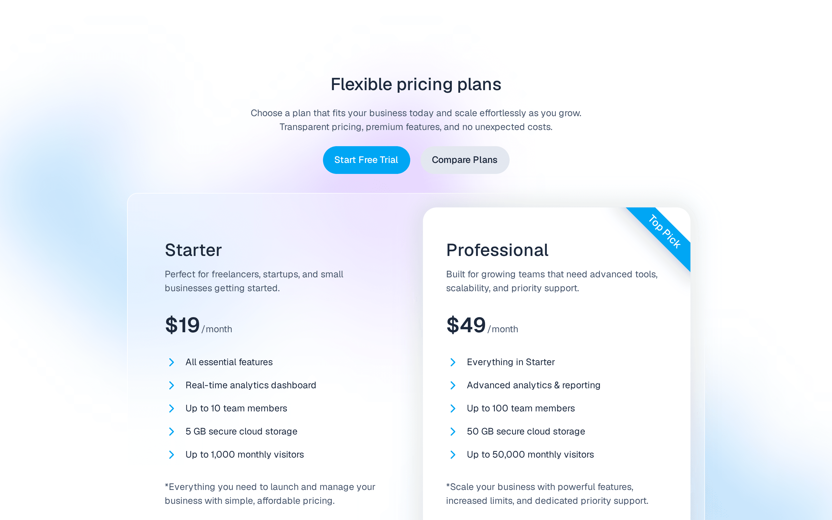
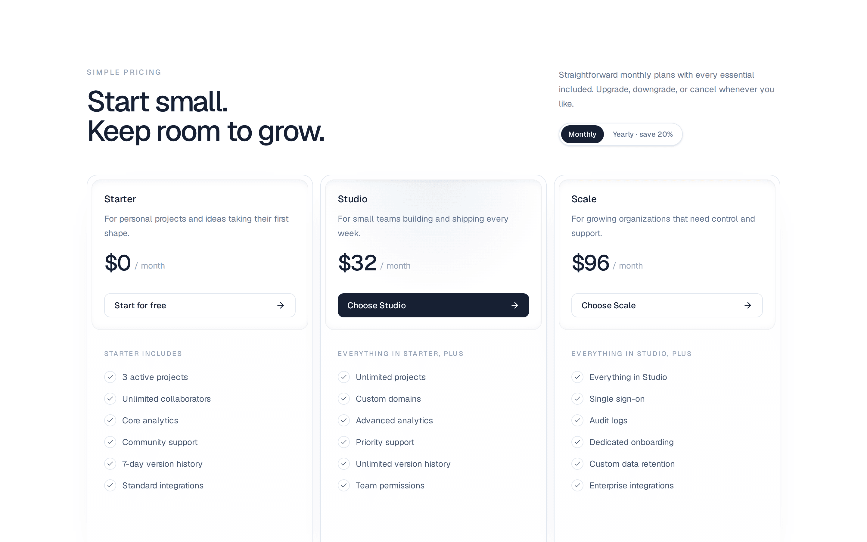
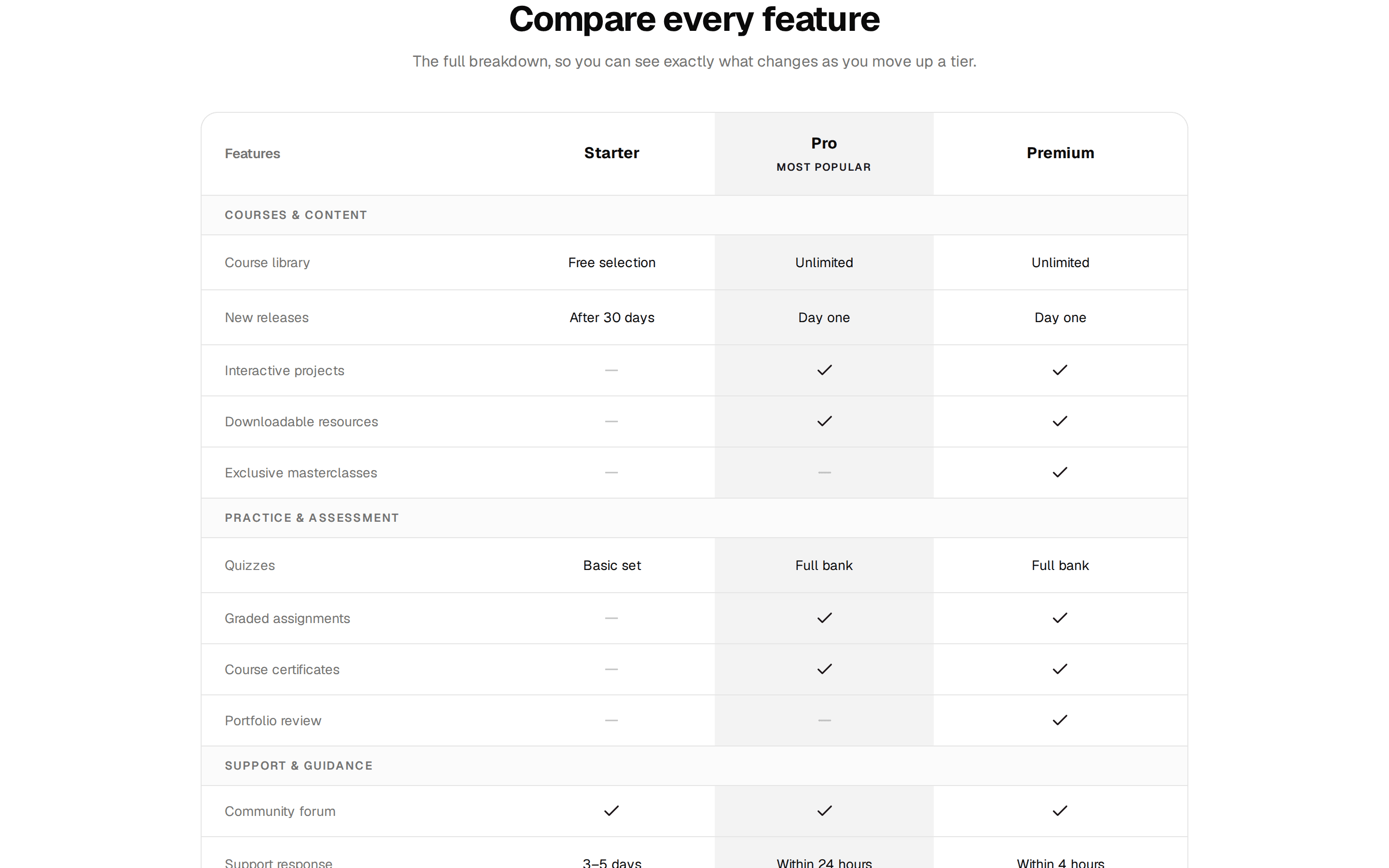
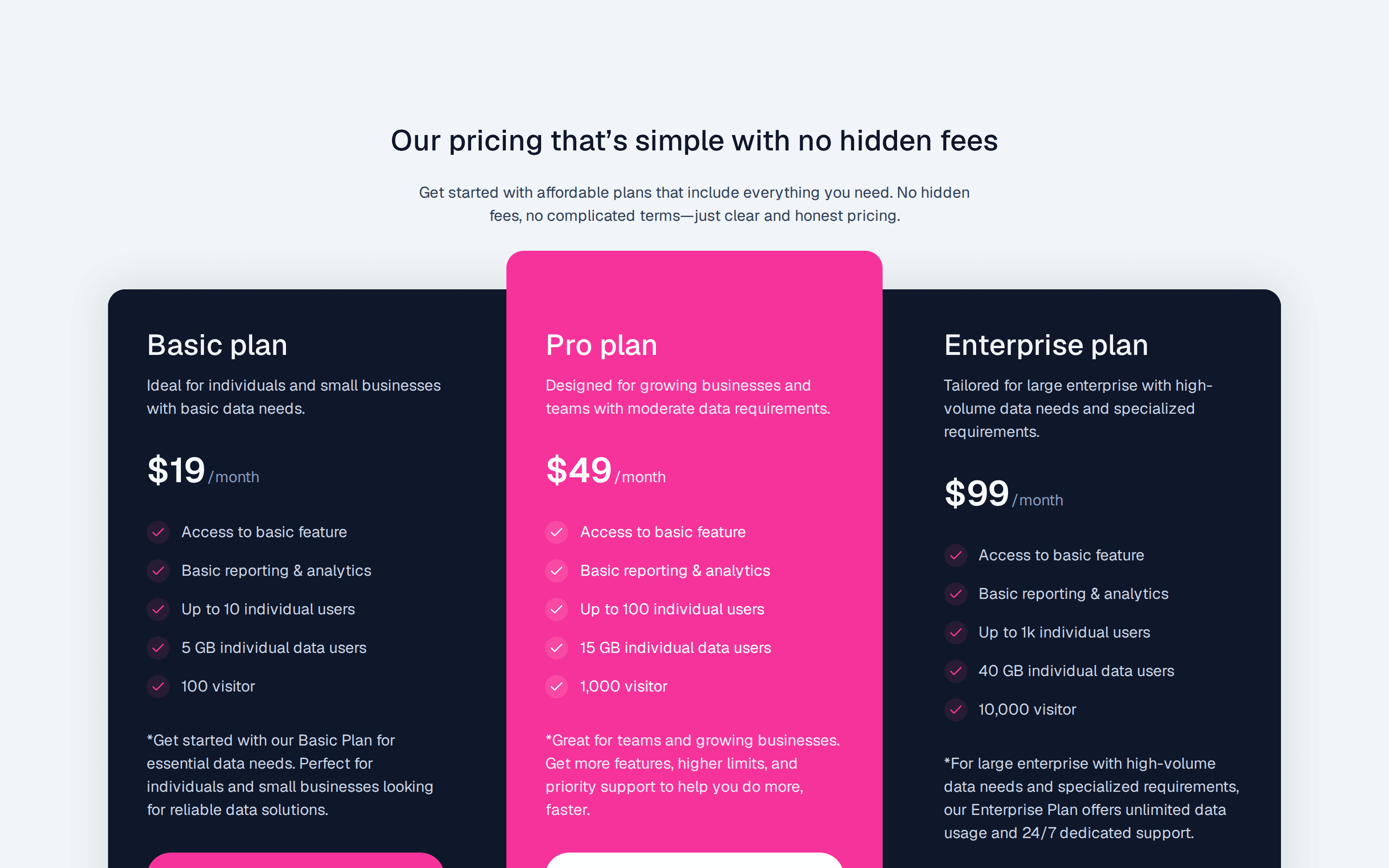
Three tier pricing grid whose monthly or annual toggle also shows the yearly billed total under each price, with a Most Popular badge on the featured tier.
@7ovr
Three tier pricing grid whose monthly or annual toggle also shows the yearly billed total under each price, with a Most Popular badge on the featured tier.
@7ovr
registry/blocks/pricing/4/pricing-block.tsx
"use client"
import { useState } from "react"
import { Badge } from "@/components/ui/badge"
import { Button } from "@/components/ui/button"
import {
Card,
CardAction,
CardContent,
CardDescription,
CardFooter,
CardHeader,
CardTitle,
} from "@/components/ui/card"
import { cn } from "@/lib/utils"
import { IconPlaceholder } from "@/components/icons/icon-placeholder"
const tiers = [
{
name: "Starter",
monthly: 0,
annual: 0,
description: "For side projects and getting started.",
features: ["Up to 3 projects", "Community support", "1 GB storage"],
cta: "Get Started",
featured: false,
},
{
name: "Pro",
monthly: 29,
annual: 24,
description: "For growing teams that ship every day.",
features: [
"Unlimited projects",
"Priority support",
"50 GB storage",
"Advanced analytics",
],
cta: "Start Free Trial",
featured: true,
},
{
name: "Enterprise",
monthly: 99,
annual: 82,
description: "For organizations with advanced needs.",
features: [
"Everything In Pro",
"Dedicated support",
"Unlimited storage",
"SSO and audit logs",
],
cta: "Contact Sales",
featured: false,
},
]
export default function PricingBlock() {
const [annual, setAnnual] = useState(false)
return (
<section className="flex w-full items-center justify-center bg-background px-6 py-16 text-foreground">
<div className="mx-auto w-full max-w-5xl">
<div className="mx-auto max-w-2xl text-center">
<Badge variant="outline" className="gap-1.5">
<IconPlaceholder
lucide="Sparkles"
tabler="IconSparkles"
hugeicons="SparklesIcon"
phosphor="Sparkle"
remixicon="RiSparklingFill"
data-icon="inline-start"
className="size-3.5 text-primary"
aria-hidden="true"
/>
Acme plans
</Badge>
<h2 className="mt-4 font-heading text-3xl font-bold tracking-tight sm:text-4xl">
Pricing that scales with you
</h2>
<p className="mt-3 text-muted-foreground">
Start for free, then upgrade when you're ready to grow. Save up
to 17% with annual billing.
</p>
</div>
<div className="mt-8 flex justify-center">
<div
role="group"
aria-label="Billing period"
className="inline-flex items-center gap-1 rounded-lg border border-border bg-muted/50 p-1"
>
<button
type="button"
onClick={() => setAnnual(false)}
aria-pressed={!annual}
className={cn(
"px-4 py-1.5 text-sm font-medium transition-colors",
!annual
? "bg-background text-foreground shadow-sm"
: "text-muted-foreground hover:text-foreground"
)}
>
Monthly
</button>
<button
type="button"
onClick={() => setAnnual(true)}
aria-pressed={annual}
className={cn(
"flex items-center gap-2 px-4 py-1.5 text-sm font-medium transition-colors",
annual
? "bg-background text-foreground shadow-sm"
: "text-muted-foreground hover:text-foreground"
)}
>
Annual
<Badge className="px-1.5 text-[10px] font-semibold">-17%</Badge>
</button>
</div>
</div>
<div className="mt-12 grid grid-cols-1 gap-6 sm:grid-cols-2 md:grid-cols-3">
{tiers.map((tier) => {
const price = annual ? tier.annual : tier.monthly
return (
<Card
key={tier.name}
className={cn(
"flex flex-col",
tier.featured && "bg-muted/30 ring-2 ring-primary"
)}
>
<CardHeader>
<CardTitle className="text-base font-semibold">
{tier.name}
</CardTitle>
{tier.featured && (
<CardAction>
<Badge className="gap-1.5">
<IconPlaceholder
lucide="Sparkles"
tabler="IconSparkles"
hugeicons="SparklesIcon"
phosphor="Sparkle"
remixicon="RiSparklingFill"
data-icon="inline-start"
className="size-3.5"
aria-hidden="true"
/>
Most popular
</Badge>
</CardAction>
)}
<CardDescription className="text-sm sm:min-h-10">
{tier.description}
</CardDescription>
</CardHeader>
<CardContent className="flex flex-1 flex-col gap-6">
<div>
<p className="flex items-baseline gap-1">
<span className="text-4xl font-bold tracking-tight text-foreground tabular-nums">
${price}
</span>
<span className="text-sm text-muted-foreground">
/Month
</span>
</p>
<p className="mt-1 h-5 text-xs text-muted-foreground">
{annual && price > 0
? `$${price * 12} billed yearly`
: " "}
</p>
</div>
<ul className="flex flex-1 flex-col gap-3 text-sm text-foreground">
{tier.features.map((feature) => (
<li key={feature} className="flex items-center gap-2">
<IconPlaceholder
lucide="Check"
tabler="IconCheck"
hugeicons="Tick02Icon"
phosphor="Check"
remixicon="RiCheckLine"
className="size-4 shrink-0 text-primary"
aria-hidden="true"
/>
{feature}
</li>
))}
</ul>
</CardContent>
<CardFooter>
<Button
nativeButton={false}
variant={tier.featured ? "default" : "outline"}
size="lg"
className="w-full active:scale-[0.97] transition-transform duration-[160ms] ease-[cubic-bezier(0.23,1,0.32,1)]"
render={<a href="#" />}
>
{tier.cta}
</Button>
</CardFooter>
</Card>
)
})}
</div>
</div>
</section>
)
}
Requires a base-* style in components.json (the shadcn init default). Legacy new-york/radix-* styles install Radix primitives, which reject the render prop this block uses.