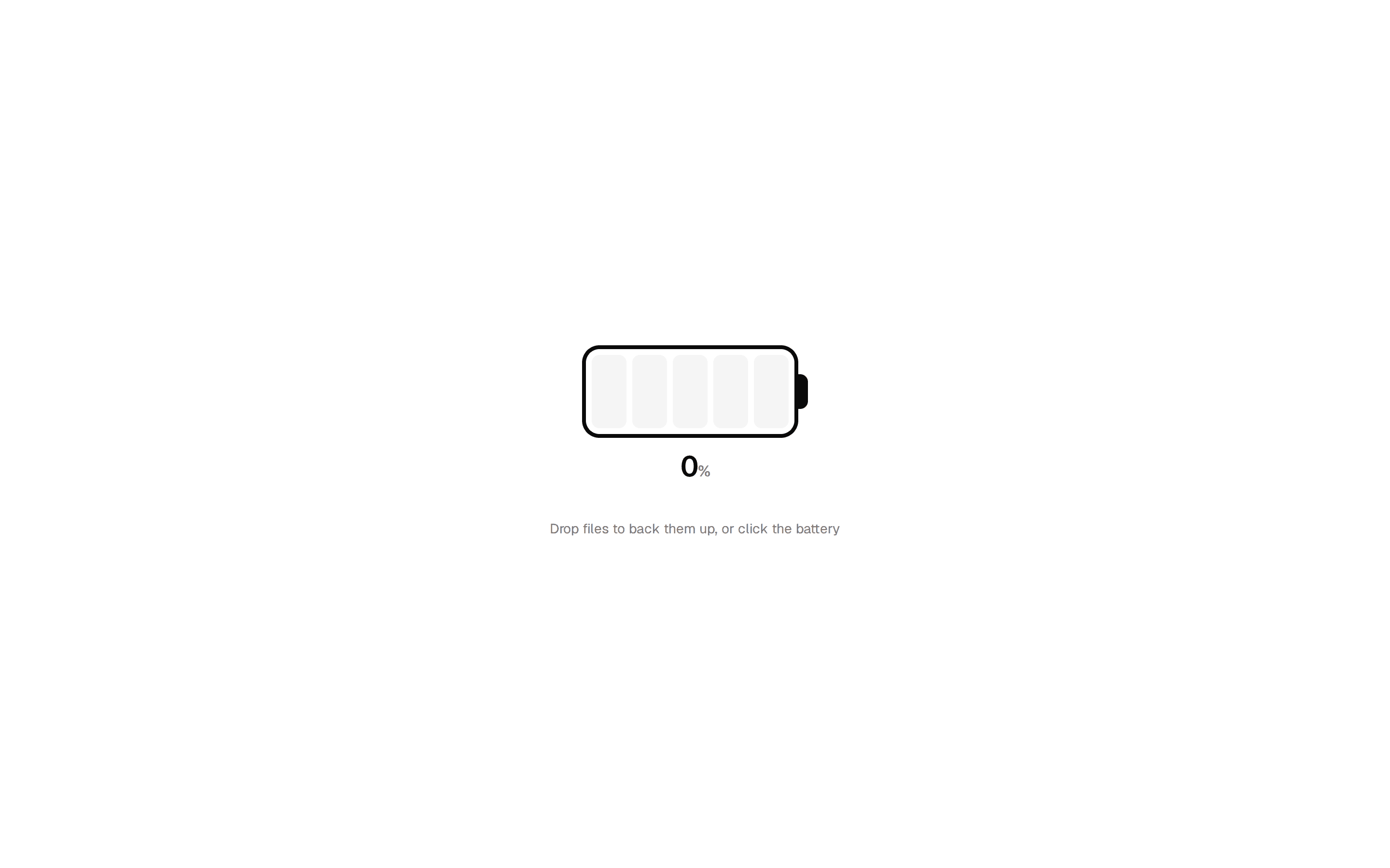
Progress Ring Upload
One ring for the whole batch: a counting percentage, per-file ticks and a self-drawing check.
@uploadcn
One ring for the whole batch: a counting percentage, per-file ticks and a self-drawing check.
@uploadcn


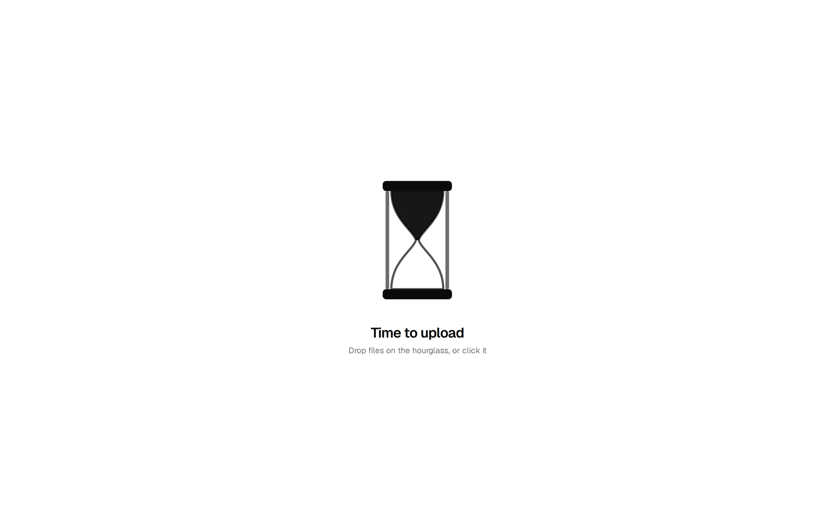


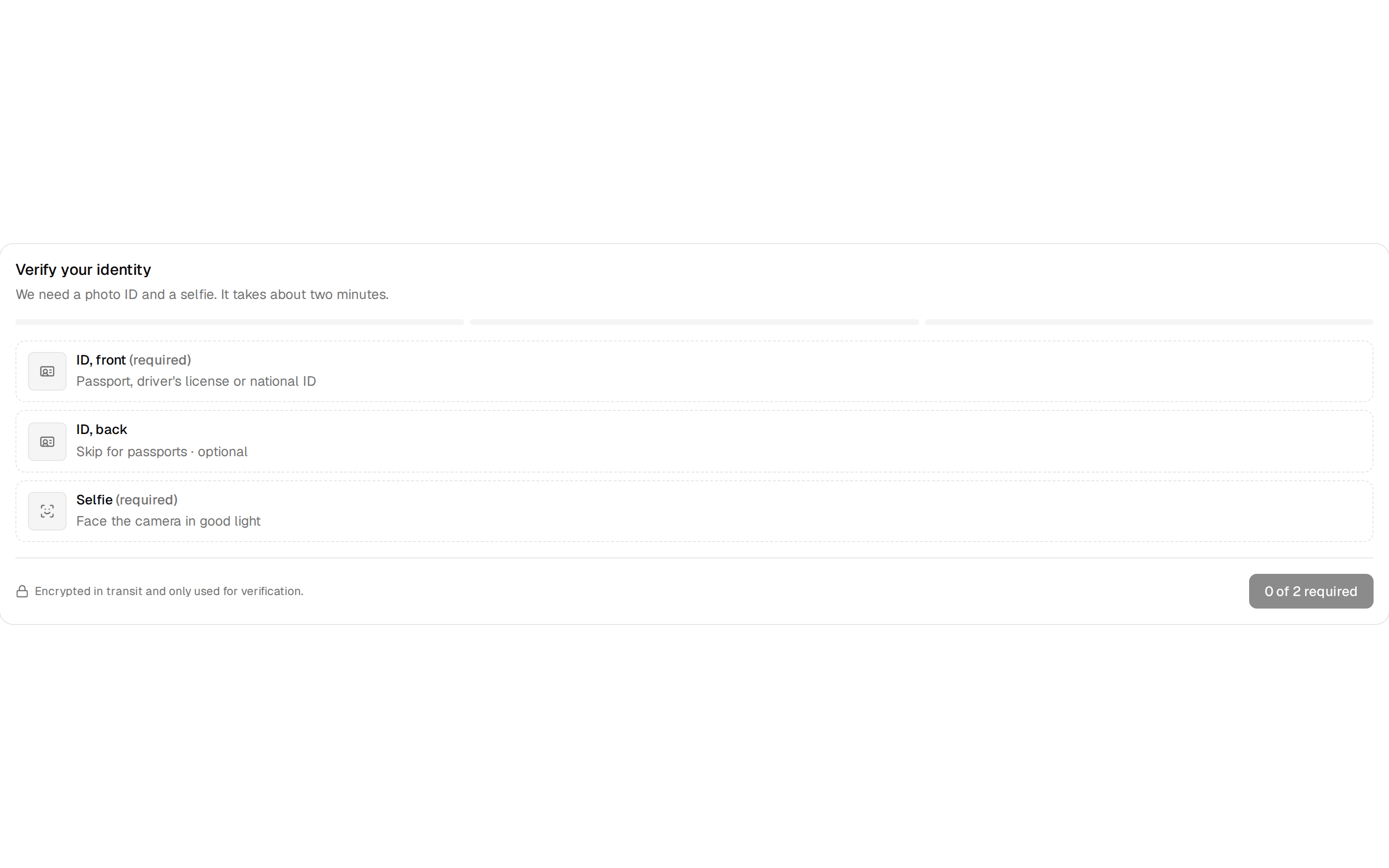






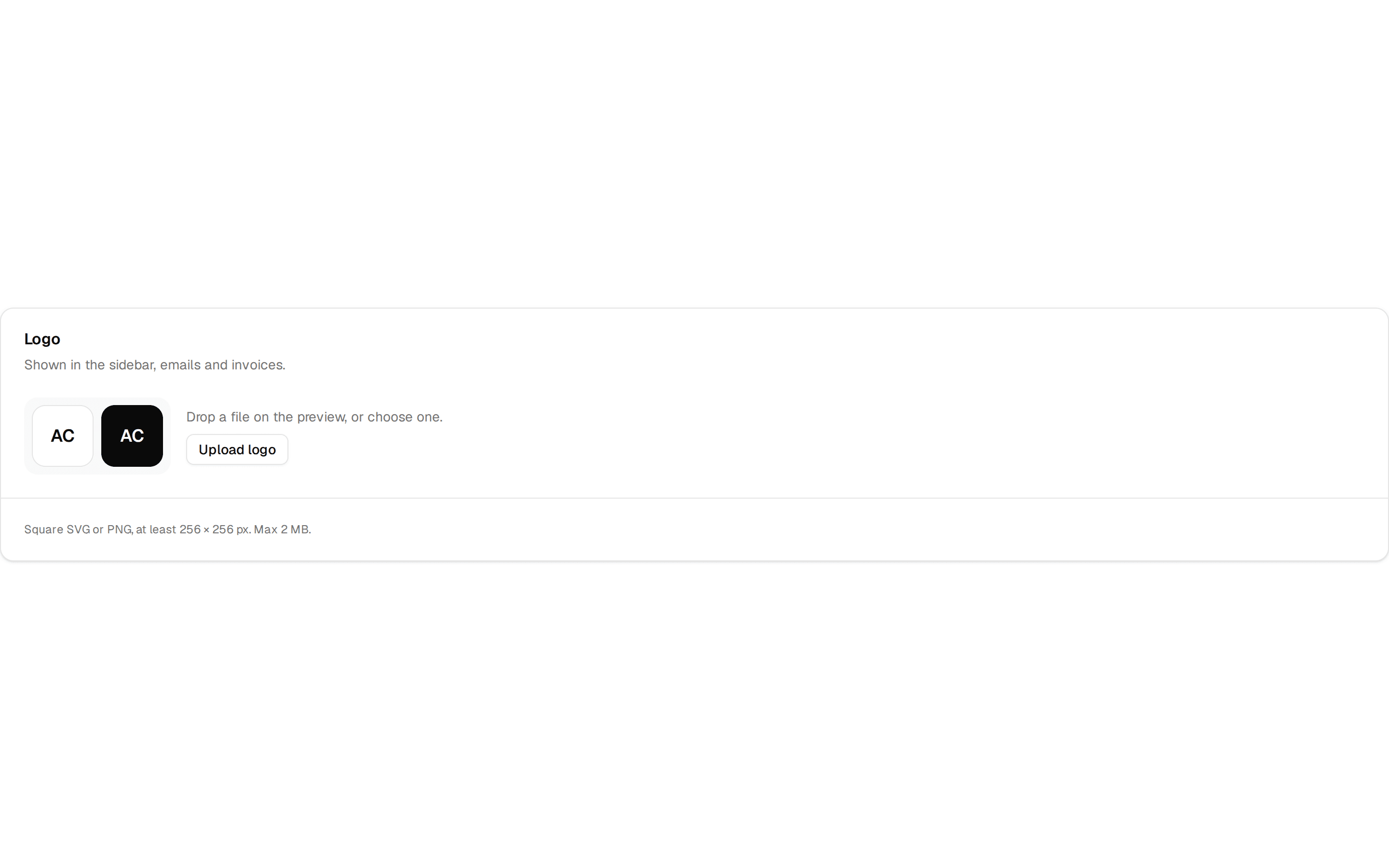


registry/default/blocks/progress-ring-upload.tsx
"use client"

import * as React from "react"
import {
  formatBytes,
  formatDuration,
  type UploadAdapter,
  type Uploader,
  type UploadItem as UploadItemData,
  type ValidationOptions,
} from "@uploadcn/core"
import {
  useUploadContext,
  useUploadProgress,
  type UploadRootProps,
} from "@uploadcn/react"
import { cn } from "cn"
import {
  AnimatePresence,
  motion,
  useReducedMotion,
  useSpring,
  useTransform,
} from "motion/react"

import { IconPlaceholder } from "@/components/icon-placeholder"
import { Upload, UploadDropzone } from "@/registry/default/ui/upload"

interface ProgressRingUploadProps<TResult> extends Pick<
  ValidationOptions,
  "accept" | "maxSize" | "maxFiles"
> {
  adapter?: UploadAdapter<TResult>
  /** Use an uploader you created with `useUploader` instead of options. */
  uploader?: Uploader<TResult>
  onSuccess?: (item: UploadItemData<TResult>) => void
  className?: string
}

const SIZE = 176
const STROKE = 10
const RADIUS = (SIZE - STROKE) / 2
const CIRCUMFERENCE = 2 * Math.PI * RADIUS

/**
 * One big ring for the whole batch: the percentage counts up in the
 * middle, ticks mark each file, and a check draws itself when everything
 * is done.
 */
function ProgressRingUpload<TResult = unknown>({
  adapter,
  uploader,
  className,
  ...options
}: ProgressRingUploadProps<TResult>) {
  return (
    <Upload
      {...((uploader
        ? { uploader }
        : {
            adapter,
            ...options,
          }) as UploadRootProps<TResult>)}
      className={cn("items-center", className)}
    >
      <UploadDropzone
        variant="muted"
        className="size-56 rounded-full bg-transparent p-0 hover:bg-transparent data-dragging:bg-transparent data-dragging:ring-0"
      >
        <Ring />
      </UploadDropzone>
      <RingCaption />
    </Upload>
  )
}

function Ring() {
  const { uploader } = useUploadContext()
  const summary = useUploadProgress(uploader)
  const reduceMotion = useReducedMotion()
  const percent = summary.isComplete ? 100 : summary.percent
  const spring = useSpring(percent, { stiffness: 90, damping: 20 })
  const offset = useTransform(
    spring,
    (value) => CIRCUMFERENCE * (1 - value / 100)
  )
  const label = useTransform(spring, (value) => `${Math.round(value)}`)

  React.useEffect(() => {
    if (reduceMotion) spring.jump(percent)
    else spring.set(percent)
  }, [spring, percent, reduceMotion])

  const idle = summary.total === 0
  return (
    <div className="relative flex items-center justify-center transition-transform duration-300 group-hover/upload-dropzone:scale-105 group-data-dragging/upload-dropzone:scale-110 motion-reduce:transition-none">
      <svg width={SIZE} height={SIZE} className="-rotate-90" aria-hidden>
        <circle
          cx={SIZE / 2}
          cy={SIZE / 2}
          r={RADIUS}
          fill="none"
          strokeWidth={STROKE}
          className="stroke-muted transition-colors group-data-dragging/upload-dropzone:stroke-primary/20"
        />
        {/* One tick per file */}
        {Array.from({ length: Math.min(summary.total, 24) }, (_, index) => {
          const angle = (index / Math.min(summary.total, 24)) * Math.PI * 2
          const r1 = RADIUS - STROKE
          const r2 = RADIUS - STROKE - 4
          return (
            <line
              key={index}
              x1={SIZE / 2 + r1 * Math.cos(angle)}
              y1={SIZE / 2 + r1 * Math.sin(angle)}
              x2={SIZE / 2 + r2 * Math.cos(angle)}
              y2={SIZE / 2 + r2 * Math.sin(angle)}
              strokeWidth={2}
              strokeLinecap="round"
              className="stroke-muted-foreground/40"
            />
          )
        })}
        <motion.circle
          cx={SIZE / 2}
          cy={SIZE / 2}
          r={RADIUS}
          fill="none"
          strokeWidth={STROKE}
          strokeLinecap="round"
          strokeDasharray={CIRCUMFERENCE}
          style={{ strokeDashoffset: offset }}
          className={cn(
            "stroke-primary",
            summary.hasErrors && !summary.isUploading && "stroke-destructive"
          )}
        />
      </svg>
      <div className="absolute inset-0 flex flex-col items-center justify-center">
        <AnimatePresence mode="wait" initial={false}>
          {idle ? (
            <motion.span
              key="idle"
              initial={{ opacity: 0, scale: 0.8 }}
              animate={{ opacity: 1, scale: 1 }}
              exit={{ opacity: 0, scale: 0.8 }}
              className="flex flex-col items-center gap-1 text-muted-foreground"
            >
              <IconPlaceholder
                lucide="PlusIcon"
                tabler="IconPlus"
                hugeicons="Add01Icon"
                phosphor="PlusIcon"
                remixicon="RiAddLine"
                className="size-7"
              />
              <span className="text-xs font-medium">Add files</span>
            </motion.span>
          ) : summary.isComplete ? (
            <motion.svg
              key="done"
              viewBox="0 0 24 24"
              className="size-14 text-primary"
              fill="none"
              stroke="currentColor"
              strokeWidth={2.5}
              strokeLinecap="round"
              strokeLinejoin="round"
              role="img"
              aria-label="All files uploaded"
            >
              <motion.path
                d="M5 12.5l4.5 4.5L19 7.5"
                initial={{ pathLength: 0 }}
                animate={{ pathLength: 1 }}
                transition={{ duration: 0.45, ease: "easeOut" }}
              />
            </motion.svg>
          ) : (
            <motion.span
              key="progress"
              initial={{ opacity: 0 }}
              animate={{ opacity: 1 }}
              exit={{ opacity: 0 }}
              className="flex items-baseline text-4xl font-semibold tracking-tight tabular-nums"
            >
              <motion.span>{label}</motion.span>
              <span className="text-lg text-muted-foreground">%</span>
            </motion.span>
          )}
        </AnimatePresence>
      </div>
    </div>
  )
}

function RingCaption() {
  const { uploader } = useUploadContext()
  const summary = useUploadProgress(uploader)
  if (summary.total === 0) {
    return (
      <p className="text-center text-sm text-muted-foreground">
        Drop files on the ring, or click it
      </p>
    )
  }
  const eta = formatDuration(summary.eta)
  return (
    <p
      className="text-center text-sm text-muted-foreground tabular-nums"
      aria-live="polite"
    >
      {summary.counts.success} of {summary.total} files ·{" "}
      {formatBytes(summary.loaded)} of {formatBytes(summary.size)}
      {summary.isUploading && eta ? ` · ${eta} left` : ""}
    </p>
  )
}

export { ProgressRingUpload, type ProgressRingUploadProps }