Stats Card 1 - Metric Card with Trend
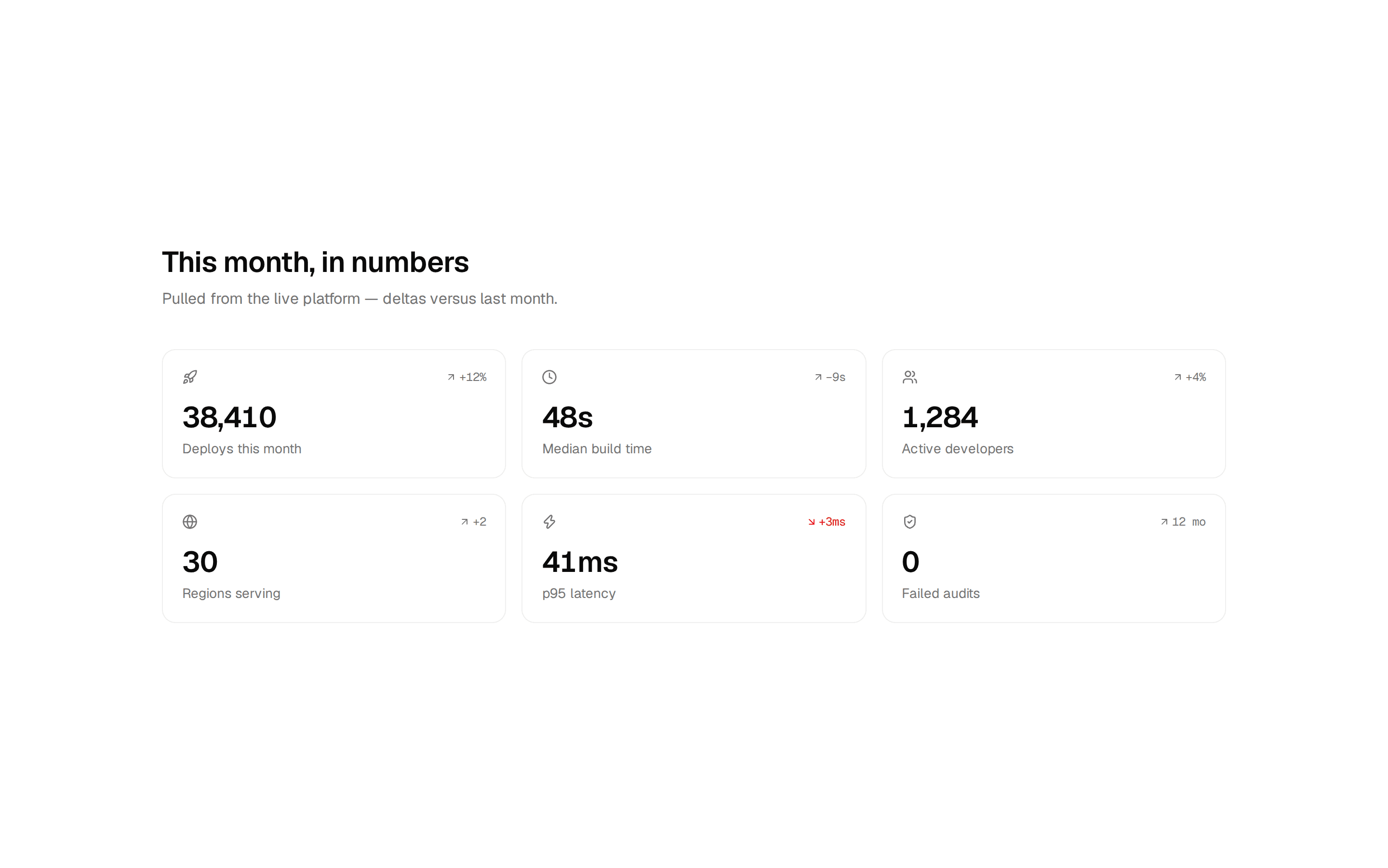
A compact metric card displaying a value with trend indicator showing percentage change and direction.
@shadcnblocks
A compact metric card displaying a value with trend indicator showing percentage change and direction.
@shadcnblocks
block/stats-card1/stats-card1.tsx
import { TrendingDown, TrendingUp } from "lucide-react";
import { cn } from "cn";

import { Card, CardContent, CardHeader, CardTitle } from "@/components/ui/card";
interface StatsCard1Props {
  title?: string;
  value?: string;
  change?: number;
  changeLabel?: string;
  className?: string;
}

const StatsCard1 = ({
  title = "Total Revenue",
  value = "$45,231.89",
  change = 20.1,
  changeLabel = "from last month",
  className,
}: StatsCard1Props) => {
  const isPositive = change >= 0;

  return (
    <Card className={cn("w-full max-w-xs", className)}>
      <CardHeader className="pb-2">
        <CardTitle className="text-sm font-medium text-muted-foreground">
          {title}
        </CardTitle>
      </CardHeader>
      <CardContent>
        <div className="text-3xl font-bold">{value}</div>
        <div className="mt-1 flex items-center gap-1 text-sm">
          {isPositive ? (
            <TrendingUp className="size-4 text-green-500" />
          ) : (
            <TrendingDown className="size-4 text-red-500" />
          )}
          <span className={isPositive ? "text-green-500" : "text-red-500"}>
            {isPositive ? "+" : ""}
            {change}%
          </span>
          <span className="text-muted-foreground">{changeLabel}</span>
        </div>
      </CardContent>
    </Card>
  );
};

export { StatsCard1 };