Stacked Cards
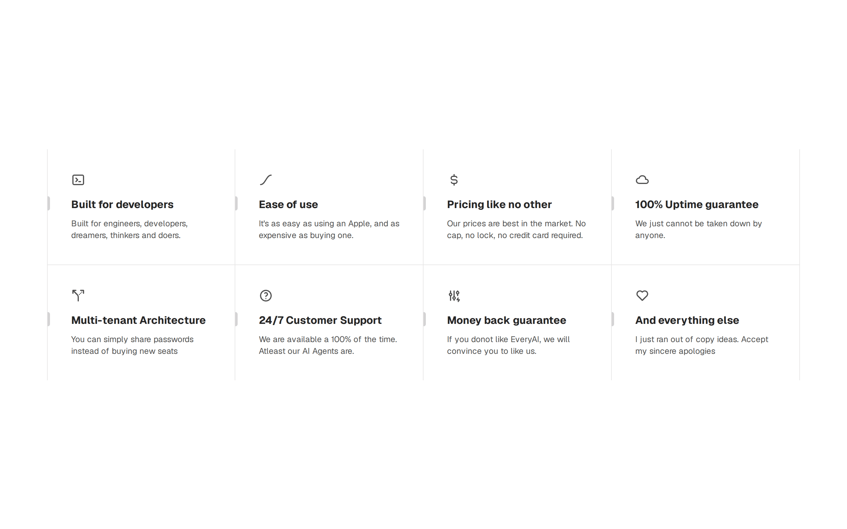
Vertically stacked icon cards, each with a title and short blurb. Reads top to bottom on any screen and keeps a long feature list easy to follow.
@shadcn-ui-blocks
Vertically stacked icon cards, each with a title and short blurb. Reads top to bottom on any screen and keeps a long feature list easy to follow.
@shadcn-ui-blocks
import { Card, CardContent, CardHeader, CardTitle } from "@/components/ui/card";
import { PaletteIcon, PresentationIcon, StoreIcon } from "lucide-react";

export default function IconSectionStackedCards() {
  return (
    <>
      {/* Icon Blocks */}
      <div className="container mx-auto px-4 py-24 md:px-6 lg:py-32 2xl:max-w-[1400px]">
        <div className="grid items-center gap-6 sm:grid-cols-2 md:gap-10 lg:grid-cols-3">
          {/* Card */}
          <Card>
            <CardHeader className="flex-row items-center gap-4 pb-4">
              <div className="bg-primary inline-flex h-[62px] w-[62px] items-center justify-center rounded-full border-2">
                <PaletteIcon className="text-primary-foreground h-6 w-6 flex-shrink-0" />
              </div>
              <CardTitle>Build your portfolio</CardTitle>
            </CardHeader>
            <CardContent>
              The simplest way to keep your portfolio always up-to-date.
            </CardContent>
          </Card>
          {/* End Card */}
          {/* Card */}
          <Card>
            <CardHeader className="flex-row items-center gap-4 pb-4">
              <div className="bg-primary inline-flex h-[62px] w-[62px] items-center justify-center rounded-full border-2">
                <PresentationIcon className="text-primary-foreground h-6 w-6 flex-shrink-0" />
              </div>
              <CardTitle>Get freelance work</CardTitle>
            </CardHeader>
            <CardContent>
              New design projects delivered to your inbox each morning.
            </CardContent>
          </Card>
          {/* End Card */}
          {/* Card */}
          <Card>
            <CardHeader className="flex-row items-center gap-4 pb-4">
              <div className="bg-primary inline-flex h-[62px] w-[62px] items-center justify-center rounded-full border-2">
                <StoreIcon className="text-primary-foreground h-6 w-6 flex-shrink-0" />
              </div>
              <CardTitle>Sell your goods</CardTitle>
            </CardHeader>
            <CardContent>
              Get your goods in front of millions of potential customers with
              ease.
            </CardContent>
          </Card>
          {/* End Card */}
          {/* Card */}
          <Card>
            <CardHeader className="flex-row items-center gap-4 pb-4">
              <div className="bg-primary inline-flex h-[62px] w-[62px] items-center justify-center rounded-full border-2">
                <StoreIcon className="text-primary-foreground h-6 w-6 flex-shrink-0" />
              </div>
              <CardTitle>Get freelance work</CardTitle>
            </CardHeader>
            <CardContent>
              New design projects delivered to your inbox each morning.
            </CardContent>
          </Card>
          {/* End Card */}
          {/* Card */}
          <Card>
            <CardHeader className="flex-row items-center gap-4 pb-4">
              <div className="bg-primary inline-flex h-[62px] w-[62px] items-center justify-center rounded-full border-2">
                <StoreIcon className="text-primary-foreground h-6 w-6 flex-shrink-0" />
              </div>
              <CardTitle>Sell your goods</CardTitle>
            </CardHeader>
            <CardContent>
              Get your goods in front of millions of potential customers with
              ease.
            </CardContent>
          </Card>
          {/* End Card */}
          {/* Card */}
          <Card>
            <CardHeader className="flex-row items-center gap-4 pb-4">
              <div className="bg-primary inline-flex h-[62px] w-[62px] items-center justify-center rounded-full border-2">
                <PaletteIcon className="text-primary-foreground h-6 w-6 flex-shrink-0" />
              </div>
              <CardTitle>Build your portfolio</CardTitle>
            </CardHeader>
            <CardContent>
              The simplest way to keep your portfolio always up-to-date.
            </CardContent>
          </Card>
          {/* End Card */}
        </div>
      </div>
      {/* End Icon Blocks */}
    </>
  );
}