Steps
Numbered steps that lay out how your product works from start to finish. Drop it on a homepage to turn a process into an easy three or four part story.
@shadcn-ui-blocks
Numbered steps that lay out how your product works from start to finish. Drop it on a homepage to turn a process into an easy three or four part story.
@shadcn-ui-blocks
components/blocks/marketing/feature-sections/steps.tsx
import { useState } from 'react';
import { cn } from '@/lib/utils';

const features = [
  {
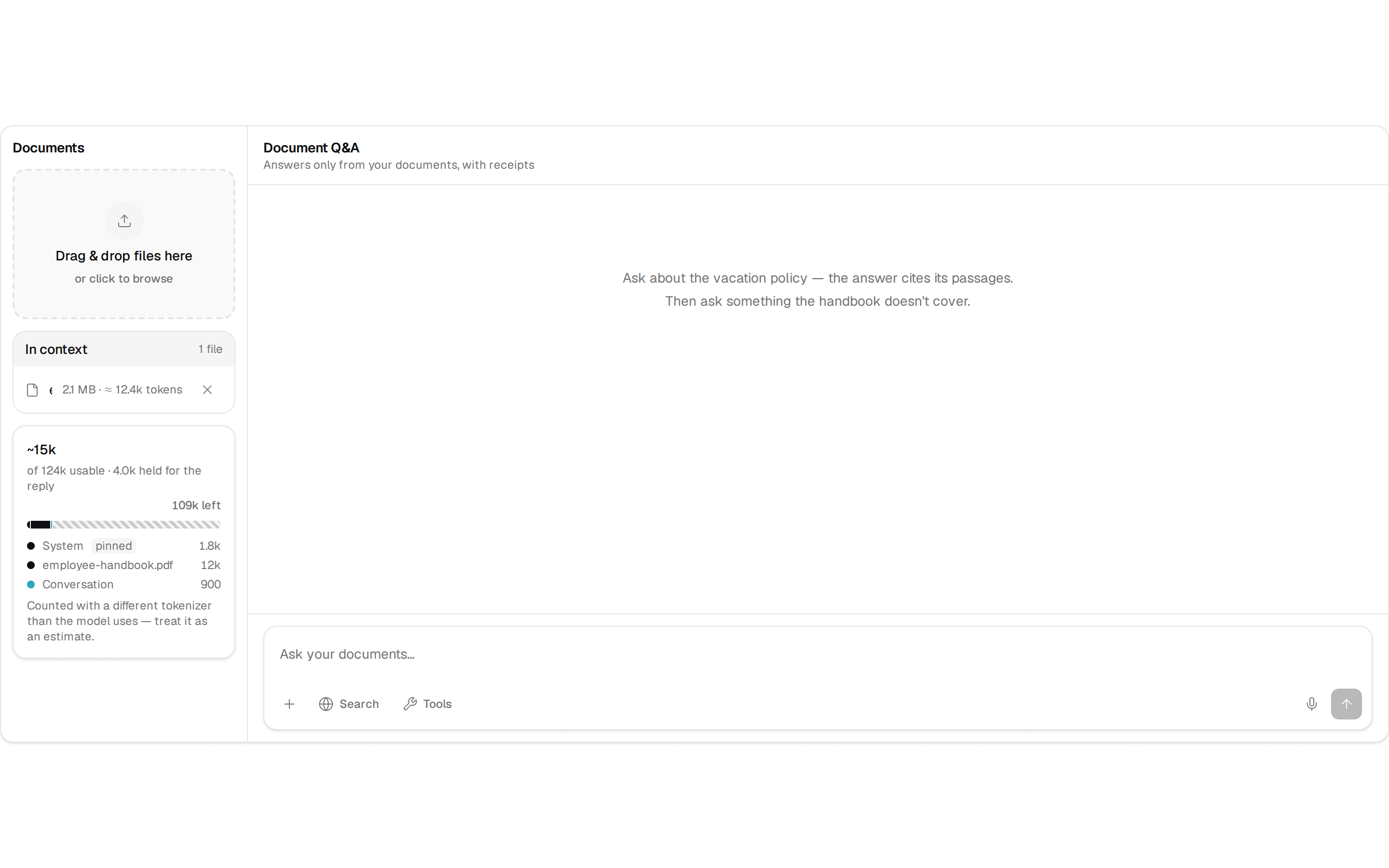
    title: 'Project Setup',
    description:
      'Get started in minutes with our streamlined setup process. No complex configuration required.',
    image: 'https://placehold.co/1024x768/jpeg?text=Setup',
    benefits: [
      'One-click installation',
      'Pre-configured templates',
      'Development environment ready',
      'Instant deployment setup',
    ],
  },
  {
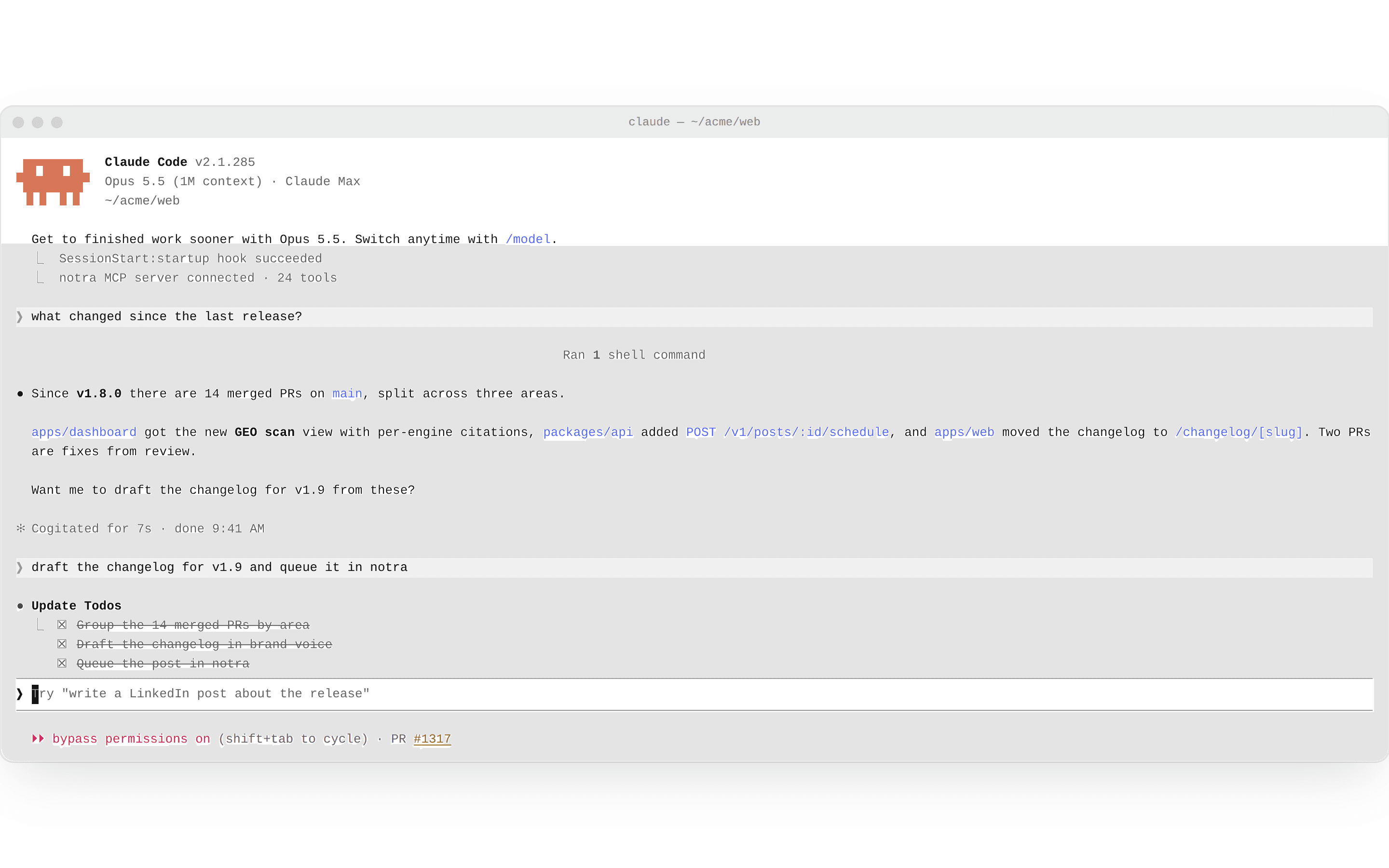
    title: 'Development',
    description:
      'Write code efficiently with modern tools and frameworks that boost your productivity.',
    image: 'https://placehold.co/1024x768/jpeg?text=Development',
    benefits: [
      'Hot reload support',
      'TypeScript integration',
      'Component library',
      'Developer tools',
    ],
  },
  {
    title: 'Testing',
    description:
      'Ensure quality with comprehensive testing tools and automated workflows.',
    image: 'https://placehold.co/1024x768/jpeg?text=Testing',
    benefits: [
      'Unit testing framework',
      'Integration tests',
      'E2E testing tools',
      'Performance testing',
    ],
  },
  {
    title: 'Deployment',
    description:
      'Deploy your applications with confidence using our robust deployment pipeline.',
    image: 'https://placehold.co/1024x768/jpeg?text=Deployment',
    benefits: [
      'One-click deployment',
      'Rollback support',
      'Environment management',
      'Deployment monitoring',
    ],
  },
];

export default function FeatureSectionSteps() {
  const [activeFeature, setActiveFeature] = useState(0);

  return (
    <section className="container mx-auto space-y-8 px-4 py-24 md:px-6 2xl:max-w-[1400px]">
      <div className="space-y-4 text-center">
        <h2 className="text-3xl font-bold tracking-tighter sm:text-4xl md:text-5xl">
          From idea to production
        </h2>
        <p className="text-muted-foreground mx-auto max-w-[700px] md:text-xl/relaxed lg:text-base/relaxed xl:text-xl/relaxed">
          Follow our proven process to build and deploy your applications with
          confidence.
        </p>
      </div>

      <div className="grid items-start gap-8 lg:grid-cols-[1fr,2fr] lg:gap-12">
        <div className="space-y-4">
          {features.map((feature, index) => (
            <button
              key={feature.title}
              onClick={() => setActiveFeature(index)}
              className={cn(
                'w-full rounded-lg px-4 py-4 text-left transition-colors',
                activeFeature === index
                  ? 'bg-primary/10 text-primary'
                  : 'hover:bg-muted'
              )}
            >
              <div className="flex items-center gap-4">
                <div
                  className={cn(
                    'flex h-8 w-8 items-center justify-center rounded-full text-sm font-medium',
                    activeFeature === index
                      ? 'bg-primary text-primary-foreground'
                      : 'bg-muted-foreground/20 text-muted-foreground'
                  )}
                >
                  {index + 1}
                </div>
                <div className="flex-1">
                  <h3 className="font-semibold">{feature.title}</h3>
                  <p
                    className={cn(
                      'text-sm',
                      activeFeature === index
                        ? 'text-primary/80'
                        : 'text-muted-foreground'
                    )}
                  >
                    {feature.description}
                  </p>
                </div>
              </div>
            </button>
          ))}
        </div>

        <div className="bg-muted relative aspect-video overflow-hidden rounded-xl">
          <img
            src={features[activeFeature]!.image}
            alt={features[activeFeature]!.title}
            className="object-cover object-center"
          />
          <div className="from-background/80 to-background/0 absolute inset-0 flex items-end bg-gradient-to-t p-6">
            <div className="space-y-4">
              <h4 className="text-lg font-semibold">Key Benefits</h4>
              <ul className="grid grid-cols-2 gap-x-4 gap-y-2">
                {features[activeFeature]!.benefits.map((benefit) => (
                  <li key={benefit} className="flex items-center gap-2 text-sm">
                    <div className="bg-primary h-1.5 w-1.5 rounded-full" />
                    {benefit}
                  </li>
                ))}
              </ul>
            </div>
          </div>
        </div>
      </div>
    </section>
  );
}