# Split Offers

> A promo split into two panels, each holding a separate offer and button. Lets shoppers pick between two competing deals within one store section.

A shadcn/ui block from the [@shadcn-ui-blocks](https://www.shadcn-ui-blocks.com) registry, listed on [shadcn.exchange](https://shadcn.exchange/r/shadcn-ui-blocks/ecommerce-promo-sections-split-offers).

- Page, with a live preview: https://shadcn.exchange/r/shadcn-ui-blocks/ecommerce-promo-sections-split-offers
- Screenshot: https://abzjhwgwpdpz7ua5.public.blob.vercel-storage.com/shots/shadcn-ui-blocks/ecommerce-promo-sections-split-offers-light-8703ce057edb18c7.png
- Registry item: https://www.shadcn-ui-blocks.com/r/ecommerce-promo-sections-split-offers.json
- Listed: 2026-10-13, source last changed 2026-10-13

## Install

```bash
npx shadcn@latest add https://www.shadcn-ui-blocks.com/r/ecommerce-promo-sections-split-offers.json
```

Run it in a project that has shadcn/ui set up. It adds the files below and installs what they depend on.

## Dependencies

- npm packages: `class-variance-authority`, `lucide-react`, `radix-ui`

## Files

### `components/blocks/ecommerce/promo-sections/split-offers.tsx`

```tsx
import { Button } from '@/components/ui/button';
import { Card, CardContent, CardHeader, CardTitle } from '@/components/ui/card';
import { CheckCircle } from 'lucide-react';

export default function SplitOffersPromo() {
  return (
    <div className="bg-background">
      <div className="mx-auto max-w-7xl lg:grid lg:grid-cols-12 lg:gap-8">
        {/* Offer Content */}
        <div className="px-4 py-12 sm:px-6 lg:col-span-7 lg:px-8 lg:py-24 xl:col-span-6">
          <div className="mx-auto max-w-2xl lg:mx-0">
            <h2 className="text-foreground text-3xl font-bold tracking-tight sm:text-4xl">
              Unlock Exclusive Travel Deals
            </h2>
            <p className="text-muted-foreground mt-4 text-lg">
              Join our loyalty program today and gain access to members-only
              discounts, early booking options, and personalized travel
              packages.
            </p>

            <div className="mt-8 space-y-6">
              <Card className="bg-card/80 shadow-sm">
                <CardHeader className="flex flex-row items-center justify-between pb-2">
                  <CardTitle className="text-sm font-medium">
                    Silver Tier
                  </CardTitle>
                  <span className="text-muted-foreground text-xs">
                    Most Popular
                  </span>
                </CardHeader>
                <CardContent>
                  <div className="text-2xl font-bold">10% Off All Bookings</div>
                  <ul className="text-muted-foreground mt-2 space-y-1 text-sm">
                    <li className="flex items-center gap-2">
                      <CheckCircle className="text-primary h-4 w-4" />
                      <span>Priority customer support</span>
                    </li>
                    <li className="flex items-center gap-2">
                      <CheckCircle className="text-primary h-4 w-4" />
                      <span>Exclusive seasonal offers</span>
                    </li>
                  </ul>
                </CardContent>
              </Card>

              <Card className="border-border/50 bg-card/50">
                <CardHeader className="flex flex-row items-center justify-between pb-2">
                  <CardTitle className="text-sm font-medium">
                    Gold Tier Upgrade
                  </CardTitle>
                </CardHeader>
                <CardContent>
                  <div className="text-lg font-semibold">
                    Upgrade for $99/year
                  </div>
                  <ul className="text-muted-foreground mt-2 space-y-1 text-sm">
                    <li className="flex items-center gap-2">
                      <CheckCircle className="text-primary h-4 w-4" />
                      <span>15% off bookings + Free room upgrades</span>
                    </li>
                    <li className="flex items-center gap-2">
                      <CheckCircle className="text-primary h-4 w-4" />
                      <span>Access to airport lounges</span>
                    </li>
                  </ul>
                </CardContent>
              </Card>
            </div>

            <div className="mt-10 flex items-center gap-x-6">
              <Button size="lg" asChild>
                <a href="#">Join Now</a>
              </Button>
              <Button variant="ghost" asChild>
                <a
                  href="#"
                  className="text-foreground text-sm leading-6 font-semibold"
                >
                  Learn more <span aria-hidden="true">→</span>
                </a>
              </Button>
            </div>
          </div>
        </div>

        {/* Image */}
        <div className="relative lg:col-span-5 lg:-mr-8 xl:absolute xl:inset-y-0 xl:right-0 xl:w-1/2">
          <img
            src="https://images.unsplash.com/photo-1566073771259-6a8506099945?q=80&w=1200&auto=format&fit=crop"
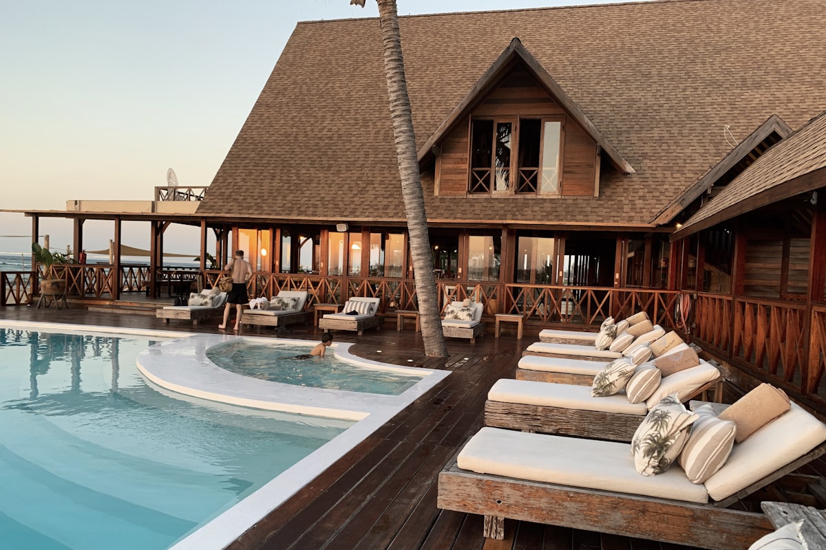
            alt="Luxury hotel resort pool area"
            className="bg-muted aspect-[3/2] w-full object-cover lg:absolute lg:inset-0 lg:aspect-auto lg:h-full"
            width={900}
            height={600}
          />
          <div
            className="via-background/40 to-background absolute inset-0 bg-gradient-to-l from-transparent lg:hidden"
            aria-hidden="true"
          />
        </div>
      </div>
    </div>
  );
}
```

### `components/ui/button.tsx`

```tsx
import * as React from "react"
import { cva, type VariantProps } from "class-variance-authority"
import { Slot } from "radix-ui"

import { cn } from "@/lib/utils"

const buttonVariants = cva(
  "group/button inline-flex shrink-0 items-center justify-center rounded-md border border-transparent bg-clip-padding text-sm font-medium whitespace-nowrap transition-all outline-none select-none focus-visible:border-ring focus-visible:ring-3 focus-visible:ring-ring/50 active:not-aria-[haspopup]:translate-y-px disabled:pointer-events-none disabled:opacity-50 aria-invalid:border-destructive aria-invalid:ring-3 aria-invalid:ring-destructive/20 dark:aria-invalid:border-destructive/50 dark:aria-invalid:ring-destructive/40 [&_svg]:pointer-events-none [&_svg]:shrink-0 [&_svg:not([class*='size-'])]:size-4",
  {
    variants: {
      variant: {
        default: "bg-primary text-primary-foreground hover:bg-primary/80",
        outline:
          "border-border bg-background shadow-xs hover:bg-muted hover:text-foreground aria-expanded:bg-muted aria-expanded:text-foreground dark:border-input dark:bg-input/30 dark:hover:bg-input/50",
        secondary:
          "bg-secondary text-secondary-foreground hover:bg-secondary/80 aria-expanded:bg-secondary aria-expanded:text-secondary-foreground",
        ghost:
          "hover:bg-muted hover:text-foreground aria-expanded:bg-muted aria-expanded:text-foreground dark:hover:bg-muted/50",
        destructive:
          "bg-destructive/10 text-destructive hover:bg-destructive/20 focus-visible:border-destructive/40 focus-visible:ring-destructive/20 dark:bg-destructive/20 dark:hover:bg-destructive/30 dark:focus-visible:ring-destructive/40",
        link: "text-primary underline-offset-4 hover:underline",
      },
      size: {
        default:
          "h-9 gap-1.5 px-2.5 in-data-[slot=button-group]:rounded-md has-data-[icon=inline-end]:pr-2 has-data-[icon=inline-start]:pl-2",
        xs: "h-6 gap-1 rounded-[min(var(--radius-md),8px)] px-2 text-xs in-data-[slot=button-group]:rounded-md has-data-[icon=inline-end]:pr-1.5 has-data-[icon=inline-start]:pl-1.5 [&_svg:not([class*='size-'])]:size-3",
        sm: "h-8 gap-1 rounded-[min(var(--radius-md),10px)] px-2.5 in-data-[slot=button-group]:rounded-md has-data-[icon=inline-end]:pr-1.5 has-data-[icon=inline-start]:pl-1.5",
        lg: "h-10 gap-1.5 px-2.5 has-data-[icon=inline-end]:pr-2 has-data-[icon=inline-start]:pl-2",
        icon: "size-9",
        "icon-xs":
          "size-6 rounded-[min(var(--radius-md),8px)] in-data-[slot=button-group]:rounded-md [&_svg:not([class*='size-'])]:size-3",
        "icon-sm":
          "size-8 rounded-[min(var(--radius-md),10px)] in-data-[slot=button-group]:rounded-md",
        "icon-lg": "size-10",
      },
    },
    defaultVariants: {
      variant: "default",
      size: "default",
    },
  }
)

function Button({
  className,
  variant = "default",
  size = "default",
  asChild = false,
  ...props
}: React.ComponentProps<"button"> &
  VariantProps<typeof buttonVariants> & {
    asChild?: boolean
  }) {
  const Comp = asChild ? Slot.Root : "button"

  return (
    <Comp
      data-slot="button"
      data-variant={variant}
      data-size={size}
      className={cn(buttonVariants({ variant, size, className }))}
      {...props}
    />
  )
}

export { Button, buttonVariants }
```

### `components/ui/card.tsx`

```tsx
import * as React from "react"

import { cn } from "@/lib/utils"

function Card({
  className,
  size = "default",
  ...props
}: React.ComponentProps<"div"> & { size?: "default" | "sm" }) {
  return (
    <div
      data-slot="card"
      data-size={size}
      className={cn(
        "group/card flex flex-col gap-6 overflow-hidden rounded-xl bg-card py-6 text-sm text-card-foreground shadow-xs ring-1 ring-foreground/10 has-[>img:first-child]:pt-0 data-[size=sm]:gap-4 data-[size=sm]:py-4 *:[img:first-child]:rounded-t-xl *:[img:last-child]:rounded-b-xl",
        className
      )}
      {...props}
    />
  )
}

function CardHeader({ className, ...props }: React.ComponentProps<"div">) {
  return (
    <div
      data-slot="card-header"
      className={cn(
        "group/card-header @container/card-header grid auto-rows-min items-start gap-1 rounded-t-xl px-6 group-data-[size=sm]/card:px-4 has-data-[slot=card-action]:grid-cols-[1fr_auto] has-data-[slot=card-description]:grid-rows-[auto_auto] [.border-b]:pb-6 group-data-[size=sm]/card:[.border-b]:pb-4",
        className
      )}
      {...props}
    />
  )
}

function CardTitle({ className, ...props }: React.ComponentProps<"div">) {
  return (
    <div
      data-slot="card-title"
      className={cn(
        "font-heading text-base leading-normal font-medium group-data-[size=sm]/card:text-sm",
        className
      )}
      {...props}
    />
  )
}

function CardDescription({ className, ...props }: React.ComponentProps<"div">) {
  return (
    <div
      data-slot="card-description"
      className={cn("text-sm text-muted-foreground", className)}
      {...props}
    />
  )
}

function CardAction({ className, ...props }: React.ComponentProps<"div">) {
  return (
    <div
      data-slot="card-action"
      className={cn(
        "col-start-2 row-span-2 row-start-1 self-start justify-self-end",
        className
      )}
      {...props}
    />
  )
}

function CardContent({ className, ...props }: React.ComponentProps<"div">) {
  return (
    <div
      data-slot="card-content"
      className={cn("px-6 group-data-[size=sm]/card:px-4", className)}
      {...props}
    />
  )
}

function CardFooter({ className, ...props }: React.ComponentProps<"div">) {
  return (
    <div
      data-slot="card-footer"
      className={cn(
        "flex items-center rounded-b-xl px-6 group-data-[size=sm]/card:px-4 [.border-t]:pt-6 group-data-[size=sm]/card:[.border-t]:pt-4",
        className
      )}
      {...props}
    />
  )
}

export {
  Card,
  CardHeader,
  CardFooter,
  CardTitle,
  CardAction,
  CardDescription,
  CardContent,
}
```