# Classic Overview

> A classic product page with a large image on the left, title, price, variant options, and add to cart on the right. Familiar layout shoppers expect.

A shadcn/ui block from the [@shadcn-ui-blocks](https://www.shadcn-ui-blocks.com) registry, listed on [shadcn.exchange](https://shadcn.exchange/r/shadcn-ui-blocks/ecommerce-product-overview-classic-overview).

- Page, with a live preview: https://shadcn.exchange/r/shadcn-ui-blocks/ecommerce-product-overview-classic-overview
- Screenshot: https://abzjhwgwpdpz7ua5.public.blob.vercel-storage.com/shots/shadcn-ui-blocks/ecommerce-product-overview-classic-overview-light-94d49e46057d835d.png
- Registry item: https://www.shadcn-ui-blocks.com/r/ecommerce-product-overview-classic-overview.json
- Listed: 2026-10-13, source last changed 2026-10-13

## Install

```bash
npx shadcn@latest add https://www.shadcn-ui-blocks.com/r/ecommerce-product-overview-classic-overview.json
```

Run it in a project that has shadcn/ui set up. It adds the files below and installs what they depend on.

## Dependencies

- npm packages: `class-variance-authority`, `lucide-react`, `radix-ui`

## Files

### `components/blocks/ecommerce/product-overview/classic-overview.tsx`

```tsx
import { Button } from '@/components/ui/button';
import { Star, Truck, ShieldCheck, Heart } from 'lucide-react';

export default function ClassicOverview() {
  return (
    <div className="mx-auto w-full max-w-7xl p-6">
      <div className="grid grid-cols-1 gap-8 md:grid-cols-2">
        {/* Product Image */}
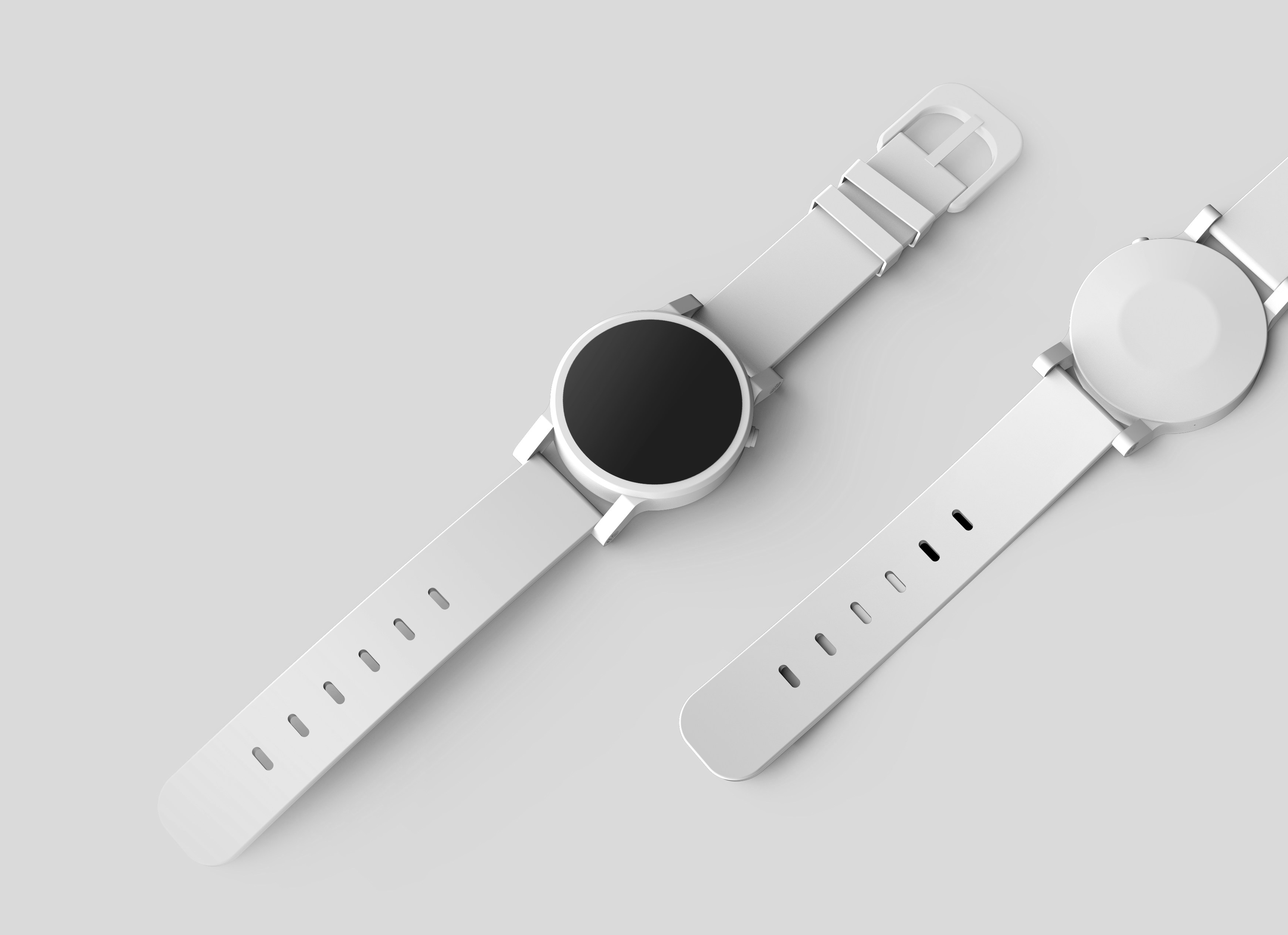
        <div className="bg-muted relative aspect-square overflow-hidden rounded-lg">
          <img
            src="https://images.unsplash.com/photo-1523275335684-37898b6baf30"
            alt="Modern watch with leather strap"
            className="h-full w-full object-cover"
            width={700}
            height={700}
          />
          <div className="absolute top-4 right-4">
            <Button
              size="icon"
              variant="outline"
              className="bg-background/80 rounded-full backdrop-blur-sm"
            >
              <Heart className="h-5 w-5" />
            </Button>
          </div>
        </div>

        {/* Product Info */}
        <div className="flex flex-col">
          <div className="mb-4 flex items-center gap-4">
            <span className="bg-primary/10 text-primary rounded-full px-3 py-1 text-sm font-medium">
              New Arrival
            </span>
            <div className="flex items-center gap-1">
              <Star className="fill-primary text-primary h-4 w-4" />
              <span className="text-sm font-medium">4.9</span>
              <span className="text-muted-foreground text-sm">
                (128 reviews)
              </span>
            </div>
          </div>

          <h1 className="mb-2 text-3xl font-bold">Classic Leather Watch</h1>
          <div className="mb-6 flex items-baseline gap-4">
            <span className="text-2xl font-bold">$299.00</span>
            <span className="text-muted-foreground text-lg line-through">
              $399.00
            </span>
            <span className="text-sm font-medium text-green-600">Save 25%</span>
          </div>

          <p className="text-muted-foreground mb-6">
            Elevate your style with our Classic Leather Watch. Featuring premium
            materials, precise movement, and timeless design that complements
            any outfit.
          </p>

          <div className="mb-8 grid grid-cols-2 gap-4">
            <div className="flex items-center gap-2 text-sm">
              <div className="h-2 w-2 rounded-full bg-green-500"></div>
              <span>In Stock</span>
            </div>
            <div className="flex items-center gap-2 text-sm">
              <Truck className="h-4 w-4" />
              <span>Free Shipping</span>
            </div>
            <div className="flex items-center gap-2 text-sm">
              <ShieldCheck className="h-4 w-4" />
              <span>2 Year Warranty</span>
            </div>
          </div>

          <div className="space-y-4">
            <div className="flex flex-col gap-2">
              <span className="font-medium">Select Color</span>
              <div className="flex gap-2">
                <button className="h-8 w-8 rounded-full bg-black ring-2 ring-black ring-offset-2"></button>
                <button className="bg-brown-500 h-8 w-8 rounded-full"></button>
                <button className="h-8 w-8 rounded-full bg-slate-200"></button>
              </div>
            </div>

            <div className="flex flex-col gap-2">
              <span className="font-medium">Select Size</span>
              <div className="flex gap-2">
                <Button variant="outline" size={'sm'}>
                  38mm
                </Button>
                <Button variant="outline" size={'sm'}>
                  42mm
                </Button>
                <Button variant="outline" size={'sm'}>
                  44mm
                </Button>
              </div>
            </div>
          </div>

          <div className="mt-8 flex gap-4">
            <Button size="lg" className="flex-1">
              Add to Cart
            </Button>
            <Button size="lg" variant="outline" className="flex-1">
              Buy Now
            </Button>
          </div>
        </div>
      </div>
    </div>
  );
}
```

### `components/ui/button.tsx`

```tsx
import * as React from "react"
import { cva, type VariantProps } from "class-variance-authority"
import { Slot } from "radix-ui"

import { cn } from "@/lib/utils"

const buttonVariants = cva(
  "group/button inline-flex shrink-0 items-center justify-center rounded-md border border-transparent bg-clip-padding text-sm font-medium whitespace-nowrap transition-all outline-none select-none focus-visible:border-ring focus-visible:ring-3 focus-visible:ring-ring/50 active:not-aria-[haspopup]:translate-y-px disabled:pointer-events-none disabled:opacity-50 aria-invalid:border-destructive aria-invalid:ring-3 aria-invalid:ring-destructive/20 dark:aria-invalid:border-destructive/50 dark:aria-invalid:ring-destructive/40 [&_svg]:pointer-events-none [&_svg]:shrink-0 [&_svg:not([class*='size-'])]:size-4",
  {
    variants: {
      variant: {
        default: "bg-primary text-primary-foreground hover:bg-primary/80",
        outline:
          "border-border bg-background shadow-xs hover:bg-muted hover:text-foreground aria-expanded:bg-muted aria-expanded:text-foreground dark:border-input dark:bg-input/30 dark:hover:bg-input/50",
        secondary:
          "bg-secondary text-secondary-foreground hover:bg-secondary/80 aria-expanded:bg-secondary aria-expanded:text-secondary-foreground",
        ghost:
          "hover:bg-muted hover:text-foreground aria-expanded:bg-muted aria-expanded:text-foreground dark:hover:bg-muted/50",
        destructive:
          "bg-destructive/10 text-destructive hover:bg-destructive/20 focus-visible:border-destructive/40 focus-visible:ring-destructive/20 dark:bg-destructive/20 dark:hover:bg-destructive/30 dark:focus-visible:ring-destructive/40",
        link: "text-primary underline-offset-4 hover:underline",
      },
      size: {
        default:
          "h-9 gap-1.5 px-2.5 in-data-[slot=button-group]:rounded-md has-data-[icon=inline-end]:pr-2 has-data-[icon=inline-start]:pl-2",
        xs: "h-6 gap-1 rounded-[min(var(--radius-md),8px)] px-2 text-xs in-data-[slot=button-group]:rounded-md has-data-[icon=inline-end]:pr-1.5 has-data-[icon=inline-start]:pl-1.5 [&_svg:not([class*='size-'])]:size-3",
        sm: "h-8 gap-1 rounded-[min(var(--radius-md),10px)] px-2.5 in-data-[slot=button-group]:rounded-md has-data-[icon=inline-end]:pr-1.5 has-data-[icon=inline-start]:pl-1.5",
        lg: "h-10 gap-1.5 px-2.5 has-data-[icon=inline-end]:pr-2 has-data-[icon=inline-start]:pl-2",
        icon: "size-9",
        "icon-xs":
          "size-6 rounded-[min(var(--radius-md),8px)] in-data-[slot=button-group]:rounded-md [&_svg:not([class*='size-'])]:size-3",
        "icon-sm":
          "size-8 rounded-[min(var(--radius-md),10px)] in-data-[slot=button-group]:rounded-md",
        "icon-lg": "size-10",
      },
    },
    defaultVariants: {
      variant: "default",
      size: "default",
    },
  }
)

function Button({
  className,
  variant = "default",
  size = "default",
  asChild = false,
  ...props
}: React.ComponentProps<"button"> &
  VariantProps<typeof buttonVariants> & {
    asChild?: boolean
  }) {
  const Comp = asChild ? Slot.Root : "button"

  return (
    <Comp
      data-slot="button"
      data-variant={variant}
      data-size={size}
      className={cn(buttonVariants({ variant, size, className }))}
      {...props}
    />
  )
}

export { Button, buttonVariants }
```
