# Timeline component 05

> Vertical product changelog timeline with sticky version badges and dates positioned on left sidebar, dual circle progress dots with border styling, continuous vertical connecting line, scroll-to-anchor ID navigation support, responsive layout with hidden sidebar on mobile, modular content rendering system accepting custom ReactNode components, and category badge displays for feature classification

A shadcn/ui block from the [@shadcn-studio](https://shadcnstudio.com) registry, listed on [shadcn.exchange](https://shadcn.exchange/r/shadcn-studio/timeline-component-05).

- Page, with a live preview: https://shadcn.exchange/r/shadcn-studio/timeline-component-05
- Screenshot: https://abzjhwgwpdpz7ua5.public.blob.vercel-storage.com/shots/shadcn-studio/timeline-component-05-light-8a22f7c810ca09be.png
- Registry item: https://shadcnstudio.com/r/new-york-v4/timeline-component-05.json
- Listed: 2026-10-13, source last changed 2026-10-13

## Install

```bash
npx shadcn@latest add https://shadcnstudio.com/r/new-york-v4/timeline-component-05.json
```

Run it in a project that has shadcn/ui set up. It adds the files below and installs what they depend on.

## Dependencies

- npm packages: `copy-code`, `lucide-react`
- Registry items: `badge`, `accordion`

## Files

### `src/registry/new-york/blocks/marketing-ui/timeline-component/timeline-component-05/page.tsx`

```tsx
import ChangelogContent from '@/registry/new-york/components/blocks/timeline-component-05/timeline-component-05'
import type { Release } from '@/registry/new-york/components/blocks/timeline-component-05/timeline-component-05'
import V1_3_0_Content from '@/registry/new-york/components/blocks/timeline-component-05/content/v1-3-0'
import V1_2_0_Content from '@/registry/new-york/components/blocks/timeline-component-05/content/v1-2-0'
import V1_1_0_Content from '@/registry/new-york/components/blocks/timeline-component-05/content/v1-1-0'

export const releases: Release[] = [
  {
    version: 'v 1.3.0',
    date: 'November 7, 2025',
    content: <V1_3_0_Content />
  },
  {
    version: 'v 1.2.0',
    date: 'March 22, 2025',
    content: <V1_2_0_Content />
  },
  {
    version: 'v 1.1.0',
    date: 'January 15, 2025',
    content: <V1_1_0_Content />
  }
]

const ChangelogComponentPage = () => {
  return (
    <div className='flex min-h-screen flex-col'>
      <div className='mx-auto max-w-4xl px-4 py-10 md:px-8 md:py-16'>
        <div className='flex flex-col items-start'>
          <ChangelogContent releases={releases} />
        </div>
      </div>
    </div>
  )
}

export default ChangelogComponentPage
```

### `src/registry/new-york/components/blocks/timeline-component-05/content/v1-1-0.tsx`

```tsx
import { Badge } from '@/registry/new-york/ui/badge'
import { Accordion, AccordionContent, AccordionItem, AccordionTrigger } from '@/registry/new-york/ui/accordion'

const V1_1_0_Content = () => {
  return (
    <div>
      <div className='space-y-4'>
        <div className='space-y-3'>
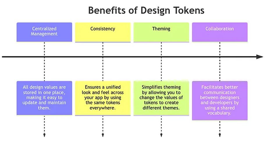
          <h3 className='text-xl font-semibold'>Design Tokens 2.0 Global Theme Rebuild</h3>
          <p className='text-muted-foreground text-sm'>
            We&apos;ve completely redesigned the theme system for Design Tokens 2.0. Tokens are now hierarchical,
            semantic, and fully type-safe — built for scaling design systems.
          </p>
        </div>
        <img
          src='https://cdn.shadcnstudio.com/ss-assets/blocks/marketing/timeline/image-03.png'
          alt='Component Sync Demo'
          className='rounded-[10px] border'
        />
        <p className='text-muted-foreground text-sm'>
          Design Tokens 2.0 introduces a complete overhaul of how themes are managed within shadcnstudio. With this
          update, design tokens are now hierarchical and semantic, offering greater flexibility and scalability for your
          design system.
        </p>
        <p className='text-muted-foreground text-sm'>
          The new system supports automatic dark/light theme pairing, making it easier than ever to maintain consistent
          visuals across all environments. Tokens for colors, spacing, typography, and more are now fully type-safe and
          easily customizable, ensuring that your design system can grow alongside your projects.{' '}
        </p>
        <Accordion type='multiple' className='-mt-4 mb-0 w-full' defaultValue={['item-1']}>
          <AccordionItem value='item-1'>
            <AccordionTrigger className='hover:no-underline [&>svg]:size-6'>
              <Badge className='h-6 rounded-sm border-none bg-green-600/10 text-green-600 focus-visible:ring-green-600/20 focus-visible:outline-none dark:bg-green-400/10 dark:text-green-400 dark:focus-visible:ring-green-400/40 [a&]:hover:bg-green-600/5 dark:[a&]:hover:bg-green-400/5'>
                New
              </Badge>
            </AccordionTrigger>
            <AccordionContent className='text-muted-foreground'>
              <ul className='text-muted-foreground list-inside list-disc space-y-3 text-sm'>
                <li>Complete token overhaul unified color, spacing & typography system.</li>
                <li>Preset Themes instantly apply predefined light/dark palettes.</li>
                <li>Global token inspector view & edit all tokens in one place.</li>
                <li>Preview share links generate temporary links to share progress with your team</li>
              </ul>
            </AccordionContent>
          </AccordionItem>
          <AccordionItem value='item-2'>
            <AccordionTrigger className='hover:no-underline [&>svg]:size-6'>
              <Badge className='h-6 rounded-sm border-none bg-sky-600/10 text-sky-600 focus-visible:ring-sky-600/20 focus-visible:outline-none dark:bg-sky-400/10 dark:text-sky-400 dark:focus-visible:ring-sky-400/40 [a&]:hover:bg-sky-600/5 dark:[a&]:hover:bg-sky-400/5'>
                Updates
              </Badge>
            </AccordionTrigger>
            <AccordionContent className='text-muted-foreground'>
              <ul className='text-muted-foreground list-inside list-disc space-y-3 text-sm'>
                <li>Smarter token fallback logic for consistent theming across components</li>
                <li>Improved OKLCH color handling for better contrast & accessibility</li>
                <li>Faster token rendering in the design preview (25% boost)</li>
                <li>Better error handling during build failures with clearer actions</li>
                <li>Updated environment variable manager for easier key/value edits</li>
              </ul>
            </AccordionContent>
          </AccordionItem>
          <AccordionItem value='item-3'>
            <AccordionTrigger className='hover:no-underline [&>svg]:size-6'>
              <Badge className='h-6 rounded-sm border-none bg-amber-600/10 text-amber-600 focus-visible:ring-amber-600/20 focus-visible:outline-none dark:bg-orange-400/10 dark:text-orange-400 dark:focus-visible:ring-orange-400/40 [a&]:hover:bg-amber-600/5 dark:[a&]:hover:bg-orange-400/5'>
                Bug Fixes
              </Badge>
            </AccordionTrigger>
            <AccordionContent className='text-muted-foreground'>
              <ul className='text-muted-foreground list-inside list-disc space-y-3 text-sm'>
                <li>Fixed broken references causing inconsistent button colors</li>
                <li>Corrected spacing token mismatch in forms and modals</li>
                <li>Resolved theme switching lag in large projects</li>
              </ul>
            </AccordionContent>
          </AccordionItem>
        </Accordion>
      </div>
    </div>
  )
}

export default V1_1_0_Content
```

### `src/registry/new-york/components/blocks/timeline-component-05/content/v1-2-0.tsx`

```tsx
import { Badge } from '@/registry/new-york/ui/badge'
import { CopyCode } from '@/registry/new-york/ui/copy-code'
import { Accordion, AccordionContent, AccordionItem, AccordionTrigger } from '@/registry/new-york/ui/accordion'

const V1_2_0_Content = () => {
  const codeExample = `// Example of updated API usage
const agent = new AIAgent({
  model: "Shadcn/studio",
  reasoning: "enhanced",
  multiModal: true,
});`

  return (
    <div>
      <div className='space-y-4'>
        <div className='space-y-3'>
          <h3 className='text-xl font-semibold'>Studio Dashboard Live Preview & Deployment</h3>
          <p className='text-muted-foreground text-sm'>
            The new Studio Dashboard brings together everything you need to preview, test, and deploy your component
            library right from your browser.
          </p>
        </div>
        <ul className='text-muted-foreground ml-2 list-inside list-disc space-y-3 text-sm'>
          <li>Preview components in any framework (Next.js, Remix, Vite)</li>
          <li>One-click deploy to Vercel</li>
          <li>Real-time preview links for teams</li>
        </ul>
        <div className='flex flex-wrap items-center gap-4'>
          {/* vite */}
          <div className='flex items-center gap-1.5 rounded-[6px] bg-amber-600/10 px-3 py-1 dark:bg-amber-400/10'>
            <img src='https://cdn.shadcnstudio.com/ss-assets/brand-logo/vite-logo.png' alt='Vite' className='h-4.5' />
            <span className='text-xs font-medium'>Vite</span>
          </div>
          {/* React */}
          <div className='flex items-center gap-1.5 rounded-[6px] bg-sky-600/10 px-3 py-1 dark:bg-sky-400/10'>
            <img src='https://cdn.shadcnstudio.com/ss-assets/brand-logo/react-logo.png' alt='React' className='h-4.5' />
            <span className='text-xs font-medium'>React</span>
          </div>
          {/* Angular */}
          <div className='bg-destructive/10 flex items-center gap-1.5 rounded-[6px] px-3 py-1'>
            <img
              src='https://cdn.shadcnstudio.com/ss-assets/brand-logo/astro-icon.png'
              alt='Astro'
              className='h-4.5 dark:hidden'
            />
            <img
              src='https://cdn.shadcnstudio.com/ss-assets/brand-logo/astro-icon-dark.png'
              alt='Astro'
              className='hidden h-4.5 dark:block'
            />
            <span className='text-xs font-medium'>Astro</span>
          </div>
        </div>
        <CopyCode code={codeExample} />
        <p className='text-muted-foreground text-sm'>
          The Studio Dashboard is a powerful tool within shadcnstudio that streamlines the process of designing,
          previewing, and deploying your component library. It allows you to instantly preview components in different
          frameworks (like Next.js, Remix, and Vite) directly from the dashboard.
        </p>
        <Accordion type='multiple' className='-mt-4 mb-0 w-full' defaultValue={['item-1']}>
          <AccordionItem value='item-1'>
            <AccordionTrigger className='hover:no-underline [&>svg]:size-6'>
              <Badge className='h-6 rounded-sm border-none bg-green-600/10 text-green-600 focus-visible:ring-green-600/20 focus-visible:outline-none dark:bg-green-400/10 dark:text-green-400 dark:focus-visible:ring-green-400/40 [a&]:hover:bg-green-600/5 dark:[a&]:hover:bg-green-400/5'>
                New
              </Badge>
            </AccordionTrigger>
            <AccordionContent className='text-muted-foreground'>
              <ul className='text-muted-foreground list-inside list-disc space-y-3 text-sm'>
                <li>Live Preview mode instantly test UI changes inside the dashboard.</li>
                <li>One-click Deployment push updates to production without leaving Studio.</li>
                <li>Multi-environment support manage dev, staging, and production easily.</li>
                <li>New semantic tokens cleaner mapping for UI states (hover, active, focus)</li>
              </ul>
            </AccordionContent>
          </AccordionItem>
          <AccordionItem value='item-2'>
            <AccordionTrigger className='hover:no-underline [&>svg]:size-6'>
              <Badge className='h-6 rounded-sm border-none bg-sky-600/10 text-sky-600 focus-visible:ring-sky-600/20 focus-visible:outline-none dark:bg-sky-400/10 dark:text-sky-400 dark:focus-visible:ring-sky-400/40 [a&]:hover:bg-sky-600/5 dark:[a&]:hover:bg-sky-400/5'>
                Updates
              </Badge>
            </AccordionTrigger>
            <AccordionContent className='text-muted-foreground'>
              <ul className='text-muted-foreground list-inside list-disc space-y-3 text-sm'>
                <li>Improved preview performance for heavy UI blocks (+40% faster).</li>
                <li>Smarter auto-refresh reloads only the updated section, not the full screen.</li>
              </ul>
            </AccordionContent>
          </AccordionItem>
          <AccordionItem value='item-3'>
            <AccordionTrigger className='hover:no-underline [&>svg]:size-6'>
              <Badge className='h-6 rounded-sm border-none bg-amber-600/10 text-amber-600 focus-visible:ring-amber-600/20 focus-visible:outline-none dark:bg-orange-400/10 dark:text-orange-400 dark:focus-visible:ring-orange-400/40 [a&]:hover:bg-amber-600/5 dark:[a&]:hover:bg-orange-400/5'>
                Bug Fixes
              </Badge>
            </AccordionTrigger>
            <AccordionContent className='text-muted-foreground'>
              <ul className='text-muted-foreground list-inside list-disc space-y-3 text-sm'>
                <li>Fixed deployment logs not showing real-time events</li>
                <li>Corrected spacing token mismatch in forms, modals, and bento blocks</li>
                <li>Fixed incorrect color export in some frameworks (React / Vue)</li>
                <li>Resolved UI flicker when switching between preview modes</li>
                <li>Corrected environment variables not syncing in some workspaces</li>
              </ul>
            </AccordionContent>
          </AccordionItem>
        </Accordion>
      </div>
    </div>
  )
}

export default V1_2_0_Content
```

### `src/registry/new-york/components/blocks/timeline-component-05/content/v1-3-0.tsx`

```tsx
import { Badge } from '@/registry/new-york/ui/badge'
import { Accordion, AccordionContent, AccordionItem, AccordionTrigger } from '@/registry/new-york/ui/accordion'

const V1_3_0_Content = () => {
  return (
    <div>
      <div className='space-y-4'>
        <div className='space-y-3'>
          <h3 className='text-xl font-semibold'>Component Sync Unified Library Management (Beta)</h3>
          <p className='text-muted-foreground text-sm'>
            We&apos;re launching Component Sync, a new way to manage, version, and update all your shadcn components
            across projects with a single click.
          </p>
        </div>
        <div className='space-y-3'>
          <p className='font-medium'>Now you can :</p>
          <ul className='text-muted-foreground ml-2 list-inside list-disc space-y-3 text-sm'>
            <li>Sync shared components instantly between multiple apps</li>
            <li>Track version diffs and apply updates selectively</li>
            <li>Automatically resolve dependency conflicts</li>
          </ul>
        </div>
        <img
          src='https://cdn.shadcnstudio.com/ss-assets/blocks/marketing/timeline/image-04.png'
          alt='Component Sync Demo'
          className='rounded-[10px]'
        />
        <Accordion type='multiple' className='-mt-4 mb-0 w-full' defaultValue={['item-1']}>
          <AccordionItem value='item-1'>
            <AccordionTrigger className='hover:no-underline [&>svg]:size-6'>
              <Badge className='h-6 rounded-sm border-none bg-green-600/10 text-green-600 focus-visible:ring-green-600/20 focus-visible:outline-none dark:bg-green-400/10 dark:text-green-400 dark:focus-visible:ring-green-400/40 [a&]:hover:bg-green-600/5 dark:[a&]:hover:bg-green-400/5'>
                New
              </Badge>
            </AccordionTrigger>
            <AccordionContent className='text-muted-foreground'>
              <ul className='text-muted-foreground list-inside list-disc space-y-3 text-sm'>
                <li>“Sync All” button for project-wide updates.</li>
                <li>Component diff viewer with inline changelog.</li>
                <li>Scoped sync choose which namespaces or folders to update</li>
              </ul>
            </AccordionContent>
          </AccordionItem>
          <AccordionItem value='item-2'>
            <AccordionTrigger className='hover:no-underline [&>svg]:size-6'>
              <Badge className='h-6 rounded-sm border-none bg-sky-600/10 text-sky-600 focus-visible:ring-sky-600/20 focus-visible:outline-none dark:bg-sky-400/10 dark:text-sky-400 dark:focus-visible:ring-sky-400/40 [a&]:hover:bg-sky-600/5 dark:[a&]:hover:bg-sky-400/5'>
                Updates
              </Badge>
            </AccordionTrigger>
            <AccordionContent className='text-muted-foreground'>
              <ul className='text-muted-foreground list-inside list-disc space-y-3 text-sm'>
                <li>Faster load times in component explorer (-30%)</li>
                <li>Auto-preview for dark/light theme variants</li>
                <li>TypeScript types now update automatically when syncing</li>
              </ul>
            </AccordionContent>
          </AccordionItem>
          <AccordionItem value='item-3'>
            <AccordionTrigger className='hover:no-underline [&>svg]:size-6'>
              <Badge className='h-6 rounded-sm border-none bg-amber-600/10 text-amber-600 focus-visible:ring-amber-600/20 focus-visible:outline-none dark:bg-orange-400/10 dark:text-orange-400 dark:focus-visible:ring-orange-400/40 [a&]:hover:bg-amber-600/5 dark:[a&]:hover:bg-orange-400/5'>
                Bug Fixes
              </Badge>
            </AccordionTrigger>
            <AccordionContent className='text-muted-foreground'>
              <ul className='text-muted-foreground list-inside list-disc space-y-3 text-sm'>
                <li>Fixed sync conflicts with large component libraries</li>
                <li>Resolved memory leak in diff viewer</li>
                <li>Fixed incorrect version detection for nested components</li>
              </ul>
              <div className='mt-4 flex flex-wrap items-center gap-4'>
                <div className='bg-primary/10 text-destructive rounded-sm px-3 py-1 text-xs leading-4.5 font-medium'>
                  /v1/components/sync
                </div>
                <div className='bg-primary/10 text-destructive rounded-sm px-3 py-1 text-xs leading-4.5 font-medium'>
                  /v1/components/pull
                </div>
                <div className='bg-primary/10 text-destructive rounded-sm px-3 py-1 text-xs leading-4.5 font-medium'>
                  --interactive
                </div>
              </div>
            </AccordionContent>
          </AccordionItem>
        </Accordion>
      </div>
    </div>
  )
}

export default V1_3_0_Content
```

### `src/registry/new-york/components/blocks/timeline-component-05/timeline-component-05.tsx`

```tsx
import type { ReactNode } from 'react'

import { Badge } from '@/registry/new-york/ui/badge'

export interface Release {
  version: string
  date: string
  content: ReactNode
}

interface ChangelogContentProps {
  releases: Release[]
}

const ChangelogContent = ({ releases }: ChangelogContentProps) => {
  return (
    <>
      <div className='mb-8 space-y-4 text-center md:mb-10 lg:mb-18'>
        <h2 className='text-2xl font-semibold tracking-tight md:text-3xl lg:text-4xl'>Changelog Origin Update</h2>
        <p className='text-muted-foreground text-xl'>
          Discover what’s been added, changed, fixed, improved, and updated in this release.
        </p>
      </div>
      {releases.map((release, index) => (
        <div key={release.version} id={String(index + 1)} className='relative flex scroll-mt-18 justify-end gap-2'>
          <div className='sticky top-19 flex w-36 flex-col items-end gap-2 self-start pb-4 max-md:hidden'>
            <Badge className='flex size-6 w-auto justify-end rounded-sm text-sm font-medium'>{release.version}</Badge>
            <div className='text-muted-foreground text-right text-sm font-medium'>{release.date}</div>
          </div>
          <div className='flex flex-col items-center'>
            <div className='sticky top-19 flex size-6 items-center justify-center max-sm:top-5'>
              <span className='bg-primary/20 flex size-4.5 shrink-0 items-center justify-center rounded-full'>
                <span className='bg-primary size-3 rounded-full' />
              </span>
            </div>
            <span className='-mt-2.5 w-px flex-1 border' />
          </div>
          <div className='flex flex-1 flex-col gap-4 pb-11 pl-3 md:pl-6 lg:pl-9'>
            <div className='flex flex-col gap-2 md:hidden'>
              <Badge className='flex rounded-sm font-medium'>{release.version}</Badge>
              <div className='font-medium'>{release.date}</div>
            </div>
            {release.content}
          </div>
        </div>
      ))}
    </>
  )
}

export default ChangelogContent
```

### `src/registry/new-york/ui/copy-code.tsx`

```tsx
'use client'

import { useState } from 'react'

import { CopyIcon, CheckIcon } from 'lucide-react'

type CopyCodeProps = {
  code: string
  language?: string
}

function CopyCode({ code = 'javascript' }: CopyCodeProps) {
  const [copied, setCopied] = useState(false)

  const handleCopy = async () => {
    try {
      // Check if clipboard API is available
      if (navigator.clipboard && window.isSecureContext) {
        await navigator.clipboard.writeText(code)
        setCopied(true)
        setTimeout(() => setCopied(false), 1500)
      } else {
        // Fallback method for older browsers or non-secure contexts
        const textArea = document.createElement('textarea')

        textArea.value = code
        textArea.style.position = 'absolute'
        textArea.style.left = '-999999px'
        document.body.prepend(textArea)
        textArea.select()
        document.execCommand('copy')
        textArea.remove()
        setCopied(true)
        setTimeout(() => setCopied(false), 1500)
      }
    } catch (err) {
      console.error('Failed to copy', err)

      // Show user feedback even if copy failed
      alert('Failed to copy code to clipboard')
    }
  }

  // Simple syntax highlighting for JavaScript/TypeScript
  const highlightCode = (code: string) => {
    let result = code

    // 1. Strings (blue) - process first to protect content
    result = result.replace(/"([^"]*)"/g, '<span class="text-blue-600 dark:text-blue-400">"$1"</span>')
    result = result.replace(/\b(agent)\b/g, '<span class="text-blue-600 dark:text-blue-400">$1</span>')

    // 2. Keywords (red/green)
    result = result.replace(/\b(const|let|var|new|false)\b/g, '<span class="text-red-600 dark:text-red-400">$1</span>')

    result = result.replace(/\b(AIAgent|true)\b/g, '<span class="text-green-600 dark:text-green-400">$1</span>')

    // 3. Comments (gray) - process last
    result = result.replace(/\/\/ ([^\n]*)/g, '<span class="text-gray-500 dark:text-gray-400">// $1</span>')

    return result
  }

  return (
    <div className='bg-muted relative rounded-[14px] p-2.5' style={{ fontFamily: "'Fira Code', monospace" }}>
      <div className='rounded-[10px] bg-white px-3.5 py-2.5 text-xs dark:bg-black'>
        <pre className='overflow-x-auto'>
          <code dangerouslySetInnerHTML={{ __html: highlightCode(code) }} />
        </pre>
        <button
          onClick={handleCopy}
          className='bg-muted absolute end-0 bottom-0 rounded-md p-1.5 transition-colors'
          aria-label={copied ? 'Copied' : 'Copy code'}
        >
          {copied ? <CheckIcon className='size-4' /> : <CopyIcon className='size-4' />}
        </button>
      </div>
    </div>
  )
}

export { CopyCode }
```