# Bento Grid 01 - Customer Testimonials

> Discover authentic feedback from satisfied customers who trust our components to build faster, streamline development workflows, and confidently launch scalable, production-ready applications.

A shadcn/ui block from the [@shadcn-space](https://shadcnspace.com) registry, listed on [shadcn.exchange](https://shadcn.exchange/r/shadcn-space/bento-grid-01).

- Page, with a live preview: https://shadcn.exchange/r/shadcn-space/bento-grid-01
- Screenshot: https://abzjhwgwpdpz7ua5.public.blob.vercel-storage.com/shots/shadcn-space/bento-grid-01-light-3415da67b6bca9d4.png
- Registry item: https://shadcnspace.com/r/bento-grid-01.json
- Listed: 2026-10-13, source last changed 2026-10-13

## Install

```bash
npx shadcn@latest add https://shadcnspace.com/r/bento-grid-01.json
```

Run it in a project that has shadcn/ui set up. It adds the files below and installs what they depend on.

## Dependencies

- npm packages: `lucide-react`, `motion`
- Registry items: `badge`

## Files

### `src/components/shadcn-space/blocks/bento-grid-01/page.tsx`

```tsx
import Bentogrid from "@/components/shadcn-space/blocks/bento-grid-01/bentogrid";

const Page = () => {
  return <Bentogrid />;
};

export default Page;
```

### `src/components/shadcn-space/blocks/bento-grid-01/bentogrid.tsx`

```tsx
import { Badge } from "@/components/ui/badge";
import ReminderAnimation from "@/components/shadcn-space/blocks/bento-grid-01/ReminderAnimation";
import AnimatedUiBlock from "@/components/shadcn-space/blocks/bento-grid-01/AnimatedUiBlock";

const Bentogrid = () => {
  return (
    <section>
      <div className="py-11 md:py-20">
        <div className="max-w-7xl xl:px-16 lg:px-8 px-4 mx-auto flex flex-col gap-12">
          <div className="flex flex-col gap-4 items-center justify-center max-w-3xl mx-auto">
            <Badge variant={"outline"} className="px-3 py-1 h-auto text-sm font-normal">
              Bento Grid Features
            </Badge>
            <h2 className="text-center md:text-5xl text-3xl mx-auto font-medium">
              Beautifully and well balanced bento grid design section
            </h2>
          </div>
          <div className="grid grid-cols-12 gap-5">
            <div className="lg:col-span-4 col-span-12 overflow-hidden">
              <div className="rounded-xl border border-border">
                <div className="bg-muted rounded-t-xl py-8 px-9 relative">
                  <ReminderAnimation />
                </div>
                <div className="flex flex-col gap-0.5 p-8 border-t border-border">
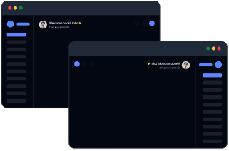
                  <h3 className="text-xl font-medium text-foreground">
                    Awesome Shadcn components
                  </h3>
                  <p className="text-base font-normal text-muted-foreground">
                    A collection of custom-built, highly flexible Shadcn components
                  </p>
                </div>
              </div>
            </div>
            <div className="lg:col-span-8 col-span-12 overflow-hidden">
              <div className="rounded-xl border border-border">
                <div className="bg-muted rounded-t-xl py-7 lg:px-30 px-6 relative">
                  <AnimatedUiBlock />
                </div>
                <div className="flex flex-col gap-0.5 p-8 border-t border-border">
                  <h3 className="text-xl font-medium text-foreground">
                    Beautifully crafted ui blocks
                  </h3>
                  <p className="text-base font-normal text-muted-foreground">
                    Build powerful dashboards in no time with per-built Shadcn components and layouts. Whether you're creating admin panels, analytics dashboards, or SaaS back-ends.
                  </p>
                </div>
              </div>
            </div>

            <div className="lg:col-span-4 col-span-12 overflow-hidden">
              <div className="rounded-xl border border-border h-full flex flex-col">
                <div className="p-8 bg-muted rounded-t-xl flex-1 flex items-center justify-center">
                  <img
                    src="https://images.shadcnspace.com/assets/bento-grid/bento-grid-img-1.png"
                    alt="layout options"
                    className="dark:hidden"
                  />
                  <img
                    src="https://images.shadcnspace.com/assets/bento-grid/bento-grid-darkimg-1.png"
                    alt="layout options"
                    className="hidden dark:block"
                  />
                </div>
                <div className="flex flex-col gap-0.5 p-8 border-t border-border">
                  <h3 className="text-xl font-medium text-foreground">
                    Multiple layout options
                  </h3>
                  <p className="text-base font-normal text-muted-foreground">
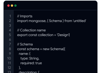
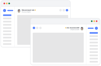
                    We have LTR and RTL options along with different layout
                    options as well.
                  </p>
                </div>
              </div>
            </div>

            <div className="lg:col-span-4 col-span-12 overflow-hidden">
              <div className="rounded-xl border border-border h-full flex flex-col">
                <div className="p-8 bg-muted rounded-t-xl flex-1 flex items-center justify-center">
                  <img
                    src="https://images.shadcnspace.com/assets/bento-grid/bento-grid-img-2.png"
                    alt="documentation"
                    className="dark:hidden"
                  />
                  <img
                    src="https://images.shadcnspace.com/assets/bento-grid/bento-grid-darkimg-2.png"
                    alt="documentation"
                    className="hidden dark:block"
                  />
                </div>
                <div className="flex flex-col gap-0.5 p-8 border-t border-border">
                  <h3 className="text-xl font-medium text-foreground">
                    Well documented
                  </h3>
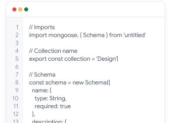
                  <p className="text-base font-normal text-muted-foreground">
                    A well-structured and easy-to-follow documentation for your
                    project.
                  </p>
                </div>
              </div>
            </div>

            <div className="lg:col-span-4 col-span-12 overflow-hidden">
              <div className="rounded-xl border border-border h-full flex flex-col">
                <div className="p-8 bg-muted rounded-t-xl flex-1 flex items-center justify-center relative">
                  <img
                    src="https://images.shadcnspace.com/assets/bento-grid/bento-grid-img-3.png"
                    alt="color options"
                  />
                </div>
                <div className="flex flex-col gap-0.5 p-8 border-t border-border">
                  <h3 className="text-xl font-medium text-foreground">
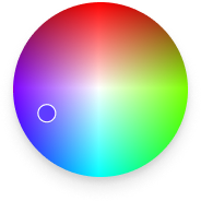
                    Multiple color options
                  </h3>
                  <p className="text-base font-normal text-muted-foreground">
                    Unlimited color options to match with your brand instantly
                    and easily.
                  </p>
                </div>
              </div>
            </div>
          </div>
        </div>
      </div>
    </section>
  );
};

export default Bentogrid;
```

### `src/components/shadcn-space/blocks/bento-grid-01/AnimatedUiBlock.tsx`

```tsx
"use client";
import { motion } from "motion/react";
import { AppWindowMac, BarChart3, Box, ChartColumnBig, Command, Presentation, ShieldCheck, WandSparkles } from "lucide-react";

export default function AnimatedUiBlock() {
    return (
        <>
            <div className="min-h-[216px] flex items-center justify-center relative">
                <span className="flex items-center justify-center rounded-full shadow-lg">
                    <img alt="shadcn dark logo" src="https://images.shadcnspace.com/assets/logo/shadcn-logo.png" width={96} height={96} />
                </span>
                <motion.div
                    className="absolute start-[70%] top-0 z-10"
                    animate={{
                        y: [-15, 15, -15]
                    }}
                    transition={{
                        duration: 3,
                        ease: "easeInOut",
                        repeat: Infinity
                    }}>
                    <span aria-label="Multiple Layouts" className="lg:size-18 size-11 flex items-center justify-center rounded-full bg-background">
                        <AppWindowMac size={32} />
                    </span>
                </motion.div>
                <motion.div
                    className="absolute start-[91%] top-[28%] z-10"
                    animate={{
                        y: [15, -15, 15]
                    }}
                    transition={{
                        duration: 3,
                        ease: "easeInOut",
                        repeat: Infinity,
                    }}>
                    <span aria-label="UI Blocks" className="lg:size-12 size-7 flex items-center justify-center rounded-full bg-background">
                        <Command size={24} />
                    </span>
                </motion.div>
                <motion.div
                    className="absolute start-[78%] top-[61%] z-10"
                    animate={{
                        y: [-15, 15, -15]
                    }}
                    transition={{
                        duration: 3,
                        ease: "easeInOut",
                        repeat: Infinity,
                        delay: 1
                    }}>
                    <span aria-label="Authentication" className="lg:size-18 size-11 flex items-center justify-center rounded-full bg-background">
                        <ShieldCheck size={36} />
                    </span>
                </motion.div>
                <motion.div
                    className="absolute end-[78%] top-0"
                    animate={{
                        y: [15, -15, 15]
                    }}
                    transition={{
                        duration: 3,
                        ease: "easeInOut",
                        repeat: Infinity,
                    }}>
                    <span aria-label="Animated Components" className="lg:size-12 size-7 flex items-center justify-center rounded-full bg-background">
                        <Presentation size={20} />
                    </span>
                </motion.div>
                <motion.div
                    className="absolute end-[67%] lg:top-[61%] top-[80%] z-10"
                    animate={{
                        y: [-15, 15, -15]
                    }}
                    transition={{
                        duration: 3,
                        ease: "easeInOut",
                        repeat: Infinity,
                        delay: 0.2
                    }}>
                    <span aria-label="Ai Builder" className="lg:size-18 size-11 flex items-center justify-center rounded-full bg-background">
                        <WandSparkles size={32} />
                    </span>
                </motion.div>
                <motion.div
                    className="absolute lg:end-[98%] end-[80%] lg:top-0 top-[30%]"
                    animate={{
                        y: [15, -15, 15]
                    }}
                    transition={{
                        duration: 3,
                        ease: "easeInOut",
                        repeat: Infinity,
                        delay: 0.5
                    }}>
                    <span aria-label="Charts" className="lg:size-18 size-11 flex items-center justify-center rounded-full bg-background">
                        <BarChart3 size={32} />
                    </span>
                </motion.div>
                <motion.div
                    className="absolute end-[95%] top-[67%] z-10"
                    animate={{
                        y: [-15, 15, -15]
                    }}
                    transition={{
                        duration: 3,
                        ease: "easeInOut",
                        repeat: Infinity,
                        delay: 0.7
                    }}>
                    <span aria-label="UI Components" className="lg:size-12 size-7 flex items-center justify-center rounded-full bg-background">
                        <Box size={22} />
                    </span>
                </motion.div>
            </div >
        </>
    )
}
```

### `src/components/shadcn-space/blocks/bento-grid-01/ReminderAnimation.tsx`

```tsx
"use client";
import { BarChart3, Check, CirclePlay, Diamond, FormInput, LayoutGrid, LucideIcon, Route } from "lucide-react";
import { motion, AnimatePresence } from "motion/react";
import { useEffect, useState } from "react";

type Item = {
  id: string;
  title: string;
  icon: LucideIcon;
};

const DATA: Item[] = [
  {
    id: "1",
    title: "Breadcrumb component",
    icon: Route,
  },
  {
    id: "2",
    title: "Animated component",
    icon: CirclePlay,
  },
  {
    id: "3",
    title: "UI components",
    icon: Diamond,
  },
  {
    id: "4",
    title: "Form components",
    icon: FormInput,
  },
  {
    id: "5",
    title: "Chart components",
    icon: BarChart3,
  },
  {
    id: "6",
    title: "Layout components",
    icon: LayoutGrid,
  },
  {
    id: "7",
    title: "Area Chart",
    icon: BarChart3,
  },
];

export default function ReminderCarousel() {
  const [visible, setVisible] = useState<Item[]>(DATA.slice(0, 3));
  const [pointer, setPointer] = useState(2);

  useEffect(() => {
    const interval = setInterval(() => {
      setVisible((prev) => {
        const nextIndex = (pointer + 1) % DATA.length;
        setPointer(nextIndex);
        return [...prev.slice(1), DATA[nextIndex]];
      });
    }, 2000);

    return () => clearInterval(interval);
  }, [pointer]);

  return (
    <div className="relative flex flex-col items-center rounded-2xl h-52 w-full overflow-hidden">
      <AnimatePresence initial={false}>
        {visible.map((item, i) => (
          <motion.div
            key={item.id}
            initial={{ y: 215, opacity: 0, scale: 0.9 }}
            animate={{
              y: i * 70,
              scale: i === 1 ? 1 : 0.9,
              opacity: i === 1 ? 1 : 0.5,
            }}
            exit={{ y: -100, opacity: 0, scale: 0.8 }}
            transition={{ duration: 0.6, ease: "easeInOut" }}
            className="absolute flex items-center justify-between w-full px-5 py-4 rounded-xl bg-background border border-border text-card-foreground">
            <div className="flex items-center justify-between w-full">
              <div className="flex items-center gap-2">
                <item.icon size={20}/>
                <span className="text-sm font-medium">{item.title}</span>
              </div>
              <Check size={20}/>
            </div>
          </motion.div>
        ))}
      </AnimatePresence>
    </div>
  );
}
```