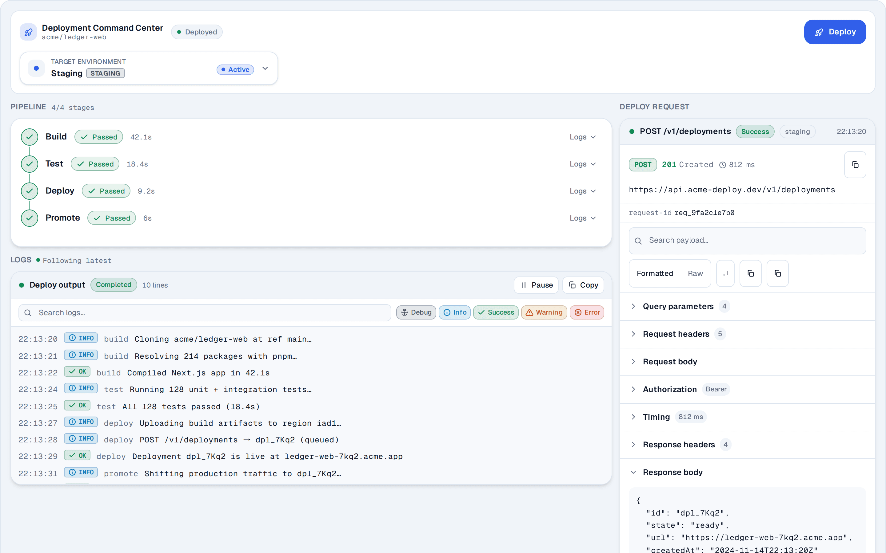
Application shell with a workspace switcher
Grouped navigation with count badges, row menus and a footer account menu.
@reui
Grouped navigation with count badges, row menus and a footer account menu.
@reui
c-sidebar-1.tsx
"use client"
import { useState, type ReactNode } from "react"
import { cn } from "cn"
import {
Avatar,
AvatarFallback,
AvatarImage,
} from "@/components/ui/avatar"
import {
Breadcrumb,
BreadcrumbItem,
BreadcrumbLink,
BreadcrumbList,
BreadcrumbPage,
BreadcrumbSeparator,
} from "@/components/ui/breadcrumb"
import { Button } from "@/components/ui/button"
import {
Card,
CardContent,
CardDescription,
CardHeader,
CardTitle,
} from "@/components/ui/card"
import {
DropdownMenu,
DropdownMenuContent,
DropdownMenuGroup,
DropdownMenuItem,
DropdownMenuLabel,
DropdownMenuSeparator,
DropdownMenuShortcut,
DropdownMenuTrigger,
} from "@/components/ui/dropdown-menu"
import {
Sidebar,
SidebarContent,
SidebarFooter,
SidebarGroup,
SidebarGroupAction,
SidebarGroupContent,
SidebarGroupLabel,
SidebarHeader,
SidebarInset,
SidebarMenu,
SidebarMenuAction,
SidebarMenuBadge,
SidebarMenuButton,
SidebarMenuItem,
SidebarProvider,
SidebarSeparator,
SidebarTrigger,
} from "@/components/ui/sidebar"
import { IconPlaceholder } from "@/app/(create)/components/icon-placeholder"
interface Workspace {
id: string
name: string
plan: string
initials: string
avatar: string
}
interface NavItem {
id: string
label: string
icon: ReactNode
badge?: number
isActive?: boolean
}
interface Deployment {
id: string
title: string
branch: string
time: string
failed?: boolean
}
// Demo data only: every link is `href="#"` and the faces come from the fixed
// set of photo ids this registry already ships, so nothing here reaches a real
// person, a real route or an invented endpoint.
const WORKSPACES: Workspace[] = [
{
id: "reui-labs",
name: "ReUI Labs",
plan: "Pro",
initials: "RL",
avatar:
"https://images.unsplash.com/photo-1535713875002-d1d0cf377fde?w=96&h=96&dpr=2&q=80",
},
{
id: "acme",
name: "Acme Robotics",
plan: "Team",
initials: "AR",
avatar:
"https://images.unsplash.com/photo-1519699047748-de8e457a634e?w=96&h=96&dpr=2&q=80",
},
{
id: "personal",
name: "Personal",
plan: "Free",
initials: "PS",
avatar:
"https://images.unsplash.com/photo-1584308972272-9e4e7685e80f?w=96&h=96&dpr=2&q=80",
},
]
// Icons live in the data as JSX nodes with a STATIC name per library. That
// shape is what `shadcn add` rewrites to whichever icon package the installer
// uses, so a computed or interpolated prop value would leave it nothing to
// rewrite and the row would render an empty box.
const NAV: NavItem[] = [
{
id: "overview",
label: "Overview",
icon: (
<IconPlaceholder
lucide="LayoutDashboardIcon"
tabler="IconLayoutDashboard"
hugeicons="DashboardSquare02Icon"
phosphor="LayoutIcon"
remixicon="RiDashboardLine"
aria-hidden="true"
/>
),
},
{
id: "inbox",
label: "Inbox",
badge: 12,
icon: (
<IconPlaceholder
lucide="InboxIcon"
tabler="IconInbox"
hugeicons="InboxIcon"
phosphor="TrayIcon"
remixicon="RiInboxLine"
aria-hidden="true"
/>
),
},
{
id: "deployments",
label: "Deployments",
isActive: true,
icon: (
<IconPlaceholder
lucide="RocketIcon"
tabler="IconRocket"
hugeicons="RocketIcon"
phosphor="RocketIcon"
remixicon="RiRocketLine"
aria-hidden="true"
/>
),
},
{
id: "analytics",
label: "Analytics",
icon: (
<IconPlaceholder
lucide="BarChart3Icon"
tabler="IconChartBar"
hugeicons="Analytics01Icon"
phosphor="ChartBarIcon"
remixicon="RiBarChartLine"
aria-hidden="true"
/>
),
},
{
id: "logs",
label: "Logs",
badge: 3,
icon: (
<IconPlaceholder
lucide="FileTextIcon"
tabler="IconFileText"
hugeicons="File02Icon"
phosphor="FileTextIcon"
remixicon="RiFileTextLine"
aria-hidden="true"
/>
),
},
{
id: "storage",
label: "Storage",
icon: (
<IconPlaceholder
lucide="LayersIcon"
tabler="IconStack2"
hugeicons="Layers01Icon"
phosphor="StackIcon"
remixicon="RiStackLine"
aria-hidden="true"
/>
),
},
]
const PROJECTS = [
{ id: "checkout", name: "Checkout API" },
{ id: "design-system", name: "Design system" },
{ id: "marketing", name: "Marketing site" },
{ id: "edge-cache", name: "Edge cache" },
]
const DEPLOYMENTS: Deployment[] = [
{
id: "d-4821",
title: "Tighten the webhook retry window",
branch: "main",
time: "12m ago",
},
{
id: "d-4820",
title: "Split the pricing bundle",
branch: "release/2.8",
time: "1h ago",
},
{
id: "d-4819",
title: "Move invoices to the edge cache",
branch: "feat/edge",
time: "3h ago",
failed: true,
},
{
id: "d-4818",
title: "Add locale fallbacks to search",
branch: "main",
time: "Yesterday",
},
]
const STATS = [
{ id: "build", label: "Build time", value: "42s" },
{ id: "success", label: "Success rate", value: "99.2%" },
{ id: "prs", label: "Open PRs", value: "7" },
]
// The ReUI mark, the same path data the App Shell Pro blocks use. An inline
// SVG on `currentColor` rather than an <img> or an icon-package import: it
// ships inside the example, needs no asset and recolours with the panel.
function BrandMark({ className }: { className?: string }) {
return (
<span
aria-hidden="true"
className={cn(
"bg-sidebar-primary text-sidebar-primary-foreground flex size-6 shrink-0 items-center justify-center rounded-md",
className
)}
>
<svg
viewBox="25.5002 25.1352 50 50"
fill="none"
xmlns="http://www.w3.org/2000/svg"
className="size-3"
>
<circle cx="70.634" cy="29.8334" r="4.69799" fill="currentColor" />
<path
fillRule="evenodd"
clipRule="evenodd"
d="M25.668 57.0144V29.8332C25.668 27.2386 27.7713 25.1352 30.366 25.1352C32.9606 25.1352 35.0639 27.2386 35.0639 29.8332V57.0144C35.0639 61.833 38.9702 65.7392 43.7888 65.7392H57.2116C62.0302 65.7392 65.9364 61.833 65.9364 57.0144V43.7258C65.9364 41.1312 68.0398 39.0278 70.6344 39.0278C73.229 39.0278 75.3324 41.1312 75.3324 43.7258V57.0144C75.3324 67.0222 67.2194 75.1352 57.2116 75.1352H43.7888C33.7809 75.1352 25.668 67.0222 25.668 57.0144Z"
fill="currentColor"
/>
</svg>
</span>
)
}
// Header switcher. The selected workspace is the example's only piece of
// state, and the breadcrumb in the inset reads the same value, so the two
// panels stay in step during render rather than through an effect.
//
// The two-line name block is `grid min-w-0 flex-1`. Without `min-w-0` a long
// workspace name refuses to shrink below its content width and pushes the
// chevron out of a 16rem column, which is the failure this file is sized to
// show off rather than avoid.
//
// No `aria-label` on the trigger. The button renders the workspace name, and
// an aria-label REPLACES visible text in the accessible name, so one here
// would hide the current selection from a screen reader and stop voice
// control addressing the button by what it reads.
//
// The tile is the product mark rather than the workspace's, fixed while the
// name beside it switches, which is the shape sidebar-08 ships. BrandMark
// defaults to the 24px tile c-sidebar-3 uses, so the call site scales tile and
// glyph together to sidebar-08's 32px instead of forking the component.
//
// The open-state highlight is `aria-expanded:`, not an open-state data
// attribute. The shadcn block writes `data-open:`, which this Base UI build
// never sets (it marks an open trigger `data-popup-open`), and the radix twin
// spells the same idea `data-[state=open]:`. Both twins do set `aria-expanded`
// on an open trigger, so it is the one spelling the two files can share.
function WorkspaceSwitcher({
workspace,
onSelect,
}: {
workspace: Workspace
onSelect: (workspace: Workspace) => void
}) {
return (
<SidebarMenu>
<SidebarMenuItem>
<DropdownMenu>
<DropdownMenuTrigger
render={
<SidebarMenuButton
size="lg"
className="aria-expanded:bg-sidebar-accent aria-expanded:text-sidebar-accent-foreground"
/>
}
>
<BrandMark className="size-8 rounded-lg [&>svg]:size-4" />
<span className="grid min-w-0 flex-1 text-left leading-tight">
<span className="truncate text-sm font-medium">
{workspace.name}
</span>
<span className="text-sidebar-foreground/70 truncate text-xs">
{workspace.plan} plan
</span>
</span>
<IconPlaceholder
lucide="ChevronsUpDownIcon"
tabler="IconSelector"
hugeicons="UnfoldMoreIcon"
phosphor="CaretUpDownIcon"
remixicon="RiExpandUpDownLine"
className="ml-auto opacity-60"
aria-hidden="true"
/>
</DropdownMenuTrigger>
<DropdownMenuContent side="bottom" align="start">
<DropdownMenuGroup>
<DropdownMenuLabel>Workspaces</DropdownMenuLabel>
{WORKSPACES.map((item) => (
<DropdownMenuItem key={item.id} onClick={() => onSelect(item)}>
<Avatar size="sm">
<AvatarImage src={item.avatar} alt="" />
<AvatarFallback>{item.initials}</AvatarFallback>
</Avatar>
<span className="truncate">{item.name}</span>
{item.id === workspace.id ? (
<IconPlaceholder
lucide="CheckIcon"
tabler="IconCheck"
hugeicons="Tick02Icon"
phosphor="CheckIcon"
remixicon="RiCheckLine"
className="ml-auto size-3.5"
aria-hidden="true"
/>
) : null}
</DropdownMenuItem>
))}
</DropdownMenuGroup>
<DropdownMenuSeparator />
<DropdownMenuGroup>
<DropdownMenuItem>
<IconPlaceholder
lucide="PlusIcon"
tabler="IconPlus"
hugeicons="PlusSignIcon"
phosphor="PlusIcon"
remixicon="RiAddLine"
aria-hidden="true"
/>
New workspace
</DropdownMenuItem>
</DropdownMenuGroup>
</DropdownMenuContent>
</DropdownMenu>
</SidebarMenuItem>
</SidebarMenu>
)
}
// Primary nav. The count badge is a SIBLING of the button, never a child:
// radix's `asChild` moves every child inside the anchor, so nesting it would
// make the two twins ship different DOM for the same example.
//
// `isActive` is the primitive's own flag rather than a class. It emits a
// `data-active` attribute that every style paints from, so the current page
// never needs hand-colouring here.
function WorkspaceNav() {
return (
<SidebarGroup>
<SidebarGroupLabel>Workspace</SidebarGroupLabel>
<SidebarGroupContent>
<SidebarMenu>
{NAV.map((item) => (
<SidebarMenuItem key={item.id}>
<SidebarMenuButton
render={<a href="#" />}
isActive={item.isActive}
>
{item.icon}
<span>{item.label}</span>
</SidebarMenuButton>
{item.badge ? (
<SidebarMenuBadge>{item.badge}</SidebarMenuBadge>
) : null}
</SidebarMenuItem>
))}
</SidebarMenu>
</SidebarGroupContent>
</SidebarGroup>
)
}
// Project rows, each with its own action menu. `showOnHover` only hides the
// action from `md` up, so on a narrow frame it stays permanently visible.
// That is the primitive's touch behaviour, not something to style around.
//
// SidebarGroupAction is absolutely positioned against the group, so it is a
// SIBLING of the label rather than a child of it. Nested inside the label it
// would still paint in the right corner and then swallow the label's own
// click target.
function ProjectNav() {
return (
<SidebarGroup>
<SidebarGroupLabel>Projects</SidebarGroupLabel>
<SidebarGroupAction type="button">
<IconPlaceholder
lucide="PlusIcon"
tabler="IconPlus"
hugeicons="PlusSignIcon"
phosphor="PlusIcon"
remixicon="RiAddLine"
aria-hidden="true"
/>
<span className="sr-only">New project</span>
</SidebarGroupAction>
<SidebarGroupContent>
<SidebarMenu>
{PROJECTS.map((project) => (
<SidebarMenuItem key={project.id}>
<SidebarMenuButton render={<a href="#" />}>
<IconPlaceholder
lucide="FolderIcon"
tabler="IconFolder"
hugeicons="FolderIcon"
phosphor="FolderIcon"
remixicon="RiFolderLine"
aria-hidden="true"
/>
<span>{project.name}</span>
</SidebarMenuButton>
<DropdownMenu>
<DropdownMenuTrigger
render={
<SidebarMenuAction
showOnHover
aria-label={`Actions for ${project.name}`}
/>
}
>
<IconPlaceholder
lucide="MoreHorizontalIcon"
tabler="IconDots"
hugeicons="MoreHorizontalCircle01Icon"
phosphor="DotsThreeIcon"
remixicon="RiMoreLine"
aria-hidden="true"
/>
</DropdownMenuTrigger>
<DropdownMenuContent side="right" align="start">
<DropdownMenuGroup>
<DropdownMenuItem>Rename</DropdownMenuItem>
<DropdownMenuItem>
<IconPlaceholder
lucide="CopyIcon"
tabler="IconCopy"
hugeicons="Copy01Icon"
phosphor="CopyIcon"
remixicon="RiFileCopyLine"
aria-hidden="true"
/>
Duplicate
</DropdownMenuItem>
</DropdownMenuGroup>
<DropdownMenuSeparator />
<DropdownMenuGroup>
<DropdownMenuItem>
<IconPlaceholder
lucide="ArchiveIcon"
tabler="IconArchive"
hugeicons="Archive01Icon"
phosphor="ArchiveIcon"
remixicon="RiArchiveLine"
aria-hidden="true"
/>
Archive
</DropdownMenuItem>
</DropdownMenuGroup>
</DropdownMenuContent>
</DropdownMenu>
</SidebarMenuItem>
))}
</SidebarMenu>
</SidebarGroupContent>
</SidebarGroup>
)
}
// Footer account menu. The label sits inside a DropdownMenuGroup in both
// twins: base's DropdownMenuLabel is a Menu.GroupLabel and throws outside one,
// radix's is standalone-safe, so grouping keeps the two files parallel.
//
// It opens to the right because the panel is flush against the left edge of
// the frame and a 548px box leaves a bottom-anchored menu nowhere to go.
//
// The trigger carries no `aria-label` for the same reason as the switcher: it
// renders the account name, and a label would replace that text rather than
// add to it.
function AccountMenu() {
return (
<SidebarMenu>
<SidebarMenuItem>
<DropdownMenu>
<DropdownMenuTrigger
render={
<SidebarMenuButton
size="lg"
className="aria-expanded:bg-sidebar-accent aria-expanded:text-sidebar-accent-foreground"
/>
}
>
<Avatar>
<AvatarImage src="https://github.com/shadcn.png" alt="" />
<AvatarFallback>NR</AvatarFallback>
</Avatar>
<span className="grid min-w-0 flex-1 text-left leading-tight">
<span className="truncate text-sm font-medium">Nadia Rahman</span>
<span className="text-sidebar-foreground/70 truncate text-xs">
nadia@reui.io
</span>
</span>
<IconPlaceholder
lucide="MoreHorizontalIcon"
tabler="IconDots"
hugeicons="MoreHorizontalCircle01Icon"
phosphor="DotsThreeIcon"
remixicon="RiMoreLine"
className="ml-auto opacity-60"
aria-hidden="true"
/>
</DropdownMenuTrigger>
<DropdownMenuContent side="right" align="end">
<DropdownMenuGroup>
<DropdownMenuLabel>Nadia Rahman</DropdownMenuLabel>
</DropdownMenuGroup>
<DropdownMenuSeparator />
<DropdownMenuGroup>
<DropdownMenuItem>
<IconPlaceholder
lucide="UserIcon"
tabler="IconUser"
hugeicons="UserIcon"
phosphor="UserIcon"
remixicon="RiUserLine"
aria-hidden="true"
/>
Profile
</DropdownMenuItem>
<DropdownMenuItem>
<IconPlaceholder
lucide="CreditCardIcon"
tabler="IconCreditCard"
hugeicons="CreditCardIcon"
phosphor="CreditCardIcon"
remixicon="RiBankCardLine"
aria-hidden="true"
/>
Billing
</DropdownMenuItem>
<DropdownMenuItem>
<IconPlaceholder
lucide="BellIcon"
tabler="IconBell"
hugeicons="NotificationIcon"
phosphor="BellIcon"
remixicon="RiNotificationLine"
aria-hidden="true"
/>
Notifications
</DropdownMenuItem>
</DropdownMenuGroup>
<DropdownMenuSeparator />
<DropdownMenuGroup>
<DropdownMenuItem>
<IconPlaceholder
lucide="LogOutIcon"
tabler="IconLogout"
hugeicons="LogoutSquare01Icon"
phosphor="SignOutIcon"
remixicon="RiLogoutBoxRLine"
aria-hidden="true"
/>
Sign out
<DropdownMenuShortcut>⇧⌘Q</DropdownMenuShortcut>
</DropdownMenuItem>
</DropdownMenuGroup>
</DropdownMenuContent>
</DropdownMenu>
</SidebarMenuItem>
</SidebarMenu>
)
}
// One run in the deployment list. Glyph and colour both carry the outcome
// visually, which is what makes the row readable without colour vision;
// neither reaches a screen reader, so the `sr-only` word is what does.
//
// The branch name drops out under 640px, where the inset is around 450px wide
// and the row would otherwise wrap onto a second line.
function DeploymentRow({ deployment }: { deployment: Deployment }) {
return (
<div className="flex items-center gap-2 text-sm">
{deployment.failed ? (
<IconPlaceholder
lucide="AlertCircleIcon"
tabler="IconAlertCircle"
hugeicons="AlertCircleIcon"
phosphor="WarningCircleIcon"
remixicon="RiErrorWarningLine"
className="text-destructive size-3.5 shrink-0"
aria-hidden="true"
/>
) : (
<IconPlaceholder
lucide="CircleCheckIcon"
tabler="IconCircleCheck"
hugeicons="CheckmarkCircle02Icon"
phosphor="CheckCircleIcon"
remixicon="RiCheckboxCircleLine"
className="text-success size-3.5 shrink-0"
aria-hidden="true"
/>
)}
<span className="sr-only">
{deployment.failed ? "Failed" : "Succeeded"}
</span>
<span className="min-w-0 flex-1 truncate">{deployment.title}</span>
<span className="text-muted-foreground hidden shrink-0 text-xs sm:inline">
{deployment.branch}
</span>
<span className="text-muted-foreground shrink-0 text-xs">
{deployment.time}
</span>
</div>
)
}
// The app surface. Every box is a Card rather than a div with a border and a
// radius: a literal `rounded-lg` is wrong in lyra and sera, which are square,
// and in maia and luma, which are far rounder. Only a component resolves the
// panel correctly under all eight styles. The header rule is a plain `border-b`
// because a single-side border carries no radius and stays style-safe.
//
// `min-w-0` on the inset matters as much as it does in the switcher: the inset
// is `w-full flex-1`, so a long breadcrumb would grow the flex item and push
// the sidebar off the left edge instead of truncating.
//
// The stat tiles only go three across from `sm` up. The panel is 16rem
// whenever it is open, so under 640px the inset has well under 400px left and
// three columns would be unreadable slivers.
function Workbench({ workspaceName }: { workspaceName: string }) {
return (
<SidebarInset className="min-w-0 overflow-hidden">
<header className="flex h-12 shrink-0 items-center gap-2 border-b px-4">
<SidebarTrigger className="-ml-1" />
<Breadcrumb className="min-w-0">
<BreadcrumbList className="flex-nowrap">
<BreadcrumbItem className="min-w-0">
<BreadcrumbLink href="#" className="truncate">
{workspaceName}
</BreadcrumbLink>
</BreadcrumbItem>
<BreadcrumbSeparator />
<BreadcrumbItem>
<BreadcrumbPage>Deployments</BreadcrumbPage>
</BreadcrumbItem>
</BreadcrumbList>
</Breadcrumb>
<Button variant="outline" size="sm" className="ml-auto">
Invite
</Button>
</header>
<div className="flex-1 overflow-auto p-4">
<div className="grid gap-3 sm:grid-cols-3">
{STATS.map((stat) => (
<Card key={stat.id} size="sm">
<CardHeader>
<CardDescription>{stat.label}</CardDescription>
<CardTitle>{stat.value}</CardTitle>
</CardHeader>
</Card>
))}
</div>
<Card size="sm" className="mt-3">
<CardHeader>
<CardTitle>Recent deployments</CardTitle>
</CardHeader>
<CardContent>
<div className="flex flex-col gap-2.5">
{DEPLOYMENTS.map((deployment) => (
<DeploymentRow key={deployment.id} deployment={deployment} />
))}
</div>
</CardContent>
</Card>
</div>
</SidebarInset>
)
}
// The full anatomy in one screen: switcher, two labelled groups, footer
// account menu, and the inset the app actually lives in.
//
// `variant="inset"` is what separates the panel from the page, and it is why
// this example no longer takes the `collapsible="none"` branch. That branch
// returns a bare `bg-sidebar` column with NO border, because only the desktop
// branch draws the `border-r`, so wherever the sidebar and page backgrounds
// sit close the two halves blur into one another. Inset paints the wrapper
// `bg-sidebar` and lifts the content out of it as a card the primitive rounds
// per style, so the boundary holds under all eight without a hand-rolled one.
//
// SidebarTrigger in the inset header is the control that takes the panel
// off-canvas and brings it back. Under 768px shadcn's Sidebar swaps the panel
// for a Sheet and that same trigger opens it.
//
// `absolute h-full` on the Sidebar, with `relative` on the provider, is what
// keeps that panel inside the example. Every branch except `collapsible="none"`
// ships `fixed inset-y-0 h-svh` on its container, and a fixed box reads neither
// the height above it nor the ancestor's overflow, so it would size against the
// VIEWPORT and paint down the page beside a 548px shell. The className lands on
// that container and tailwind-merge swaps both groups.
//
// `min-h-0` next to the height is load-bearing. SidebarProvider ships
// `min-h-svh`, and tailwind-merge only drops it when another `min-h-*` arrives
// with it, so without the pair the example is viewport tall inside its frame.
export function Pattern() {
const [workspace, setWorkspace] = useState<Workspace>(WORKSPACES[0])
return (
<SidebarProvider className="relative h-dvh min-h-0 w-full overflow-hidden">
<Sidebar variant="inset" className="absolute h-full">
<SidebarHeader>
<WorkspaceSwitcher workspace={workspace} onSelect={setWorkspace} />
</SidebarHeader>
<SidebarContent role="navigation" aria-label="Workspace">
<WorkspaceNav />
<ProjectNav />
</SidebarContent>
<SidebarFooter>
{/*
`mx-0` is a fix, not a preference. SidebarSeparator ships `w-auto`
to undo Separator's `data-horizontal:w-full`, but a variant
selector outranks a plain utility, so the rule stays full width and
the primitive's own `mx-2` then pushes it 8px past the panel's
right edge while leaving a 16px gap on the left. Zeroing the margin
lines it up with the footer's own padding.
*/}
<SidebarSeparator className="mx-0" />
<AccountMenu />
</SidebarFooter>
</Sidebar>
<Workbench workspaceName={workspace.name} />
</SidebarProvider>
)
}