Features 1
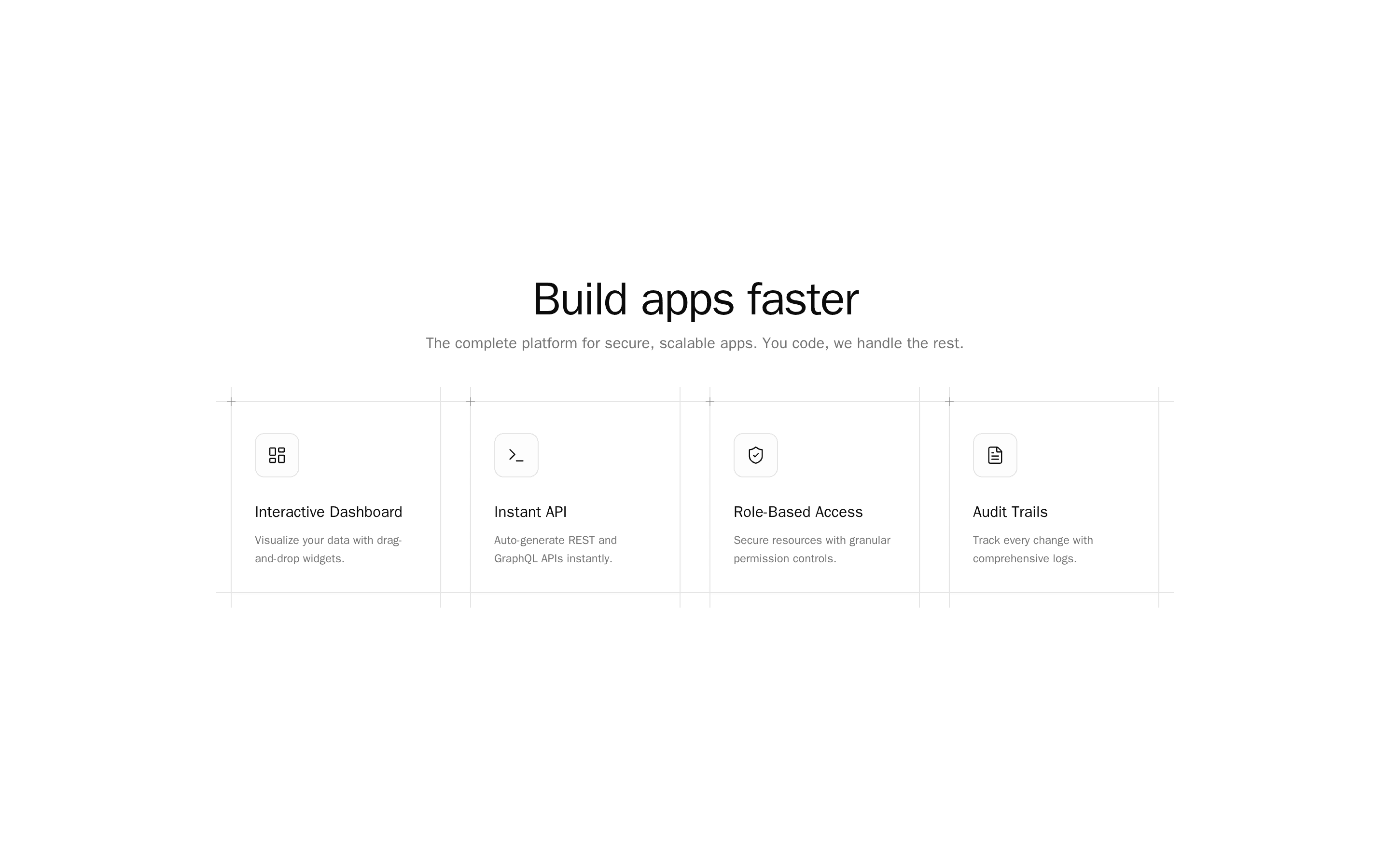
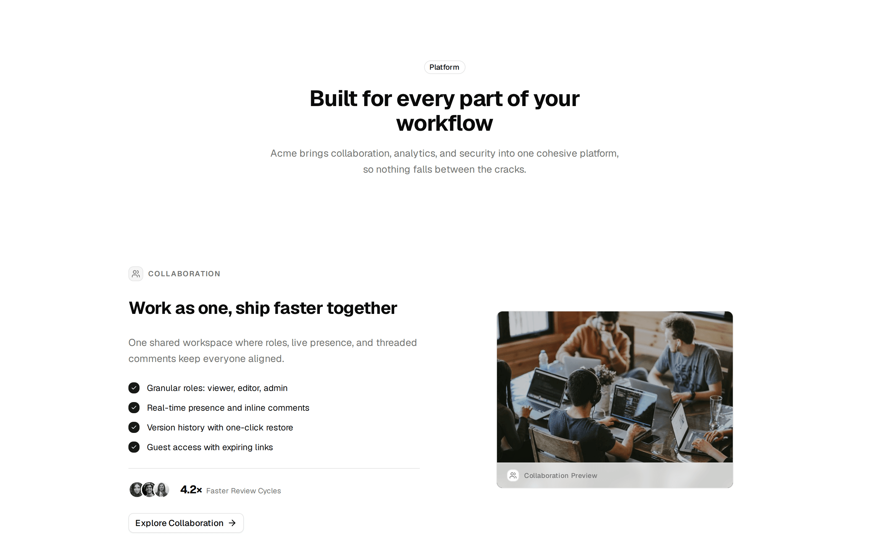
Six-cell bento grid with product features, grid-pattern cards, and scroll entrances.
@nusaiba
Six-cell bento grid with product features, grid-pattern cards, and scroll entrances.
@nusaiba
registry/blocks/features/1/features-bento-section.tsx
"use client";

import type React from "react";
import {
	BarChart3Icon,
	GlobeIcon,
	LockIcon,
	RefreshCwIcon,
	UsersIcon,
	ZapIcon,
} from "lucide-react";
import { motion } from "motion/react";
import { GridPattern } from "@/components/ui/grid-pattern";
import { SectionShell, ContentRail } from "@/components/layout-contract";

type Feature = {
	title: string;
	description: string;
	icon: React.ReactNode;
};

const features: Feature[] = [
	{
		title: "Real-time collaboration",
		icon: <UsersIcon />,
		description: "Comments, mentions, and live cursors keep everyone aligned as you ship.",
	},
	{
		title: "Automated workflows",
		icon: <RefreshCwIcon />,
		description: "Trigger actions across tools when status changes — no manual handoffs.",
	},
	{
		title: "Custom dashboards",
		icon: <BarChart3Icon />,
		description: "Build views for every team with filters, charts, and shared reports.",
	},
	{
		title: "Global CDN",
		icon: <GlobeIcon />,
		description: "Fast load times worldwide with edge caching and 99.9% uptime SLA.",
	},
	{
		title: "Role-based access",
		icon: <LockIcon />,
		description: "Granular permissions for admins, editors, and viewers out of the box.",
	},
	{
		title: "Instant setup",
		icon: <ZapIcon />,
		description: "Import your data and invite your team in under five minutes.",
	},
];

export function FeaturesBentoSection() {
	return (
		<SectionShell spacingMode="section">
			<ContentRail maxWidth="max-w-5xl" className="space-y-10">
				<div className="mx-auto max-w-3xl text-center">
					<p className="font-medium text-primary text-xs uppercase tracking-[0.25em]">
						Features
					</p>
					<h2 className="mt-3 text-balance font-medium text-2xl tracking-tight md:text-4xl lg:text-5xl">
						Built for teams that ship every week
					</h2>
					<p className="mt-4 text-muted-foreground text-sm md:text-base">
						Everything you need to plan, build, and launch — without switching between
						a dozen tools.
					</p>
				</div>
				<div className="overflow-hidden border border-border bg-border">
					<div className="grid grid-cols-1 gap-px sm:grid-cols-2 lg:grid-cols-3">
						{features.map((feature, index) => (
							<FeatureCard feature={feature} index={index} key={feature.title} />
						))}
					</div>
				</div>
			</ContentRail>
		</SectionShell>
	);
}

function FeatureCard({ feature, index }: { feature: Feature; index: number }) {
	return (
		<motion.div
			className="relative overflow-hidden bg-background p-6 md:p-8"
			initial={{ opacity: 0, y: 16 }}
			transition={{ delay: index * 0.06, duration: 0.45, ease: "easeOut" }}
			viewport={{ once: true }}
			whileInView={{ opacity: 1, y: 0 }}
		>
			<div className="pointer-events-none absolute inset-0 mask-[radial-gradient(farthest-side_at_top,white,transparent)]">
				<GridPattern
					className="absolute inset-0 size-full stroke-foreground/15"
					height={40}
					width={40}
					x={20}
				/>
			</div>
			<div className="relative z-10 [&_svg]:size-5 [&_svg]:text-foreground/70">
				{feature.icon}
			</div>
			<h3 className="relative z-10 mt-8 font-medium text-sm md:text-base">
				{feature.title}
			</h3>
			<p className="relative z-10 mt-2 text-muted-foreground text-xs md:text-sm">
				{feature.description}
			</p>
		</motion.div>
	);
}