registry/patterns/collapsible/collapsible-04.tsx
import {
  Collapsible,
  CollapsibleContent,
  CollapsibleTrigger,
} from '@/components/ui/collapsible'
import { ChevronDownIcon } from 'lucide-react'

export function Collapsible04() {
  return (
    <Collapsible className="w-full max-w-md space-y-2">
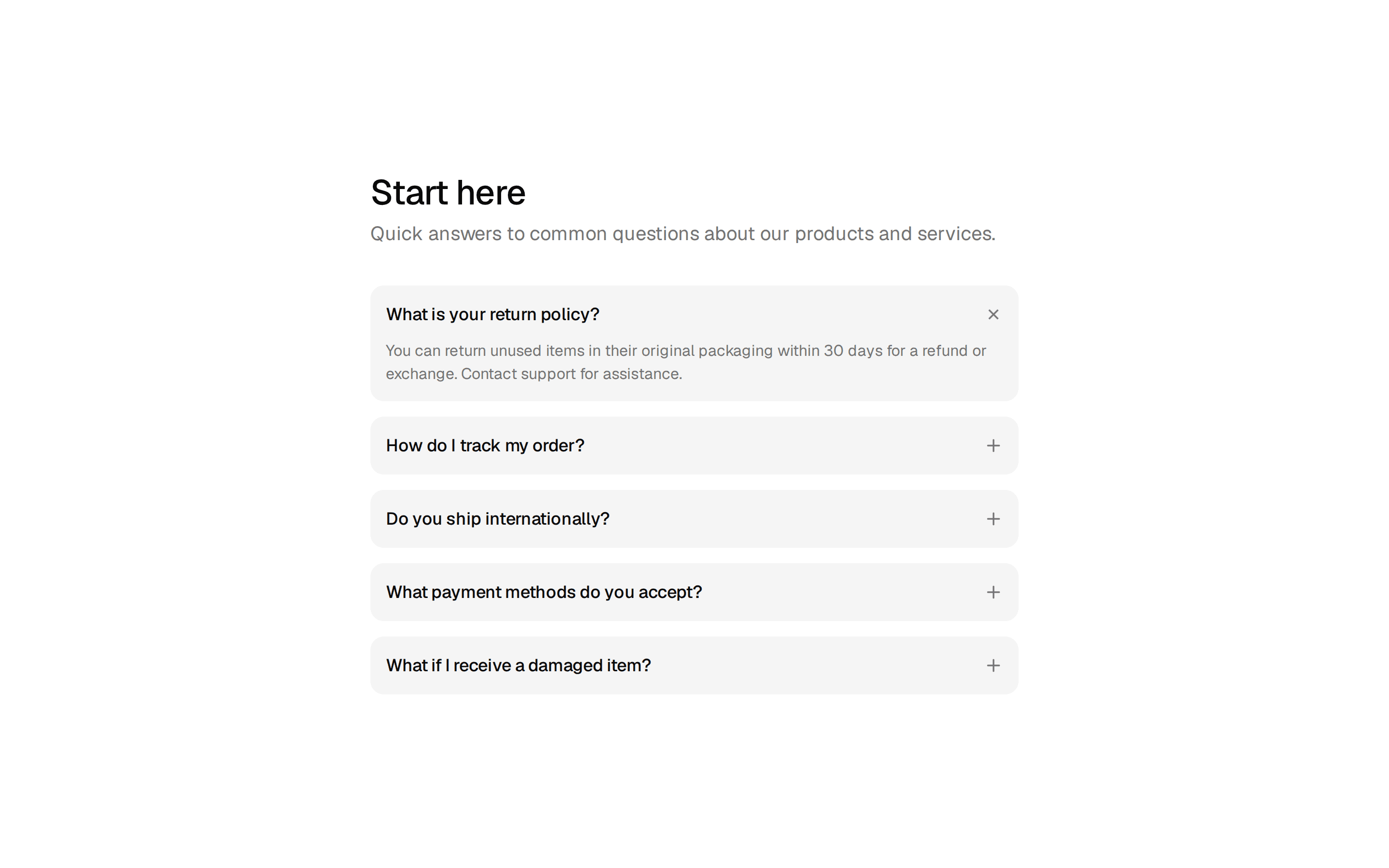
      <p className="text-sm leading-relaxed">
        Collapsible shows and hides a section of content behind an accessible
        trigger. It ships unstyled, so you own the markup, spacing, and
        animation entirely.
      </p>
      <CollapsibleContent>
        <p className="text-sm leading-relaxed">
          Under the hood it tracks the open state and exposes the content height
          as a CSS variable, so you can animate from zero to the natural height
          without measuring anything in JavaScript. Pair it with a chevron and a
          label swap for a polished read-more control.
        </p>
      </CollapsibleContent>
      <CollapsibleTrigger className="group text-primary inline-flex items-center gap-1 text-sm font-medium">
        <span className="group-data-panel-open:hidden">Read more</span>
        <span className="hidden group-data-panel-open:inline">Show less</span>
        <ChevronDownIcon className="size-4 transition-transform group-data-panel-open:rotate-180" />
      </CollapsibleTrigger>
    </Collapsible>
  )
}