"use client";
import { AnimatePresence, motion, type Transition } from "motion/react";
import * as React from "react";
import { cn } from "@/lib/utils";
import { useReducedMotion } from "@/hooks/use-reduced-motion";
/* ================================================================ shared */
const DEFAULT_ACCENT = "#818cf8";
const EASE: [number, number, number, number] = [0.22, 1, 0.36, 1];
const INSTANT: Transition = { duration: 0 };
const HEIGHT_SPRING: Transition = { type: "spring", stiffness: 420, damping: 42, mass: 0.9 };
const RISE_SPRING: Transition = { type: "spring", stiffness: 340, damping: 32, mass: 0.9 };
/** Black or white ink, whichever reads against the accent fill. */
function readableOn(hex: string): string {
const m = /^#?([0-9a-f]{3}|[0-9a-f]{6})$/i.exec(hex.trim());
if (!m) return "#0a0a0a";
let s = m[1];
if (s.length === 3) s = s.replace(/./g, (c) => c + c);
const n = parseInt(s, 16);
const lum = 0.2126 * ((n >> 16) & 255) + 0.7152 * ((n >> 8) & 255) + 0.0722 * (n & 255);
return lum > 140 ? "#0a0a0a" : "#ffffff";
}
function storageGet(key: string | undefined): string | null {
if (!key) return null;
try {
return window.localStorage.getItem(key);
} catch {
return null;
}
}
function storageSet(key: string | undefined, value: string | null) {
if (!key) return;
try {
if (value === null) window.localStorage.removeItem(key);
else window.localStorage.setItem(key, value);
} catch {
/* storage blocked (private mode, sandbox) — state stays in memory */
}
}
const FOCUS_RING =
"outline-none focus-visible:ring-2 focus-visible:ring-[var(--pn-accent)] focus-visible:ring-offset-2 focus-visible:ring-offset-neutral-950";
/* ================================================================ Pennant */
export interface PennantLink {
/** Visible link text. */
label: string;
/** Destination href. */
href: string;
}
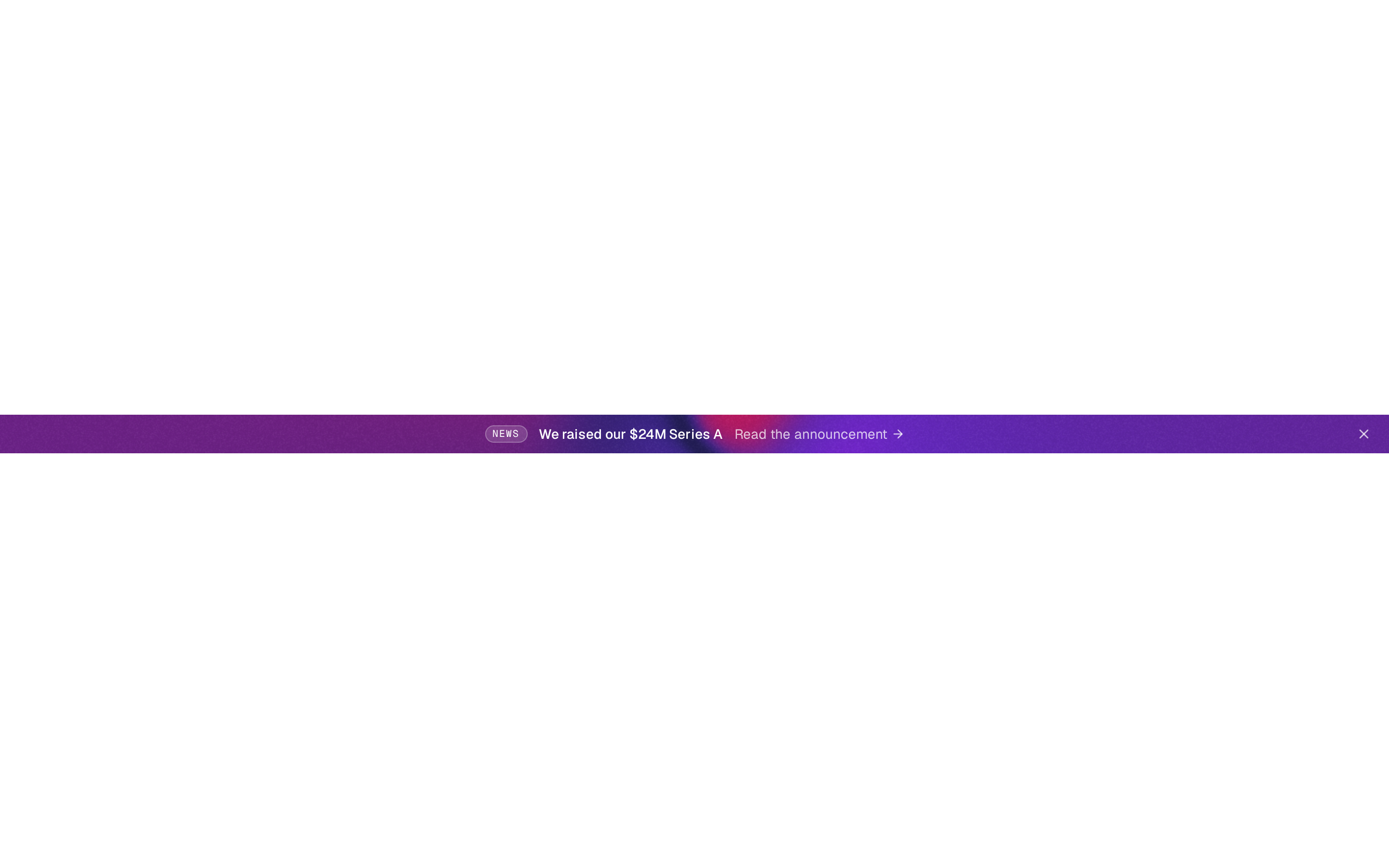
export interface PennantMessage {
/** Short pill before the text (e.g. "New"). Omit for no pill. */
badge?: string;
/** The announcement copy. Keep it to one short sentence. */
text: React.ReactNode;
/** Inline call-to-action link after the text. */
link?: PennantLink;
/** Show a rolling countdown to this moment (Date, epoch ms or ISO string). */
endsAt?: Date | number | string;
/** Countdown target relative to mount, in milliseconds. Handy for demos; `endsAt` wins. */
endsIn?: number;
}
/** Imperative verbs exposed through the `ref` prop. */
export interface PennantHandle {
/** Bring the bar back (clears any persisted dismissal) and replay its intro. */
show: () => void;
/** Collapse the bar as if the dismiss button was pressed. */
dismiss: () => void;
/** Re-run the drop-in intro. */
replay: () => void;
/** Advance to the next rotating message. */
next: () => void;
/** Go back to the previous rotating message. */
prev: () => void;
}
export interface PennantProps extends Omit<React.ComponentPropsWithoutRef<"div">, "children"> {
/**
* Messages to rotate through with a vertical slide. One message renders
* static. Omit (and omit `text`) for a three-message sample set.
*/
messages?: PennantMessage[];
/** Single-message shorthand: the announcement copy. Ignored when `messages` is set. */
text?: React.ReactNode;
/** Single-message shorthand: inline link. */
link?: PennantLink;
/** Single-message shorthand: pill before the text. */
badge?: string;
/** Single-message shorthand: rolling countdown target. */
endsAt?: Date | number | string;
/** Milliseconds each message holds before sliding to the next. @default 6000 */
interval?: number;
/** Show the dismiss button. @default true */
dismissible?: boolean;
/**
* localStorage key that remembers a dismissal across visits. Bump the key
* when you publish a new announcement. Omit to never persist.
*/
storageKey?: string;
/** `"subtle"` is a near-black bar with accent details; `"solid"` fills it with the accent. @default "subtle" */
appearance?: "subtle" | "solid";
/** Accent hex for the pill, link, countdown and focus rings. @default "#818cf8" */
accentColor?: string;
/** Accessible name of the landmark region. @default "Announcement" */
label?: string;
/** Called after the bar is dismissed by the user or `dismiss()`. */
onDismiss?: () => void;
/** Called when the visible message changes (index into the message list). */
onMessageChange?: (index: number) => void;
/** Imperative handle (`show`, `dismiss`, `replay`, `next`, `prev`). React 19 ref-as-prop. */
ref?: React.Ref<PennantHandle>;
/** Extra classes for the outer region. */
className?: string;
}
const DEFAULT_MESSAGES: PennantMessage[] = [
{
badge: "New",
text: "Workflows 2.0 is here: branch, retry and schedule any step.",
link: { label: "See what's new", href: "#" },
},
{
badge: "Offer",
text: "Early-bird pricing ends in",
endsIn: (2 * 24 * 60 + 14 * 60 + 7) * 60_000 + 31_000,
link: { label: "Claim 30% off", href: "#" },
},
{
badge: "Live",
text: "Join Thursday's product walkthrough with the team.",
link: { label: "Save a seat", href: "#" },
},
];
function toTime(v: Date | number | string | undefined): number | null {
if (v === undefined) return null;
const t = v instanceof Date ? v.getTime() : typeof v === "number" ? v : Date.parse(v);
return Number.isFinite(t) ? t : null;
}
/** One odometer digit: the new value rolls down in from above. */
function RollDigit({ digit, reduced }: { digit: string; reduced: boolean }) {
return (
<span className="relative inline-flex h-[1.3em] w-[1ch] justify-center overflow-hidden">
<AnimatePresence initial={false} mode="popLayout">
<motion.span
key={digit}
className="block leading-[1.3em]"
initial={reduced ? { opacity: 0 } : { y: "-100%", opacity: 0 }}
animate={{ y: "0%", opacity: 1 }}
exit={reduced ? { opacity: 0 } : { y: "100%", opacity: 0 }}
transition={reduced ? { duration: 0.15 } : { type: "spring", stiffness: 520, damping: 40 }}
>
{digit}
</motion.span>
</AnimatePresence>
</span>
);
}
function Countdown({ target, solid, reduced }: { target: number; solid: boolean; reduced: boolean }) {
const [now, setNow] = React.useState<number | null>(null);
React.useEffect(() => {
let timer = 0;
const tick = () => {
const t = Date.now();
setNow(t);
if (t < target) timer = window.setTimeout(tick, 1000 - (t % 1000) + 8);
};
tick();
return () => window.clearTimeout(timer);
}, [target]);
const left = Math.max(0, now === null ? 0 : target - now);
const s = Math.floor(left / 1000);
const parts: [string, string, string][] = [
["d", "days", String(Math.min(99, Math.floor(s / 86400))).padStart(2, "0")],
["h", "hours", String(Math.floor((s % 86400) / 3600)).padStart(2, "0")],
["m", "minutes", String(Math.floor((s % 3600) / 60)).padStart(2, "0")],
["s", "seconds", String(s % 60).padStart(2, "0")],
];
const spoken =
now === null ? "" : parts.slice(0, 3).map(([, unit, v]) => `${Number(v)} ${unit}`).join(", ") + " left";
return (
<span
role="timer"
aria-label={spoken}
className={cn(
"inline-flex shrink-0 items-center gap-1 font-mono text-[12px] font-medium tabular-nums",
now === null && "opacity-0"
)}
>
{parts.map(([u, , v]) => (
<span
key={u}
aria-hidden
className={cn(
"inline-flex items-baseline rounded-[5px] px-1 ring-1 ring-inset",
solid ? "bg-black/15 ring-black/10" : "bg-white/[0.06] text-white ring-white/[0.08]"
)}
>
{v.split("").map((d, i) => (
<RollDigit key={i} digit={d} reduced={reduced} />
))}
<span className={cn("ml-px text-[10px]", solid ? "opacity-60" : "text-white/40")}>{u}</span>
</span>
))}
</span>
);
}
/**
* Pennant — a slim top-of-page announcement bar. Rotates short messages with a
* vertical slide (paused while hovered or focused, with a hairline progress
* meter), rolls an odometer countdown when a message has a deadline, and
* collapses on a height spring when dismissed — remembering it via
* `storageKey`. Under reduced motion messages crossfade and only change on
* demand.
*/
export function Pennant({
messages,
text,
link,
badge,
endsAt,
interval = 6000,
dismissible = true,
storageKey,
appearance = "subtle",
accentColor = DEFAULT_ACCENT,
label = "Announcement",
onDismiss,
onMessageChange,
ref,
className,
style,
...rest
}: PennantProps) {
const reduced = useReducedMotion();
const solid = appearance === "solid";
const ink = readableOn(accentColor);
const list = React.useMemo<PennantMessage[]>(() => {
if (messages && messages.length) return messages;
if (text !== undefined) return [{ text, link, badge, endsAt }];
return DEFAULT_MESSAGES;
}, [messages, text, link, badge, endsAt]);
// Hidden until mounted when persisting, so a stored dismissal never flashes.
const [visible, setVisible] = React.useState(!storageKey);
const [introKey, setIntroKey] = React.useState(0);
const [index, setIndex] = React.useState(0);
const [dir, setDir] = React.useState<1 | -1>(1);
const [hovered, setHovered] = React.useState(false);
const [focused, setFocused] = React.useState(false);
const [onscreen, setOnscreen] = React.useState(true);
const [mountedAt, setMountedAt] = React.useState<number | null>(null);
const rootRef = React.useRef<HTMLDivElement>(null);
React.useEffect(() => {
const raf = requestAnimationFrame(() => {
setMountedAt(Date.now());
if (storageKey) setVisible(storageGet(storageKey) !== "dismissed");
});
return () => cancelAnimationFrame(raf);
}, [storageKey]);
React.useEffect(() => {
const el = rootRef.current;
if (!el || typeof IntersectionObserver === "undefined") return;
const io = new IntersectionObserver(([e]) => setOnscreen(e.isIntersecting));
io.observe(el);
return () => io.disconnect();
}, []);
const count = list.length;
const current = Math.min(index, count - 1);
const rotating = count > 1 && !reduced;
const paused = hovered || focused || !onscreen;
const go = React.useCallback(
(step: 1 | -1) => {
if (count < 2) return;
setDir(step);
setIndex((i) => {
const n = (Math.min(i, count - 1) + step + count) % count;
onMessageChange?.(n);
return n;
});
},
[count, onMessageChange]
);
const dismiss = React.useCallback(() => {
setVisible(false);
storageSet(storageKey, "dismissed");
onDismiss?.();
}, [storageKey, onDismiss]);
React.useImperativeHandle(
ref,
() => ({
show: () => {
storageSet(storageKey, null);
setVisible(true);
setIntroKey((k) => k + 1);
},
dismiss,
replay: () => setIntroKey((k) => k + 1),
next: () => go(1),
prev: () => go(-1),
}),
[storageKey, dismiss, go]
);
const msg = list[current];
const target =
toTime(msg.endsAt) ?? (msg.endsIn !== undefined && mountedAt !== null ? mountedAt + msg.endsIn : null);
const slide = reduced
? { initial: { opacity: 0 }, animate: { opacity: 1 }, exit: { opacity: 0 } }
: {
initial: { y: dir > 0 ? "70%" : "-70%", opacity: 0, filter: "blur(2px)" },
animate: { y: "0%", opacity: 1, filter: "blur(0px)" },
exit: { y: dir > 0 ? "-70%" : "70%", opacity: 0, filter: "blur(2px)" },
};
const ctrlBtn = cn(
"grid size-7 shrink-0 place-items-center rounded-md transition-colors",
FOCUS_RING,
solid ? "opacity-70 hover:bg-black/10 hover:opacity-100" : "text-white/45 hover:bg-white/[0.06] hover:text-white"
);
return (
<AnimatePresence initial={!reduced}>
{visible && (
<motion.div
key="pennant"
{...(rest as Omit<typeof rest, "onDrag" | "onDragStart" | "onDragEnd" | "onAnimationStart">)}
ref={rootRef}
role="region"
aria-label={label}
initial={{ height: 0, opacity: 0 }}
animate={{ height: "auto", opacity: 1 }}
exit={{ height: 0, opacity: 0 }}
transition={reduced ? { duration: 0.2 } : HEIGHT_SPRING}
onPointerEnter={(e) => e.pointerType === "mouse" && setHovered(true)}
onPointerLeave={() => setHovered(false)}
onFocus={() => setFocused(true)}
onBlur={(e) => {
if (!e.currentTarget.contains(e.relatedTarget as Node | null)) setFocused(false);
}}
className={cn("@container relative w-full overflow-hidden", className)}
style={
{
"--pn-accent": accentColor,
background: solid ? accentColor : undefined,
color: solid ? ink : undefined,
...style,
} as React.CSSProperties
}
>
{!solid && (
<>
<div aria-hidden className="absolute inset-0 bg-neutral-950" />
<div
aria-hidden
className="absolute inset-0"
style={{
background: `radial-gradient(60% 140% at 50% 0%, color-mix(in oklab, ${accentColor} 16%, transparent), transparent 70%)`,
}}
/>
<div
aria-hidden
className="absolute inset-x-0 bottom-0 h-px"
style={{
background: `linear-gradient(90deg, rgba(255,255,255,0.06), color-mix(in oklab, ${accentColor} 55%, transparent) 50%, rgba(255,255,255,0.06))`,
}}
/>
</>
)}
<motion.div
key={introKey}
initial={reduced ? { opacity: 0 } : { opacity: 0, y: -6 }}
animate={{ opacity: 1, y: 0 }}
transition={reduced ? { duration: 0.2 } : { duration: 0.5, ease: EASE, delay: 0.12 }}
className="relative flex min-h-11 items-center gap-2 px-2 @lg:px-3"
>
{/* Left spacer mirrors the controls so the message stays optically centred. */}
<div aria-hidden className={cn("shrink-0", count > 1 ? "w-7 @2xl:w-[4.25rem]" : "w-7", !dismissible && count < 2 && "w-0")} />
<div
className="relative grid min-w-0 flex-1 place-items-center overflow-hidden py-2"
aria-roledescription={count > 1 ? "carousel" : undefined}
>
<AnimatePresence initial={false} mode="popLayout" custom={dir}>
<motion.div
key={current}
aria-roledescription={count > 1 ? "slide" : undefined}
aria-label={count > 1 ? `${current + 1} of ${count}` : undefined}
initial={slide.initial}
animate={slide.animate}
exit={slide.exit}
transition={reduced ? { duration: 0.2 } : { type: "spring", stiffness: 380, damping: 36 }}
className="flex min-w-0 flex-wrap items-center justify-center gap-x-2.5 gap-y-1 text-center text-[12.5px] leading-snug @lg:text-[13px]"
>
{msg.badge && (
<span
className="hidden shrink-0 rounded-full px-2 py-px text-[10.5px] font-semibold uppercase tracking-[0.08em] @md:inline-block"
style={
solid
? { background: "rgba(0,0,0,0.14)" }
: {
color: accentColor,
background: `color-mix(in oklab, ${accentColor} 14%, transparent)`,
boxShadow: `inset 0 0 0 1px color-mix(in oklab, ${accentColor} 30%, transparent)`,
}
}
>
{msg.badge}
</span>
)}
<span className={cn("font-medium", solid ? "" : "text-white/80")}>{msg.text}</span>
{target !== null && <Countdown target={target} solid={solid} reduced={reduced} />}
{msg.link && (
<a
href={msg.link.href}
className={cn(
"group/link inline-flex shrink-0 items-center gap-1 rounded font-semibold underline-offset-4 hover:underline",
FOCUS_RING
)}
style={solid ? undefined : { color: accentColor }}
>
{msg.link.label}
<svg
aria-hidden
viewBox="0 0 16 16"
className="size-3.5 transition-transform duration-200 group-hover/link:translate-x-0.5"
fill="none"
>
<path d="M3 8h9m0 0L8.5 4.5M12 8l-3.5 3.5" stroke="currentColor" strokeWidth="1.6" strokeLinecap="round" strokeLinejoin="round" />
</svg>
</a>
)}
</motion.div>
</AnimatePresence>
</div>
<div className="flex shrink-0 items-center gap-0.5">
{count > 1 && (
<div className="hidden items-center gap-0.5 @2xl:flex">
<button type="button" aria-label="Previous announcement" onClick={() => go(-1)} className={ctrlBtn}>
<svg aria-hidden viewBox="0 0 16 16" className="size-3.5" fill="none">
<path d="M10 3.5 5.5 8l4.5 4.5" stroke="currentColor" strokeWidth="1.6" strokeLinecap="round" strokeLinejoin="round" />
</svg>
</button>
<button type="button" aria-label="Next announcement" onClick={() => go(1)} className={ctrlBtn}>
<svg aria-hidden viewBox="0 0 16 16" className="size-3.5" fill="none">
<path d="M6 3.5 10.5 8 6 12.5" stroke="currentColor" strokeWidth="1.6" strokeLinecap="round" strokeLinejoin="round" />
</svg>
</button>
</div>
)}
{count > 1 && (
<button type="button" aria-label="Next announcement" onClick={() => go(1)} className={cn(ctrlBtn, "@2xl:hidden", dismissible && "hidden")}>
<svg aria-hidden viewBox="0 0 16 16" className="size-3.5" fill="none">
<path d="M6 3.5 10.5 8 6 12.5" stroke="currentColor" strokeWidth="1.6" strokeLinecap="round" strokeLinejoin="round" />
</svg>
</button>
)}
{dismissible && (
<button type="button" aria-label="Dismiss announcement" onClick={dismiss} className={ctrlBtn}>
<svg aria-hidden viewBox="0 0 16 16" className="size-3.5" fill="none">
<path d="m4.5 4.5 7 7m0-7-7 7" stroke="currentColor" strokeWidth="1.6" strokeLinecap="round" />
</svg>
</button>
)}
</div>
</motion.div>
{/* Rotation meter: a hairline that fills over `interval`; its end advances the message. */}
{rotating && (
<div aria-hidden className="absolute inset-x-0 bottom-0 h-px">
<div
key={`${current}-${introKey}`}
className="h-full origin-left"
onAnimationEnd={() => go(1)}
style={{
background: solid ? "currentColor" : accentColor,
opacity: solid ? 0.35 : 0.9,
animation: `pennant-meter ${interval}ms linear forwards`,
animationPlayState: paused ? "paused" : "running",
}}
/>
<style>{`@keyframes pennant-meter{from{transform:scaleX(0)}to{transform:scaleX(1)}}`}</style>
</div>
)}
</motion.div>
)}
</AnimatePresence>
);
}
/* ================================================================ Consent */
/** The four consent categories. `necessary` is always `true`. */
export interface ConsentPreferences {
/** Strictly necessary cookies — always on. */
necessary: true;
/** Usage measurement. */
analytics: boolean;
/** Ads and attribution. */
marketing: boolean;
/** Remembered settings such as language or theme. */
preferences: boolean;
}
export type ConsentCategory = Exclude<keyof ConsentPreferences, "necessary">;
export interface ConsentCategoryCopy {
/** Switch label. */
label: string;
/** One-line description under the label. */
description: string;
}
/** Imperative verbs exposed through the `ref` prop. */
export interface ConsentHandle {
/** Open the card (expanded to the saved choices if a decision exists) and move focus into it. */
open: () => void;
/** Close the card without recording a decision. */
close: () => void;
/** Forget the stored decision, restore default switches and reopen collapsed. */
reset: () => void;
}
export interface ConsentProps extends Omit<React.ComponentPropsWithoutRef<"div">, "children" | "title"> {
/** Controlled visibility. Pair with `onOpenChange`. */
open?: boolean;
/**
* Uncontrolled initial visibility. Omit to open automatically only when no
* decision is stored under `storageKey`.
*/
defaultOpen?: boolean;
/** Called whenever the card asks to open or close. */
onOpenChange?: (open: boolean) => void;
/**
* Called with the final choices. Return a Promise to hold the pressed
* button in a pending state; a rejection shows its message inline and keeps
* the card open.
*/
onDecision?: (preferences: ConsentPreferences) => void | Promise<unknown>;
/** localStorage key that remembers the decision (JSON). Omit to never persist. */
storageKey?: string;
/** Heading. @default "We value your privacy" */
title?: React.ReactNode;
/** Short body copy under the heading. */
description?: React.ReactNode;
/** Optional "Cookie policy" link appended to the copy. */
policyHref?: string;
/** Override labels and descriptions per category. */
categories?: Partial<Record<keyof ConsentPreferences, Partial<ConsentCategoryCopy>>>;
/** Initial switch values for the optional categories. @default all off */
defaultPreferences?: Partial<Record<ConsentCategory, boolean>>;
/** Which bottom corner the card rises into (≥640px). @default "left" */
side?: "left" | "right";
/**
* `"fixed"` pins to the viewport; `"absolute"` pins to the nearest
* positioned ancestor (previews, mock frames). @default "fixed"
*/
strategy?: "fixed" | "absolute";
/** Seconds before an auto-open card rises in. @default 0.6 */
delay?: number;
/** Accent hex for the primary button, switches and focus rings. @default "#818cf8" */
accentColor?: string;
/** Imperative handle (`open`, `close`, `reset`). React 19 ref-as-prop. */
ref?: React.Ref<ConsentHandle>;
/** Extra classes for the card. */
className?: string;
}
const CATEGORY_ORDER: (keyof ConsentPreferences)[] = ["necessary", "analytics", "marketing", "preferences"];
const CATEGORY_COPY: Record<keyof ConsentPreferences, ConsentCategoryCopy> = {
necessary: { label: "Necessary", description: "Sign-in, security and load balancing. The site can't work without these." },
analytics: { label: "Analytics", description: "Anonymous usage counts that show us which pages help and which don't." },
marketing: { label: "Marketing", description: "Measures campaigns and limits how often you see the same ad elsewhere." },
preferences: { label: "Preferences", description: "Remembers choices like language, region and theme between visits." },
};
type Pending = "accept" | "reject" | "save" | null;
function readStored(key: string | undefined): ConsentPreferences | null {
const raw = storageGet(key);
if (!raw) return null;
try {
const p = JSON.parse(raw) as { prefs?: Partial<ConsentPreferences> };
if (!p.prefs) return null;
return {
necessary: true,
analytics: !!p.prefs.analytics,
marketing: !!p.prefs.marketing,
preferences: !!p.prefs.preferences,
};
} catch {
return null;
}
}
function Switch({
checked,
locked,
onChange,
labelId,
descId,
reduced,
}: {
checked: boolean;
locked?: boolean;
onChange: (v: boolean) => void;
labelId: string;
descId: string;
reduced: boolean;
}) {
return (
<button
type="button"
role="switch"
aria-checked={checked}
aria-disabled={locked || undefined}
aria-labelledby={labelId}
aria-describedby={descId}
onClick={() => !locked && onChange(!checked)}
className={cn(
"relative inline-flex h-5 w-9 shrink-0 items-center rounded-full p-0.5 transition-colors duration-200",
FOCUS_RING,
locked ? "cursor-not-allowed opacity-60" : "cursor-pointer",
checked ? "" : "bg-white/[0.12] hover:bg-white/[0.16]"
)}
style={checked ? { background: "var(--pn-accent)" } : undefined}
>
<motion.span
aria-hidden
className="block size-4 rounded-full shadow-[0_1px_2px_rgba(0,0,0,0.4)]"
style={{ background: checked ? "var(--pn-ink)" : "#e5e5e5" }}
animate={{ x: checked ? 16 : 0 }}
transition={reduced ? INSTANT : { type: "spring", stiffness: 700, damping: 38 }}
/>
</button>
);
}
function Spinner() {
return (
<svg aria-hidden viewBox="0 0 16 16" className="size-3.5 animate-spin motion-reduce:animate-none" fill="none">
<circle cx="8" cy="8" r="6" stroke="currentColor" strokeOpacity="0.25" strokeWidth="2" />
<path d="M14 8a6 6 0 0 0-6-6" stroke="currentColor" strokeWidth="2" strokeLinecap="round" />
</svg>
);
}
/**
* Consent — a cookie-consent card that rises into a bottom corner (a
* full-width bar under 640px). "Customize" grows the same card into
* per-category switches instead of opening a second modal. Non-modal dialog:
* the page stays usable, Escape folds the details away, and opening it via
* the ref (e.g. a footer "Cookie settings" link) moves focus into it and
* returns focus when it closes.
*/
export function Consent({
open: openProp,
defaultOpen,
onOpenChange,
onDecision,
storageKey,
title = "We value your privacy",
description = "We use cookies to keep the site secure, understand what's working and personalise what you see. Choose what you're comfortable with.",
policyHref,
categories,
defaultPreferences,
side = "left",
strategy = "fixed",
delay = 0.6,
accentColor = DEFAULT_ACCENT,
ref,
className,
style,
...rest
}: ConsentProps) {
const reduced = useReducedMotion();
const ink = readableOn(accentColor);
const uid = React.useId();
const controlled = openProp !== undefined;
const initialPrefs = React.useCallback(
(): Omit<ConsentPreferences, "necessary"> => ({
analytics: !!defaultPreferences?.analytics,
marketing: !!defaultPreferences?.marketing,
preferences: !!defaultPreferences?.preferences,
}),
[defaultPreferences]
);
const [innerOpen, setInnerOpen] = React.useState(false);
const [expanded, setExpanded] = React.useState(false);
const [prefs, setPrefs] = React.useState(initialPrefs);
const [pending, setPending] = React.useState<Pending>(null);
const [error, setError] = React.useState<string | null>(null);
const [announce, setAnnounce] = React.useState("");
const [autoDelay, setAutoDelay] = React.useState(true);
const isOpen = controlled ? !!openProp : innerOpen;
const cardRef = React.useRef<HTMLDivElement>(null);
const returnFocus = React.useRef<HTMLElement | null>(null);
const wantFocus = React.useRef(false);
const focusSwitch = React.useRef(false);
const decided = React.useRef(false);
// "Customize" unmounts itself — hand focus to the first optional switch.
React.useEffect(() => {
if (!expanded || !focusSwitch.current) return;
focusSwitch.current = false;
cardRef.current?.querySelector<HTMLElement>('[role="switch"]:not([aria-disabled])')?.focus({ preventScroll: true });
}, [expanded]);
// Uncontrolled: decide on mount whether to show (never during SSR).
React.useEffect(() => {
const raf = requestAnimationFrame(() => {
const stored = readStored(storageKey);
if (stored) setPrefs({ analytics: stored.analytics, marketing: stored.marketing, preferences: stored.preferences });
if (!controlled) setInnerOpen(defaultOpen ?? !stored);
});
return () => cancelAnimationFrame(raf);
// eslint-disable-next-line react-hooks/exhaustive-deps
}, [storageKey]);
const setOpen = React.useCallback(
(next: boolean) => {
if (!controlled) setInnerOpen(next);
onOpenChange?.(next);
},
[controlled, onOpenChange]
);
// Restore focus to wherever it came from when the card closes with focus inside.
const closeCard = React.useCallback(() => {
const card = cardRef.current;
if (card && card.contains(document.activeElement) && returnFocus.current?.isConnected) {
returnFocus.current.focus();
}
returnFocus.current = null;
setOpen(false);
}, [setOpen]);
const openCard = React.useCallback(
(opts: { expand: boolean }) => {
const active = document.activeElement;
if (active instanceof HTMLElement && !cardRef.current?.contains(active)) returnFocus.current = active;
wantFocus.current = true;
setAutoDelay(false);
setError(null);
setPending(null);
setExpanded(opts.expand);
setOpen(true);
if (cardRef.current) {
requestAnimationFrame(() => cardRef.current?.focus({ preventScroll: true }));
wantFocus.current = false;
}
},
[setOpen]
);
React.useImperativeHandle(
ref,
() => ({
open: () => {
const stored = readStored(storageKey);
if (stored) setPrefs({ analytics: stored.analytics, marketing: stored.marketing, preferences: stored.preferences });
openCard({ expand: !!stored || decided.current });
},
close: closeCard,
reset: () => {
decided.current = false;
storageSet(storageKey, null);
setPrefs(initialPrefs());
openCard({ expand: false });
},
}),
[storageKey, openCard, closeCard, initialPrefs]
);
const decide = async (kind: Exclude<Pending, null>) => {
if (pending) return;
const chosen: ConsentPreferences =
kind === "accept"
? { necessary: true, analytics: true, marketing: true, preferences: true }
: kind === "reject"
? { necessary: true, analytics: false, marketing: false, preferences: false }
: { necessary: true, ...prefs };
setError(null);
try {
const result = onDecision?.(chosen);
if (result && typeof (result as Promise<unknown>).then === "function") {
setPending(kind);
await result;
}
} catch (e) {
setPending(null);
setError(e instanceof Error && e.message ? e.message : "Couldn't save your choices. Please try again.");
return;
}
setPending(null);
decided.current = true;
setPrefs({ analytics: chosen.analytics, marketing: chosen.marketing, preferences: chosen.preferences });
storageSet(storageKey, JSON.stringify({ v: 1, prefs: chosen, at: new Date().toISOString() }));
setAnnounce(
kind === "accept" ? "All cookies accepted." : kind === "reject" ? "Optional cookies rejected." : "Cookie choices saved."
);
closeCard();
};
const copy = (k: keyof ConsentPreferences): ConsentCategoryCopy => ({ ...CATEGORY_COPY[k], ...categories?.[k] });
const enterDelay = autoDelay && !reduced ? delay : 0;
const btnBase =
"relative inline-flex h-9 items-center justify-center gap-1.5 rounded-lg px-3.5 text-[13px] font-medium transition-[background-color,color,box-shadow,opacity] duration-150 disabled:cursor-default";
const btnGhost = cn(btnBase, FOCUS_RING, "text-white/70 hover:bg-white/[0.06] hover:text-white");
const btnSecondary = cn(
btnBase,
FOCUS_RING,
"bg-white/[0.06] text-white ring-1 ring-inset ring-white/[0.08] hover:bg-white/[0.1]"
);
const btnPrimary = cn(btnBase, FOCUS_RING, "shadow-[0_1px_0_rgba(255,255,255,0.25)_inset] hover:opacity-90");
const busy = pending !== null;
const label = (kind: Exclude<Pending, null>, text: string) => (
<>
{pending === kind && <Spinner />}
{text}
</>
);
return (
<>
<span role="status" className="sr-only">
{announce}
</span>
<AnimatePresence>
{isOpen && (
<motion.div
key="consent"
{...(rest as Omit<typeof rest, "onDrag" | "onDragStart" | "onDragEnd" | "onAnimationStart">)}
ref={(el: HTMLDivElement | null) => {
cardRef.current = el;
if (el && wantFocus.current) {
wantFocus.current = false;
requestAnimationFrame(() => el.focus({ preventScroll: true }));
}
}}
role="dialog"
aria-modal="false"
aria-labelledby={`${uid}-title`}
aria-describedby={`${uid}-desc`}
tabIndex={-1}
onKeyDown={(e) => {
if (e.key === "Escape" && expanded && !busy) {
e.stopPropagation();
setExpanded(false);
cardRef.current?.focus({ preventScroll: true });
}
}}
initial={reduced ? { opacity: 0 } : { opacity: 0, y: 28, scale: 0.98 }}
animate={{ opacity: 1, y: 0, scale: 1 }}
exit={reduced ? { opacity: 0 } : { opacity: 0, y: 18, scale: 0.98 }}
transition={
reduced
? { duration: 0.2 }
: { ...RISE_SPRING, delay: enterDelay, opacity: { duration: 0.35, ease: EASE, delay: enterDelay } }
}
className={cn(
strategy === "fixed" ? "fixed" : "absolute",
"z-50 flex flex-col overflow-hidden bg-neutral-900/95 text-white shadow-[0_24px_60px_-12px_rgba(0,0,0,0.7)] outline-none backdrop-blur-xl",
"inset-x-0 bottom-0 max-h-[85%] rounded-t-2xl border-t border-white/[0.08]",
"sm:inset-x-auto sm:bottom-4 sm:w-[min(400px,calc(100%-2rem))] sm:rounded-2xl sm:border",
side === "left" ? "sm:left-4" : "sm:right-4",
strategy === "fixed" && "max-h-[85vh]",
className
)}
style={{ "--pn-accent": accentColor, "--pn-ink": ink, ...style } as React.CSSProperties}
>
{/* Accent hairline along the top edge. */}
<div
aria-hidden
className="pointer-events-none absolute inset-x-6 top-0 h-px"
style={{ background: `linear-gradient(90deg, transparent, color-mix(in oklab, ${accentColor} 70%, transparent), transparent)` }}
/>
<div className={cn("min-h-0 flex-1 overflow-y-auto overscroll-contain p-5", expanded ? "pb-4" : "pb-0")}>
<div className="flex items-start gap-3">
<span
aria-hidden
className="mt-0.5 grid size-8 shrink-0 place-items-center rounded-lg"
style={{
color: accentColor,
background: `color-mix(in oklab, ${accentColor} 13%, transparent)`,
boxShadow: `inset 0 0 0 1px color-mix(in oklab, ${accentColor} 26%, transparent)`,
}}
>
<svg viewBox="0 0 20 20" className="size-4" fill="none">
<path
d="M10 2.75a7.25 7.25 0 1 0 7.2 6.4 2.4 2.4 0 0 1-3.1-2.2 2.4 2.4 0 0 1-2.85-2.85 2.4 2.4 0 0 1-1.25-1.35Z"
stroke="currentColor"
strokeWidth="1.5"
strokeLinejoin="round"
/>
<circle cx="7.25" cy="9" r="1" fill="currentColor" />
<circle cx="11" cy="12.75" r="1" fill="currentColor" />
<circle cx="7.5" cy="13" r="0.75" fill="currentColor" />
</svg>
</span>
<div className="min-w-0">
<h2 id={`${uid}-title`} className="text-[15px] font-semibold tracking-tight text-white">
{title}
</h2>
<p id={`${uid}-desc`} className="mt-1 text-[13px] leading-relaxed text-white/55">
{description}
{policyHref && (
<>
{" "}
<a
href={policyHref}
className={cn("rounded font-medium text-white/80 underline decoration-white/25 underline-offset-4 hover:text-white", FOCUS_RING)}
>
Cookie policy
</a>
</>
)}
</p>
</div>
</div>
<AnimatePresence initial={false}>
{expanded && (
<motion.div
key="details"
initial={{ height: 0, opacity: 0 }}
animate={{ height: "auto", opacity: 1 }}
exit={{ height: 0, opacity: 0 }}
transition={reduced ? { duration: 0.15 } : { height: HEIGHT_SPRING, opacity: { duration: 0.25, ease: EASE } }}
className="overflow-hidden"
>
<ul
aria-label="Cookie categories"
className="mt-4 divide-y divide-white/[0.06] rounded-xl border border-white/[0.07] bg-white/[0.02]"
>
{CATEGORY_ORDER.map((k, i) => {
const c = copy(k);
const locked = k === "necessary";
const checked = locked ? true : prefs[k as ConsentCategory];
return (
<motion.li
key={k}
initial={reduced ? false : { opacity: 0, y: 6 }}
animate={{ opacity: 1, y: 0 }}
transition={reduced ? INSTANT : { duration: 0.35, ease: EASE, delay: 0.05 + i * 0.045 }}
className="flex items-start gap-3 px-3.5 py-3"
>
<div className="min-w-0 flex-1">
<div className="flex items-center gap-2">
<span id={`${uid}-${k}-l`} className="text-[13px] font-medium text-white">
{c.label}
</span>
{locked && (
<span className="rounded-full bg-white/[0.06] px-1.5 py-px text-[10px] font-medium uppercase tracking-[0.06em] text-white/45">
Always on
</span>
)}
</div>
<p id={`${uid}-${k}-d`} className="mt-0.5 text-[12px] leading-relaxed text-white/45">
{c.description}
</p>
</div>
<div className="pt-0.5">
<Switch
checked={checked}
locked={locked}
labelId={`${uid}-${k}-l`}
descId={`${uid}-${k}-d`}
reduced={reduced}
onChange={(v) => setPrefs((p) => ({ ...p, [k]: v }))}
/>
</div>
</motion.li>
);
})}
</ul>
</motion.div>
)}
</AnimatePresence>
<AnimatePresence initial={false}>
{error && (
<motion.p
key="err"
role="alert"
initial={{ opacity: 0, height: 0 }}
animate={{ opacity: 1, height: "auto" }}
exit={{ opacity: 0, height: 0 }}
transition={reduced ? INSTANT : { duration: 0.25, ease: EASE }}
className="overflow-hidden text-[12px] text-rose-300"
>
<span className="block pt-3">{error}</span>
</motion.p>
)}
</AnimatePresence>
</div>
<div className={cn("flex flex-wrap items-center gap-2 p-5 pt-4", expanded && "border-t border-white/[0.06] pt-4")}>
{expanded ? (
<>
<button type="button" className={cn(btnGhost, "-ml-2")} disabled={busy} onClick={() => decide("reject")}>
{label("reject", "Reject all")}
</button>
<div className="ml-auto flex gap-2">
<button type="button" className={btnSecondary} disabled={busy} onClick={() => decide("accept")}>
{label("accept", "Accept all")}
</button>
<button
type="button"
className={btnPrimary}
style={{ background: accentColor, color: ink }}
disabled={busy}
onClick={() => decide("save")}
>
{label("save", "Save choices")}
</button>
</div>
</>
) : (
<>
<button
type="button"
className={cn(btnGhost, "-ml-2")}
aria-expanded={false}
disabled={busy}
onClick={() => {
focusSwitch.current = true;
setExpanded(true);
}}
>
Customize
</button>
<div className="ml-auto flex gap-2">
<button type="button" className={btnSecondary} disabled={busy} onClick={() => decide("reject")}>
{label("reject", "Reject all")}
</button>
<button
type="button"
className={btnPrimary}
style={{ background: accentColor, color: ink }}
disabled={busy}
onClick={() => decide("accept")}
>
{label("accept", "Accept all")}
</button>
</div>
</>
)}
</div>
</motion.div>
)}
</AnimatePresence>
</>
);
}