components/craftui/blocks/onboarding-form/default.tsx
"use client";
import { useEffect, useId, useRef, useState } from "react";
import { motion, AnimatePresence, useReducedMotion } from "motion/react";
import { HugeiconsIcon } from "@hugeicons/react";
import {
AlertCircleIcon,
ArrowLeft01Icon,
ArrowRight01Icon,
Tick02Icon,
} from "@hugeicons/core-free-icons";
import { RadioGroup, RadioGroupItem } from "@/components/ui/radio-group";
import {
Select,
SelectContent,
SelectItem,
SelectTrigger,
SelectValue,
} from "@/components/ui/select";
import { Checkbox } from "@/components/ui/checkbox";
import { Input } from "@/components/ui/input";
import { Textarea } from "@/components/ui/textarea";
import { Button } from "@/components/ui/button";
// ── Types ─────────────────────────────────────────────────────────────────────
type StepType = "radio" | "select" | "multi" | "text" | "textarea";
interface Step {
label: string;
question: string;
/** Defaults to "radio", so a steps array written before this existed still works. */
type?: StepType;
/** Required by radio, select and multi; ignored by text and textarea. */
options?: string[];
placeholder?: string;
/** Lets the user move on without answering, and shows a Skip button. */
optional?: boolean;
}
/** "multi" answers are string[]; every other type answers with a string. */
type Answer = string | string[];
interface OnboardingFormProps {
steps?: Step[];
onComplete?: (answers: Record<number, Answer>) => void;
}
// ── Constants ─────────────────────────────────────────────────────────────────
/* Each control is chosen by the shape of its question, not to tick off a type:
* short exclusive lists are cards, a long list is a dropdown, genuinely
* multiple answers are checkboxes, open-ended answers are text. All five field
* types ship here so they can be swapped straight into your own questions. */
const DEFAULT_STEPS: Step[] = [
{
label: "Your Role",
question: "What best describes your role?",
type: "radio",
options: ["Designer", "Developer", "Product Manager", "Other"],
},
{
label: "Team Size",
question: "How large is your team?",
// Eight buckets: past four or five options, cards stop scanning well and a
// dropdown is the better control.
type: "select",
options: [
"Just me",
"2–5 people",
"6–10 people",
"11–25 people",
"26–50 people",
"51–100 people",
"101–250 people",
"250+ people",
],
placeholder: "Choose a team size",
},
{
label: "Primary Goal",
question: "What do you want out of this tool?",
type: "multi",
options: [
"Ship faster",
"Better collaboration",
"Track progress",
"Reduce busywork",
],
},
{
label: "Current Tool",
question: "Which tool are you moving from?",
type: "text",
placeholder: "e.g. Notion, Jira, or nothing yet",
},
{
label: "Discovery",
question: "How did you hear about us?",
type: "textarea",
placeholder: "Share as much or as little as you like",
optional: true,
},
];
const ROW_HEIGHT = 64;
/** Completed rows compress to this, so the remaining path visibly shortens. */
const ROW_HEIGHT_DONE = 44;
const ACTIVE_ROW = 2;
const DOT_TOP = ACTIVE_ROW * ROW_HEIGHT;
const DOT_OFFSET = 20;
/** Rows the ticker window shows at once. Seven, not five: the two leading rows
* are empty padding, so a five-row window showed only three steps on step one
* and left the rail looking truncated with ~200px dead below it. Seven fits the
* active step plus every remaining one at the start. The cost is more slack
* below the active row on the last step, once completed rows have compressed
* and scrolled up — a worse final step in exchange for a better first one. */
const VISIBLE_ROWS = 7;
/** One duration for everything a step change moves — rail scroll, row
* compression, progress bar and question panel. They fire on the same click
* and sit side by side, so finishing at different times read as lag. It was
* also inverted before: the rail travelled one row in 500ms while the panel
* covered ~370px in 380ms, so the shortest move took the longest. 300ms is the
* ceiling for UI motion, and this fires five times in about a minute. */
const STEP_DUR = 0.3;
/** Exits run shorter than entrances — leaving should clear out faster. */
const EXIT_RATIO = 0.8;
type Bezier = readonly [number, number, number, number];
/** The ticker scrolls and its labels shift: elements already on screen moving,
* which is the ease-in-out case. */
const EASING_MOVE: Bezier = [0.645, 0.045, 0.355, 1];
/** The question panel enters and leaves the viewport, which is ease-out. */
const EASING_ENTER: Bezier = [0.165, 0.84, 0.44, 1];
const ERROR_BY_TYPE: Record<StepType, string> = {
radio: "Select an option to continue.",
select: "Choose an option to continue.",
multi: "Select at least one option to continue.",
text: "Enter an answer to continue.",
textarea: "Enter an answer to continue.",
};
/** First focusable control of any field type, for focusing the failed step. */
const FIELD_FOCUS_SELECTOR =
"[role=radio],[data-slot=select-trigger],[data-slot=checkbox],[data-slot=input],[data-slot=textarea]";
/** Exit runs at 80% of the entrance: leaving should get out of the way faster
* than arriving. Per-variant transitions are the only way to split the two,
* since one `transition` prop covers both directions. */
const makeSlideVariants = (enter: object, exit: object) => ({
initial: (dir: number) => ({ x: `${80 * dir}%`, opacity: 0 }),
active: { x: "0%", opacity: 1, transition: enter },
exit: (dir: number) => ({ x: `${-80 * dir}%`, opacity: 0, transition: exit }),
});
/* Type scale — four sizes only: 24 / 18 / 14 / 12.
* 24 text-2xl the question, and the completion heading
* 18 text-lg the active rail label
* 14 text-sm options, field values, completion body
* 12 text-xs step counter, rail eyebrow, numerals, hint, error
* The question outranks the rail on purpose: the rail is aria-hidden decoration
* and was previously the largest type on screen. */
/** One focus treatment for every control in the block.
*
* The five primitives disagree out of the box — Input ships ring-1 plus
* ring-offset-1, Textarea ring-1 with no offset, SelectTrigger ring-[3px],
* RadioGroupItem and Checkbox ring-3 — so tabbing through changed the
* indicator's shape, width and offset on almost every stop. The rings are
* suppressed and replaced by a single outline. No colour is set, so it renders
* currentColor and adapts per surface instead of hardcoding a brand value.
* Change it here and every control follows. */
const FOCUS_CLASS =
"focus-visible:ring-0 focus-visible:ring-offset-0 focus-visible:outline-1 focus-visible:outline-offset-0";
/** Shared token styling for the boxed controls (select trigger, input, textarea).
* The aria-invalid overrides replace shadcn's --destructive, which measures
* Lc 70.1 light / -46.5 dark against this card and fails both.
* shadow-none drops the shadcn shadow-xs: the option cards carry no shadow, and
* the two sat side by side at the same width, radius and padding with different
* depth. This block's language is flat, so the fields lose the shadow rather
* than the cards gaining one. */
const FIELD_CLASS =
`w-full rounded-xl border-[var(--onb-border)] bg-transparent text-sm text-[var(--onb-fg)] shadow-none placeholder:text-[var(--onb-fg-muted)] aria-invalid:border-[var(--onb-danger)] aria-invalid:ring-0 dark:bg-transparent dark:aria-invalid:border-[var(--onb-danger)] ${FOCUS_CLASS}`;
/** Shared card styling for the radio and multi options, so both read the same.
* Selected is a tint plus an accent border, not a solid accent fill: a solid
* fill matched the Next button's weight, so the answer and the action read as
* equally important. Fill weight now says "chosen"; only the button says "act". */
const optionCardClass = (isSelected: boolean, invalid: boolean) => {
// The card, not the 16px indicator, is what shows focus — hence the has-[]
// form of FOCUS_CLASS's outline.
const base =
"flex min-h-11 cursor-pointer items-center gap-3 rounded-xl border-1 px-4 py-3 text-sm font-medium transition-colors duration-150 ease-[ease] has-[:focus-visible]:outline-1 has-[:focus-visible]:outline-offset-0";
if (isSelected)
return `${base} border-[var(--onb-accent)] bg-[var(--onb-selected)] text-[var(--onb-fg)]`;
// Nothing is selected when the group is invalid, so the danger border is the
// only way the cards themselves show the failure.
if (invalid)
return `${base} border-[var(--onb-danger)] bg-[var(--onb-card)] text-[var(--onb-fg)]`;
return `${base} border-[var(--onb-border)] bg-[var(--onb-card)] text-[var(--onb-fg)] hover:border-[var(--onb-fg-muted)]`;
};
/** Both indicators inherit currentColor, which the card already sets per state,
* instead of shadcn's data-checked:bg-primary / text-primary-foreground.
*
* The 150ms pairs the indicator with its card, which already transitions at
* 150ms — they read as one element, so they should resolve together. Radix
* mounts the dot and the tick only once checked, so their arrival needs a
* mount animation rather than a transition; `[&>span]` is the indicator
* wrapper in both components. globals.css collapses `animate-in` under
* prefers-reduced-motion. */
const INDICATOR_CLASS =
"shrink-0 border-current bg-transparent text-current transition-colors duration-150 ease-[ease] focus-visible:ring-0 data-checked:border-current data-checked:bg-transparent data-checked:text-current dark:bg-transparent dark:data-checked:bg-transparent [&>span]:animate-in [&>span]:fade-in-0 [&>span]:zoom-in-75 [&>span]:duration-150";
const isAnswered = (answer: Answer | undefined) =>
Array.isArray(answer) ? answer.length > 0 : Boolean(answer?.trim());
/** Row heights drive both the rail's layout and its scroll offset, so they have
* to be derived from one function — see yOffsetFor. */
const rowHeight = (stepIndex: number, activeStep: number) =>
stepIndex < activeStep ? ROW_HEIGHT_DONE : ROW_HEIGHT;
/** The active row must sit under the fixed dot at every resting state. Summing
* the real heights above it is what keeps that true once completed rows
* compress — and because this offset and the heights animate under one shared
* transition, the active row stays pinned to the dot mid-flight too: both
* sides are lerps over the same easing, so their sum is constant. */
const yOffsetFor = (steps: Step[], activeStep: number) => {
let above = 0;
for (let i = 0; i < activeStep + ACTIVE_ROW; i++) {
const stepIndex = i - ACTIVE_ROW;
const isPadding = stepIndex < 0 || stepIndex >= steps.length;
above += isPadding ? ROW_HEIGHT : rowHeight(stepIndex, activeStep);
}
return DOT_TOP - above;
};
// ── StepLabel ─────────────────────────────────────────────────────────────────
// Colour and weight are class-driven rather than Motion-animated: Motion cannot
// interpolate `var(--token)`, and animating literal hex values is what stopped
// this rail from theming at all. Motion keeps the x-offset and the height; CSS
// transitions the colour, and globals.css collapses those under reduced motion.
function StepLabel({
step,
stepIndex,
isActive,
isDone,
height,
heightTransition,
labelTransition,
}: {
step: Step;
stepIndex: number;
isActive: boolean;
isDone: boolean;
height: number;
heightTransition: object;
labelTransition: object;
}) {
return (
<motion.div
className="flex items-center overflow-hidden"
initial={false}
animate={{ height }}
transition={heightTransition}
>
<motion.div
animate={{ x: isActive ? DOT_OFFSET : 0 }}
transition={labelTransition}
className="flex flex-col gap-0.5"
>
<span
className={`flex h-4 items-center font-mono text-xs tracking-widest transition-colors duration-200 ${
isActive ? "text-[var(--onb-fg)]" : "text-[var(--onb-fg-muted)]"
}`}
>
{isDone ? (
<HugeiconsIcon
icon={Tick02Icon}
size={13}
strokeWidth={2}
color="currentColor"
aria-hidden="true"
/>
) : (
String(stepIndex + 1).padStart(2, "0")
)}
</span>
<span
className={`text-lg leading-tight whitespace-nowrap transition-colors duration-200 ${
isActive
? "font-normal text-[var(--onb-fg)]"
: "font-extralight text-[var(--onb-fg-muted)]"
}`}
>
{step.label}
</span>
</motion.div>
</motion.div>
);
}
// ── StepTicker ────────────────────────────────────────────────────────────────
// Decorative: it duplicates progress that the live region already announces, so
// it is hidden from assistive tech rather than read out as a run of loose text.
function StepTicker({
steps,
activeStep,
scrollTransition,
labelTransition,
}: {
steps: Step[];
activeStep: number;
/** Drives the scroll *and* the row heights — they must share one transition
* or the active row drifts off the dot mid-animation. */
scrollTransition: object;
labelTransition: object;
}) {
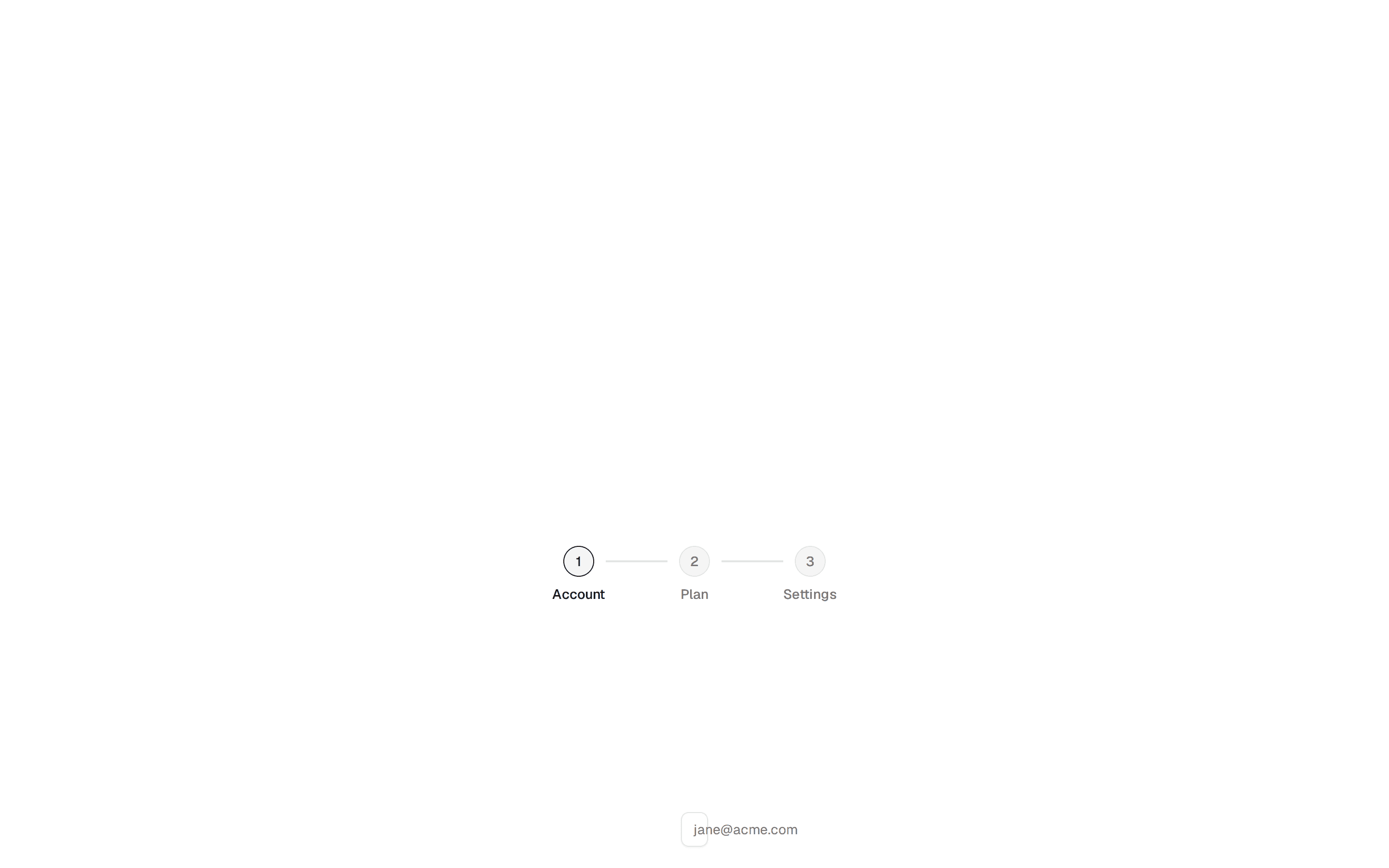
const padded = [
...Array(ACTIVE_ROW).fill(null),
...steps,
...Array(ACTIVE_ROW).fill(null),
];
return (
<div
aria-hidden="true"
className="flex w-56 shrink-0 flex-col rounded-lg bg-[var(--onb-rail)] py-8"
>
<div className="mb-6 px-6">
<p className="text-xs font-semibold tracking-tight text-[var(--onb-fg-muted)] uppercase">
Getting started
</p>
</div>
<div
className="relative overflow-hidden"
style={{ height: ROW_HEIGHT * VISIBLE_ROWS }}
>
{/* Fixed dot — never moves */}
<div
className="pointer-events-none absolute left-6 z-10 flex items-center"
style={{ top: DOT_TOP, height: ROW_HEIGHT }}
>
<div className="h-2.5 w-2.5 rounded-full bg-[var(--onb-fg)]" />
</div>
{/* Scrolling step labels */}
<motion.div
initial={false}
animate={{ y: yOffsetFor(steps, activeStep) }}
transition={scrollTransition}
className="absolute top-0 left-6 w-full"
>
{padded.map((step, i) => {
if (!step)
return <div key={`pad-${i}`} style={{ height: ROW_HEIGHT }} />;
const stepIndex = i - ACTIVE_ROW;
return (
<StepLabel
key={`step-${stepIndex}`}
step={step}
stepIndex={stepIndex}
isActive={stepIndex === activeStep}
isDone={stepIndex < activeStep}
height={rowHeight(stepIndex, activeStep)}
heightTransition={scrollTransition}
labelTransition={labelTransition}
/>
);
})}
</motion.div>
</div>
</div>
);
}
// ── StepMeter ─────────────────────────────────────────────────────────────────
// The single owner of "how far along am I". Absolutely positioned rather than in
// the content flow for two reasons: it must not shift when a taller question or
// a textarea changes the centred stack's height, and it belongs next to the nav
// buttons — that is where the eye is at the moment the user decides to move on,
// so it can say how far is left while they are deciding.
//
// The track matters as much as the fill: without it the bar is a stray rule with
// nothing to show what fraction it represents.
function StepMeter({
activeStep,
totalSteps,
optional,
transition,
}: {
activeStep: number;
totalSteps: number;
optional: boolean;
transition: object;
}) {
const current = activeStep + 1;
return (
// h-11 matches the nav buttons' height so the two sit on one optical line.
<div className="absolute bottom-10 left-10 flex h-11 w-56 flex-col justify-center gap-2">
<p className="text-xs font-semibold tracking-widest whitespace-nowrap text-[var(--onb-fg-muted)] uppercase">
Step {current} of {totalSteps}
{optional && (
<span className="ml-2 normal-case opacity-70">· optional</span>
)}
</p>
<div
role="progressbar"
aria-valuemin={1}
aria-valuemax={totalSteps}
aria-valuenow={current}
aria-valuetext={`Step ${current} of ${totalSteps}`}
aria-label="Onboarding progress"
className="h-0.5 w-full overflow-hidden rounded-full bg-[var(--onb-border)]"
>
{/* scaleX rather than width, so this stays composite-only. */}
<motion.div
initial={false}
animate={{ scaleX: current / totalSteps }}
transition={transition}
className="h-full w-full origin-left rounded-full bg-[var(--onb-accent)]"
/>
</div>
</div>
);
}
// ── QuestionField ─────────────────────────────────────────────────────────────
// One field per step type. Every branch takes its accessible name from the
// question heading, so the visible question is the control's programmatic label
// and no placeholder is ever doing that job.
function QuestionField({
step,
stepIndex,
answer,
headingId,
describedBy,
invalid,
onChange,
}: {
step: Step;
stepIndex: number;
answer: Answer | undefined;
headingId: string;
describedBy: string | undefined;
invalid: boolean;
onChange: (value: Answer) => void;
}) {
const type = step.type ?? "radio";
const options = step.options ?? [];
const fieldId = `onb-field-${stepIndex}`;
const value = typeof answer === "string" ? answer : "";
if (type === "select") {
const valueId = `${fieldId}-value`;
return (
<Select value={value} onValueChange={onChange}>
{/* Named by the question *and* the current value, so the answer is
still announced; aria-labelledby alone would suppress it. */}
<SelectTrigger
id={fieldId}
aria-labelledby={`${headingId} ${valueId}`}
aria-invalid={invalid || undefined}
aria-describedby={describedBy}
className={`${FIELD_CLASS} h-11 data-[placeholder]:text-[var(--onb-fg-muted)]`}
>
<SelectValue
id={valueId}
placeholder={step.placeholder ?? "Choose an option"}
/>
</SelectTrigger>
{/* ease-out sets --tw-ease, which tw-animate-css's animate-in/out read
in place of their `ease` default: the panel enters and exits the
viewport. Set here rather than in ui/select.tsx so consumers keep
the pristine shadcn component. */}
<SelectContent className="rounded-xl ease-out data-[state=closed]:duration-[120ms]">
{options.map((option) => (
<SelectItem key={option} value={option} className="text-sm">
{option}
</SelectItem>
))}
</SelectContent>
</Select>
);
}
if (type === "multi") {
const list = Array.isArray(answer) ? answer : [];
return (
<div
role="group"
aria-labelledby={headingId}
aria-describedby={describedBy}
className="flex flex-col gap-2"
>
{options.map((option, i) => {
const id = `onb-${stepIndex}-${i}`;
const checked = list.includes(option);
return (
<label
key={option}
htmlFor={id}
className={optionCardClass(checked, invalid)}
>
<Checkbox
id={id}
checked={checked}
aria-invalid={invalid || undefined}
onCheckedChange={() =>
onChange(
checked
? list.filter((v) => v !== option)
: [...list, option],
)
}
className={INDICATOR_CLASS}
/>
{option}
</label>
);
})}
</div>
);
}
if (type === "text") {
return (
<Input
id={fieldId}
type="text"
aria-labelledby={headingId}
aria-invalid={invalid || undefined}
aria-describedby={describedBy}
placeholder={step.placeholder}
value={value}
onChange={(e) => onChange(e.target.value)}
className={`${FIELD_CLASS} h-11 px-4`}
/>
);
}
if (type === "textarea") {
return (
<Textarea
id={fieldId}
rows={4}
aria-labelledby={headingId}
aria-invalid={invalid || undefined}
aria-describedby={describedBy}
placeholder={step.placeholder}
value={value}
onChange={(e) => onChange(e.target.value)}
// Enter inserts a newline in a textarea, so submitting needs the
// platform's ⌘/Ctrl+Enter instead.
onKeyDown={(e) => {
if ((e.metaKey || e.ctrlKey) && e.key === "Enter") {
e.preventDefault();
e.currentTarget.form?.requestSubmit();
}
}}
className={`${FIELD_CLASS} min-h-24 px-4 py-3`}
/>
);
}
return (
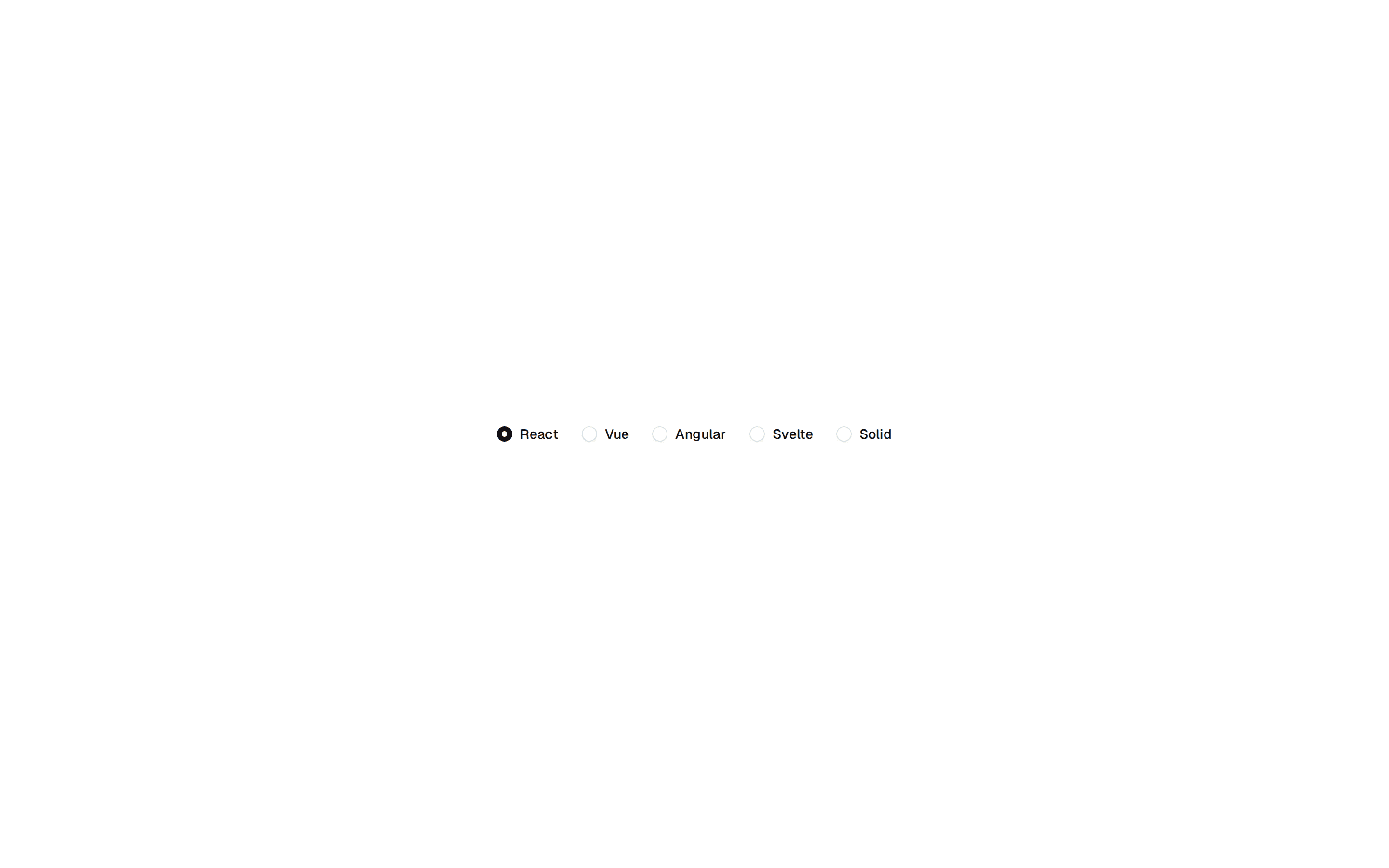
<RadioGroup
aria-labelledby={headingId}
aria-invalid={invalid || undefined}
aria-describedby={describedBy}
value={value}
onValueChange={onChange}
className="flex flex-col gap-2"
>
{options.map((option, i) => {
const id = `onb-${stepIndex}-${i}`;
return (
<label
key={option}
htmlFor={id}
className={optionCardClass(value === option, invalid)}
>
{/* The indicator is scoped to the dot inside it: Radix renders the
indicator itself as a <span> too, so a bare [&_span] would paint
the whole 16px wrapper instead of the dot. */}
<RadioGroupItem
id={id}
value={option}
className={`${INDICATOR_CLASS} [&_[data-slot=radio-group-indicator]>span]:bg-current`}
/>
{option}
</label>
);
})}
</RadioGroup>
);
}
// ── QuestionSlide ─────────────────────────────────────────────────────────────
function QuestionSlide({
step,
stepIndex,
answer,
direction,
transition,
exitTransition,
error,
errorId,
fieldRef,
onChange,
}: {
step: Step;
stepIndex: number;
answer: Answer | undefined;
direction: number;
transition: object;
exitTransition: object;
error: string;
errorId: string;
fieldRef: React.RefObject<HTMLDivElement | null>;
onChange: (value: Answer) => void;
}) {
const headingId = `onb-q-${stepIndex}`;
const hintId = `onb-hint-${stepIndex}`;
const isTextarea = step.type === "textarea";
const slideVariants = makeSlideVariants(transition, exitTransition);
const describedBy =
[error ? errorId : null, isTextarea ? hintId : null]
.filter(Boolean)
.join(" ") || undefined;
return (
<AnimatePresence mode="popLayout" initial={false} custom={direction}>
<motion.div
key={stepIndex}
variants={slideVariants}
initial="initial"
animate="active"
exit="exit"
custom={direction}
className="w-full"
>
<h2
id={headingId}
className="mb-5 text-2xl leading-snug font-bold text-[var(--onb-fg)]"
>
{step.question}
</h2>
<div ref={fieldRef}>
<QuestionField
step={step}
stepIndex={stepIndex}
answer={answer}
headingId={headingId}
describedBy={describedBy}
invalid={Boolean(error)}
onChange={onChange}
/>
</div>
{isTextarea && (
<p id={hintId} className="mt-2 text-xs text-[var(--onb-fg-muted)]">
Press ⌘ + Enter to finish.
</p>
)}
{/* Reserved so the message never shifts the field on appearing. The
icon is what separates this from the hint above, which otherwise
shares its size, colour and position. */}
<p
id={errorId}
className="mt-2 flex min-h-5 items-center gap-1.5 text-xs font-medium text-[var(--onb-danger)]"
>
{error && (
<HugeiconsIcon
icon={AlertCircleIcon}
size={14}
strokeWidth={2}
color="currentColor"
aria-hidden="true"
className="shrink-0"
/>
)}
{error}
</p>
</motion.div>
</AnimatePresence>
);
}
// ── NavButtons ────────────────────────────────────────────────────────────────
// Next stays enabled even without an answer: pressing it surfaces the error and
// moves focus to the field, which is what tells the user what to fix. Back is
// natively disabled on step one, where it is genuinely unavailable.
function NavButtons({
isFirst,
isLast,
isOptional,
onBack,
onSkip,
}: {
isFirst: boolean;
isLast: boolean;
isOptional: boolean;
onBack: () => void;
onSkip: () => void;
}) {
// Equal 40px inset on both axes, and right-10 keeps the cluster on the same
// vertical edge as the question and options above it.
return (
<div className="absolute right-10 bottom-10 flex items-center gap-2">
{isOptional && (
<Button
type="button"
onClick={onSkip}
className={`mr-1 h-11 rounded-full bg-transparent px-4 text-sm font-medium text-[var(--onb-fg-muted)] hover:bg-[var(--onb-surface)] hover:text-[var(--onb-fg)] ${FOCUS_CLASS}`}
>
Skip
</Button>
)}
<Button
type="button"
onClick={onBack}
disabled={isFirst}
aria-label="Previous step"
className={`size-11 rounded-full bg-[var(--onb-surface)] text-[var(--onb-fg)] hover:bg-[var(--onb-border)] ${FOCUS_CLASS}`}
>
<HugeiconsIcon
icon={ArrowLeft01Icon}
size={16}
strokeWidth={2}
color="currentColor"
aria-hidden="true"
/>
</Button>
<Button
type="submit"
aria-label={isLast ? "Finish onboarding" : "Next step"}
className={`size-11 rounded-full bg-[var(--onb-accent)] text-[var(--onb-accent-fg)] hover:bg-[var(--onb-accent)]/90 ${FOCUS_CLASS}`}
>
<AnimatePresence mode="wait" initial={false}>
{isLast ? (
<motion.span
key="tick"
initial={{ opacity: 0, scale: 0.5 }}
animate={{ opacity: 1, scale: 1 }}
exit={{ opacity: 0, scale: 0.5 }}
transition={{ type: "spring", duration: 0.25, bounce: 0 }}
className="flex items-center"
>
<HugeiconsIcon
icon={Tick02Icon}
size={16}
strokeWidth={2}
color="currentColor"
aria-hidden="true"
/>
</motion.span>
) : (
<motion.span
key="arrow"
initial={{ opacity: 0, scale: 0.5 }}
animate={{ opacity: 1, scale: 1 }}
exit={{ opacity: 0, scale: 0.5 }}
transition={{ type: "spring", duration: 0.25, bounce: 0 }}
className="flex items-center"
>
<HugeiconsIcon
icon={ArrowRight01Icon}
size={16}
strokeWidth={2}
color="currentColor"
aria-hidden="true"
/>
</motion.span>
)}
</AnimatePresence>
</Button>
</div>
);
}
// ── CompletionScreen ──────────────────────────────────────────────────────────
// Reflects the answers back rather than ending on a bare tick: five steps of
// effort should visibly buy something. Built from steps + answers so it holds
// for any steps array a consumer passes.
function formatAnswer(answer: Answer | undefined) {
if (Array.isArray(answer))
return answer.length ? answer.join(", ") : "Skipped";
const trimmed = answer?.trim();
return trimmed ? trimmed : "Skipped";
}
function CompletionScreen({
steps,
answers,
headingRef,
}: {
steps: Step[];
answers: Record<number, Answer>;
headingRef: React.RefObject<HTMLHeadingElement | null>;
}) {
return (
<motion.div
key="done"
initial={{ opacity: 0, scale: 0.96 }}
animate={{ opacity: 1, scale: 1 }}
exit={{ opacity: 0 }}
transition={{
type: "tween",
ease: [0.165, 0.84, 0.44, 1],
duration: 0.38,
}}
className="flex w-full flex-col items-center justify-center gap-4 rounded-lg bg-[var(--onb-card)] px-10"
>
<div className="flex h-14 w-14 items-center justify-center rounded-full bg-[var(--onb-accent)] text-[var(--onb-accent-fg)]">
<HugeiconsIcon
icon={Tick02Icon}
size={22}
strokeWidth={2}
color="currentColor"
aria-hidden="true"
/>
</div>
{/* tabIndex -1 so focus can land here when the form unmounts, instead of
falling back to <body> with nothing announced. */}
<h2
ref={headingRef}
tabIndex={-1}
className={`text-2xl font-bold text-[var(--onb-fg)] ${FOCUS_CLASS}`}
>
All set!
</h2>
<p className="text-sm text-[var(--onb-fg-muted)]">
Here’s what you told us.
</p>
{/* Capped and scrollable so a long textarea answer can't push the card
out of shape; overscroll-contain keeps that scroll local. */}
<dl className="mt-1 flex max-h-56 w-full max-w-sm flex-col overflow-y-auto [overscroll-behavior:contain]">
{steps.map((step, i) => {
const value = formatAnswer(answers[i]);
const skipped = value === "Skipped";
return (
<div
key={step.label}
className="flex items-baseline justify-between gap-4 border-b border-[var(--onb-border)] py-2 last:border-0"
>
<dt className="shrink-0 text-xs text-[var(--onb-fg-muted)]">
{step.label}
</dt>
<dd
className={`line-clamp-2 text-right text-sm ${
skipped
? "text-[var(--onb-fg-muted)] italic"
: "text-[var(--onb-fg)]"
}`}
>
{value}
</dd>
</div>
);
})}
</dl>
</motion.div>
);
}
// ── Root ──────────────────────────────────────────────────────────────────────
export default function OnboardingForm({
steps = DEFAULT_STEPS,
onComplete,
}: OnboardingFormProps) {
const shouldReduceMotion = useReducedMotion();
const [activeStep, setActiveStep] = useState(0);
const [direction, setDirection] = useState(1);
const [answers, setAnswers] = useState<Record<number, Answer>>({});
const [done, setDone] = useState(false);
const [error, setError] = useState("");
const [status, setStatus] = useState("");
const uid = useId();
const errorId = `onb-error-${uid}`;
const fieldRef = useRef<HTMLDivElement | null>(null);
const doneHeadingRef = useRef<HTMLHeadingElement | null>(null);
const isFirst = activeStep === 0;
const isLast = activeStep === steps.length - 1;
const isOptional = Boolean(steps[activeStep].optional);
const hasAnswer = isAnswered(answers[activeStep]);
const tween = (duration: number, ease = EASING_MOVE) =>
shouldReduceMotion
? { duration: 0 }
: { type: "tween" as const, ease, duration };
// Focus the completion heading once it exists, so focus never falls back to
// <body> when the form unmounts.
useEffect(() => {
if (done) doneHeadingRef.current?.focus();
}, [done]);
const announceStep = (index: number) =>
setStatus(`Step ${index + 1} of ${steps.length}. ${steps[index].question}`);
/** Moves forward without validating — the shared tail of Next and Skip. */
const advance = () => {
setError("");
if (isLast) {
onComplete?.(answers);
setStatus("Onboarding complete. Your preferences have been saved.");
setDone(true);
return;
}
setDirection(1);
setActiveStep(activeStep + 1);
announceStep(activeStep + 1);
};
const goNext = () => {
if (!hasAnswer && !isOptional) {
setError(ERROR_BY_TYPE[steps[activeStep].type ?? "radio"]);
fieldRef.current
?.querySelector<HTMLElement>(FIELD_FOCUS_SELECTOR)
?.focus();
return;
}
advance();
};
const goBack = () => {
if (isFirst) return;
setError("");
setDirection(-1);
setActiveStep(activeStep - 1);
announceStep(activeStep - 1);
};
const setAnswer = (value: Answer) => {
setError("");
setAnswers((prev) => ({ ...prev, [activeStep]: value }));
};
return (
<div className="flex h-full w-full items-center justify-center bg-[var(--onb-surface)] font-sans">
{/* Live region is present from first paint and empty, so the messages
injected into it later actually get announced. */}
<div role="status" aria-live="polite" className="sr-only">
{status}
</div>
{/* The shadow defines the card's edge in light mode and disappears
entirely in dark (black shadow on a near-black page), where the card
then differed from the page by 0.06 lightness and stopped reading as a
surface. The hairline carries the edge there. */}
<div className="relative flex h-[600px] w-[800px] overflow-hidden rounded-2xl bg-[var(--onb-card)] px-2 py-2 shadow-2xl ring-1 ring-[var(--onb-card-edge)]">
<AnimatePresence mode="wait">
{done ? (
<CompletionScreen
key="done"
steps={steps}
answers={answers}
headingRef={doneHeadingRef}
/>
) : (
<motion.form
key="form"
initial={false}
noValidate
onSubmit={(e) => {
e.preventDefault();
goNext();
}}
className="flex h-full w-full gap-2"
>
<StepTicker
steps={steps}
activeStep={activeStep}
scrollTransition={tween(STEP_DUR)}
labelTransition={tween(STEP_DUR)}
/>
{/* pb clears the nav cluster: 40px inset + 44px button + 12px. */}
<div className="relative flex flex-1 flex-col justify-center overflow-hidden rounded-lg bg-[var(--onb-card)] px-10 pb-24">
<StepMeter
activeStep={activeStep}
totalSteps={steps.length}
optional={isOptional}
transition={tween(STEP_DUR, EASING_ENTER)}
/>
<QuestionSlide
step={steps[activeStep]}
stepIndex={activeStep}
answer={answers[activeStep]}
direction={direction}
transition={tween(STEP_DUR, EASING_ENTER)}
exitTransition={tween(STEP_DUR * EXIT_RATIO, EASING_ENTER)}
error={error}
errorId={errorId}
fieldRef={fieldRef}
onChange={setAnswer}
/>
<NavButtons
isFirst={isFirst}
isLast={isLast}
isOptional={isOptional}
onBack={goBack}
onSkip={advance}
/>
</div>
</motion.form>
)}
</AnimatePresence>
</div>
</div>
);
}