Dismissible Alert Stack
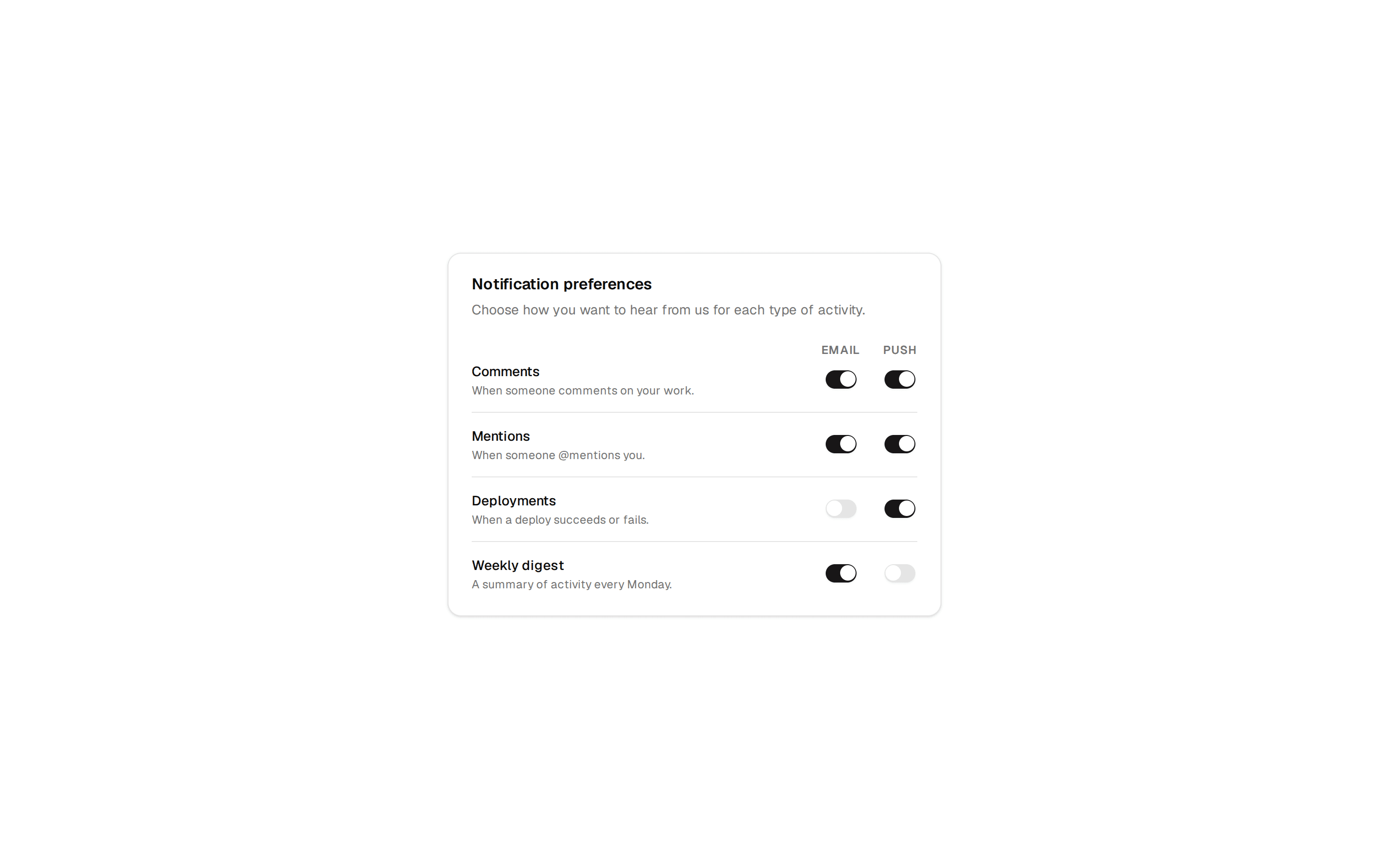
Stack of dismissible inline notification alerts in success, info, warning, and error variants, resolving to an all caught up empty state.
@7ovr
Stack of dismissible inline notification alerts in success, info, warning, and error variants, resolving to an all caught up empty state.
@7ovr
registry/blocks/notifications/5/notifications-block.tsx
"use client"
import { useState } from "react"
import { cn } from "@/lib/utils"
import { IconPlaceholder } from "@/components/icons/icon-placeholder"
type IconProps = { className?: string; size?: number | string }
type IconRenderer = (props: IconProps) => React.ReactNode
type Variant = "success" | "info" | "warning" | "error"
const config: Record<Variant, { icon: IconRenderer; accent: string }> = {
success: {
icon: (p: IconProps) => (
<IconPlaceholder
lucide="CircleCheck"
tabler="IconCircleCheck"
hugeicons="CheckmarkCircle02Icon"
phosphor="CheckCircle"
remixicon="RiCheckboxCircleFill"
{...p}
/>
),
accent: "text-success",
},
info: {
icon: (p: IconProps) => (
<IconPlaceholder
lucide="Info"
tabler="IconInfoCircle"
hugeicons="InformationCircleIcon"
phosphor="Info"
remixicon="RiInformationFill"
{...p}
/>
),
accent: "text-foreground",
},
warning: {
icon: (p: IconProps) => (
<IconPlaceholder
lucide="TriangleAlert"
tabler="IconAlertTriangle"
hugeicons="Alert01Icon"
phosphor="Warning"
remixicon="RiAlertFill"
{...p}
/>
),
accent: "text-warning",
},
error: {
icon: (p: IconProps) => (
<IconPlaceholder
lucide="CircleAlert"
tabler="IconAlertCircle"
hugeicons="AlertCircleIcon"
phosphor="WarningCircle"
remixicon="RiErrorWarningFill"
{...p}
/>
),
accent: "text-destructive",
},
}
const initial: { id: number; variant: Variant; title: string; body: string }[] =
[
{
id: 1,
variant: "success",
title: "Changes saved",
body: "Your project settings were updated successfully.",
},
{
id: 2,
variant: "info",
title: "New version available",
body: "Refresh to get the latest features and fixes.",
},
{
id: 3,
variant: "warning",
title: "Usage nearing limit",
body: "You've used 85% of your monthly quota.",
},
{
id: 4,
variant: "error",
title: "Payment failed",
body: "We couldn't process your card. Update it to continue.",
},
]
export default function NotificationsBlock() {
const [toasts, setToasts] = useState(initial)
return (
<section className="flex min-h-svh w-full items-center justify-center bg-muted/30 px-6 py-16 text-foreground">
<div className="flex w-full max-w-sm flex-col gap-3">
{toasts.map((toast) => {
const { icon: Icon, accent } = config[toast.variant]
return (
<div
key={toast.id}
role="status"
className="flex items-start gap-3 rounded-lg border border-border bg-background p-4 shadow-sm"
>
<Icon
className={cn("mt-0.5 size-5 shrink-0", accent)}
aria-hidden="true"
/>
<div className="flex min-w-0 flex-1 flex-col gap-0.5">
<span className="text-sm font-semibold">{toast.title}</span>
<span className="text-xs text-muted-foreground">
{toast.body}
</span>
</div>
<button
type="button"
onClick={() =>
setToasts((prev) => prev.filter((t) => t.id !== toast.id))
}
aria-label="Dismiss"
className="shrink-0 text-muted-foreground transition-colors hover:text-foreground"
>
<IconPlaceholder
lucide="X"
tabler="IconX"
hugeicons="Cancel01Icon"
phosphor="X"
remixicon="RiCloseLine"
className="size-4"
aria-hidden="true"
/>
</button>
</div>
)
})}
{toasts.length === 0 && (
<p className="rounded-lg border border-dashed border-border py-10 text-center text-sm text-muted-foreground">
You're all caught up.
</p>
)}
</div>
</section>
)
}