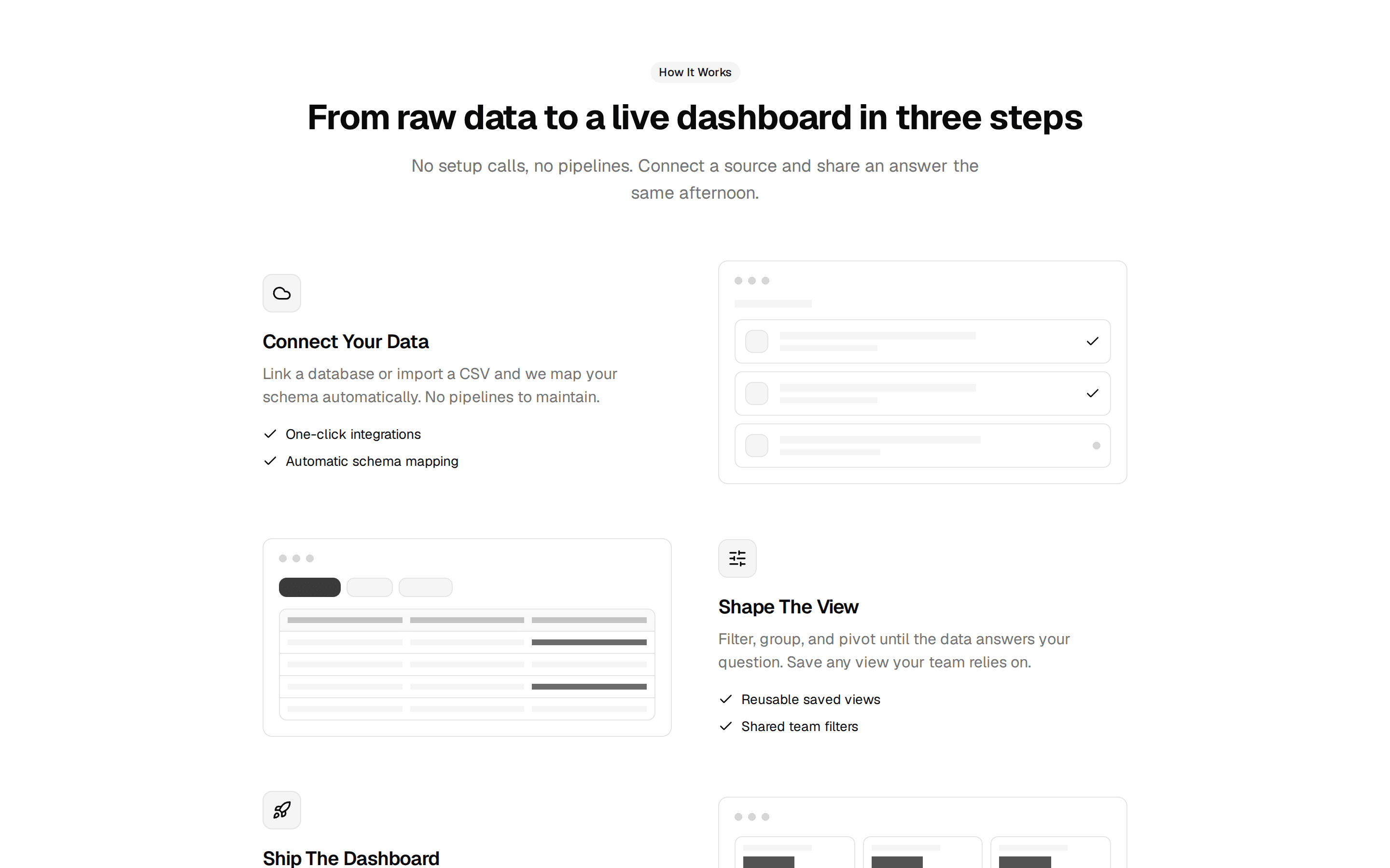
Clickable Horizontal Stepper
Interactive how it works stepper with clickable steps along a progress line that fills to the active step, stacking vertically on mobile.
@7ovr
Interactive how it works stepper with clickable steps along a progress line that fills to the active step, stacking vertically on mobile.
@7ovr
registry/blocks/how-it-works/3/how-it-works-block.tsx
"use client"

import { useState } from "react"
import { Badge } from "@/components/ui/badge"
import { cn } from "@/lib/utils"
import { IconPlaceholder } from "@/components/icons/icon-placeholder"

type IconProps = { className?: string; size?: number | string }

const steps = [
  {
    icon: (p: IconProps) => (
      <IconPlaceholder
        lucide="UserPlus"
        tabler="IconUserPlus"
        hugeicons="UserAddIcon"
        phosphor="UserPlus"
        remixicon="RiUserAddLine"
        {...p}
      />
    ),
    title: "Create your account",
    copy: "Sign up in under two minutes, no card required to get started.",
  },
  {
    icon: (p: IconProps) => (
      <IconPlaceholder
        lucide="Palette"
        tabler="IconPalette"
        hugeicons="PaintBoardIcon"
        phosphor="Palette"
        remixicon="RiPaletteLine"
        {...p}
      />
    ),
    title: "Customize your space",
    copy: "Pick a template and tune Acme to match how your team already works.",
  },
  {
    icon: (p: IconProps) => (
      <IconPlaceholder
        lucide="Users"
        tabler="IconUsersGroup"
        hugeicons="UserGroupIcon"
        phosphor="UsersThree"
        remixicon="RiTeamLine"
        {...p}
      />
    ),
    title: "Invite your team",
    copy: "Send role-based invites in bulk and let colleagues join in one click.",
  },
  {
    icon: (p: IconProps) => (
      <IconPlaceholder
        lucide="Rocket"
        tabler="IconRocket"
        hugeicons="RocketIcon"
        phosphor="Rocket"
        remixicon="RiRocketLine"
        {...p}
      />
    ),
    title: "Ship with confidence",
    copy: "Run automated checks and deploy knowing Acme has your back.",
  },
]

export default function HowItWorksBlock() {
  const [active, setActive] = useState(0)
  const progress = ((active + 0.5) / steps.length) * 100

  return (
    <section className="flex w-full items-center justify-center bg-muted/30 px-6 py-16 text-foreground">
      <div className="mx-auto w-full max-w-4xl">
        <div className="mb-12 text-center">
          <Badge variant="outline" className="mb-4">
            How it works
          </Badge>
          <h2 className="font-heading text-3xl font-bold tracking-tight sm:text-4xl">
            Up and running in four steps
          </h2>
          <p className="mx-auto mt-3 max-w-xl text-muted-foreground">
            Go from sign-up to full team collaboration without a single support
            ticket.
          </p>
        </div>

        <ol
          className={cn("relative flex flex-col gap-8", "md:flex-row md:gap-0")}
        >
          <div
            className="absolute top-0 left-[1.25rem] hidden h-full w-px bg-border md:top-5 md:left-0 md:h-px md:w-full"
            aria-hidden="true"
          />
          <div
            className="absolute top-0 left-[1.25rem] hidden h-full w-px origin-top bg-primary transition-transform duration-200 ease-[cubic-bezier(0.23,1,0.32,1)] md:top-5 md:left-0 md:h-px md:w-auto"
            style={{ transform: `scaleY(${progress / 100})` }}
            aria-hidden="true"
          />
          <div
            className="absolute top-5 left-0 hidden h-px w-full origin-left bg-primary transition-transform duration-200 ease-[cubic-bezier(0.23,1,0.32,1)] md:block"
            style={{ transform: `scaleX(${progress / 100})` }}
            aria-hidden="true"
          />

          {steps.map(({ icon: Icon, title, copy }, index) => {
            const isDone = index <= active
            const isCurrent = index === active
            return (
              <li
                key={title}
                className="relative flex flex-1 gap-4 md:flex-col md:items-center md:gap-0 md:px-3 md:text-center"
              >
                <button
                  type="button"
                  onClick={() => setActive(index)}
                  aria-current={isCurrent ? "step" : undefined}
                  className={cn(
                    "z-10 flex size-10 shrink-0 cursor-pointer items-center justify-center rounded-full border p-0 transition-colors focus-visible:ring-2 focus-visible:ring-ring focus-visible:ring-offset-2 focus-visible:ring-offset-background focus-visible:outline-none",
                    isDone
                      ? "border-primary bg-primary text-primary-foreground"
                      : "border-border bg-background text-muted-foreground hover:bg-muted",
                    isCurrent &&
                      "ring-2 ring-primary ring-offset-2 ring-offset-background"
                  )}
                >
                  {isDone ? (
                    <IconPlaceholder
                      lucide="Check"
                      tabler="IconCheck"
                      hugeicons="Tick02Icon"
                      phosphor="Check"
                      remixicon="RiCheckLine"
                      className="size-4"
                      aria-hidden="true"
                    />
                  ) : (
                    <Icon className="size-4" aria-hidden="true" />
                  )}
                  <span className="sr-only">{title}</span>
                </button>

                <div className="md:mt-4">
                  <h3
                    className={cn(
                      "mt-0.5 font-heading text-sm font-semibold transition-colors",
                      isCurrent || isDone
                        ? "text-foreground"
                        : "text-muted-foreground"
                    )}
                  >
                    {title}
                  </h3>
                  <p className="mt-1.5 text-sm text-muted-foreground md:mx-auto md:max-w-[16rem]">
                    {copy}
                  </p>
                </div>
              </li>
            )
          })}
        </ol>
      </div>
    </section>
  )
}