Call To Action Footer
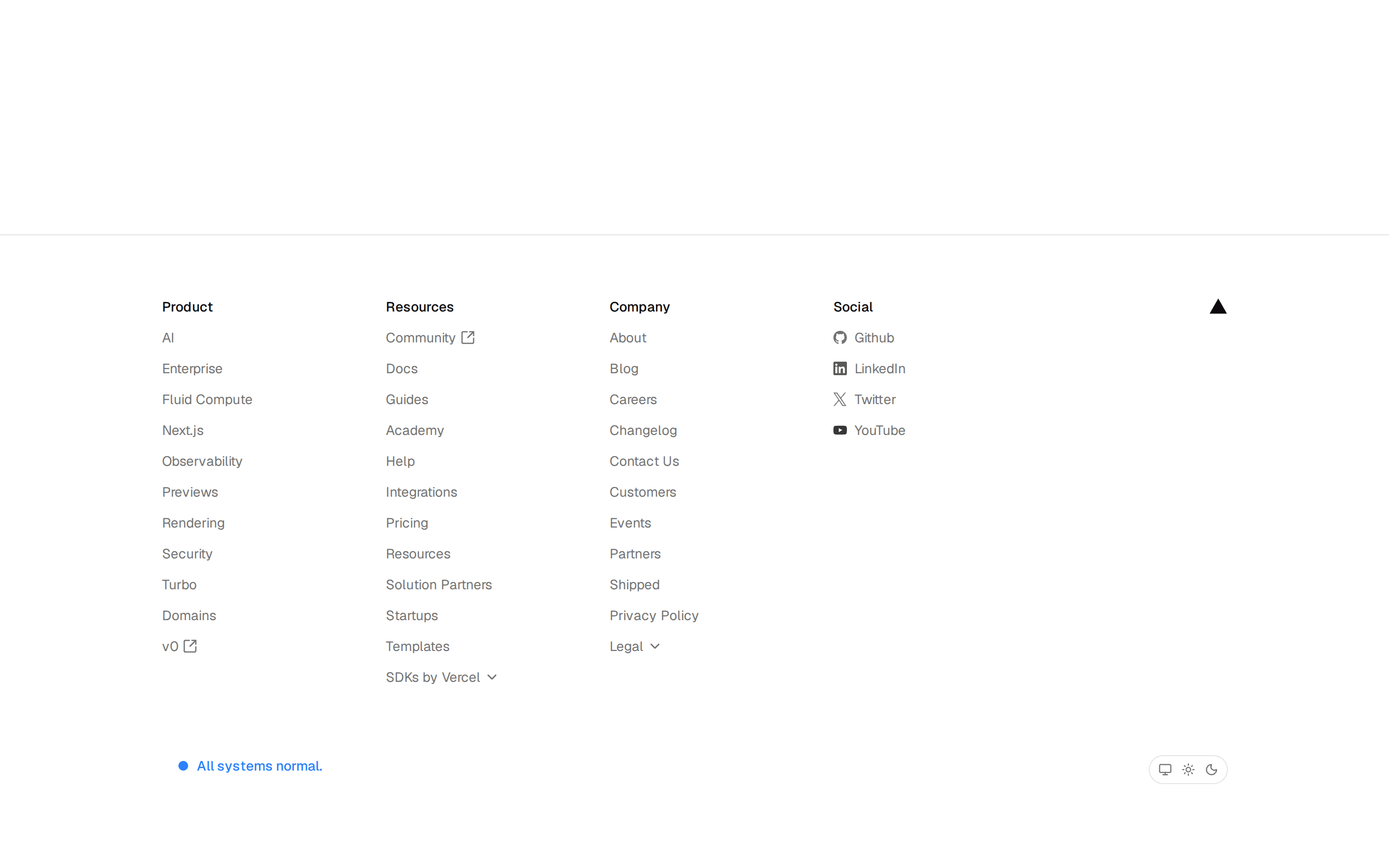
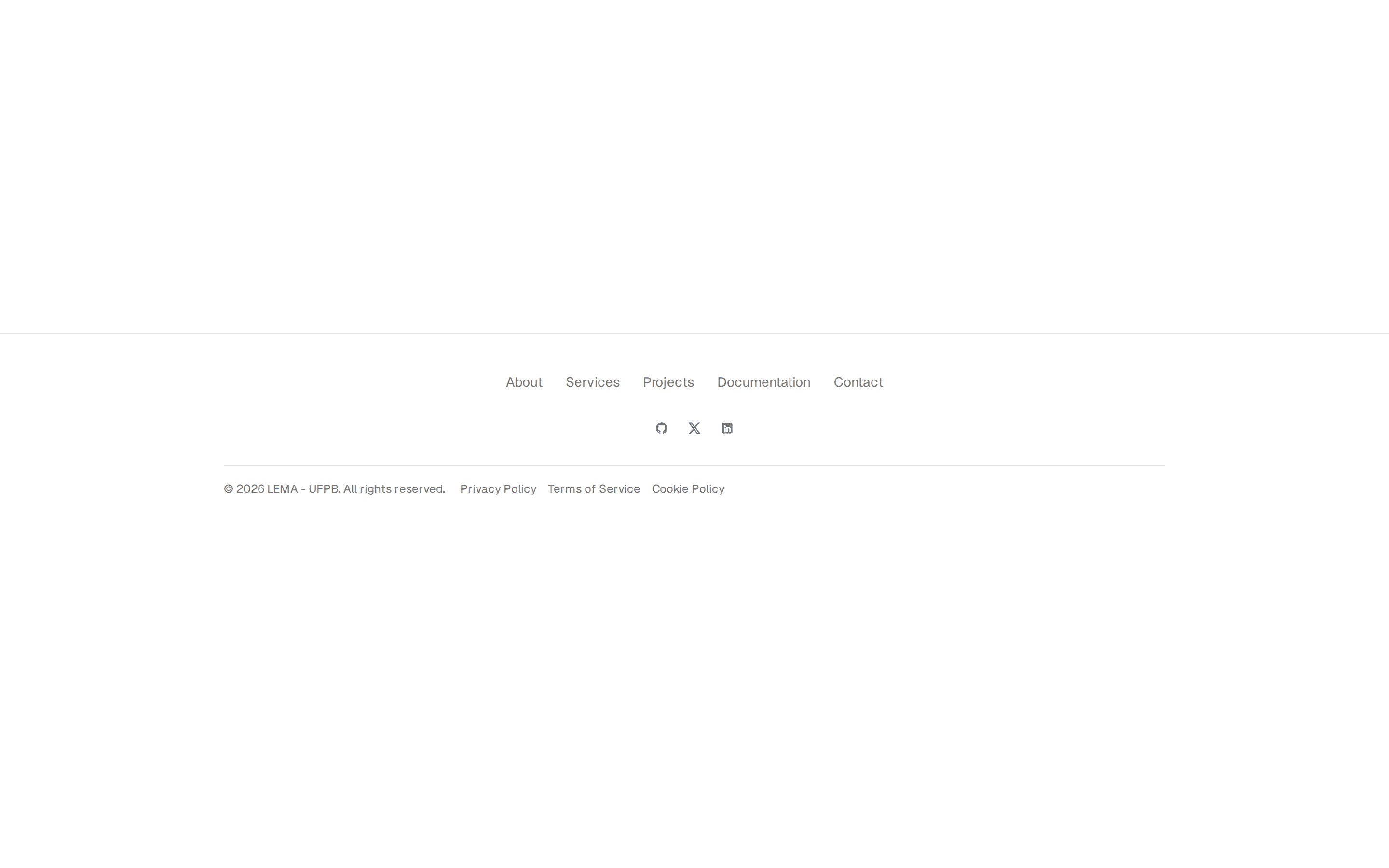
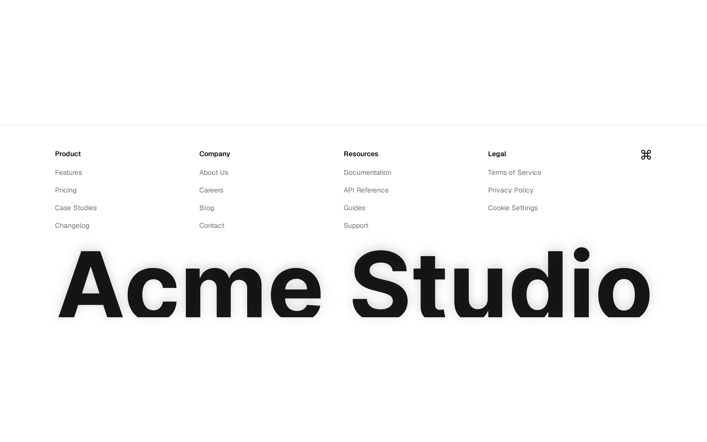
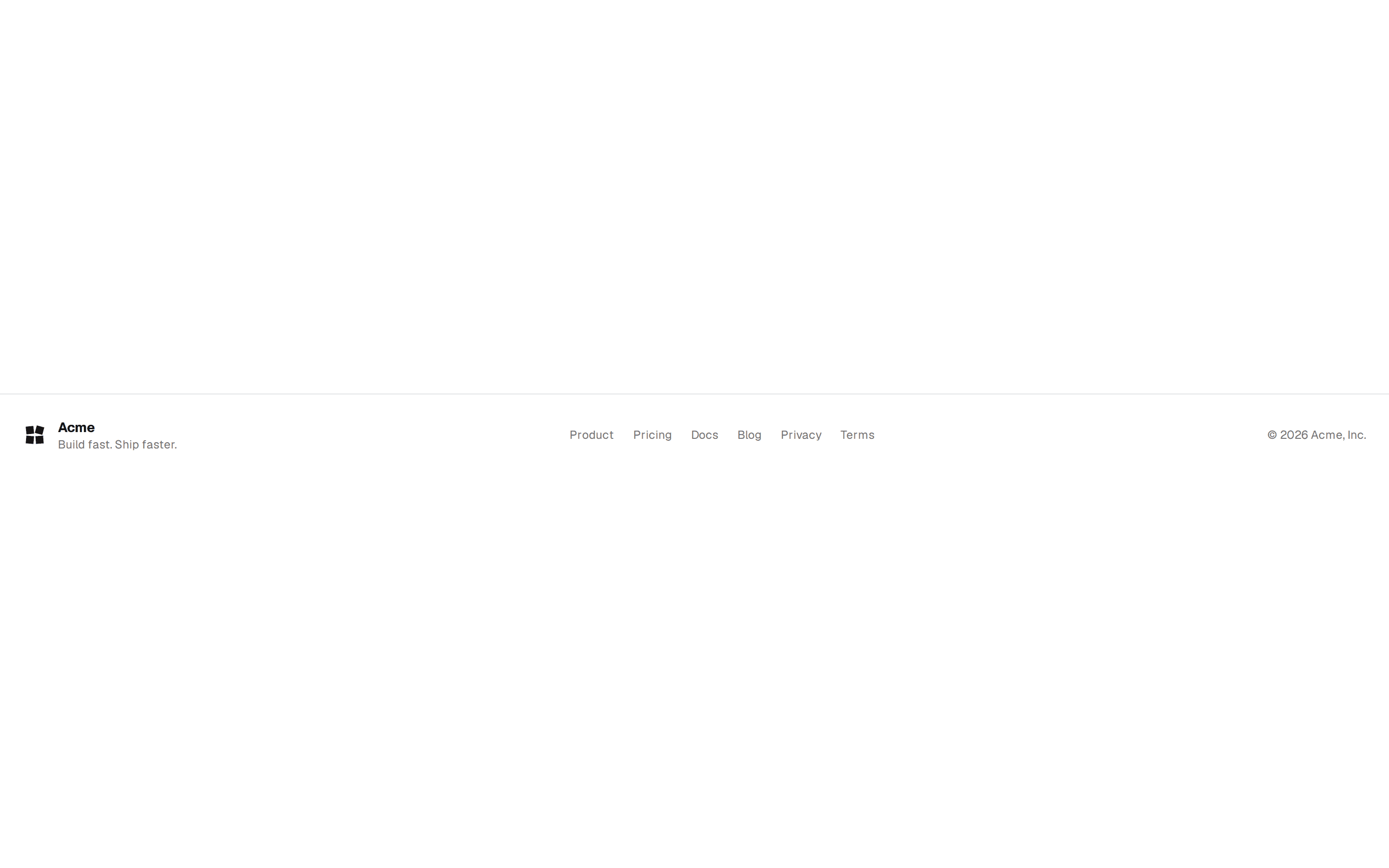
Footer led by a call to action band with heading and button, above brand and sitemap columns and a social bottom bar.
@7ovr
Footer led by a call to action band with heading and button, above brand and sitemap columns and a social bottom bar.
@7ovr
registry/blocks/footer/5/footer-block.tsx
import { Button } from "@/components/ui/button"
import { IconPlaceholder } from "@/components/icons/icon-placeholder"

function Logo({ className }: { className?: string }) {
  return (
    <svg
      viewBox="0 0 24 24"
      fill="currentColor"
      aria-hidden="true"
      className={className}
    >
      <rect x="3" y="3" width="8" height="8" transform="rotate(-6 7 7)" />
      <rect x="3" y="13" width="8" height="8" transform="rotate(5 7 17)" />
      <rect x="13" y="13" width="8" height="8" transform="rotate(-4 17 17)" />
      <rect x="13" y="3" width="8" height="8" transform="rotate(15 17 7)" />
    </svg>
  )
}

const columns = [
  {
    heading: "Product",
    links: ["Features", "Pricing", "Changelog", "Roadmap"],
  },
  { heading: "Company", links: ["About", "Blog", "Careers", "Contact"] },
  { heading: "Resources", links: ["Docs", "Support", "Status", "Community"] },
]

export default function FooterBlock() {
  return (
    <footer className="w-full border-t border-border bg-background text-foreground">
      <div className="mx-auto w-full max-w-5xl px-6">
        <div className="flex flex-col items-center gap-5 border-b border-border py-12 text-center">
          <h2 className="font-heading text-2xl font-bold tracking-tight text-balance sm:text-3xl">
            Ready to build something great?
          </h2>
          <p className="max-w-md text-sm text-pretty text-muted-foreground">
            Start free, no credit card required. Ship your first project today.
          </p>
          <Button render={<a href="#" />} nativeButton={false} size="lg">
            Get started
            <IconPlaceholder
              lucide="ChevronRight"
              tabler="IconChevronRight"
              hugeicons="ArrowRight01Icon"
              phosphor="CaretRight"
              remixicon="RiArrowRightSLine"
              data-icon="inline-end"
              aria-hidden="true"
            />
          </Button>
        </div>

        <div className="grid grid-cols-2 gap-8 py-12 sm:grid-cols-4">
          <div className="col-span-2 flex flex-col gap-3 sm:col-span-1">
            <a href="#" className="flex items-center gap-2">
              <Logo className="size-6 text-primary" />
              <span className="text-lg font-bold tracking-tight">Acme</span>
            </a>
            <p className="max-w-xs text-sm text-muted-foreground">
              The all-in-one platform for modern product teams.
            </p>
          </div>
          {columns.map((column) => (
            <div key={column.heading} className="flex flex-col gap-3">
              <h3 className="font-heading text-xs font-semibold tracking-widest text-muted-foreground uppercase">
                {column.heading}
              </h3>
              <ul className="flex flex-col gap-2">
                {column.links.map((link) => (
                  <li key={link}>
                    <a
                      href="#"
                      className="text-sm text-muted-foreground transition-colors hover:text-foreground"
                    >
                      {link}
                    </a>
                  </li>
                ))}
              </ul>
            </div>
          ))}
        </div>

        <div className="flex flex-col items-center justify-between gap-4 border-t border-border py-6 sm:flex-row">
          <p className="text-xs text-muted-foreground">
            © 2026 Acme Inc. All rights reserved.
          </p>
          <div className="flex items-center gap-1">
            <Button variant="ghost" size="icon" aria-label="X">
              <XMark className="size-4" aria-hidden="true" />
            </Button>
            <Button variant="ghost" size="icon" aria-label="GitHub">
              <GithubMark className="size-4" aria-hidden="true" />
            </Button>
          </div>
        </div>
      </div>
    </footer>
  )
}

type MarkProps = React.ComponentProps<"svg"> & { size?: number | string }

function GithubMark({ size = 24, ...props }: MarkProps) {
  return (
    <svg
      viewBox="0 0 24 24"
      width={size}
      height={size}
      fill="currentColor"
      aria-hidden="true"
      {...props}
    >
      <path d="M12.001 2C6.47598 2 2.00098 6.475 2.00098 12C2.00098 16.425 4.86348 20.1625 8.83848 21.4875C9.33848 21.575 9.52598 21.275 9.52598 21.0125C9.52598 20.775 9.51348 19.9875 9.51348 19.15C7.00098 19.6125 6.35098 18.5375 6.15098 17.975C6.03848 17.6875 5.55098 16.8 5.12598 16.5625C4.77598 16.375 4.27598 15.9125 5.11348 15.9C5.90098 15.8875 6.46348 16.625 6.65098 16.925C7.55098 18.4375 8.98848 18.0125 9.56348 17.75C9.65098 17.1 9.91348 16.6625 10.201 16.4125C7.97598 16.1625 5.65098 15.3 5.65098 11.475C5.65098 10.3875 6.03848 9.4875 6.67598 8.7875C6.57598 8.5375 6.22598 7.5125 6.77598 6.1375C6.77598 6.1375 7.61348 5.875 9.52598 7.1625C10.326 6.9375 11.176 6.825 12.026 6.825C12.876 6.825 13.726 6.9375 14.526 7.1625C16.4385 5.8625 17.276 6.1375 17.276 6.1375C17.826 7.5125 17.476 8.5375 17.376 8.7875C18.0135 9.4875 18.401 10.375 18.401 11.475C18.401 15.3125 16.0635 16.1625 13.8385 16.4125C14.201 16.725 14.5135 17.325 14.5135 18.2625C14.5135 19.6 14.501 20.675 14.501 21.0125C14.501 21.275 14.6885 21.5875 15.1885 21.4875C19.259 20.1133 21.9999 16.2963 22.001 12C22.001 6.475 17.526 2 12.001 2Z" />
    </svg>
  )
}

function XMark({ size = 24, ...props }: MarkProps) {
  return (
    <svg
      viewBox="0 0 24 24"
      width={size}
      height={size}
      fill="currentColor"
      aria-hidden="true"
      {...props}
    >
      <path d="M17.6874 3.0625L12.6907 8.77425L8.37045 3.0625H2.11328L9.58961 12.8387L2.50378 20.9375H5.53795L11.0068 14.6886L15.7863 20.9375H21.8885L14.095 10.6342L20.7198 3.0625H17.6874ZM16.6232 19.1225L5.65436 4.78217H7.45745L18.3034 19.1225H16.6232Z" />
    </svg>
  )
}
Requires a base-* style in components.json (the shadcn init default). Legacy new-york/radix-* styles install Radix primitives, which reject the render prop this block uses.