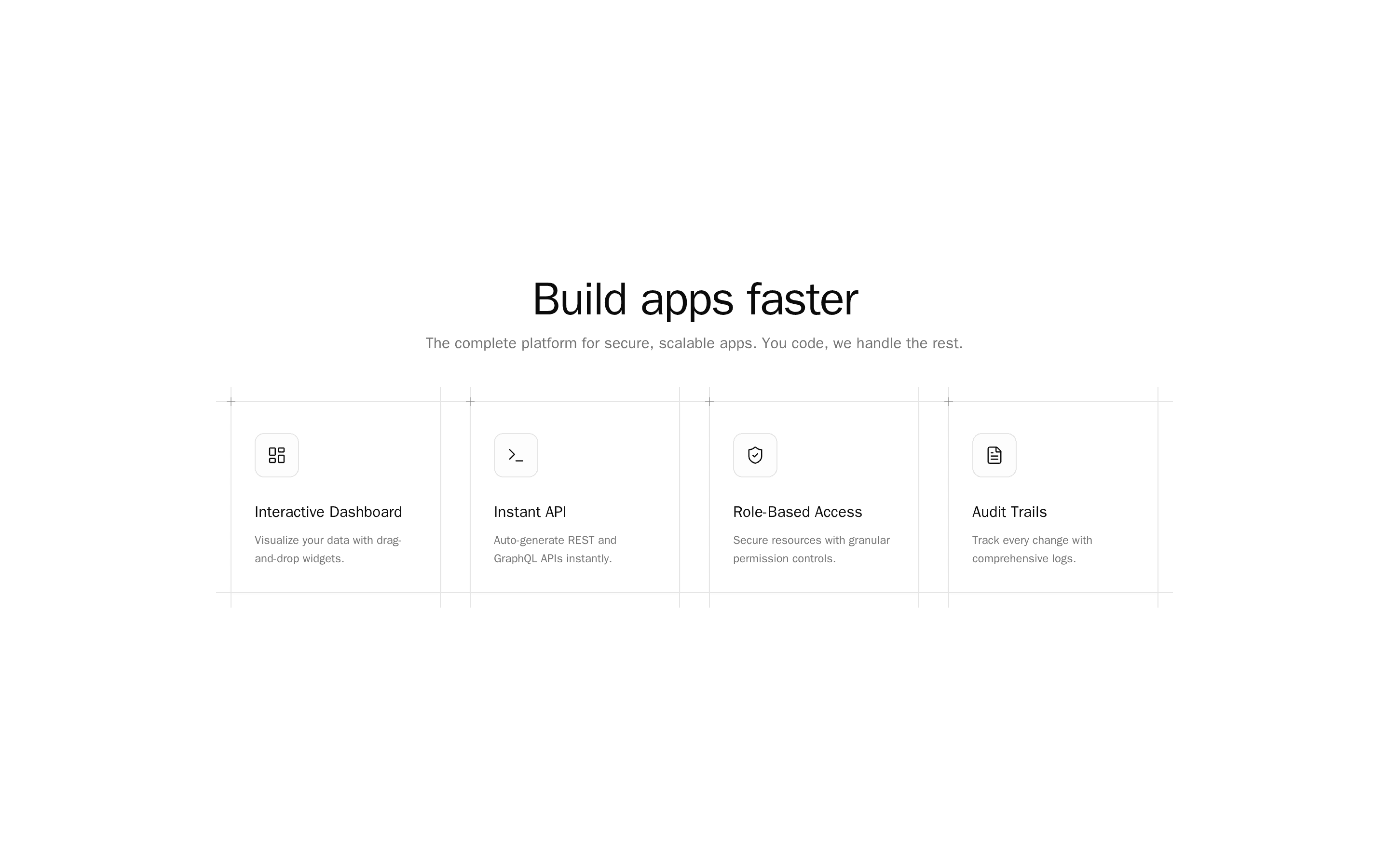
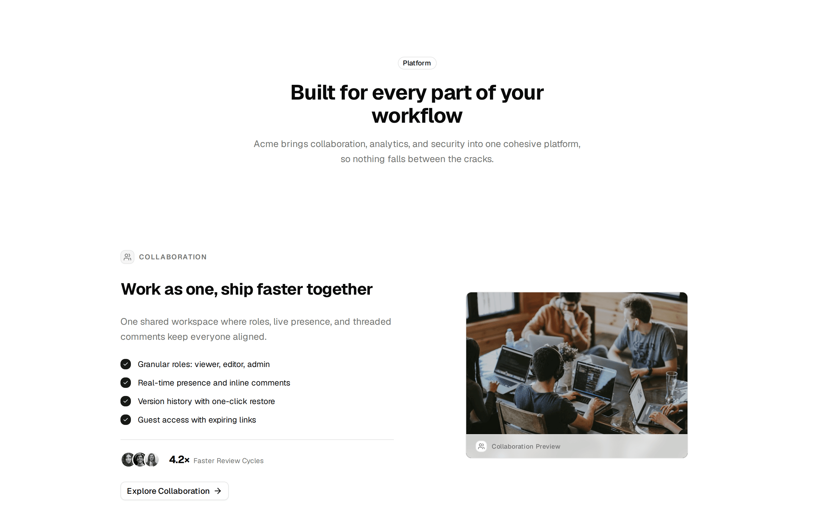
Six Card Icon Grid
Features grid of six icon cards, each with a short title and one line of supporting copy, in a three-column layout.
@7ovr
Features grid of six icon cards, each with a short title and one line of supporting copy, in a three-column layout.
@7ovr
registry/blocks/features/1/features-block.tsx
import {
  Card,
  CardDescription,
  CardHeader,
  CardTitle,
} from "@/components/ui/card"
import { IconPlaceholder } from "@/components/icons/icon-placeholder"

type IconProps = { className?: string; size?: number | string }

const features = [
  {
    icon: (p: IconProps) => (
      <IconPlaceholder
        lucide="Flashlight"
        tabler="IconBulb"
        hugeicons="FlashlightIcon"
        phosphor="Flashlight"
        remixicon="RiFlashlightLine"
        {...p}
      />
    ),
    title: "Lightning fast",
    copy: "Ship in milliseconds with an edge-first runtime tuned for speed.",
  },
  {
    icon: (p: IconProps) => (
      <IconPlaceholder
        lucide="ShieldCheck"
        tabler="IconShieldCheck"
        hugeicons="Shield01Icon"
        phosphor="ShieldCheck"
        remixicon="RiShieldCheckLine"
        {...p}
      />
    ),
    title: "Secure by default",
    copy: "Encryption, audit logs, and granular access baked into every layer.",
  },
  {
    icon: (p: IconProps) => (
      <IconPlaceholder
        lucide="LayoutGrid"
        tabler="IconLayoutGrid"
        hugeicons="LayoutGridIcon"
        phosphor="GridFour"
        remixicon="RiLayoutGridLine"
        {...p}
      />
    ),
    title: "Composable blocks",
    copy: "Drop in sharp, accessible components and compose them your way.",
  },
  {
    icon: (p: IconProps) => (
      <IconPlaceholder
        lucide="ChartBar"
        tabler="IconChartBar"
        hugeicons="BarChartIcon"
        phosphor="ChartBar"
        remixicon="RiBarChartBoxLine"
        {...p}
      />
    ),
    title: "Real-time insights",
    copy: "Track usage and performance the moment events happen.",
  },
  {
    icon: (p: IconProps) => (
      <IconPlaceholder
        lucide="LineChart"
        tabler="IconChartLine"
        hugeicons="ChartLineIcon"
        phosphor="ChartLine"
        remixicon="RiLineChartLine"
        {...p}
      />
    ),
    title: "Scales with you",
    copy: "From first user to millions without re-architecting a thing.",
  },
  {
    icon: (p: IconProps) => (
      <IconPlaceholder
        lucide="Settings"
        tabler="IconSettings"
        hugeicons="SettingsIcon"
        phosphor="GearSix"
        remixicon="RiSettings3Line"
        {...p}
      />
    ),
    title: "Fully configurable",
    copy: "Tune defaults, theming, and workflows to fit your team.",
  },
]

export default function FeaturesBlock() {
  return (
    <section className="flex w-full items-center justify-center bg-background px-6 py-16 text-foreground">
      <div className="mx-auto w-full max-w-5xl">
        <div className="mx-auto max-w-2xl text-center">
          <span className="text-sm font-medium tracking-widest text-muted-foreground uppercase">
            Features
          </span>
          <h2 className="mt-3 font-heading text-3xl font-bold tracking-tight sm:text-4xl">
            Everything you need to build
          </h2>
          <p className="mt-3 text-muted-foreground">
            A focused toolkit that gets out of your way so you can move fast.
          </p>
        </div>

        <div className="mt-12 grid grid-cols-1 gap-6 sm:grid-cols-2 md:grid-cols-3">
          {features.map(({ icon: Icon, title, copy }) => (
            <Card key={title} className="p-6">
              <CardHeader className="p-0">
                <span className="flex size-11 items-center justify-center rounded-lg border border-border bg-muted">
                  <Icon className="size-5" aria-hidden="true" />
                </span>
                <CardTitle className="mt-4 text-base font-semibold">
                  {title}
                </CardTitle>
                <CardDescription className="mt-2 text-sm">
                  {copy}
                </CardDescription>
              </CardHeader>
            </Card>
          ))}
        </div>
      </div>
    </section>
  )
}