Two-Plan Table With Billing Toggle
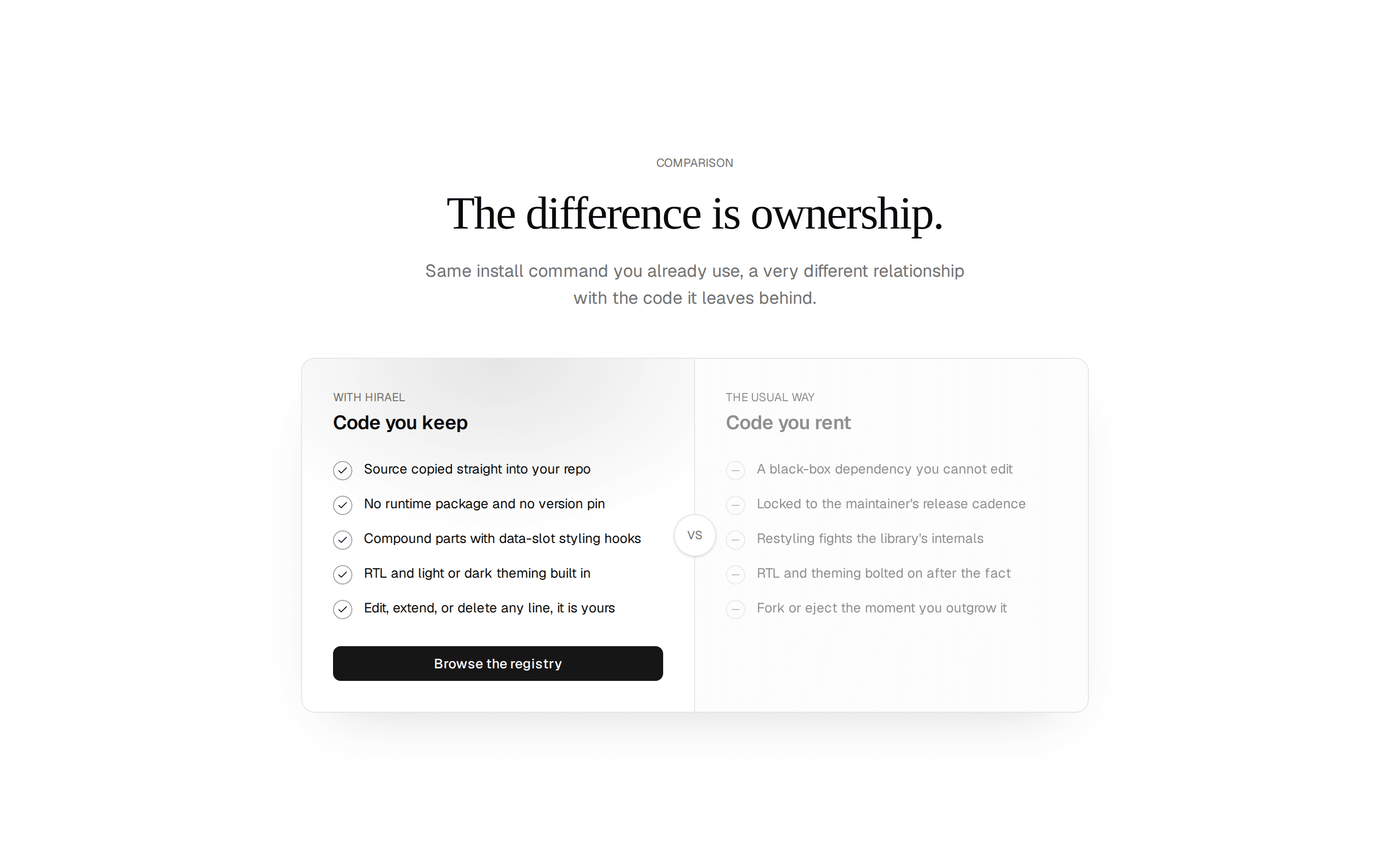
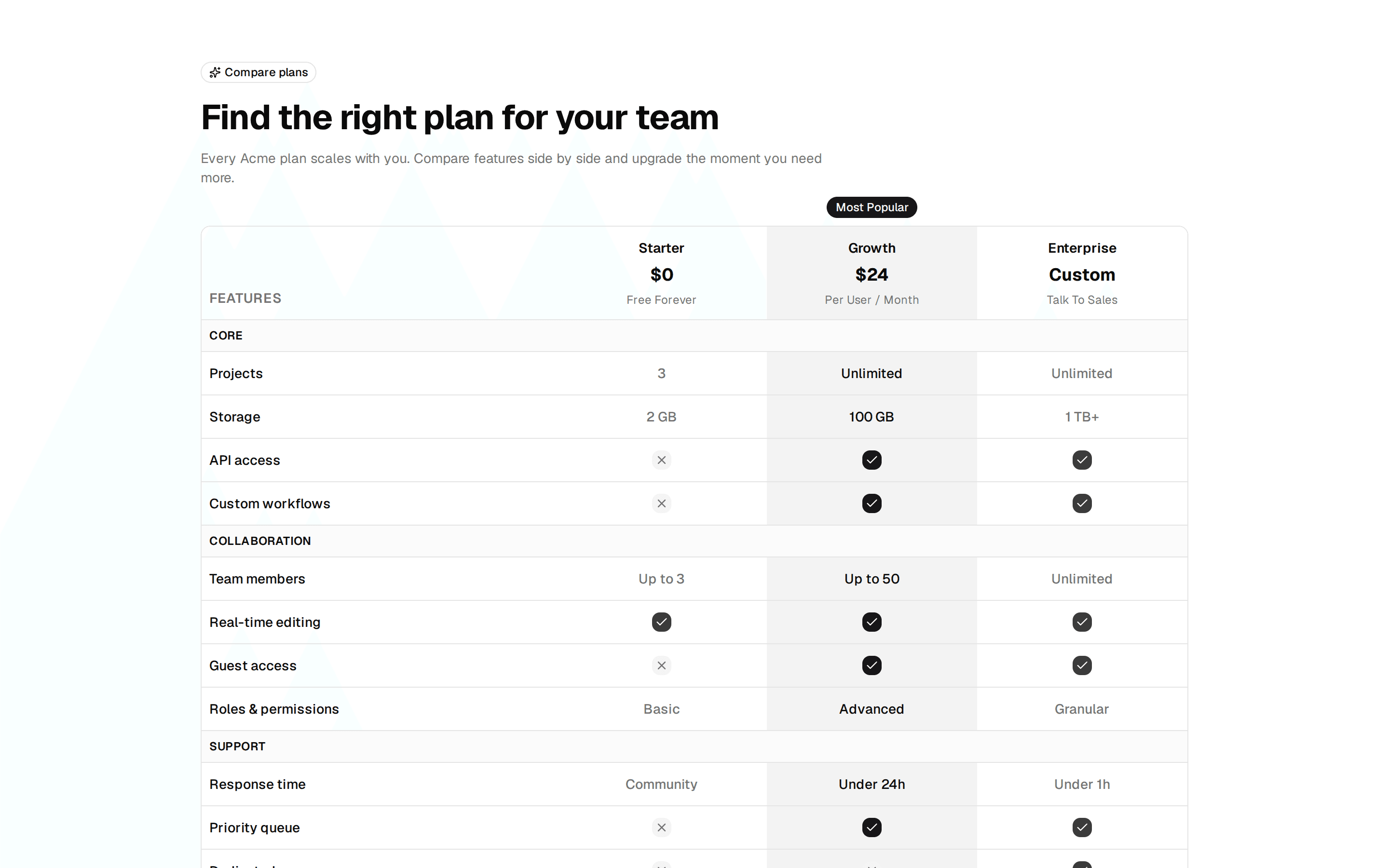
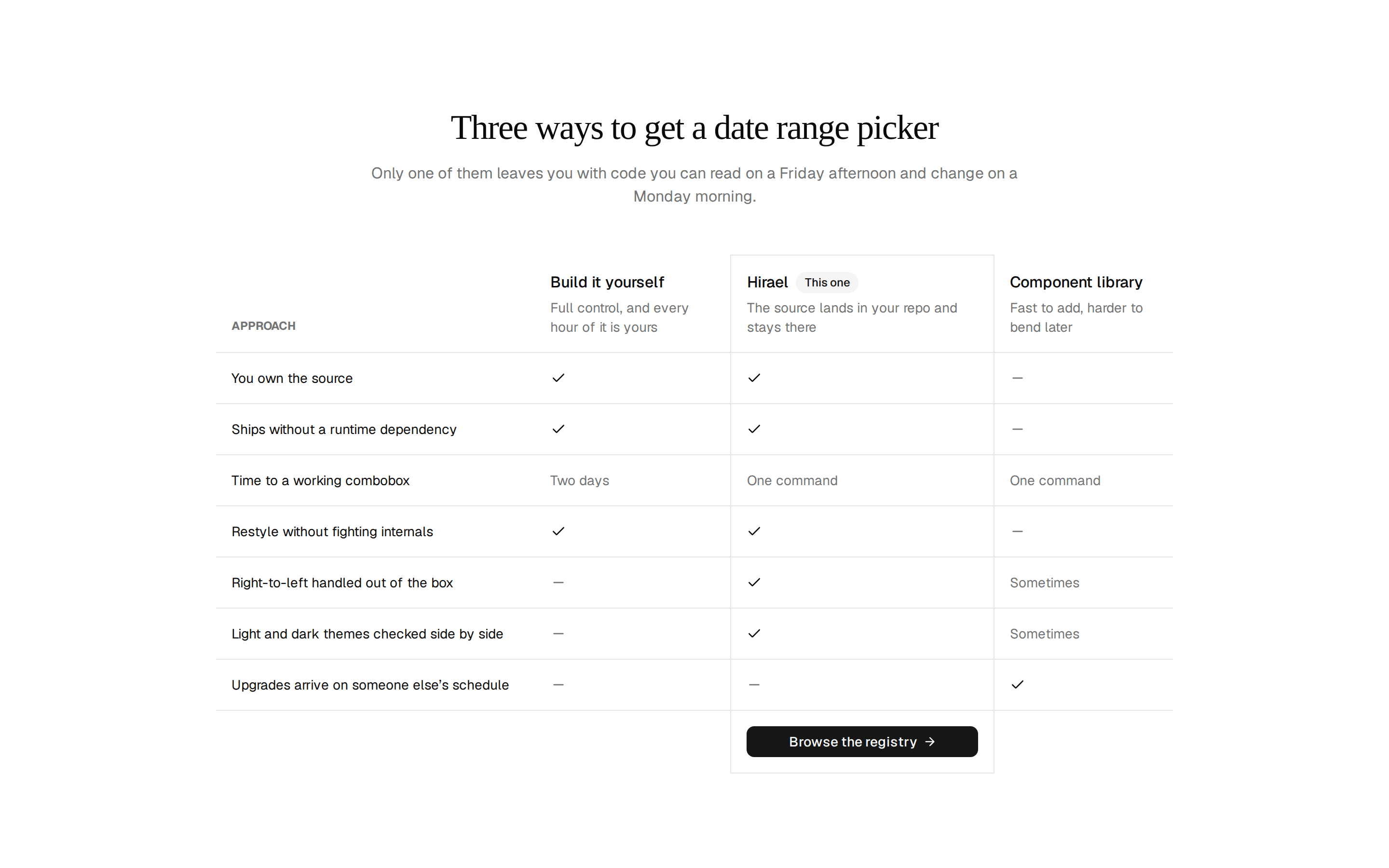
Plan comparison table pitting Starter against Pro across grouped feature rows, with a monthly and annual toggle that changes the price and cell values.
@7ovr
Plan comparison table pitting Starter against Pro across grouped feature rows, with a monthly and annual toggle that changes the price and cell values.
@7ovr
registry/blocks/comparison/1/comparison-block.tsx
"use client"

import * as React from "react"
import { Badge } from "@/components/ui/badge"
import { Button } from "@/components/ui/button"
import {
  Table,
  TableBody,
  TableCell,
  TableHead,
  TableHeader,
  TableRow,
} from "@/components/ui/table"
import { cn } from "@/lib/utils"
import { IconPlaceholder } from "@/components/icons/icon-placeholder"

type Billing = "monthly" | "annual"

type Cell = boolean | string | { monthly: string; annual: string }

const resolveCell = (value: Cell, billing: Billing): boolean | string =>
  typeof value === "object" ? value[billing] : value

const FEATURES: {
  category: string
  rows: { label: string; starter: Cell; pro: Cell }[]
}[] = [
  {
    category: "Core",
    rows: [
      { label: "Projects", starter: "Up to 3", pro: "Unlimited" },
      {
        label: "Storage",
        starter: "1 GB",
        pro: { monthly: "100 GB", annual: "200 GB" },
      },
      { label: "API access", starter: true, pro: true },
      { label: "Custom domains", starter: false, pro: true },
    ],
  },
  {
    category: "Collaboration",
    rows: [
      { label: "Team members", starter: "1", pro: "Unlimited" },
      { label: "Role-based permissions", starter: false, pro: true },
      { label: "Shared workspaces", starter: false, pro: true },
      { label: "Activity log", starter: false, pro: true },
    ],
  },
  {
    category: "Security & Compliance",
    rows: [
      { label: "Two-factor authentication", starter: true, pro: true },
      { label: "SSO / SAML", starter: false, pro: true },
      { label: "Audit logs", starter: false, pro: true },
      { label: "Data residency controls", starter: false, pro: true },
    ],
  },
  {
    category: "Support",
    rows: [
      { label: "Community forum", starter: true, pro: true },
      { label: "Email support", starter: false, pro: true },
      {
        label: "Priority response SLA",
        starter: false,
        pro: { monthly: "< 4 h", annual: "< 2 h" },
      },
      { label: "Dedicated account manager", starter: false, pro: true },
    ],
  },
]

function FeatureValue({
  value,
  highlight,
}: {
  value: boolean | string
  highlight?: boolean
}) {
  if (typeof value === "string") {
    return (
      <span
        className={cn(
          "text-sm font-medium",
          highlight ? "text-foreground" : "text-muted-foreground"
        )}
      >
        {value}
      </span>
    )
  }
  if (value) {
    return (
      <IconPlaceholder
        lucide="Check"
        tabler="IconCheck"
        hugeicons="Tick02Icon"
        phosphor="Check"
        remixicon="RiCheckLine"
        className={cn(
          "mx-auto size-4",
          highlight ? "text-primary" : "text-muted-foreground"
        )}
        aria-label="Included"
      />
    )
  }
  return (
    <IconPlaceholder
      lucide="X"
      tabler="IconX"
      hugeicons="Cancel01Icon"
      phosphor="X"
      remixicon="RiCloseLine"
      className="mx-auto size-4 text-muted-foreground/40"
      aria-label="Not included"
    />
  )
}

export default function ComparisonBlock() {
  const [billing, setBilling] = React.useState<Billing>("monthly")
  const proPrice = billing === "annual" ? 23 : 29

  return (
    <section className="flex w-full items-center justify-center bg-background px-4 py-16 text-foreground sm:px-6">
      <div className="mx-auto w-full max-w-3xl">
        <div className="mx-auto max-w-xl text-center">
          <span className="text-sm font-medium tracking-widest text-muted-foreground uppercase">
            Plans
          </span>
          <h2 className="mt-3 font-heading text-3xl font-bold tracking-tight sm:text-4xl">
            Compare plans
          </h2>
          <p className="mt-3 text-muted-foreground">
            Every feature, side by side, so you can pick the right plan with
            confidence.
          </p>
        </div>

        <div className="mt-8 flex justify-center">
          <div
            role="group"
            aria-label="Billing period"
            className="inline-flex items-center gap-1 rounded-lg border border-border bg-muted/50 p-1"
          >
            <button
              type="button"
              onClick={() => setBilling("monthly")}
              aria-pressed={billing === "monthly"}
              className={cn(
                "rounded-md px-4 py-1.5 text-sm font-medium transition-colors",
                billing === "monthly"
                  ? "bg-background text-foreground shadow-sm"
                  : "text-muted-foreground hover:text-foreground"
              )}
            >
              Monthly
            </button>
            <button
              type="button"
              onClick={() => setBilling("annual")}
              aria-pressed={billing === "annual"}
              className={cn(
                "flex items-center gap-2 rounded-md px-4 py-1.5 text-sm font-medium transition-colors",
                billing === "annual"
                  ? "bg-background text-foreground shadow-sm"
                  : "text-muted-foreground hover:text-foreground"
              )}
            >
              Annual
              <Badge className="px-1.5 text-[10px] font-semibold">-20%</Badge>
            </button>
          </div>
        </div>

        <div className="relative mt-10 rounded-lg border border-border bg-card">
          <Badge className="absolute bottom-full left-[87.5%] z-20 mb-2 -translate-x-1/2 px-2 text-[10px] font-semibold">
            Popular
          </Badge>
          <Table>
            <TableHeader>
              <TableRow className="hover:bg-transparent">
                <TableHead className="w-1/2 py-4 text-sm font-semibold text-foreground">
                  Feature
                </TableHead>
                <TableHead className="w-1/4 py-4 text-center text-sm font-semibold text-foreground">
                  <div className="flex flex-col items-center gap-0.5">
                    <span>Starter</span>
                    <span className="text-xs font-normal text-muted-foreground">
                      Free
                    </span>
                  </div>
                </TableHead>
                <TableHead className="w-1/4 rounded-tr-lg bg-primary/10 py-4 text-center text-sm font-semibold text-foreground">
                  <div className="flex flex-col items-center gap-0.5">
                    <span>Pro</span>
                    <span className="text-xs font-normal text-muted-foreground">
                      ${proPrice} / Month
                    </span>
                  </div>
                </TableHead>
              </TableRow>
            </TableHeader>

            <TableBody>
              {FEATURES.map(({ category, rows }) => (
                <React.Fragment key={category}>
                  <TableRow className="bg-muted/50 hover:bg-muted/50">
                    <TableCell
                      colSpan={3}
                      className="py-2 text-xs font-semibold tracking-wider text-muted-foreground uppercase"
                    >
                      {category}
                    </TableCell>
                  </TableRow>

                  {rows.map((row) => (
                    <TableRow key={row.label}>
                      <TableCell className="text-sm text-foreground">
                        {row.label}
                      </TableCell>
                      <TableCell className="text-center">
                        <FeatureValue
                          value={resolveCell(row.starter, billing)}
                        />
                      </TableCell>
                      <TableCell className="bg-primary/5 text-center">
                        <FeatureValue
                          value={resolveCell(row.pro, billing)}
                          highlight
                        />
                      </TableCell>
                    </TableRow>
                  ))}
                </React.Fragment>
              ))}

              <TableRow className="hover:bg-transparent">
                <TableCell />
                <TableCell className="py-5 text-center">
                  <Button
                    nativeButton={false}
                    variant="outline"
                    size="sm"
                    className="w-full max-w-[120px]"
                    render={<a href="#" />}
                  >
                    Get Started
                  </Button>
                </TableCell>
                <TableCell className="rounded-br-lg bg-primary/5 py-5 text-center">
                  <Button
                    nativeButton={false}
                    size="sm"
                    className="w-full max-w-[120px]"
                    render={<a href="#" />}
                  >
                    Start Free Trial
                  </Button>
                </TableCell>
              </TableRow>
            </TableBody>
          </Table>
        </div>
      </div>
    </section>
  )
}
Requires a base-* style in components.json (the shadcn init default). Legacy new-york/radix-* styles install Radix primitives, which reject the render prop this block uses.