In-App What's New Card
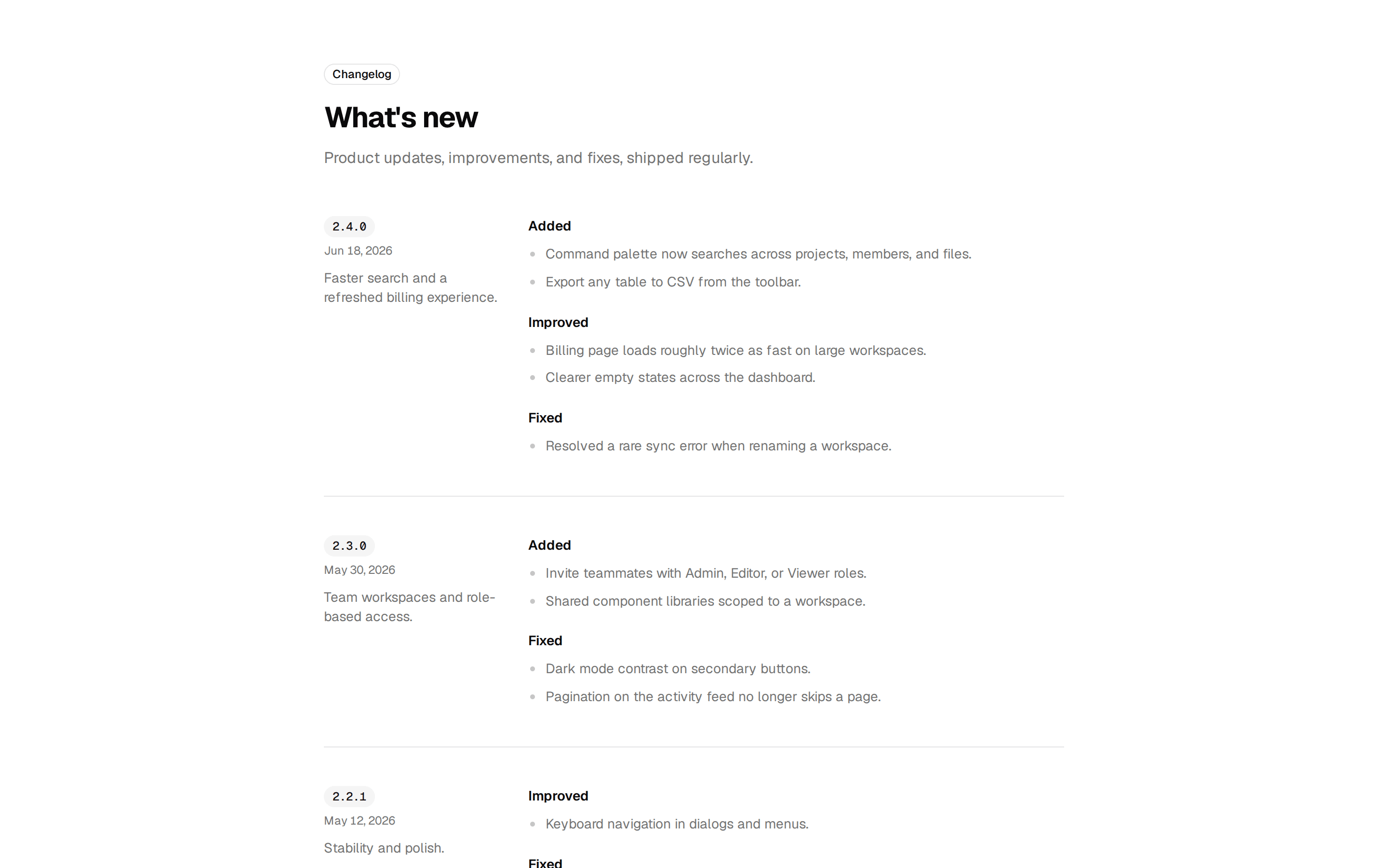
Compact what's new card with a version pill, release date, highlighted changes with type icons and badges, and a full changelog link.
@7ovr
Compact what's new card with a version pill, release date, highlighted changes with type icons and badges, and a full changelog link.
@7ovr
registry/blocks/changelog/3/changelog-block.tsx
import { Badge } from "@/components/ui/badge"
import { Button } from "@/components/ui/button"
import { Card, CardContent, CardFooter, CardHeader } from "@/components/ui/card"
import { Separator } from "@/components/ui/separator"
import { IconPlaceholder } from "@/components/icons/icon-placeholder"
import type * as React from "react"
type IconProps = { className?: string; size?: number | string }
type IconRenderer = (props: IconProps) => React.ReactNode
type ChangeType = "New" | "Improved" | "Fixed"
const changes: {
type: ChangeType
icon: IconRenderer
title: string
description: string
}[] = [
{
type: "New",
icon: (p: IconProps) => (
<IconPlaceholder
lucide="Sparkles"
tabler="IconSparkles"
hugeicons="SparklesIcon"
phosphor="Sparkle"
remixicon="RiSparkling2Line"
{...p}
/>
),
title: "Command palette",
description:
"Jump anywhere with Command K, now across your whole workspace.",
},
{
type: "Improved",
icon: (p: IconProps) => (
<IconPlaceholder
lucide="Gauge"
tabler="IconGauge"
hugeicons="GaugeIcon"
phosphor="Gauge"
remixicon="RiSpeedUpLine"
{...p}
/>
),
title: "Faster billing",
description: "The billing page loads about twice as fast on large teams.",
},
{
type: "Fixed",
icon: (p: IconProps) => (
<IconPlaceholder
lucide="Bug"
tabler="IconBug"
hugeicons="BugIcon"
phosphor="Bug"
remixicon="RiBugLine"
{...p}
/>
),
title: "Workspace rename",
description: "Renaming a busy workspace no longer triggers a sync error.",
},
]
const typeVariant: Record<ChangeType, "default" | "secondary" | "outline"> = {
New: "default",
Improved: "secondary",
Fixed: "outline",
}
export default function ChangelogBlock() {
return (
<section className="flex w-full items-center justify-center bg-background px-6 py-16 text-foreground">
<Card className="w-full max-w-sm gap-0 py-0">
<CardHeader className="gap-0 border-b border-border p-5">
<div className="flex items-center justify-between gap-3">
<span className="text-base font-semibold tracking-tight">
What's New
</span>
<Badge variant="secondary" className="font-mono tabular-nums">
2.4.0
</Badge>
</div>
<p className="mt-1 text-sm text-muted-foreground">
Released Jun 18, 2026
</p>
</CardHeader>
<CardContent className="flex flex-col p-0">
{changes.map((change, i) => (
<div key={change.title}>
{i > 0 && <Separator />}
<div className="flex items-start gap-3 p-4">
<span className="flex size-9 shrink-0 items-center justify-center rounded-lg border border-border bg-muted/50 text-muted-foreground">
<change.icon className="size-4.5" aria-hidden="true" />
</span>
<div className="flex flex-col gap-1">
<div className="flex items-center gap-2">
<h3 className="font-heading text-sm font-semibold">
{change.title}
</h3>
<Badge variant={typeVariant[change.type]}>
{change.type}
</Badge>
</div>
<p className="text-xs/relaxed text-muted-foreground">
{change.description}
</p>
</div>
</div>
</div>
))}
</CardContent>
<CardFooter className="border-t border-border p-3">
<Button
variant="ghost"
size="sm"
className="w-full justify-between"
render={<a href="#" />}
nativeButton={false}
>
View Full Changelog
<IconPlaceholder
lucide="ArrowRight"
tabler="IconArrowRight"
hugeicons="ArrowRightIcon"
phosphor="ArrowRight"
remixicon="RiArrowRightLine"
data-icon="inline-end"
aria-hidden="true"
/>
</Button>
</CardFooter>
</Card>
</section>
)
}
Requires a base-* style in components.json (the shadcn init default). Legacy new-york/radix-* styles install Radix primitives, which reject the render prop this block uses.